Getting Started with WPF Chromeless Window
3 Sep 20257 minutes to read
This section explains how to implement the ChromelessWindow control. It describes the following:
Assembly deployment
Refer to the control dependencies section to get the list of assemblies or NuGet package that needs to be added as reference to use the control in any application.
You can find more details about installing the NuGet packages in a WPF application in the following link:
Creating simple application with ChromelessWindow
You can create a WPF application with ChromelessWindow using the following steps:
- Create a project.
- Add ChromelessWindow.
- Customize title bar.
- Customize title bar background.
- Customize title bar font.
- Customize title bar height.
- Customize title bar icon.
- Customize the border of the ChromelessWindow.
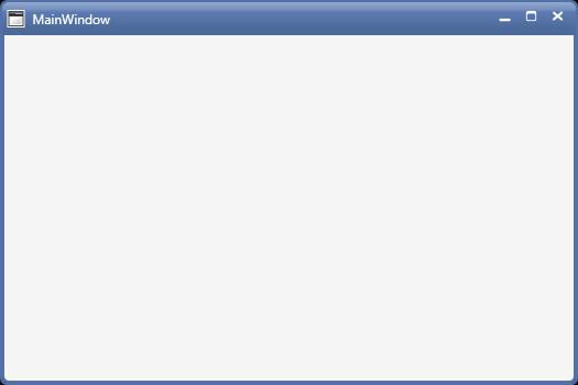
Creating the project
Create a new WPF project in Visual Studio to display chromeless window.
Add ChromelessWindow
The following steps help you add ChromelessWindow:
- Create a WPF project, and refer the following assemblies:
- Syncfusion.Shared.WPF.dll.
-
Include an XML namespace for the above assemblies to the Main window.
<Window x:Class="Chromelesswindow.MainWindow" xmlns="http://schemas.microsoft.com/winfx/2006/xaml/presentation" xmlns:x="http://schemas.microsoft.com/winfx/2006/xaml" Title="MainWindow" Height="350" Width="525" xmlns:syncfusion="clr-namespace:Syncfusion.Windows.Shared;assembly=Syncfusion.Shared.WPF"> </Window> -
Change the Window to ChromelessWindow.
<syncfusion:ChromelessWindow x:Class="Chromelesswindow.MainWindow" xmlns="http://schemas.microsoft.com/winfx/2006/xaml/presentation" xmlns:x="http://schemas.microsoft.com/winfx/2006/xaml" Title="MainWindow" Height="350" Width="525" xmlns:syncfusion="clr-namespace:Syncfusion.Windows.Shared;assembly=Syncfusion.Shared.WPF"> </syncfusion:ChromelessWindow> -
Add the Syncfusion.Windows.Shared namespace, and inherit MainWindow from ChromelessWindow in code behind.
using Syncfusion.Windows.Shared;
public partial class MainWindow : ChromelessWindow
{
    public MainWindow()
    {
        InitializeComponent();
    }
}
Customizing title bar
Title bar background
You can customize the background of the title bar by setting the TitleBarBackground property of ChromelessWindow.
<syncfusion:ChromelessWindow
    x:Class="WPF_CalendarEdit.MainWindow"
    xmlns="http://schemas.microsoft.com/winfx/2006/xaml/presentation"
    xmlns:x="http://schemas.microsoft.com/winfx/2006/xaml"
    xmlns:d="http://schemas.microsoft.com/expression/blend/2008"
    xmlns:syncfusion="http://schemas.syncfusion.com/wpf"
    TitleBarBackground="Red"
    Title="ChromelessWindow Sample" Height="350" Width="525">
    <Grid>
    </Grid>
</syncfusion:ChromelessWindow>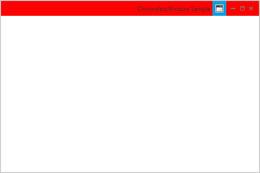
Title bar font
The font of the caption in the title bar can be customized using the TitleFontSize property.
<syncfusion:ChromelessWindow
    x:Class="WPF_CalendarEdit.MainWindow"
    xmlns="http://schemas.microsoft.com/winfx/2006/xaml/presentation"
    xmlns:x="http://schemas.microsoft.com/winfx/2006/xaml"
    xmlns:d="http://schemas.microsoft.com/expression/blend/2008"
    xmlns:syncfusion="http://schemas.syncfusion.com/wpf"
    TitleFontSize="15"
    Title="ChromelessWindow Sample" Height="350" Width="525">
	<Grid>
	</Grid>
</syncfusion:ChromelessWindow>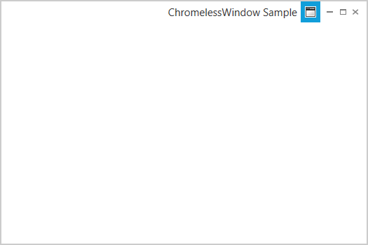
Title bar height
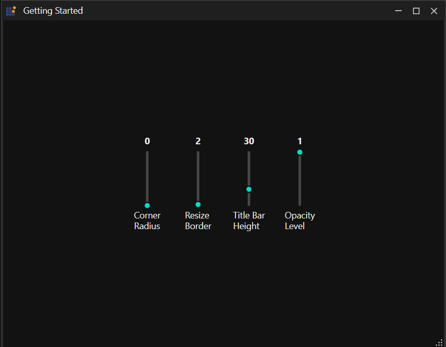
You can customize the caption height by setting the TitleBarHeight of ChromelessWindow.
<syncfusion:ChromelessWindow
    x:Class="WPF_CalendarEdit.MainWindow"
    xmlns="http://schemas.microsoft.com/winfx/2006/xaml/presentation"
    xmlns:x="http://schemas.microsoft.com/winfx/2006/xaml"
    xmlns:d="http://schemas.microsoft.com/expression/blend/2008"
    xmlns:syncfusion="http://schemas.syncfusion.com/wpf"
    xmlns:local="clr-namespace:WPF_CalendarEdit"
	TitleBarHeight="50"
    Title="ChromelessWindow Sample" Height="350" Width="525">
	<Grid>
    </Grid>
</syncfusion:ChromelessWindow>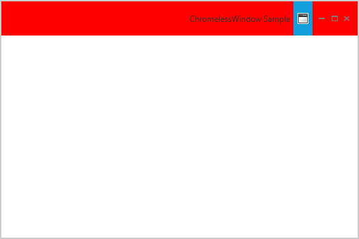
Title bar text alignment
The text alignment of the title can be set using the TitleTextAlignment property in the Chromeless Window. The various options of the TitleTextAlignment are listed below.
- Left
- Right
- Center
- Stretch
<syncfusion:ChromelessWindow x:Class="Chromeless_Window_Sample.MainWindow"
        xmlns="http://schemas.microsoft.com/winfx/2006/xaml/presentation"
        xmlns:x="http://schemas.microsoft.com/winfx/2006/xaml"
        xmlns:d="http://schemas.microsoft.com/expression/blend/2008"
        xmlns:mc="http://schemas.openxmlformats.org/markup-compatibility/2006"
        xmlns:local="clr-namespace:Chromeless_Window_Sample"
        mc:Ignorable="d" xmlns:syncfusion="http://schemas.syncfusion.com/wpf"
        TitleTextAlignment="Center"
        Title="Chromeless Window Sample"
        Height="350" Width="550">
    <Grid>
    </Grid>
</syncfusion:ChromelessWindow>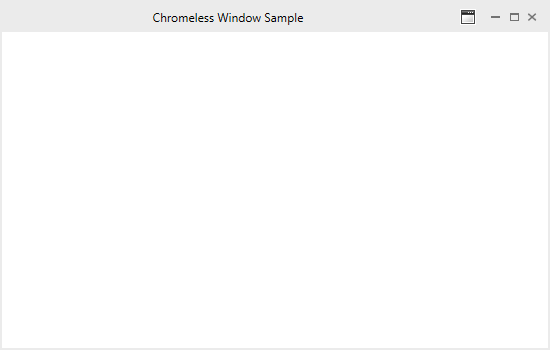
Title bar icon
You can set the caption icon by setting the Icon property.
<syncfusion:ChromelessWindow
    x:Class="WPF_CalendarEdit.MainWindow"
    xmlns="http://schemas.microsoft.com/winfx/2006/xaml/presentation"
    xmlns:x="http://schemas.microsoft.com/winfx/2006/xaml"
    xmlns:d="http://schemas.microsoft.com/expression/blend/2008"
    xmlns:syncfusion="http://schemas.syncfusion.com/wpf"
	Icon="App.ico"
    Title="ChromelessWindow Sample" Height="350" Width="525">
    <Grid>
    </Grid>
</syncfusion:ChromelessWindow>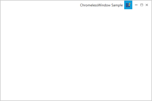
Title bar icon alignment
The title bar icon can be aligned to Left or Right using the IconAlignment property in the Chromeless Window. Its various options are listed below.
- Left
- Right
<syncfusion:ChromelessWindow x:Class="Chromeless_Window_Sample.MainWindow"
        xmlns="http://schemas.microsoft.com/winfx/2006/xaml/presentation"
        xmlns:x="http://schemas.microsoft.com/winfx/2006/xaml"
        xmlns:d="http://schemas.microsoft.com/expression/blend/2008"
        xmlns:mc="http://schemas.openxmlformats.org/markup-compatibility/2006"
        xmlns:local="clr-namespace:Chromeless_Window_Sample"
        mc:Ignorable="d" xmlns:syncfusion="http://schemas.syncfusion.com/wpf"
        TitleTextAlignment="Center"
        Title="Chromeless Window Sample" IconAlignment="Left"
        Height="350" Width="550">
    <Grid>
    </Grid>
</syncfusion:ChromelessWindow>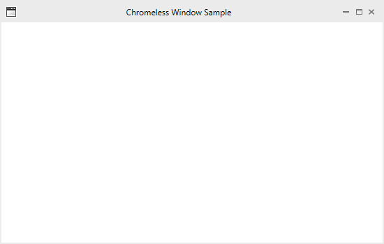
Customizing the border of ChromelessWindow
You can change the border color of the chromeless window by setting the ResizeBorderBrush property.
<syncfusion:ChromelessWindow
    x:Class="WpfApplication2.MainWindow"
    xmlns="http://schemas.microsoft.com/winfx/2006/xaml/presentation"
    xmlns:x="http://schemas.microsoft.com/winfx/2006/xaml"
    xmlns:d="http://schemas.microsoft.com/expression/blend/2008"
    xmlns:syncfusion="http://schemas.syncfusion.com/wpf"
	ResizeBorderBrush="Red"
    Title="ChromelessWindow Sample" Height="350" Width="525">
	<Grid>
	</Grid>
</syncfusion:ChromelessWindow>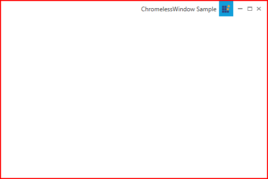
Theme
ChromelessWindow supports various built-in themes. Refer to the below links to apply themes for the ChromelessWindow,
NOTE