How can I help you?
Styling the ChromelessWindow in WPF Chromeless Window
12 Nov 20244 minutes to read
This section deals with the Styles and Templates supported by ChromelessWindow control.
Custom template for the TitleBar
ChromelessWindow allows the end-user to write own templates for the TitleBar. The TitleBar can be customized by using the TitleBarTemplate property. The following code snippet illustrates how to set the TitleBarTemplate property.
<syncfusion:ChromelessWindow x:Class="Chromelesswindow.MainWindow"
xmlns="http://schemas.microsoft.com/winfx/2006/xaml/presentation"
xmlns:x="http://schemas.microsoft.com/winfx/2006/xaml"
Title="ChromelessWindow" Height="350" Width="525" TitleBarTemplate="{StaticResource TitleBarTemplateKey}"
syncfusion:SkinStorage.VisualStyle="Metro" x:Name="_chromelessWindow"
xmlns:syncfusion="clr-namespace:Syncfusion.Windows.Shared;assembly=Syncfusion.Shared.WPF"  >
</syncfusion:ChromelessWindow>
For example, use the following code for a TitleBarTemplate.
<ControlTemplate x:Key="TitleBarTemplateKey" TargetType="{x:Type syncfusion:TitleBar}">
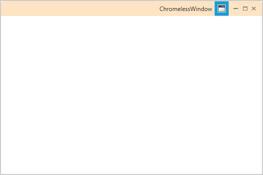
<Border x:Name="MainGrid" Height="30" CornerRadius="5,5,0,0" Background="Bisque" >
<Border BorderBrush="Transparent" Background="Transparent" BorderThickness=".5" Width="Auto" CornerRadius="0,0,0,0">
<ContentPresenter HorizontalAlignment="Stretch" VerticalAlignment="Center" />
</Border>
</Border>
</ControlTemplate>NOTE
The drag and drop feature for the ChromelessWindow is available only with the TitleBar,to incorporate this feature,include a TitleBar into your ChromelessWindow.Also it is necessary to specify the name of the TitleBar as PART_TitleBar”,to enable the drag and drop feature.
Custom template for the TitleButton
ChromelessWindow enables the user to write their own templates for the Title button that is used in the TitleBar. Maximize , Minimize , Restore and Close Button can be edited with MaximizeButtonTemplate , MinimizeButtonTemplate , RestoreButtonTemplate , CloseButtonTemplate property respectively. The below code example is illustrated to change the template of the Maximize Button using MaximizeButtonTemplate property
<syncfusion:ChromelessWindow x:Class="Chromelesswindow.MainWindow"
xmlns="http://schemas.microsoft.com/winfx/2006/xaml/presentation"
xmlns:x="http://schemas.microsoft.com/winfx/2006/xaml"
Title="ChromelessWindow" Height="350" Width="525" MaximizeButtonTemplate="{StaticResource MaxTemplateKey}"
syncfusion:SkinStorage.VisualStyle="Metro"    x:Name="_chromelessWindow"
xmlns:syncfusion="clr-namespace:Syncfusion.Windows.Shared;assembly=Syncfusion.Shared.WPF" >
<Grid>
</Grid>
</syncfusion:ChromelessWindow>
For example, use the following code for a MaximizeButtonTemplate.
<ControlTemplate x:Key="MaxTemplateKey" TargetType="{x:Type syncfusion:TitleButton}">
<Border SnapsToDevicePixels="true" x:Name="maxborder" Width="15" Height="15" Background="Coral"
BorderThickness="0" BorderBrush="Transparent">
<Grid SnapsToDevicePixels="true" x:Name="grid" HorizontalAlignment="Center" VerticalAlignment="Center" Width="9" Height="8">
<Path Name="pathButton" SnapsToDevicePixels="True"  Stretch="Fill" StrokeThickness="1"
Data="M1,1 L8,1 L8,8 L1,8 z M1,2 L8,2" Stroke="Green"
HorizontalAlignment="Center" VerticalAlignment="Center"  Width="9" Height="8">
</Path>
</Grid>
</Border>
</ControlTemplate>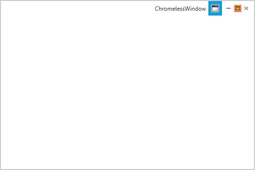
Similarly, the template for the desired button can be changed by using the corresponding button property
Overriding the default style
ChromelessWindow can be customized by editing the default template. The default style can be downloaded from the following link
https://www.syncfusion.com/downloads/support/directtrac/general/ze/DefaultStyle-1700710349
This default style need to be included in the App.xaml file of your application and the override this style as you desire.
NOTE
All the templates should be written in App.xaml file only.
The below example is illustrated to override the ChromelessWindow’s full style
<ControlTemplate x:Key="TitleBarTemplateKey" TargetType="{x:Type syncfusion:TitleBar}">
<Border Name="border" Background="#AA161616" Height="30">
<ContentPresenter HorizontalAlignment="Stretch" VerticalAlignment="Bottom" Margin="0,0,0,0"/>
</Border>
</ControlTemplate>
<ControlTemplate x:Key="ChromelessWindowTemplate" TargetType="{x:Type syncfusion:ChromelessWindow}">
<AdornerDecorator>
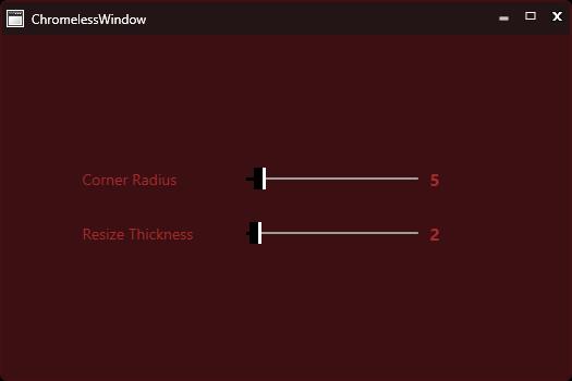
<Border Name="OuterBorder" Background="#F1401013" BorderThickness="2" CornerRadius="{Binding ElementName=CornerRadiusSlider,Path=Value}" BorderBrush="#401013">
......
......
......
<syncfusion:TitleBar Name="PART_TitleBar" Grid.Row="0" Template="{StaticResource TitleBarTemplateKey}" >
<Grid VerticalAlignment="Top" Height="30">
<StackPanel Orientation="Horizontal">
<Image x:Name="PART_Icon" Source="{Binding RelativeSource={RelativeSource FindAncestor, AncestorType={x:Type syncfusion:ChromelessWindow}}, Path=Icon}" VerticalAlignment="Center" HorizontalAlignment="Left" Margin="4,4,2,4" MaxWidth="16" MaxHeight="16" MinWidth="16" MinHeight="16" />
<ContentControl Foreground="White" Content="{TemplateBinding Title}" VerticalAlignment="Center" HorizontalAlignment="Left" x:Name="TitlePresenter" Margin="5,5,5,5" />
</StackPanel>
......
......
</Grid>
</syncfusion:TitleBar>
......
......
</Grid>
</Border>
</AdornerDecorator>
</ControlTemplate>Then apply this style to the ChromelessWindow using Template Property
<syncfusion:ChromelessWindow x:Class="Chromelesswindow.MainWindow"
xmlns="http://schemas.microsoft.com/winfx/2006/xaml/presentation"
xmlns:x="http://schemas.microsoft.com/winfx/2006/xaml"
Title="ChromelessWindow" Height="350" Width="525" Template="{StaticResource ChromelessWindowTemplate}"
syncfusion:SkinStorage.VisualStyle="Metro" x:Name="_chromelessWindow"
xmlns:syncfusion="clr-namespace:Syncfusion.Windows.Shared;assembly=Syncfusion.Shared.WPF"  >
</syncfusion:ChromelessWindow>
The following screen shot shows the Custom ChromelessWindow control created using the preceding code.