Track in WinUI RangeSlider
18 Nov 20188 minutes to read
This section explains how to customize the track in the RangeSlider.
Refer to the getting started documentation for information on installing the NuGet package, adding namespace references, and adding the
SfRangeSlidercontrol to your application. TheColorHelperused in the C# examples is part of theSyncfusion.UI.Xaml.Corenamespace.
Track Color
You can change the active and inactive track colors of the range slider using the ActiveTrackFill and InactiveTrackFill properties respectively.
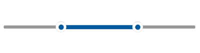
The active track is the region between the start and end thumbs. The inactive track is visible between the Minimum value and the start thumb, and between the end thumb and the Maximum value.
<slider:SfRangeSlider RangeStart="30"
                      RangeEnd="70"
                      ActiveTrackFill="#009688"
                      InactiveTrackFill="#C2E6E3" />
SfRangeSlider sfRangeSlider = new SfRangeSlider();
sfRangeSlider.RangeStart = 30;
sfRangeSlider.RangeEnd = 70;
sfRangeSlider.ActiveTrackFill = new SolidColorBrush(ColorHelper.FromArgb(255, 0, 150, 136));
sfRangeSlider.InactiveTrackFill = new SolidColorBrush(ColorHelper.FromArgb(255, 194, 230, 227));
this.Content = sfRangeSlider;
Track Hover Color
You can change the active and inactive track hover colors of the range slider using the SyncfusionSliderActiveTrackFillPointerOver and SyncfusionSliderInactiveTrackFillPointerOver resource keys respectively. These colors are applied when the cursor hovers over the RangeSlider control.
The hover color resource keys can only be overridden in XAML resources. The C# example below shows the normal-state track colors for reference; the hover resource keys must be declared as XAML resources.
<Page.Resources>
    <SolidColorBrush x:Key="SyncfusionSliderActiveTrackFillPointerOver">#009688</SolidColorBrush>
    <SolidColorBrush x:Key="SyncfusionSliderInactiveTrackFillPointerOver">#C2E6E3</SolidColorBrush>
</Page.Resources>

<slider:SfRangeSlider RangeStart="30"
                      RangeEnd="70"
                      ActiveTrackFill="#006688"
                      InactiveTrackFill="#A2E6E3" />
SfRangeSlider sfRangeSlider = new SfRangeSlider();
sfRangeSlider.RangeStart = 30;
sfRangeSlider.RangeEnd = 70;
sfRangeSlider.ActiveTrackFill = new SolidColorBrush(ColorHelper.FromArgb(255, 0, 150, 136));
sfRangeSlider.InactiveTrackFill = new SolidColorBrush(ColorHelper.FromArgb(255, 194, 230, 227));
this.Content = sfRangeSlider;
Track Pressed Color
You can change the active and inactive track pressed colors of the range slider using the SyncfusionSliderActiveTrackFillPressed and SyncfusionSliderInactiveTrackFillPressed resource keys respectively. These colors are applied when the cursor is pressed on the range slider control.
The pressed color resource keys can only be overridden in XAML resources. The C# example below shows the normal-state track colors for reference; the pressed resource keys must be declared as XAML resources.
<Page.Resources>
    <SolidColorBrush x:Key="SyncfusionSliderActiveTrackFillPointerOver">#009688</SolidColorBrush>
    <SolidColorBrush x:Key="SyncfusionSliderInactiveTrackFillPointerOver">#C2E6E3</SolidColorBrush>

    <SolidColorBrush x:Key="SyncfusionSliderActiveTrackFillPressed">#018A7D</SolidColorBrush>
    <SolidColorBrush x:Key="SyncfusionSliderInactiveTrackFillPressed">#98B8B5</SolidColorBrush>
</Page.Resources>

<slider:SfRangeSlider RangeStart="30"
                      RangeEnd="70"
                      ActiveTrackFill="#006688"
                      InactiveTrackFill="#A2E6E3"  />
SfRangeSlider sfRangeSlider = new SfRangeSlider();
sfRangeSlider.RangeStart = 30;
sfRangeSlider.RangeEnd = 70;
sfRangeSlider.ActiveTrackFill = new SolidColorBrush(ColorHelper.FromArgb(255, 0, 150, 136));
sfRangeSlider.InactiveTrackFill = new SolidColorBrush(ColorHelper.FromArgb(255, 194, 230, 227));
this.Content = sfRangeSlider;
Track Height
You can change the track height of the range slider using the ActiveTrackHeight and InactiveTrackHeight properties. The values are measured in pixels. The default values of both properties are 2.
<slider:SfRangeSlider RangeStart="30"
                      RangeEnd="70"
                      ActiveTrackHeight="8"
                      InactiveTrackHeight="8"  />
SfRangeSlider sfRangeSlider = new SfRangeSlider();
sfRangeSlider.RangeStart = 30;
sfRangeSlider.RangeEnd = 70;
sfRangeSlider.ActiveTrackHeight = 8;
sfRangeSlider.InactiveTrackHeight = 8;
this.Content = sfRangeSlider;
Track Style
You can change the track style of the range slider using the ActiveTrackStyle and InactiveTrackStyle properties. The default values of both properties are null.
<Page.Resources>
    <Style x:Key="ActiveTrackStyle"
            TargetType="Rectangle">
        <Setter Property="RadiusX"
                Value="4" />
        <Setter Property="RadiusY"
                Value="4" />
    </Style>

    <Style x:Key="InactiveTrackStyle"
            TargetType="Rectangle">
        <Setter Property="RadiusX"
                Value="3" />
        <Setter Property="RadiusY"
                Value="3" />
    </Style>
</Page.Resources>

<slider:SfRangeSlider RangeStart="30"
                      RangeEnd="70"
                      ActiveTrackHeight="8"
                      InactiveTrackHeight="6"
                      ActiveTrackStyle="{StaticResource ActiveTrackStyle}"
                      InactiveTrackStyle="{StaticResource InactiveTrackStyle}" />
SfRangeSlider sfRangeSlider = new SfRangeSlider();
sfRangeSlider.RangeStart = 30;
sfRangeSlider.RangeEnd = 70;
sfRangeSlider.ActiveTrackHeight = 8;
sfRangeSlider.InactiveTrackHeight = 6;
sfRangeSlider.ActiveTrackStyle = this.Resources["ActiveTrackStyle"] as Style;
sfRangeSlider.InactiveTrackStyle = this.Resources["InactiveTrackStyle"] as Style;
this.Content = sfRangeSlider;