Thumb and Thumb Overlay in WinUI RangeSlider
18 Nov 201814 minutes to read
This section explains how to customize the thumb and thumb overlay in the RangeSlider.
The thumb is an element of the RangeSlider that is used to drag and change the selected values. The thumb overlay is rendered around the thumb and is displayed while interacting with it, providing visual feedback to the user.
Refer to the getting started documentation for information on installing the NuGet package, adding namespace references, and adding the
SfRangeSlidercontrol to your application.
Thumb Type
You can change the thumb type using the ThumbType property. The default value of the ThumbType property is ThumbType.Circle. The available values are:
-
ThumbType.Circle– Renders a circular thumb (default). -
ThumbType.Diamond– Renders an oval-shaped thumb. -
ThumbType.Rectangle– Renders a rectangular thumb.
<slider:SfRangeSlider RangeStart="30"
                      RangeEnd="70"
                      ThumbType="Rectangle" />
SfRangeSlider sfRangeSlider = new SfRangeSlider();
sfRangeSlider.RangeStart = 30;
sfRangeSlider.RangeEnd = 70;
sfRangeSlider.ThumbType = ThumbType.Rectangle;
this.Content = sfRangeSlider;
Thumb Height and Width
You can change the thumb height and width of the range slider using the ThumbHeight and ThumbWidth properties respectively. The default values of both properties are 22.
<Page.Resources>
    <x:Double x:Key="SyncfusionSliderInnerThumbHeight">18</x:Double>
    <x:Double x:Key="SyncfusionSliderInnerThumbWidth">18</x:Double>
</Page.Resources>

<slider:SfRangeSlider RangeStart="30"
                      RangeEnd="70"
                      ThumbHeight="30"
                      ThumbWidth="30"
                      ActiveTrackHeight="8"
                      InactiveTrackHeight="8" />
SfRangeSlider sfRangeSlider = new SfRangeSlider();
sfRangeSlider.RangeStart = 30;
sfRangeSlider.RangeEnd = 70;
sfRangeSlider.ThumbHeight = 30;
sfRangeSlider.ThumbWidth = 30;
sfRangeSlider.ActiveTrackHeight = 8;
sfRangeSlider.InactiveTrackHeight = 8;
this.Content = sfRangeSlider;
Thumb Background
You can change the thumb background of the range slider using the ThumbBackground property.
<slider:SfRangeSlider RangeStart="30"
                      RangeEnd="70"
                      ThumbBackground="#2A934D" />
SfRangeSlider sfRangeSlider = new SfRangeSlider();
sfRangeSlider.RangeStart = 30;
sfRangeSlider.RangeEnd = 70;
sfRangeSlider.ThumbBackground = new SolidColorBrush(ColorHelper.FromArgb(255, 42, 147, 77));
this.Content = sfRangeSlider;
Thumb Hover Background
You can change the thumb hover background of the range slider using the SyncfusionSliderThumbBackgroundPointerOver resource key.
<Page.Resources>
    <SolidColorBrush x:Key="SyncfusionSliderThumbBackgroundPointerOver">#009688</SolidColorBrush>
</Page.Resources>

<slider:SfRangeSlider RangeStart="30"
                      RangeEnd="70"
                      ThumbBackground="#33b35c" />
SfRangeSlider sfRangeSlider = new SfRangeSlider();
sfRangeSlider.RangeStart = 30;
sfRangeSlider.RangeEnd = 70;
sfRangeSlider.ThumbBackground = new SolidColorBrush(ColorHelper.FromArgb(255, 42, 147, 77));
this.Content = sfRangeSlider;
Thumb Pressed Background
You can change the thumb pressed background of the range slider using the SyncfusionSliderThumbBackgroundPressed resource key.
<Page.Resources>
    <SolidColorBrush x:Key="SyncfusionSliderThumbBackgroundPointerOver">#009688</SolidColorBrush>
    <SolidColorBrush x:Key="SyncfusionSliderThumbBackgroundPressed">#288e49</SolidColorBrush>
</Page.Resources>

<slider:SfRangeSlider RangeStart="30"
                      RangeEnd="70"
                      ThumbBackground="#33b35c" />
SfRangeSlider sfRangeSlider = new SfRangeSlider();
sfRangeSlider.RangeStart = 30;
sfRangeSlider.RangeEnd = 70;
sfRangeSlider.ThumbBackground = new SolidColorBrush(ColorHelper.FromArgb(255, 42, 147, 77));
this.Content = sfRangeSlider;
Thumb Style
The ThumbStyle property allows you to define the style for the thumb as shown in the following code example.
<coreconverters:FormatStringConverter x:Key="FormatStringConverter" />

<Style x:Name="thumbStyle"
       TargetType="Thumb">
    <Setter Property="Template">
        <Setter.Value>
            <ControlTemplate TargetType="Thumb">
                <Grid>
                    <Ellipse Height="{TemplateBinding Height}"
                             Width="{TemplateBinding Width}"
                             Fill="WhiteSmoke"
                             Stroke="{TemplateBinding Background}"
                             StrokeThickness="2" />
                    <TextBlock Text="{Binding Converter={StaticResource FormatStringConverter},
                                              ConverterParameter='N0'}"
                               FontSize="14"
                               Margin="0,0,0,2"
                               HorizontalTextAlignment="Center"
                               VerticalAlignment="Center" />
                </Grid>
            </ControlTemplate>
        </Setter.Value>
    </Setter>
</Style>

<slider:SfRangeSlider RangeStart="30"
                      RangeEnd="70"
                      ShowToolTip="False"
                      ThumbHeight="30"
                      ThumbWidth="30"
                      ThumbStyle="{StaticResource thumbStyle}" />
SfRangeSlider sfRangeSlider = new SfRangeSlider();
sfRangeSlider.RangeStart = 30;
sfRangeSlider.RangeEnd = 70;
sfRangeSlider.ShowToolTip = false;
sfRangeSlider.ThumbHeight = 30;
sfRangeSlider.ThumbWidth = 30;
sfRangeSlider.ThumbStyle = this.Resources["thumbStyle"] as Style;
this.Content = sfRangeSlider;
The thumb template’s DataContext is the current value of the thumb.
Thumb Overlay Radius
The ThumbOverlayRadius property allows you to define the radius for the thumb overlay, as shown in the following code example. The default value of the ThumbOverlayRadius property is 0. The value is measured in pixels.
<Style x:Name="thumbStyle"
       TargetType="Thumb">
    <Setter Property="Template">
        <Setter.Value>
            <ControlTemplate TargetType="Thumb">
                <Grid>
                    <Ellipse Fill="{ThemeResource SystemAccentColorDark1}" />
                </Grid>
            </ControlTemplate>
        </Setter.Value>
    </Setter>
</Style>

<slider:SfRangeSlider RangeStart="30"
                      RangeEnd="70"
                      ShowToolTip="False"
                      ThumbOverlayRadius="20"
                      ThumbStyle="{StaticResource thumbStyle}" />
SfRangeSlider sfRangeSlider = new SfRangeSlider();
sfRangeSlider.RangeStart = 30;
sfRangeSlider.RangeEnd = 70;
sfRangeSlider.ShowToolTip = false;
sfRangeSlider.ThumbOverlayRadius = 20;
this.Content = sfRangeSlider;
Thumb Overlay Fill
The ThumbOverlayFill property allows you to define the fill color for the thumb overlay, as shown in the following code example.
<Style x:Name="thumbStyle"
       TargetType="Thumb">
    <Setter Property="Template">
        <Setter.Value>
            <ControlTemplate TargetType="Thumb">
                <Grid>
                    <Ellipse Fill="{ThemeResource SystemAccentColorDark1}" />
                </Grid>
            </ControlTemplate>
        </Setter.Value>
    </Setter>
</Style>

<slider:SfRangeSlider RangeStart="30"
                      RangeEnd="70"
                      ThumbOverlayFill="Red"
                      ThumbOverlayRadius="10"
                      ThumbStyle="{StaticResource thumbStyle}" />
SfRangeSlider sfRangeSlider = new SfRangeSlider();
sfRangeSlider.RangeStart = 30;
sfRangeSlider.RangeEnd = 70;
sfRangeSlider.ThumbOverlayFill = new SolidColorBrush(Colors.Red);
this.Content = sfRangeSlider;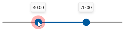
The thumb overlay is automatically rendered at 0.3 opacity. This opacity is fixed and cannot be changed.
Events
ThumbDragStarted
The ThumbDragStarted event is raised when a thumb drag starts.
<slider:SfRangeSlider RangeStart="30"
                      RangeEnd="70"
                      ThumbDragStarted="SfRangeSlider_ThumbDragStarted" />
private void SfRangeSlider_ThumbDragStarted(object sender, DragStartedEventArgs e)
{
// Perform action here.
}ThumbDragCompleted
The ThumbDragCompleted event is raised when a thumb drag is completed.
<slider:SfRangeSlider RangeStart="30"
                      RangeEnd="70"
                      ThumbDragCompleted="SfRangeSlider_ThumbDragCompleted" />
private void SfRangeSlider_ThumbDragCompleted(object sender, DragCompletedEventArgs e)
{
// Perform action here.
}