About Syncfusion® WinUI RangeSlider Control
18 Nov 20181 minute to read
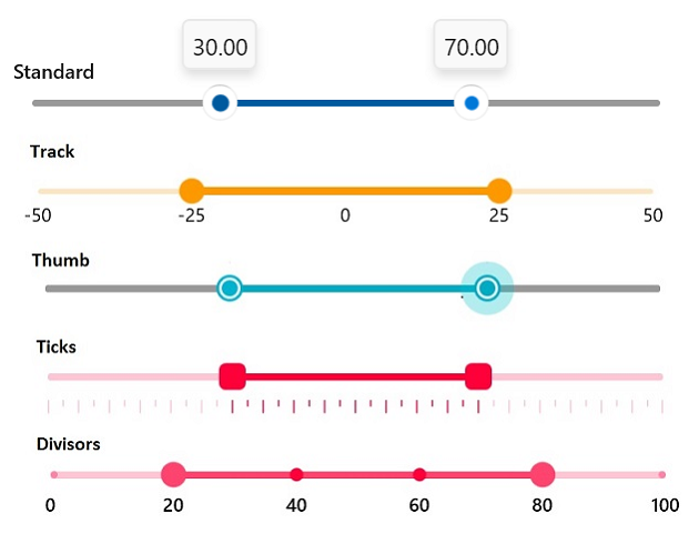
The Syncfusion WinUI RangeSlider is a highly interactive UI control that allows users to select a smaller range from a larger data set. The range can be selected by moving the thumbs along the track. It provides rich features such as labels, ticks, dividers, thumb styles, and tooltips.
Key Features
- Numeric value support: Allows users to select a numeric value range of their choice.
- Labels: Supports adding labels for numeric values with the option to customize their format and style based on your requirements.
- Ticks and dividers: Provides the option to show ticks and dividers based on the slider interval. Also, minor ticks can be enabled to indicate the values between each interval. Refer to ticks for more details. These options help present the selected values more intuitively.
- Thumb icon: Provides various built-in thumb icons and options to customize the thumb style.
- Tooltip: Supports adding a tooltip to show the selected values clearly. You can customize the format of the text shown in the tooltip and place the tooltip above or below the track. Also, you can show the tooltip on both thumbs or only on the active thumb.
- Highly customizable: Fine-tune every aspect of the control’s appearance and behavior.
You can find samples in the GitHub repository.