Axis in WinUI Radial Gauge
13 Jul 202624 minutes to read
The Radial axis is a circular arc in which a set of values are displayed along a linear or custom scale based on the design requirements. Axis elements such as labels, ticks, and axis line can be easily customized with built-in properties.
Axis customization
Setting axis minimum and maximum value
The Minimum and Maximum properties of an axis can be used to customize the axis value range. The default value of Minimum is 0 and the default value of Maximum is 100.
<gauge:SfRadialGauge>
    <gauge:SfRadialGauge.Axes>
        <gauge:RadialAxis Minimum="-60"
                          Maximum="60" />
    </gauge:SfRadialGauge.Axes>
</gauge:SfRadialGauge>
SfRadialGauge sfRadialGauge = new SfRadialGauge();
RadialAxis radialAxis = new RadialAxis();
radialAxis.Minimum = -60;
radialAxis.Maximum = 60;
sfRadialGauge.Axes.Add(radialAxis);
this.Content = sfRadialGauge;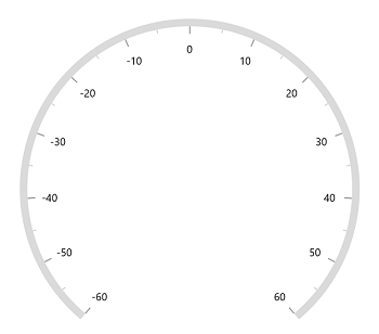
Interval
The interval between labels can be customized using the Interval property of axis.
<gauge:SfRadialGauge>
    <gauge:SfRadialGauge.Axes>
        <gauge:RadialAxis Interval="20" />
    </gauge:SfRadialGauge.Axes>
</gauge:SfRadialGauge>
SfRadialGauge sfRadialGauge = new SfRadialGauge();
RadialAxis radialAxis = new RadialAxis();
radialAxis.Interval = 20;
sfRadialGauge.Axes.Add(radialAxis);
this.Content = sfRadialGauge;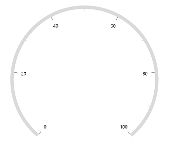
Angle customization
The start and end angles of the radial axis can be customized using the StartAngle and EndAngle properties.
<gauge:SfRadialGauge>
    <gauge:SfRadialGauge.Axes>
        <gauge:RadialAxis StartAngle="180"
                          EndAngle="90" />
    </gauge:SfRadialGauge.Axes>
</gauge:SfRadialGauge>
SfRadialGauge sfRadialGauge = new SfRadialGauge();
RadialAxis radialAxis = new RadialAxis();
radialAxis.StartAngle = 180;
radialAxis.EndAngle = 90;
sfRadialGauge.Axes.Add(radialAxis);
this.Content = sfRadialGauge;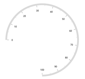
Radius customization
The radius of the radial axis can be customized using the RadiusFactor property. The default value of the RadiusFactor is 0.9. The value of RadiusFactor ranges from 0 to 1. For example, when the RadiusFactor value is 1, the full radius will be considered for rendering the axis, and when the RadiusFactor value is 0.5, then half of the radius value will be considered for rendering the circle.
<gauge:SfRadialGauge>
    <gauge:SfRadialGauge.Axes>
        <gauge:RadialAxis />
        <gauge:RadialAxis RadiusFactor="0.5" />
    </gauge:SfRadialGauge.Axes>
</gauge:SfRadialGauge>
SfRadialGauge sfRadialGauge = new SfRadialGauge();
RadialAxis radialAxis1 = new RadialAxis();
sfRadialGauge.Axes.Add(radialAxis1);
RadialAxis radialAxis2 = new RadialAxis();
radialAxis2.RadiusFactor = 0.5;
sfRadialGauge.Axes.Add(radialAxis2);
this.Content = sfRadialGauge;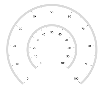
Positioning axis based on its angle
The CanScaleToFit property of the radial gauge allows you to position the axis and its features based on the provided StartAngle and EndAngle. By default, the CanScaleToFit is true.
<gauge:SfRadialGauge CanScaleToFit="True">
    <gauge:SfRadialGauge.Axes>
        <gauge:RadialAxis StartAngle="180"
                          EndAngle="0"
                          Interval="10" />
    </gauge:SfRadialGauge.Axes>
</gauge:SfRadialGauge>
SfRadialGauge sfRadialGauge = new SfRadialGauge();
sfRadialGauge.CanScaleToFit = true;
RadialAxis radialAxis = new RadialAxis();
radialAxis.StartAngle = 180;
radialAxis.EndAngle = 0;
radialAxis.Interval = 10;
sfRadialGauge.Axes.Add(radialAxis);
this.Content = sfRadialGauge;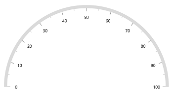
Axis label rotation
The axis label can be rotated based on its current angle using the CanRotateLabels property of axis. The default value of CanRotateLabels is false.
<gauge:SfRadialGauge>
    <gauge:SfRadialGauge.Axes>
        <gauge:RadialAxis CanRotateLabels="True" />
    </gauge:SfRadialGauge.Axes>
</gauge:SfRadialGauge>
SfRadialGauge sfRadialGauge = new SfRadialGauge();
RadialAxis radialAxis = new RadialAxis();
radialAxis.CanRotateLabels = true;
sfRadialGauge.Axes.Add(radialAxis);
this.Content = sfRadialGauge;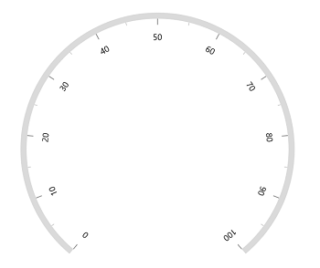
Edge label customization
The visibility of the first and last labels of an axis can be customized using the ShowFirstLabel and ShowLastLabel properties.
-
ShowFirstLabel– Enables or disables the first label of the axis. -
ShowLastLabel– Enables or disables the last label of the axis.
The default value of both the ShowFirstLabel and the ShowLastLabel properties is true.
<gauge:SfRadialGauge>
    <gauge:SfRadialGauge.Axes>
        <gauge:RadialAxis Minimum="0"
                          Maximum="12"
                          Interval="1"
                          StartAngle="270"
                          EndAngle="270"
                          ShowFirstLabel="False" />
    </gauge:SfRadialGauge.Axes>
</gauge:SfRadialGauge>
SfRadialGauge sfRadialGauge = new SfRadialGauge();
RadialAxis radialAxis = new RadialAxis();
radialAxis.Minimum = 0;
radialAxis.Maximum = 12;
radialAxis.Interval = 1;
radialAxis.StartAngle = 270;
radialAxis.EndAngle = 270;
radialAxis.ShowFirstLabel = false;
sfRadialGauge.Axes.Add(radialAxis);
this.Content = sfRadialGauge;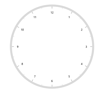
Axis direction customization
The direction of the Radial axis can be customized using the IsInversed property.
When the IsInversed property is true, the axis can be placed in a counter-clockwise direction. When the IsInversed property is set to false, the axis will be positioned in a clockwise direction.
<gauge:SfRadialGauge>
    <gauge:SfRadialGauge.Axes>
        <gauge:RadialAxis IsInversed="True" />
    </gauge:SfRadialGauge.Axes>
</gauge:SfRadialGauge>
SfRadialGauge sfRadialGauge = new SfRadialGauge();
RadialAxis radialAxis = new RadialAxis();
radialAxis.IsInversed = true;
sfRadialGauge.Axes.Add(radialAxis);
this.Content = sfRadialGauge;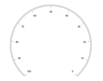
Maximum number of labels per 100 logical pixels
By default, a maximum of three labels are displayed for each 100 logical pixels in an axis. The maximum number of labels that should be present within 100 logical pixels length can be customized using the MaximumLabelsCount property of the axis. This property is applicable only for automatic range calculation and will not work if you set a value for the interval property of an axis.
<gauge:SfRadialGauge>
    <gauge:SfRadialGauge.Axes>
        <gauge:RadialAxis MaximumLabelsCount="5" />
    </gauge:SfRadialGauge.Axes>
</gauge:SfRadialGauge>
SfRadialGauge sfRadialGauge = new SfRadialGauge();
RadialAxis radialAxis = new RadialAxis();
radialAxis.MaximumLabelsCount = 5;
sfRadialGauge.Axes.Add(radialAxis);
this.Content = sfRadialGauge;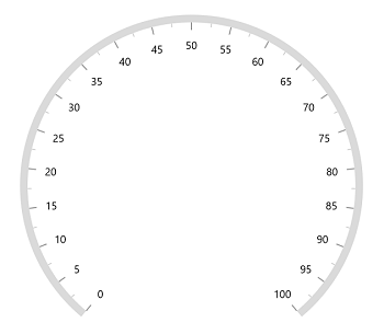
Axis line customization
The radial axis line can be customized using the following properties.
-
AxisLineWidth– Customizes the thickness of the axis line. -
AxisLineWidthUnit– Allows you to specify the thickness of the axis line either in pixel or factor. Its default value isPixel. -
AxisLineFill– Customizes the color of the axis line. -
GradientStops- Allows you to apply the gradient brush for the axis line.
Axis line width in pixel
If the AxisLineWidthUnit is set as a pixel, the axis line will be rendered based on the pixel value given in AxisLineWidth.
<gauge:SfRadialGauge>
    <gauge:SfRadialGauge.Axes>
        <gauge:RadialAxis AxisLineWidth="30"
                          AxisLineWidthUnit="Pixel" />
    </gauge:SfRadialGauge.Axes>
</gauge:SfRadialGauge>
SfRadialGauge sfRadialGauge = new SfRadialGauge();
RadialAxis radialAxis = new RadialAxis();
radialAxis.AxisLineWidth = 30;
radialAxis.AxisLineWidthUnit = SizeUnit.Pixel;
sfRadialGauge.Axes.Add(radialAxis);
this.Content = sfRadialGauge;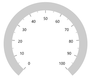
Axis line width in factor
If the AxisLineWidthUnit is set as a factor, the given factor value in the AxisLineWidth is multiplied by the axis radius. The value of the factor ranges from 0 to 1.
<gauge:SfRadialGauge>
    <gauge:SfRadialGauge.Axes>
        <gauge:RadialAxis AxisLineWidth="0.1"
                          AxisLineWidthUnit="Factor" />
    </gauge:SfRadialGauge.Axes>
</gauge:SfRadialGauge>
SfRadialGauge sfRadialGauge = new SfRadialGauge();
RadialAxis radialAxis = new RadialAxis();
radialAxis.AxisLineWidth = 0.1;
radialAxis.AxisLineWidthUnit = SizeUnit.Factor;
sfRadialGauge.Axes.Add(radialAxis);
this.Content = sfRadialGauge;
Setting axis line fill brush
To apply the brush to the axis line, use the AxisLineFill property of the radial axis.
<gauge:SfRadialGauge>
    <gauge:SfRadialGauge.Axes>
        <gauge:RadialAxis AxisLineWidth="0.1"
                          AxisLineWidthUnit="Factor"
                          AxisLineFill="BlueViolet" />
    </gauge:SfRadialGauge.Axes>
</gauge:SfRadialGauge>
SfRadialGauge sfRadialGauge = new SfRadialGauge();
RadialAxis radialAxis = new RadialAxis();
radialAxis.AxisLineWidth = 0.1;
radialAxis.AxisLineWidthUnit = SizeUnit.Factor;
radialAxis.AxisLineFill = new SolidColorBrush(Colors.BlueViolet);
sfRadialGauge.Axes.Add(radialAxis);
this.Content = sfRadialGauge;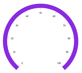
Setting gradient brush to axis line
The GradientStops property of the radial axis allows you to specify the gradient brush to the axis line by specifying different colors based on the provided axis value.
<gauge:SfRadialGauge>
    <gauge:SfRadialGauge.Axes>
        <gauge:RadialAxis AxisLineWidth="0.1"
                          AxisLineWidthUnit="Factor">
            <gauge:RadialAxis.GradientStops>
                <gauge:GaugeGradientStop Value="25"
                                         Color="#FFFF7676" />
                <gauge:GaugeGradientStop Value="75"
                                         Color="#FFF54EA2" />
            </gauge:RadialAxis.GradientStops>
        </gauge:RadialAxis>
    </gauge:SfRadialGauge.Axes>
</gauge:SfRadialGauge>
SfRadialGauge sfRadialGauge = new SfRadialGauge();
RadialAxis radialAxis = new RadialAxis();
radialAxis.AxisLineWidth = 0.1;
radialAxis.AxisLineWidthUnit = SizeUnit.Factor;
GaugeGradientStop gaugeGradientStop1 = new GaugeGradientStop();
gaugeGradientStop1.Value = 25;
gaugeGradientStop1.Color = Color.FromArgb(255, 255, 118, 118);
radialAxis.GradientStops.Add(gaugeGradientStop1);
GaugeGradientStop gaugeGradientStop2 = new GaugeGradientStop();
gaugeGradientStop2.Value = 75;
gaugeGradientStop2.Color = Color.FromArgb(255, 245, 78, 162);
radialAxis.GradientStops.Add(gaugeGradientStop2);
sfRadialGauge.Axes.Add(radialAxis);
this.Content = sfRadialGauge;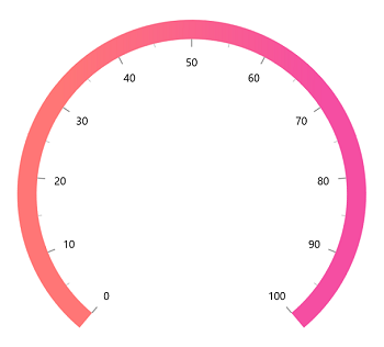
Axis line visibility
The visibility of the axis line can be customized using the ShowAxisLine property of the axis. By default, this property is set to true.
<gauge:SfRadialGauge>
    <gauge:SfRadialGauge.Axes>
        <gauge:RadialAxis ShowAxisLine="False" />
    </gauge:SfRadialGauge.Axes>
</gauge:SfRadialGauge>
SfRadialGauge sfRadialGauge = new SfRadialGauge();
RadialAxis radialAxis = new RadialAxis();
radialAxis.ShowAxisLine = false;
sfRadialGauge.Axes.Add(radialAxis);
this.Content = sfRadialGauge;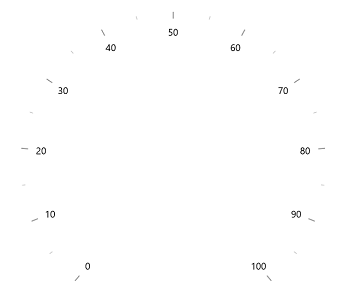
Background Content Support
The Radial axis allows you to add any visual content as its background using the BackgroundContent property.
<Page.Resources>
    <Style x:Key="MajorTickStyle"
           TargetType="Line">
        <Setter Property="Stroke"
                Value="#FF949494" />
        <Setter Property="StrokeThickness"
                Value="2.3" />
    </Style>
    <Style x:Key="MinorTickStyle"
           TargetType="Line">
        <Setter Property="Stroke"
                Value="#FF616161" />
        <Setter Property="StrokeThickness"
                Value="1.6" />
    </Style>
</Page.Resources>

<gauge:SfRadialGauge>
    <gauge:SfRadialGauge.Axes>
        <gauge:RadialAxis ShowAxisLine="False"
                          RadiusFactor="1"
                          CanRotateLabels="True"
                          TickOffset="0.32"
                          OffsetUnit="Factor"
                          LabelPrepared="RadialAxis_LabelPrepared"
                          StartAngle="270"
                          EndAngle="270"
                          LabelOffset="0.45"
                          Maximum="360"
                          Minimum="0"
                          Interval="30"
                          MinorTicksPerInterval="4"
                          Foreground="White"
                          FontSize="11"
                          MajorTickLength="0.087"
                          MinorTickLength="0.058"
                          TickLengthUnit="Factor"
                          MajorTickStyle="{StaticResource MajorTickStyle}"
                          MinorTickStyle="{StaticResource MinorTickStyle}">

            <gauge:RadialAxis.BackgroundContent>
                <Image Source="AxisBackground.png" />
            </gauge:RadialAxis.BackgroundContent>

            <gauge:RadialAxis.Pointers>
                <gauge:ShapePointer Value="90"
                                     Background="#FFDF5F2D"
                                     EnableAnimation="True"
                                     AnimationDuration="1200"
                                     MarkerOffset="0.71"
                                     OffsetUnit="Factor"
                                     ShapeType="Triangle"
                                     ShapeHeight="10"
                                     ShapeWidth="15" />
            </gauge:RadialAxis.Pointers>

            <gauge:RadialAxis.Annotations>
                <gauge:GaugeAnnotation DirectionValue="270">
                    <gauge:GaugeAnnotation.Content>
                        <TextBlock Text="90"
                                   Foreground="#FFDF5F2D"
                                   FontWeight="SemiBold"
                                   FontSize="22" />
                    </gauge:GaugeAnnotation.Content>
                </gauge:GaugeAnnotation>
            </gauge:RadialAxis.Annotations>
        </gauge:RadialAxis>
    </gauge:SfRadialGauge.Axes>
</gauge:SfRadialGauge>
SfRadialGauge sfRadialGauge = new SfRadialGauge();
RadialAxis radialAxis = new RadialAxis();
radialAxis.ShowAxisLine = false;
radialAxis.RadiusFactor = 1;
radialAxis.CanRotateLabels = true;
radialAxis.TickOffset = 0.32;
radialAxis.OffsetUnit = SizeUnit.Factor;
radialAxis.LabelPrepared += this.RadialAxis_LabelPrepared;
radialAxis.StartAngle = 270;
radialAxis.EndAngle = 270;
radialAxis.LabelOffset = 0.45;
radialAxis.Maximum = 360;
radialAxis.Minimum = 0;
radialAxis.Interval = 30;
radialAxis.MinorTicksPerInterval = 4;
radialAxis.Foreground = new SolidColorBrush(Colors.White);
radialAxis.FontSize = 11;
radialAxis.MajorTickLength = 0.087;
radialAxis.MinorTickLength = 0.058;
radialAxis.TickLengthUnit = SizeUnit.Factor;
radialAxis.MajorTickStyle = this.Resources["MajorTickStyle"] as Style;
radialAxis.MinorTickStyle = this.Resources["MinorTickStyle"] as Style;
BitmapImage bm = new BitmapImage();
bm.UriSource = new Uri("ms-appx:/AxisBackground.png", UriKind.Absolute);
Image image = new Image { Source = bm };
radialAxis.BackgroundContent = image;
sfRadialGauge.Axes.Add(radialAxis);
ShapePointer shapePointer = new ShapePointer();
shapePointer.Value = 90;
shapePointer.Background = new SolidColorBrush(Color.FromArgb(255, 223, 95, 45));
shapePointer.EnableAnimation = true;
shapePointer.AnimationDuration = 1200;
shapePointer.MarkerOffset = 0.71;
shapePointer.OffsetUnit = SizeUnit.Factor;
shapePointer.ShapeType = Syncfusion.UI.Xaml.Gauges.GaugeShapeType.Triangle;
shapePointer.ShapeHeight = 10;
shapePointer.ShapeWidth = 15;
radialAxis.Pointers.Add(shapePointer);
GaugeAnnotation gaugeAnnotation = new GaugeAnnotation();
gaugeAnnotation.DirectionValue = 270;
TextBlock textBlock = new TextBlock();
textBlock.Text = "90";
textBlock.Foreground = new SolidColorBrush(Color.FromArgb(255, 223, 95, 45));
textBlock.FontWeight = FontWeights.SemiBold;
textBlock.FontSize = 22;
gaugeAnnotation.Content = textBlock;
radialAxis.Annotations.Add(gaugeAnnotation);
this.Content = sfRadialGauge;
// Label prepared event.
private void RadialAxis_LabelPrepared(object sender, LabelPreparedEventArgs e)
{
if (e.LabelText == "90")
{
e.LabelText = "E";
}
else if (e.LabelText == "360")
{
e.LabelText = string.Empty;
}
else
{
if (e.LabelText == "0")
{
e.LabelText = "N";
}
else if (e.LabelText == "180")
{
e.LabelText = "S";
}
else if (e.LabelText == "270")
{
e.LabelText = "W";
}
}
}
Axis label customization
The axis labels can be customized using the following properties:
-
Foreground– Allows you to customize the color of the labels. -
FontFamily– Allows you to specify the font family for labels. -
FontStyle– Allows you to specify the font style for labels. -
FontWeight– Allows you to specify the font weight for labels. -
FontSize– Allows you to specify the font size for labels.
<gauge:SfRadialGauge>
    <gauge:SfRadialGauge.Axes>
        <gauge:RadialAxis FontSize="15"
                          Foreground="Red"
                          FontFamily="Comic Sans MS"
                          FontWeight="Bold"
                          FontStyle="Italic" />
    </gauge:SfRadialGauge.Axes>
</gauge:SfRadialGauge>
SfRadialGauge sfRadialGauge = new SfRadialGauge();
RadialAxis radialAxis = new RadialAxis();
radialAxis.FontSize = 15;
radialAxis.Foreground = new SolidColorBrush(Colors.Red);
radialAxis.FontFamily = new FontFamily("Comic Sans MS");
radialAxis.FontWeight = FontWeights.SemiBold;
radialAxis.FontStyle = Windows.UI.Text.FontStyle.Italic;
sfRadialGauge.Axes.Add(radialAxis);
this.Content = sfRadialGauge;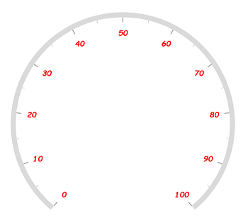
Formatting axis label
The following property of the axis allows you to customize the axis label text.
-
LabelFormat- Allows you to customize the axis label with the globalized label format.
<gauge:SfRadialGauge>
    <gauge:SfRadialGauge.Axes>
        <gauge:RadialAxis LabelFormat="c" />
    </gauge:SfRadialGauge.Axes>
</gauge:SfRadialGauge>
SfRadialGauge sfRadialGauge = new SfRadialGauge();
RadialAxis radialAxis = new RadialAxis();
radialAxis.LabelFormat = "c";
sfRadialGauge.Axes.Add(radialAxis);
this.Content = sfRadialGauge;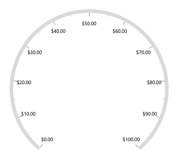
Template support for axis label
The LabelTemplate property allows you to define the data template for the axis labels, as shown in the following code example.
<Page.Resources>
    <DataTemplate x:Key="labelTemplate">
        <Border Background="Gray"
                CornerRadius="5">
            <TextBlock Text="{Binding Text}"
                       Foreground="White"
                       FontStyle="Normal"
                       FontWeight="Bold"
                       Margin="3" />
        </Border>
    </DataTemplate>
</Page.Resources>

<gauge:SfRadialGauge>
    <gauge:SfRadialGauge.Axes>
        <gauge:RadialAxis LabelTemplate="{StaticResource labelTemplate}" />
    </gauge:SfRadialGauge.Axes>
</gauge:SfRadialGauge>
SfRadialGauge sfRadialGauge = new SfRadialGauge();
RadialAxis radialAxis = new RadialAxis();
radialAxis.LabelTemplate = this.Resources["labelTemplate"] as DataTemplate;
sfRadialGauge.Axes.Add(radialAxis);
this.Content = sfRadialGauge;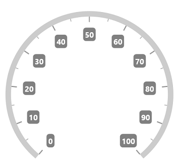
Label visibility
The ShowLabels property of the axis allows you to enable or disable the visibility of labels. The default value of the property is true.
<gauge:SfRadialGauge>
    <gauge:SfRadialGauge.Axes>
        <gauge:RadialAxis ShowLabels="False" />
    </gauge:SfRadialGauge.Axes>
</gauge:SfRadialGauge>
SfRadialGauge sfRadialGauge = new SfRadialGauge();
RadialAxis radialAxis = new RadialAxis();
radialAxis.ShowLabels = false;
sfRadialGauge.Axes.Add(radialAxis);
this.Content = sfRadialGauge;
Label placement
The radial axis allows you to position the labels either inside or outside of the axis line using the LabelPosition property. By default, labels are positioned inside the axis line.
<gauge:SfRadialGauge>
    <gauge:SfRadialGauge.Axes>
        <gauge:RadialAxis LabelPosition="Outside" />
    </gauge:SfRadialGauge.Axes>
</gauge:SfRadialGauge>
SfRadialGauge sfRadialGauge = new SfRadialGauge();
RadialAxis radialAxis = new RadialAxis();
radialAxis.LabelPosition = GaugeLabelsPosition.Outside;
sfRadialGauge.Axes.Add(radialAxis);
this.Content = sfRadialGauge;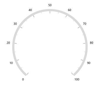
Label position customization
The LabelOffset property allows you to adjust the distance between the axis line and the labels. The OffsetUnit property of the axis allows you to specify the label offset either in factor or pixels. By default, the value of the label offset is double.NaN.
Label offset in pixel
If the OffsetUnit is set as a pixel, the axis labels will be moved based on the pixel value given in LabelOffset.
<gauge:SfRadialGauge>
    <gauge:SfRadialGauge.Axes>
        <gauge:RadialAxis LabelOffset="70"
                          OffsetUnit="Pixel" />
    </gauge:SfRadialGauge.Axes>
</gauge:SfRadialGauge>
SfRadialGauge sfRadialGauge = new SfRadialGauge();
RadialAxis radialAxis = new RadialAxis();
radialAxis.OffsetUnit = SizeUnit.Pixel;
radialAxis.LabelOffset = 70;
sfRadialGauge.Axes.Add(radialAxis);
this.Content = sfRadialGauge;
Label offset in factor
If the OffsetUnit is set as a factor, then the provided factor value in the LabelOffset is multiplied by the axis radius. The factor value ranges from 0 to 1.
<gauge:SfRadialGauge>
    <gauge:SfRadialGauge.Axes>
        <gauge:RadialAxis LabelOffset="0.3"
                          OffsetUnit="Factor" />
    </gauge:SfRadialGauge.Axes>
</gauge:SfRadialGauge>
SfRadialGauge sfRadialGauge = new SfRadialGauge();
RadialAxis radialAxis = new RadialAxis();
radialAxis.OffsetUnit = SizeUnit.Factor;
radialAxis.LabelOffset = 0.3;
sfRadialGauge.Axes.Add(radialAxis);
this.Content = sfRadialGauge;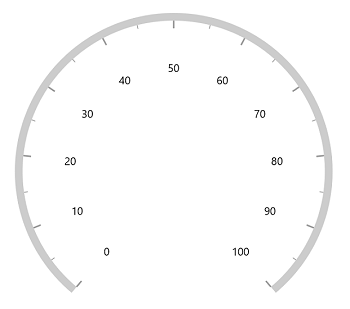
NOTE
The
OffsetUnitproperty of the axis is common for both theTickOffsetandLabelOffset.
Tick customization
The major and minor tick lines of an axis can be customized using the following properties.
-
MajorTickLength– Specifies the major length of ticks. -
MinorTickLength– Specifies the minor length of ticks. -
TickLengthUnit– Allows you to specify the tick length either in pixels or factor. This property is common for both major and minor ticks. -
MajorTickStyle– Allows you to specify the style for the major tick line. -
MinorTickStyle– Allows you to specify the style for the minor tick line.
Tick length in pixel
If the TickLengthUnit is set as a pixel, the major and minor tick lines will be rendered based on the pixel values given in MajorTickLength and MinorTickLength.
<gauge:SfRadialGauge>
    <gauge:SfRadialGauge.Axes>
        <gauge:RadialAxis MajorTickLength="15"
                          MinorTickLength="10"
                          TickLengthUnit="Pixel" />
    </gauge:SfRadialGauge.Axes>
</gauge:SfRadialGauge>
SfRadialGauge sfRadialGauge = new SfRadialGauge();
RadialAxis radialAxis = new RadialAxis();
radialAxis.MajorTickLength = 15;
radialAxis.MinorTickLength = 10;
radialAxis.TickLengthUnit = SizeUnit.Pixel;
sfRadialGauge.Axes.Add(radialAxis);
this.Content = sfRadialGauge;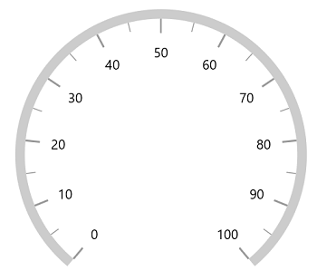
Tick length in factor
If the TickLengthUnit is set as a factor, the provided factor value in the MajorTickLength and MinorTickLength is multiplied by the axis radius, respectively. The factor value ranges from 0 to 1.
<gauge:SfRadialGauge>
    <gauge:SfRadialGauge.Axes>
        <gauge:RadialAxis MajorTickLength="0.1"
                          MinorTickLength="0.05"
                          TickLengthUnit="Factor" />
    </gauge:SfRadialGauge.Axes>
</gauge:SfRadialGauge>
SfRadialGauge sfRadialGauge = new SfRadialGauge();
RadialAxis radialAxis = new RadialAxis();
radialAxis.MajorTickLength = 0.1;
radialAxis.MinorTickLength = 0.05;
radialAxis.TickLengthUnit = SizeUnit.Factor;
sfRadialGauge.Axes.Add(radialAxis);
this.Content = sfRadialGauge;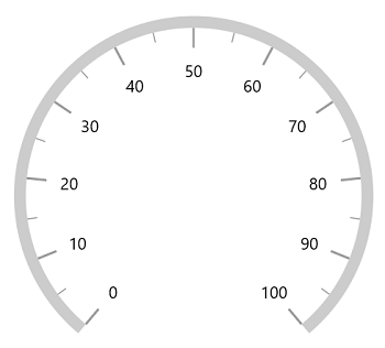
Setting style for major ticks
The MajorTickStyle property allows you to define the style for the major ticks, as shown in the following code example.
<Page.Resources>
    <Style x:Key="MajorTickLineStyle"
           TargetType="Line">
        <Setter Property="Stroke"
                Value="Black"></Setter>
        <Setter Property="StrokeThickness"
                Value="1.5"></Setter>
    </Style>
</Page.Resources>

<gauge:SfRadialGauge>
    <gauge:SfRadialGauge.Axes>
        <gauge:RadialAxis MajorTickStyle="{StaticResource MajorTickLineStyle}" />
    </gauge:SfRadialGauge.Axes>
</gauge:SfRadialGauge>
SfRadialGauge sfRadialGauge = new SfRadialGauge();
RadialAxis radialAxis = new RadialAxis();
radialAxis.MajorTickStyle = this.Resources["MajorTickLineStyle"] as Style;
sfRadialGauge.Axes.Add(radialAxis);
this.Content = sfRadialGauge;
Setting style for minor ticks
The MinorTickStyle property allows you to define the style for the minor ticks, as shown in the following code example.
<Page.Resources>
    <Style x:Key="MinorTickLineStyle"
           TargetType="Line">
        <Setter Property="Stroke"
                Value="Black"></Setter>
        <Setter Property="StrokeThickness"
                Value="1.5"></Setter>
    </Style>
</Page.Resources>

<gauge:SfRadialGauge>
    <gauge:SfRadialGauge.Axes>
        <gauge:RadialAxis MinorTickStyle="{StaticResource MinorTickLineStyle}" />
    </gauge:SfRadialGauge.Axes>
</gauge:SfRadialGauge>
SfRadialGauge sfRadialGauge = new SfRadialGauge();
RadialAxis radialAxis = new RadialAxis();
radialAxis.MinorTickStyle = this.Resources["MinorTickLineStyle"] as Style;
sfRadialGauge.Axes.Add(radialAxis);
this.Content = sfRadialGauge;
Setting dashed tick lines
By defining the StrokeDashArray property in both MajorTickStyle and MinorTickStyle, you can draw the dashed tick lines.
<Page.Resources>
    <Style x:Key="MajorTickLineStyle"
           TargetType="Line">
        <Setter Property="Stroke"
                Value="Black"></Setter>
        <Setter Property="StrokeDashArray"
                Value="5,2.5"></Setter>
    </Style>

    <Style x:Key="MinorTickLineStyle"
           TargetType="Line">
        <Setter Property="Stroke"
                Value="Black"></Setter>
        <Setter Property="StrokeDashArray"
                Value="3,2.5"></Setter>
    </Style>
</Page.Resources>

<gauge:SfRadialGauge>
    <gauge:SfRadialGauge.Axes>
        <gauge:RadialAxis MajorTickLength="15"
                          MinorTickLength="10"
                          MajorTickStyle="{StaticResource MajorTickLineStyle}"
                          MinorTickStyle="{StaticResource MinorTickLineStyle}" />
    </gauge:SfRadialGauge.Axes>
</gauge:SfRadialGauge>
SfRadialGauge sfRadialGauge = new SfRadialGauge();
RadialAxis radialAxis = new RadialAxis();
radialAxis.MajorTickLength = 15;
radialAxis.MinorTickLength = 10;
radialAxis.MajorTickStyle = this.Resources["MajorTickLineStyle"] as Style;
radialAxis.MinorTickStyle = this.Resources["MinorTickLineStyle"] as Style;
sfRadialGauge.Axes.Add(radialAxis);
this.Content = sfRadialGauge;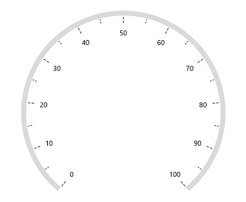
Setting minor ticks count
The major ticks are generated based on the Interval property. Like major ticks, the minor ticks are generated using the MinorTicksPerInterval property of the axis. By default, the count value of this property is 1.
<gauge:SfRadialGauge>
    <gauge:SfRadialGauge.Axes>
        <gauge:RadialAxis MinorTicksPerInterval="4" />
    </gauge:SfRadialGauge.Axes>
</gauge:SfRadialGauge>
SfRadialGauge sfRadialGauge = new SfRadialGauge();
RadialAxis radialAxis = new RadialAxis();
radialAxis.MinorTicksPerInterval = 4;
sfRadialGauge.Axes.Add(radialAxis);
this.Content = sfRadialGauge;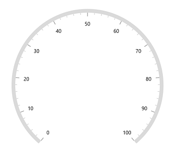
Tick line visibility
The ShowTicks property of the axis is used to enable or disable the visibility of both the major and the minor ticks of the axis. The default value of this property is true.
<gauge:SfRadialGauge>
    <gauge:SfRadialGauge.Axes>
        <gauge:RadialAxis ShowTicks="False" />
    </gauge:SfRadialGauge.Axes>
</gauge:SfRadialGauge>
SfRadialGauge sfRadialGauge = new SfRadialGauge();
RadialAxis radialAxis = new RadialAxis();
radialAxis.ShowTicks = false;
sfRadialGauge.Axes.Add(radialAxis);
this.Content = sfRadialGauge;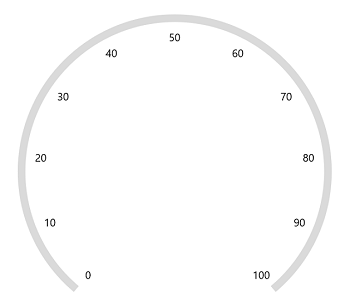
Tick placement
The Radial axis allows you to position the ticks either inside, outside, or at the center of the axis line using the TickPosition property. By default, ticks are positioned inside the axis line.
<gauge:SfRadialGauge>
    <gauge:SfRadialGauge.Axes>
        <gauge:RadialAxis TickPosition="Outside" />
    </gauge:SfRadialGauge.Axes>
</gauge:SfRadialGauge>
SfRadialGauge sfRadialGauge = new SfRadialGauge();
RadialAxis radialAxis = new RadialAxis();
radialAxis.TickPosition = GaugeElementPosition.Outside;
sfRadialGauge.Axes.Add(radialAxis);
this.Content = sfRadialGauge;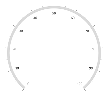
Tick position customization
The ticks can be moved near or far to the axis line using the TickOffset property. The OffsetUnit property of the axis allows you to specify the TickOffset either in factor or pixels, and the default value of OffsetUnit is Pixel and the default value of TickOffset is double.NaN.
Tick offset in pixel
If the OffsetUnit is set as a pixel, the axis ticks will be moved based on the pixel value given in TickOffset.
<gauge:SfRadialGauge>
    <gauge:SfRadialGauge.Axes>
        <gauge:RadialAxis TickOffset="50" />
    </gauge:SfRadialGauge.Axes>
</gauge:SfRadialGauge>
SfRadialGauge sfRadialGauge = new SfRadialGauge();
RadialAxis radialAxis = new RadialAxis();
radialAxis.TickOffset = 50;
sfRadialGauge.Axes.Add(radialAxis);
this.Content = sfRadialGauge;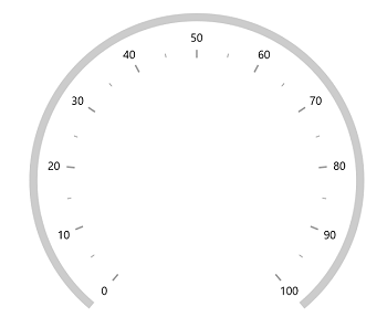
Tick offset in factor
If the OffsetUnit is set as a factor, the provided factor value in the TickOffset is multiplied by the axis radius. The factor value ranges from 0 to 1.
<gauge:SfRadialGauge>
    <gauge:SfRadialGauge.Axes>
        <gauge:RadialAxis TickOffset="0.5"
                          OffsetUnit="Factor" />
    </gauge:SfRadialGauge.Axes>
</gauge:SfRadialGauge>
SfRadialGauge sfRadialGauge = new SfRadialGauge();
RadialAxis radialAxis = new RadialAxis();
radialAxis.TickOffset = 0.5;
radialAxis.OffsetUnit = SizeUnit.Factor;
sfRadialGauge.Axes.Add(radialAxis);
this.Content = sfRadialGauge;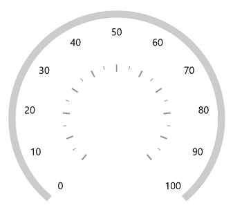
NOTE
The
OffsetUnitproperty of axis is common for both theTickOffsetandLabelOffset.
Multiple axis
The radial gauge allows you to add n number of radial axis in its axes collection. You can also customize individual axis added in the Axes collection.
<Page.Resources>
    <Style x:Key="InnerAxisMajorTickStyle"
           TargetType="Line">
        <Setter Property="Stroke"
                Value="Black"></Setter>
        <Setter Property="StrokeThickness"
                Value="1.5"></Setter>
    </Style>

    <Style x:Key="InnerAxisMinorTickStyle"
           TargetType="Line">
        <Setter Property="Stroke"
                Value="Black"></Setter>
        <Setter Property="StrokeThickness"
                Value="1.5"></Setter>
    </Style>

    <Style x:Key="OuterAxisMajorTickStyle"
           TargetType="Line">
        <Setter Property="Stroke"
                Value="#8f1502"></Setter>
        <Setter Property="StrokeThickness"
                Value="1.5"></Setter>
    </Style>

    <Style x:Key="OuterAxisMinorTickStyle"
           TargetType="Line">
        <Setter Property="Stroke"
                Value="#8f1502"></Setter>
        <Setter Property="StrokeThickness"
                Value="1.5"></Setter>
    </Style>
</Page.Resources>

<gauge:SfRadialGauge>
    <gauge:SfRadialGauge.Axes>
        <gauge:RadialAxis Maximum="60"
                            Interval="10"
                            MinorTicksPerInterval="5"
                            RadiusFactor="0.63"
                            TickLengthUnit="Factor"
                            MinorTickLength="0.05"
                            MajorTickLength="0.10"
                            AxisLineWidth="3"
                            AxisLineFill="Black"
                            Foreground="Black"
                            MinorTickStyle="{StaticResource InnerAxisMinorTickStyle}"
                            MajorTickStyle="{StaticResource InnerAxisMajorTickStyle}">
        </gauge:RadialAxis>

        <gauge:RadialAxis LabelPosition="Outside"
                            TickPosition="Outside"
                            Minimum="0"
                            Maximum="100"
                            Interval="10"
                            MinorTicksPerInterval="5"
                            RadiusFactor="0.95"
                            TickLengthUnit="Factor"
                            MinorTickLength="0.07"
                            MajorTickLength="0.15"
                            AxisLineWidth="3"
                            AxisLineFill="#8f1502"
                            Foreground="#8f1502"
                            MinorTickStyle="{StaticResource OuterAxisMinorTickStyle}"
                            MajorTickStyle="{StaticResource OuterAxisMajorTickStyle}">

        </gauge:RadialAxis>
    </gauge:SfRadialGauge.Axes>
</gauge:SfRadialGauge>
SfRadialGauge sfRadialGauge = new SfRadialGauge();
RadialAxis innerRadialAxis = new RadialAxis();
innerRadialAxis.Maximum = 60;
innerRadialAxis.Interval = 10;
innerRadialAxis.MinorTicksPerInterval = 5;
innerRadialAxis.RadiusFactor = 0.63;
innerRadialAxis.TickLengthUnit = SizeUnit.Factor;
innerRadialAxis.MinorTickLength = 0.05;
innerRadialAxis.MajorTickLength = 0.10;
innerRadialAxis.AxisLineWidth = 3;
innerRadialAxis.AxisLineFill = new SolidColorBrush(Colors.Black);
innerRadialAxis.Foreground = new SolidColorBrush(Colors.Black);
innerRadialAxis.MinorTickStyle = this.Resources["InnerAxisMinorTickStyle"] as Style;
innerRadialAxis.MajorTickStyle = this.Resources["InnerAxisMajorTickStyle"] as Style;
sfRadialGauge.Axes.Add(innerRadialAxis);
RadialAxis outerRadialAxis = new RadialAxis();
outerRadialAxis.LabelPosition = GaugeLabelsPosition.Outside;
outerRadialAxis.TickPosition = GaugeElementPosition.Outside;
outerRadialAxis.Minimum = 0;
outerRadialAxis.Maximum = 100;
outerRadialAxis.Interval = 10;
outerRadialAxis.MinorTicksPerInterval = 5;
outerRadialAxis.RadiusFactor = 0.95;
outerRadialAxis.TickLengthUnit = SizeUnit.Factor;
outerRadialAxis.MinorTickLength = 0.07;
outerRadialAxis.MajorTickLength = 0.15;
outerRadialAxis.AxisLineWidth = 3;
outerRadialAxis.AxisLineFill = new SolidColorBrush(Color.FromArgb(255, 143, 21, 2));
outerRadialAxis.Foreground = new SolidColorBrush(Color.FromArgb(255, 143, 21, 2));
outerRadialAxis.MinorTickStyle = this.Resources["OuterAxisMinorTickStyle"] as Style;
outerRadialAxis.MajorTickStyle = this.Resources["OuterAxisMajorTickStyle"] as Style;
sfRadialGauge.Axes.Add(outerRadialAxis);
this.Content = sfRadialGauge;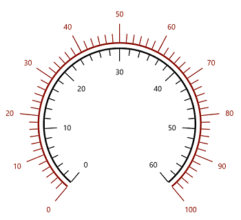
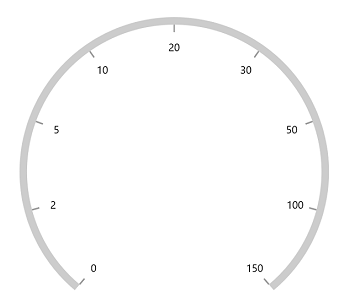
Custom scale range
The radial gauge allows you to add a custom scale range by extending the axis based on your business logic.
<gauge:SfRadialGauge>
    <gauge:SfRadialGauge.Axes>
        <local:RadialAxisExt Maximum="150" />
    </gauge:SfRadialGauge.Axes>
</gauge:SfRadialGauge>
public class RadialAxisExt : RadialAxis
{
public override List<AxisLabelData> GenerateVisibleLabels()
{
List<AxisLabelData> customLabels = new List<AxisLabelData>();
for (int i = 0; i < 9; i++)
{
double value = CalculateLabelValue(i);
AxisLabelData label = new AxisLabelData
{
Value = value,
Text = value.ToString()
};
customLabels.Add(label);
}
return customLabels;
}
public override double ValueToCoefficient(double value)
{
if (value >= 0 && value <= 2)
{
return (value * 0.125) / 2;
}
else if (value > 2 && value <= 5)
{
return (((value - 2) * 0.125) / (5 - 2)) + (1 * 0.125);
}
else if (value > 5 && value <= 10)
{
return (((value - 5) * 0.125) / (10 - 5)) + (2 * 0.125);
}
else if (value > 10 && value <= 20)
{
return (((value - 10) * 0.125) / (20 - 10)) + (3 * 0.125);
}
else if (value > 20 && value <= 30)
{
return (((value - 20) * 0.125) / (30 - 20)) + (4 * 0.125);
}
else if (value > 30 && value <= 50)
{
return (((value - 30) * 0.125) / (50 - 30)) + (5 * 0.125);
}
else if (value > 50 && value <= 100)
{
return (((value - 50) * 0.125) / (100 - 50)) + (6 * 0.125);
}
else if (value > 100 && value <= 150)
{
return (((value - 100) * 0.125) / (150 - 100)) + (7 * 0.125);
}
else
{
return 1;
}
}
double CalculateLabelValue(double value)
{
if (value == 0)
{
return 0;
}
else if (value == 1)
{
return 2;
}
else if (value == 2)
{
return 5;
}
else if (value == 3)
{
return 10;
}
else if (value == 4)
{
return 20;
}
else if (value == 5)
{
return 30;
}
else if (value == 6)
{
return 50;
}
else if (value == 7)
{
return 100;
}
else
{
return 150;
}
}
}
Events
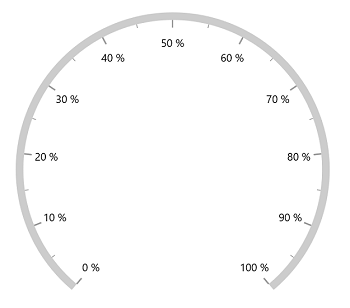
LabelPrepared
The LabelPrepared event occurs each time a label is prepared for use. The following properties can be customized for each label in this event’s args:
-
LabelText– Allows you to customize the text property of the label.
<gauge:SfRadialGauge>
    <gauge:SfRadialGauge.Axes>
        <gauge:RadialAxis LabelPrepared="RadialAxis_LabelPrepared" />
    </gauge:SfRadialGauge.Axes>
</gauge:SfRadialGauge>
private void RadialAxis_LabelPrepared(object sender, LabelPreparedEventArgs e)
{
e.LabelText += " %";
}
AxisTapped
The AxisTapped event is called when an axis is tapped. The corresponding axis value at the tapped position can be obtained from the event argument.
<gauge:SfRadialGauge>
    <gauge:SfRadialGauge.Axes>
        <gauge:RadialAxis AxisTapped="RadialAxis_AxisTapped" />
    </gauge:SfRadialGauge.Axes>
</gauge:SfRadialGauge>
private void RadialAxis_AxisTapped(object sender, AxisTappedEventArgs e)
{
var value = e.Value;
}