UI customization of the WinUI Calendar (SfCalendar)
25 May 202221 minutes to read
This section describes about the various customization options available in the Calendar control.
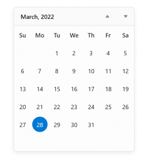
Hide days that are out of scope
You can hide the days that are out of scope of the current view by setting the OutOfScopeVisibility property value as Hidden. The default value of OutOfScopeVisibility property is Enabled.
<calendar:SfCalendar x:Name="sfCalendar"
                     OutOfScopeVisibility="Hidden"
                     />
SfCalendar sfCalendar = new SfCalendar();
sfCalendar.OutOfScopeVisibility = OutOfScopeVisibility.Hidden;
NOTE
Download demo application from GitHub.
Custom UI for specific cell in calendar
You can change the UI of specific cells in Calendar by using the CalendarItem.ContentTemplate property. The DataContext of CalendarItem.ContentTemplate is Calendar.
public class EventDataConverter : IValueConverter
{
    Dictionary<DateTimeOffset, string> SpecialDates;
    public EventDataConverter()
    {
        SpecialDates = new Dictionary<DateTimeOffset, string>();
        SpecialDates.Add(DateTimeOffset.Now.AddMonths(-1).AddDays(1), "SingleEvent_1");
        SpecialDates.Add(DateTimeOffset.Now.AddMonths(-1).AddDays(5), "DoubleEvent_1");
        SpecialDates.Add(DateTimeOffset.Now.AddMonths(-1).AddDays(-2), "TripleEvent_2");
        SpecialDates.Add(DateTimeOffset.Now.AddDays(1), "TripleEvent_1");
        SpecialDates.Add(DateTimeOffset.Now.AddDays(5), "SingleEvent_2");
        SpecialDates.Add(DateTimeOffset.Now.AddDays(7), "DoubleEvent_2");
        SpecialDates.Add(DateTimeOffset.Now.AddDays(9), "SingleEvent_1");
        SpecialDates.Add(DateTimeOffset.Now.AddDays(12), "TripleEvent_2");
        SpecialDates.Add(DateTimeOffset.Now.AddDays(-4), "DoubleEvent_1");
        SpecialDates.Add(DateTimeOffset.Now.AddMonths(1).AddDays(1), "DoubleEvent_3");
        SpecialDates.Add(DateTimeOffset.Now.AddMonths(1).AddDays(3), "SingleEvent_2");
        SpecialDates.Add(DateTimeOffset.Now.AddMonths(1).AddDays(-5), "DoubleEvent_2");
    }
    public object Convert(object value, Type targetType, object parameter, string language)
    {
        DateTimeOffset dateTimeOffset = SpecialDates.Keys.FirstOrDefault(x => x.Date == (DateTime)value);

        if (dateTimeOffset != DateTimeOffset.MinValue)
        {
            string template = SpecialDates[dateTimeOffset];
            StackPanel stackPanel;
            switch (template)
            {
                case "SingleEvent_1":
                    return new List<Brush>() { new SolidColorBrush(Colors.DeepPink) };
                case "SingleEvent_2":
                    return new List<Brush>() { new SolidColorBrush(Colors.Cyan) };
                case "DoubleEvent_1":
                    return new List<Brush>() { new SolidColorBrush(Colors.Violet), new SolidColorBrush(Colors.Orange) };
                case "DoubleEvent_2":
                    return new List<Brush>() { new SolidColorBrush(Colors.Gold), new SolidColorBrush(Colors.Green) };
                case "DoubleEvent_3":
                    return new List<Brush>() { new SolidColorBrush(Colors.Brown), new SolidColorBrush(Colors.Blue) };
                case "TripleEvent_1":
                    return new List<Brush>() { new SolidColorBrush(Colors.Green), new SolidColorBrush(Colors.DeepSkyBlue), new SolidColorBrush(Colors.Orange) };
                case "TripleEvent_2":
                    return new List<Brush>() { new SolidColorBrush(Colors.Red), new SolidColorBrush(Colors.Green), new SolidColorBrush(Colors.Gold) };
            }
        }
        return null;
    }

    public object ConvertBack(object value, Type targetType, object parameter, string language)
    {
        return null;
    }
}<Grid>
<Grid.Resources>
<local:EventDataConverter x:Key="EventDataConverterKey" />
<DataTemplate x:Key="customTemplate">
<ItemsControl ItemsSource="{Binding Path=Date, Converter={StaticResource EventDataConverterKey}}">
<ItemsControl.ItemTemplate>
<DataTemplate >
<Ellipse MinHeight="4" MinWidth="4" Margin="2" Fill="{Binding}"/>
</DataTemplate>
</ItemsControl.ItemTemplate>
<ItemsControl.ItemsPanel>
<ItemsPanelTemplate>
<StackPanel Orientation="Horizontal"/>
</ItemsPanelTemplate>
</ItemsControl.ItemsPanel>
</ItemsControl>
</DataTemplate>
</Grid.Resources>
<calendar:SfCalendar
CornerRadius="14"
DayOfWeekFormat="{}{dayofweek.abbreviated(3)}">
<calendar:SfCalendar.Resources>
<ResourceDictionary>
<!-- Resources and color keys for Calendar Control -->
<SolidColorBrush x:Key="SyncfusionCalendarItemOutOfScopeForeground"
Color="SlateGray" Opacity="0.5" />
<SolidColorBrush x:Key="SyncfusionCalendarWeekItemForeground"
Color="{ThemeResource SystemBaseMediumLowColor}" />
<x:Double x:Key="SyncfusionSubtitleAltFontSize">16</x:Double>
<Thickness x:Key="SyncfusionCalendarItemMargin">1</Thickness>
<x:Double x:Key="SyncfusionBodyFontSize">13</x:Double>
<Style TargetType="calendar:CalendarItem">
<Setter Property="CornerRadius" Value="14"/>
<Setter Property="HorizontalContentAlignment" Value="Stretch"/>
<Setter Property="VerticalContentAlignment" Value="Stretch"/>
<Setter Property="ContentTemplate">
<Setter.Value>
<DataTemplate>
<Grid MinWidth="40" MinHeight="40">
<ContentControl
HorizontalAlignment="Center"
VerticalAlignment="Center"
Margin="2"
Content="{Binding DisplayText}"/>
<ContentControl
Margin="3"
HorizontalAlignment="Center"
VerticalAlignment="Bottom"
Content="{Binding Date}"
ContentTemplate="{StaticResource customTemplate}"
/>
</Grid>
</DataTemplate>
</Setter.Value>
</Setter>
</Style>
</ResourceDictionary>
</calendar:SfCalendar.Resources>
</calendar:SfCalendar>
</Grid>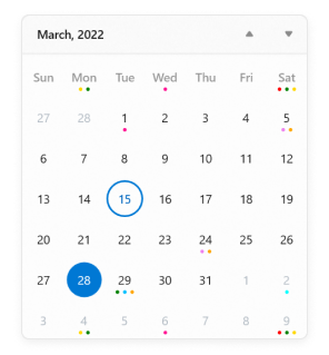
NOTE
Download demo application from GitHub.
Customize using theme keys
You can customize the colors of day names and headers of month, year, decade and century by changing the theme keys values in a ResourceDictionary used in the Calendar control.
| Name of the key | Description |
|---|---|
| SyncfusionCalendarNavigationButtonForeground | Key to change the color of calendar navigation button foreground color. |
| SyncfusionCalendarWeekItemForeground | Key to change the color of calendar week days name foreground color. |
| SyncfusionCalendarTodayItemForeground | Key to change the color of calendar today date foreground color. |
| SyncfusionCalendarItemBackground | Key to change the color of calendar date cells background color except today date cell. |
| SyncfusionCalendarItemBorderBrush | Key to change the color of calendar date cells border brush. |
| SyncfusionCalendarTodayItemBackground | Key to change the color of calendar today date cell background color |
| SyncfusionCalendarTodayItemBorderBrush | Key to change the color of calendar today date cell border brush. |
| SyncfusionCalendarItemOutOfScopeForeground | Key to change the color of calendar date cells foreground color which are out of scope. |
| SyncfusionCalendarItemMargin | Key to change the margin of calendar item. |
| SyncfusionSubtitleAltFontSize | Key to change the font size of calendar header region. |
| SyncfusionBodyFontSize | Key to change the font size of calendar items region. |
<calendar:SfCalendar CornerRadius="6">
     <calendar:SfCalendar.Resources>
        <ResourceDictionary>
                    <!--Theme Key customization-->
            <SolidColorBrush x:Key="SyncfusionCalendarNavigationButtonForeground"
                                         Color="#FF248D92" />
            <SolidColorBrush x:Key="SyncfusionCalendarWeekItemForeground"
                                         Color="#FF248D92" />
            <SolidColorBrush x:Key="SyncfusionCalendarTodayItemForeground"
                                         Color="{ThemeResource SystemBaseHighColor}" />
            <SolidColorBrush x:Key="SyncfusionCalendarItemBackground"
                                         Color="{ThemeResource SystemChromeMediumLowColor}" />
            <SolidColorBrush x:Key="SyncfusionCalendarItemBorderBrush"
                                         Color="{ThemeResource SystemChromeMediumLowColor}"/>
            <SolidColorBrush x:Key="SyncfusionCalendarTodayItemBackground"
                                         Color="#FF9BC5ED" />
            <SolidColorBrush x:Key="SyncfusionCalendarTodayItemBorderBrush"
                                         Color="#FF9BC5ED" />
            <SolidColorBrush x:Key="SyncfusionCalendarItemOutOfScopeForeground"
                                         Color="SlateGray" Opacity="0.5" />
            <Thickness x:Key="SyncfusionCalendarItemMargin">1</Thickness>
            <x:Double x:Key="SyncfusionSubtitleAltFontSize">16</x:Double>
            <x:Double x:Key="SyncfusionBodyFontSize">13</x:Double>
            <FontFamily x:Key="SyncfusionControlThemeFontFamily">SimSun</FontFamily>
            <Style TargetType="calendar:CalendarItem">
                <Setter Property="CornerRadius" Value="5"/>
                <Setter Property="HorizontalContentAlignment" Value="Stretch"/>
                <Setter Property="VerticalContentAlignment" Value="Stretch"/>
                <Setter Property="ContentTemplate">
                    <Setter.Value>
                        <DataTemplate>
                            <Grid MinWidth="40" MinHeight="40">
                                <ContentControl
                                                HorizontalAlignment="Center"
                                                VerticalAlignment="Center"
                                                Margin="3"
                                                Content="{Binding DisplayText}"/>
                            </Grid>
                        </DataTemplate>
                    </Setter.Value>
                </Setter>
            </Style>
        </ResourceDictionary>
    </calendar:SfCalendar.Resources>
</calendar:SfCalendar>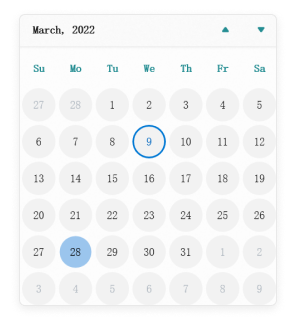
NOTE
Download demo from GitHub.