Getting Started with WinUI Calendar (SfCalendar)
24 May 20237 minutes to read
This section explains the steps required to add the WinUI Calendar control and its date selection options. This section covers only basic features needed to get started with Syncfusion Calendar control.
Structure of Calendar control
Creating an application with WinUI Calendar
In this walk-through, you will create a WinUI application that contains the Calendar control.
Adding control manually in XAML
To add Calendar control manually in XAML, follow these steps:
- Create a WinUI 3 desktop app for C# and .NET 5.
-
Download and refer the following NuGet in the project.
- Import the control namespace
Syncfusion.UI.Xaml.Calendarin XAML page. -
Initialize the
Calendarcontrol.<Window x:Class="GettingStarted.MainWindow" xmlns="http://schemas.microsoft.com/winfx/2006/xaml/presentation" xmlns:x="http://schemas.microsoft.com/winfx/2006/xaml" xmlns:local="using:GettingStarted" xmlns:d="http://schemas.microsoft.com/expression/blend/2008" xmlns:mc="http://schemas.openxmlformats.org/markup-compatibility/2006" xmlns:calendar="using:Syncfusion.UI.Xaml.Calendar" mc:Ignorable="d"> <Grid Name="grid"> <!--Adding Calendar control --> <calendar:SfCalendar Name="sfCalendar"/> </Grid> </Window>
Adding control manually in C#
To add the Calendar control manually in C#, follow these steps:
- Create a WinUI 3 desktop app for C# and .NET 5.
-
Download and refer the following NuGet in the project.
- Import the
CalendarnamespaceSyncfusion.UI.Xaml.Calendarin C# page. -
Initialize the
Calendarcontrol.using Syncfusion.UI.Xaml.Calendar; namespace GettingStarted { /// <summary> /// An empty page that can be used on its own or navigated to within a Frame. /// </summary> public sealed partial class MainWindow : Window { public MainWindow() { this.InitializeComponent(); // Creating an instance of the Calendar control SfCalendar sfCalendar = new SfCalendar(); this.Content = sfCalendar; } } }
NOTE
Download demo application from GitHub.
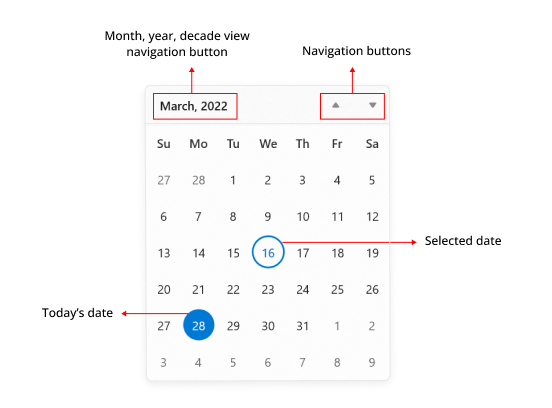
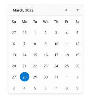
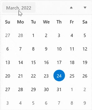
Select a date
You can change the selected date interactively by clicking on the specific date or you can select programmatically by using SelectedDate property. By default, SelectedDate property value is null and Calendar control allows you to select single date at a time.
If you want to restrict date selection or select multiple dates, set SelectionMode property value from the following values:
- None - Prevents from selecting a date.
- Single - Allows to select a single date.
- Multiple - Allows to select multiple dates.
- Range - Allows to select range of dates.
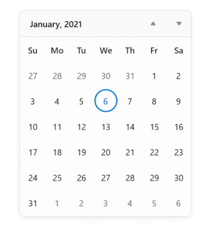
SfCalendar sfCalendar= new SfCalendar();
sfCalendar.SelectedDate = new DateTimeOffset(new DateTime(2021, 01, 06));
NOTE
Download demo application from GitHub.
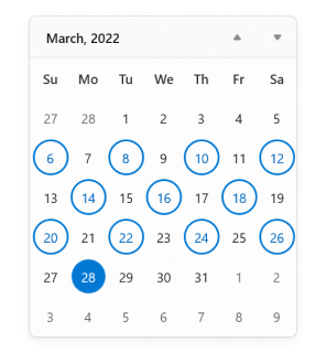
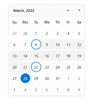
Select multiple dates
You can select one or multiple dates from a different month, year, decade, or century, by changing the SelectionMode property value to Multiple. Now, you can get the selected dates collection from the SelectedDates property. By default, SelectedDates collection will be empty.
NOTE
SelectedDatesproperty collection will be empty, if theSelectionModevalue is None.
<calendar:SfCalendar Name="sfCalendar"
                     SelectionMode="Multiple" />
SfCalendar sfCalendar= new SfCalendar();
sfCalendar.SelectionMode = CalendarSelectionMode.Multiple;
NOTE
Download demo application from GitHub.
Select a date range
You can select a range of dates in Calendar control by changing the SelectionMode property value to Range. Now, you can get the selected dates collection from the SelectedDates property. By default, SelectedDates collection will be empty.
NOTE
SelectedDatesproperty collection will be empty, if theSelectionModevalue is None.
<calendar:SfCalendar Name="sfCalendar"
                     SelectionMode="Range" />
SfCalendar sfCalendar= new SfCalendar();
sfCalendar.SelectionMode = CalendarSelectionMode.Range;
Selection changed notification
You will be notified when selected date is changed in Calendar by using the SelectedDateChanged event. The SelectedDateChanged event contains the old and newly selected date in the OldDate and NewDate properties.
-
OldDate- Gets a date which was previously selected. -
NewDate- Gets a date which is currently selected.
<calendar:SfCalendar Name="sfCalendar"
                     SelectedDateChanged="SfCalendar_SelectedDateChanged">
</calendar:SfCalendar>
SfCalendar sfCalendar = new SfCalendar();
sfCalendar.SelectedDateChanged += SfCalendar_SelectedDateChanged;
You can handle the event as follows:
private void SfCalendar_SelectedDateChanged(object sender, SelectedDateChangedEventArgs e)
{
    var oldDate = e.OldDate;
    var newDate = e.NewDate;
}
Restrict selection
You can restrict users from:
- Selecting single or multiple dates within a specific minimum and maximum range using
MinDateandMaxDateproperties. - Selecting a date or dates from blocked dates using the
BlackoutDatesproperty. - Selecting a date or dates from specifically blocked set of dates (example : blocking weekend dates) using the
ItemPreparedevent.
For further details, refer to Restrict Date Selection.
Navigation between views
- You can navigate between month, year, decade, and century views in
Calendarcontrol. - You can also restrict the users to navigate between specific views only (month and year selection for credit card) by using the
MinDisplayModeandMaxDisplayModeproperties.
- You can navigate within a view horizontally or vertically using
NavigationDirectionproperty. By default, navigation direction is vertical within a view either by mouse scrolling or by navigation buttons.
For further details, refer to Navigation.