Font Customization in .NET MAUI Text Input Layout
18 Nov 201814 minutes to read
The .NET MAUI Text Input Layout control allows to customize the appearance (size, attributes, and family) of the font by setting the FontFamily, FontSize, and FontAttributes properties of the LabelStyle class.
Refer to this documentation to configure the custom fonts in the .NET MAUI.
Prerequisites
Before using the SfTextInputLayout, ensure the following NuGet package is installed in your .NET MAUI project:
Syncfusion.Maui.Core
For a step-by-step setup, refer to the Getting Started documentation.
Overview
The following LabelStyle properties are available on Text Input Layout:
| Property | Applies To | Notes |
|---|---|---|
| HintLabelStyle | Hint label (floating label). | Always visible. |
| HelperLabelStyle | Helper text below the input line. | Replaced by error text when HasError is true. |
| ErrorLabelStyle | Error text below the input line. | Rendered only when HasError is true. |
LabelStyle Properties
LabelStyle exposes the following font-related properties.
| Property | Type | Default | Description |
|---|---|---|---|
FontFamily |
string |
Platform default | Font family. For custom fonts, the value must match the font file name (without the TrueType or OpenType font extension). |
FontSize |
double |
Platform default | Font size in device-independent units. |
FontAttributes |
FontAttributes |
None |
One or more of Bold and Italic. |
TextColor |
Color |
Theme default | Text color (useful alongside the font properties). |
FontAutoScalingEnabled |
bool |
false |
Enables automatic font size adjustment based on device settings. |
Customize the Hint Label
The floating hint label is customized using HintLabelStyle property. The hint label is always visible.
<inputLayout:SfTextInputLayout Hint="Name"
                               ContainerType="Outlined"
                               HelperText="Enter your name">
    <inputLayout:SfTextInputLayout.HintLabelStyle>
        <inputLayout:LabelStyle FontSize="16"
                                FontFamily="Lobster-Regular" />
    </inputLayout:SfTextInputLayout.HintLabelStyle>
    <Entry />
</inputLayout:SfTextInputLayout>
SfTextInputLayout inputLayout = new SfTextInputLayout
{
Hint = "Name",
ContainerType = ContainerType.Outlined,
HelperText = "Enter your name",
HintLabelStyle = new LabelStyle
{
FontFamily = "Lobster-Regular",
FontSize = 16
},
Content = new Entry()
};
Content = inputLayout;
Customize the Hint Line Break Mode
The floating hint label behavior is customized using the HintLineBreakMode property. This property controls how long hint text is displayed when the available space is limited by applying .NET MAUI LineBreakMode values such as wrapping and truncation.
The following example wraps a long hint across multiple lines.
<inputLayout:SfTextInputLayout Hint="Business registration identification number"
                               HintLineBreakMode="WordWrap"
                               ContainerType="Outlined"
                               HeightRequest="80"
                               WidthRequest="150">
    <Entry Text="2026001234" />
</inputLayout:SfTextInputLayout>
var inputLayout = new SfTextInputLayout
{
Hint = "Business registration identification number",
HintLineBreakMode = LineBreakMode.TailTruncation,
ContainerType = ContainerType.Outlined,
Content = new Entry { Text = "2026001234" },
HeightRequest= 80 ,
WidthRequest= 150
};
Content = inputLayout;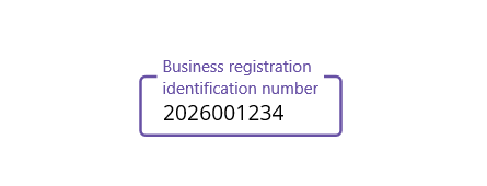
Customize the Hint View
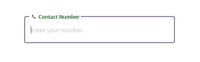
The floating hint label is customized using the HintView property. This property allows any .NET MAUI View to be displayed as the floating hint label, enabling richer content such as styled text, icons, and other visual elements beyond a text-only hint.
When
HintViewis assigned, it takes precedence overHint. The custom view participates in the same floating behavior as the standard hint: it moves to the floating position when the input view receives focus or contains text, and returns to its resting position when appropriate.
The following example uses a styled label as the floating hint view.
<inputLayout:SfTextInputLayout
            ContainerType="Outlined"
            EnableHintAnimation="True" >

    <inputLayout:SfTextInputLayout.HintView>

        <HorizontalStackLayout Spacing="4">

            <Image Source="call.png"
                WidthRequest="16"
                HeightRequest="16"
                VerticalOptions="Center"
                HorizontalOptions="Center"/>

            <Label Text="Contact Number"
                FontSize="12"
                FontAttributes="Bold"
                TextColor="#2E7D32"
                VerticalTextAlignment="Center" />

        </HorizontalStackLayout>

    </inputLayout:SfTextInputLayout.HintView>

    <Entry Placeholder="Enter your number" />

</inputLayout:SfTextInputLayout>
var inputLayout = new SfTextInputLayout
{
ContainerType = ContainerType.Outlined,
EnableHintAnimation = true
};
var hintLayout = new HorizontalStackLayout
{
Spacing = 4
};
hintLayout.Children.Add(new Image
{
Source = "call.png",
WidthRequest = 16,
HeightRequest = 16,
VerticalOptions = LayoutOptions.Center,
HorizontalOptions = LayoutOptions.Center
});
hintLayout.Children.Add(new Label
{
Text = "Contact Number",
FontSize = 12,
FontAttributes = FontAttributes.Bold,
TextColor = Color.FromArgb("#2E7D32"),
VerticalTextAlignment = TextAlignment.Center
});
inputLayout.HintView = hintLayout;
inputLayout.Content = new Entry
{
Placeholder = "Enter your number"
};
Content = inputLayout;The Hint value is included as a fallback, but it is not displayed while HintView is assigned.
Customize the Helper Text Label
The helper text below the input line is customized using HelperLabelStyle property. When HasError is true, the helper text is replaced by the error text, so HelperLabelStyle has no visible effect in that state.
<inputLayout:SfTextInputLayout Hint="Name"
                               ContainerType="Outlined"
                               HelperText="Enter your name">
    <inputLayout:SfTextInputLayout.HelperLabelStyle>
        <inputLayout:LabelStyle FontSize="12"
                                FontFamily="Lobster-Regular" />
    </inputLayout:SfTextInputLayout.HelperLabelStyle>
    <Entry />
</inputLayout:SfTextInputLayout>
SfTextInputLayout inputLayout = new SfTextInputLayout
{
Hint = "Name",
ContainerType = ContainerType.Outlined,
HelperText = "Enter your name",
HelperLabelStyle = new LabelStyle
{
FontFamily = "Lobster-Regular",
FontSize = 12
},
Content = new Entry()
};
Content = inputLayout;
Customize the Error Text Label
The error text is customized using ErrorLabelStyle property and is visible only when HasError is set to true.
<inputLayout:SfTextInputLayout Hint="Name"
                               ContainerType="Outlined"
                               HasError="True"
                               ErrorText="Enter valid name">
    <inputLayout:SfTextInputLayout.ErrorLabelStyle>
        <inputLayout:LabelStyle FontSize="12"
                                FontFamily="Lobster-Regular" />
    </inputLayout:SfTextInputLayout.ErrorLabelStyle>
    <Entry />
</inputLayout:SfTextInputLayout>
SfTextInputLayout inputLayout = new SfTextInputLayout
{
Hint = "Name",
ContainerType = ContainerType.Outlined,
HasError = true,
ErrorText = "Enter valid name",
ErrorLabelStyle = new LabelStyle
{
FontFamily = "Lobster-Regular",
FontSize = 12
},
Content = new Entry()
};
Content = inputLayout;
Apply a Unified Brand Style
The following example applies a single font family to all three label styles so the input field has a consistent brand appearance.
<inputLayout:SfTextInputLayout Hint="Name"
                               ContainerType="Outlined"
                               HelperText="Enter your name">
    <inputLayout:SfTextInputLayout.HintLabelStyle>
        <inputLayout:LabelStyle FontFamily="Lobster-Regular"
                                FontSize="16" />
    </inputLayout:SfTextInputLayout.HintLabelStyle>
    <inputLayout:SfTextInputLayout.HelperLabelStyle>
        <inputLayout:LabelStyle FontFamily="Lobster-Regular"
                                FontSize="12" />
    </inputLayout:SfTextInputLayout.HelperLabelStyle>
    <inputLayout:SfTextInputLayout.ErrorLabelStyle>
        <inputLayout:LabelStyle FontFamily="Lobster-Regular"
                                FontSize="12" />
    </inputLayout:SfTextInputLayout.ErrorLabelStyle>
    <Entry />
</inputLayout:SfTextInputLayout>
SfTextInputLayout inputLayout = new SfTextInputLayout
{
Hint = "Name",
ContainerType = ContainerType.Outlined,
HelperText = "Enter your name",
HintLabelStyle = new LabelStyle { FontFamily = "Lobster-Regular", FontSize = 16 },
HelperLabelStyle = new LabelStyle { FontFamily = "Lobster-Regular", FontSize = 12 },
ErrorLabelStyle = new LabelStyle { FontFamily = "Lobster-Regular", FontSize = 12 },
Content = new Entry()
};
Content = inputLayout;