States and Colors in .NET MAUI Text Input Layout
18 Nov 201813 minutes to read
Customize the appearance of Text Input Layout by setting stroke and background colors, applying visual states, and styling the labels. This page covers the following customization points:
- The base Stroke color and the per-state stroke values via the Visual State Manager.
- The ContainerBackground color for Filled and Outlined containers.
- The text color of the hint, helper, and error labels via LabelStyle.
- The disabled appearance via IsEnabled.
The current stroke color is exposed through the read-only CurrentActiveColor property (type
Color). The error color is not set toCurrentActiveColorwhenHasErroristrue; instead, the control uses theStrokevalue from theErrorvisual state (or the default error color if no state is defined).
Prerequisites
Before using the SfTextInputLayout, ensure the following NuGet package is installed in your .NET MAUI project:
Syncfusion.Maui.Core
For a step-by-step setup, refer to the Getting Started documentation.
Stroke and visual states
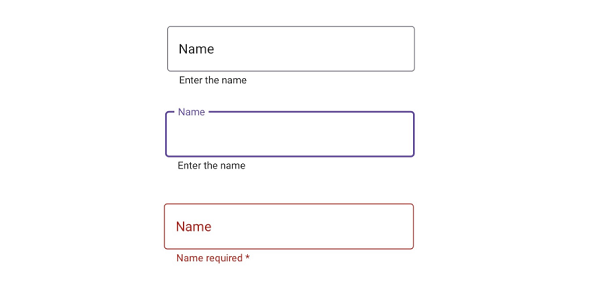
The Stroke property is applied to the hint label and the border. Use the Visual State Manager to override Stroke per state.
The cursor color of the inner input view follows the
Accentcolor of the application on each platform.
<VerticalStackLayout>
    <inputLayout:SfTextInputLayout Hint="Name"
                                   Stroke="#00AFA0"
                                   HelperText="Enter the name">
        <VisualStateManager.VisualStateGroups>
            <VisualStateGroupList>
                <VisualStateGroup x:Name="CommonStates">
                    <VisualState Name="Normal">
                        <VisualState.Setters>
                            <Setter Property="Stroke"
                                    Value="#79747E" />
                        </VisualState.Setters>
                    </VisualState>
                    <VisualState Name="Focused">
                        <VisualState.Setters>
                            <Setter Property="Stroke"
                                    Value="#6750A4" />
                        </VisualState.Setters>
                    </VisualState>
                    <VisualState Name="Error">
                        <VisualState.Setters>
                            <Setter Property="Stroke"
                                    Value="#B3261E" />
                        </VisualState.Setters>
                    </VisualState>
                </VisualStateGroup>
            </VisualStateGroupList>
        </VisualStateManager.VisualStateGroups>
        <Entry />
    </inputLayout:SfTextInputLayout>
</VerticalStackLayout>
var inputLayout = new SfTextInputLayout
{
Hint = "Name",
Stroke = Color.FromArgb("#00AFA0"),
HelperText = "Enter the name",
Content = new Entry()
};
var visualStateGroupList = new VisualStateGroupList();
var visualStateGroup = new VisualStateGroup { Name = "CommonStates" };
var normalState = new VisualState { Name = "Normal" };
normalState.Setters.Add(new Setter { Property = SfTextInputLayout.StrokeProperty, Value = Color.FromArgb("#79747E") });
var focusedState = new VisualState { Name = "Focused" };
focusedState.Setters.Add(new Setter { Property = SfTextInputLayout.StrokeProperty, Value = Color.FromArgb("#6750A4") });
var errorState = new VisualState { Name = "Error" };
errorState.Setters.Add(new Setter { Property = SfTextInputLayout.StrokeProperty, Value = Color.FromArgb("#B3261E") });
visualStateGroup.States.Add(normalState);
visualStateGroup.States.Add(focusedState);
visualStateGroup.States.Add(errorState);
visualStateGroupList.Add(visualStateGroup);
VisualStateManager.SetVisualStateGroups(inputLayout, visualStateGroupList);
Content = new VerticalStackLayout
{
Children =
{
inputLayout
}
};
Disabled state
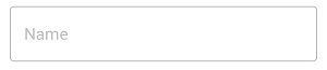
Disable the control by setting IsEnabled to false (default: true). The container, hint, helper text, and border switch to the disabled theme. The disabled colors are not customizable.
<VerticalStackLayout>
    <inputLayout:SfTextInputLayout Hint="Name"
                                   IsEnabled="False">
        <Entry />
    </inputLayout:SfTextInputLayout>
</VerticalStackLayout>
var inputLayout = new SfTextInputLayout
{
Hint = "Name",
IsEnabled = false,
Content = new Entry()
};
Content = new VerticalStackLayout
{
Children =
{
inputLayout
}
};
Container background
The ContainerBackground property is honored only when ContainerType is Filled or Outlined.
Filled
<VerticalStackLayout>
    <inputLayout:SfTextInputLayout Hint="Name"
                                   Stroke="#0450C2"
                                   ContainerType="Filled"
                                   ContainerBackground="#E6EEF9">
        <Entry />
    </inputLayout:SfTextInputLayout>
</VerticalStackLayout>
var inputLayout = new SfTextInputLayout
{
Hint = "Name",
Stroke = Color.FromHex("#0450C2"),
ContainerBackground = Color.FromHex("#E6EEF9"),
ContainerType = ContainerType.Filled,
Content = new Entry { Text = "John" }
};
Content = new VerticalStackLayout
{
Children =
{
inputLayout
}
};
Outlined
<VerticalStackLayout>
    <inputLayout:SfTextInputLayout Hint="Name"
                                   Stroke="#0450C2"
                                   ContainerType="Outlined"
                                   ContainerBackground="#E6EEF9">
        <Entry />
    </inputLayout:SfTextInputLayout>
</VerticalStackLayout>
var inputLayout = new SfTextInputLayout
{
Hint = "Name",
ContainerType = ContainerType.Outlined,
Stroke = Color.FromHex("#0450C2"),
ContainerBackground = Color.FromHex("#E6EEF9"),
Content = new Entry()
};
Content = new VerticalStackLayout
{
Children =
{
inputLayout
}
};
Customize the label text color
Use the TextColor property of the LabelStyle class to customize the color of the hint, helper, and error labels.
<VerticalStackLayout>
    <inputLayout:SfTextInputLayout Hint="Name"
                                   ContainerType="Outlined"
                                   Stroke="Red"
                                   HelperText="Enter your name"
                                   ErrorText="Invalid text">
        <inputLayout:SfTextInputLayout.HintLabelStyle>
            <inputLayout:LabelStyle TextColor="Green" />
        </inputLayout:SfTextInputLayout.HintLabelStyle>
        <inputLayout:SfTextInputLayout.HelperLabelStyle>
            <inputLayout:LabelStyle TextColor="Blue" />
        </inputLayout:SfTextInputLayout.HelperLabelStyle>
        <inputLayout:SfTextInputLayout.ErrorLabelStyle>
            <inputLayout:LabelStyle TextColor="Maroon" />
        </inputLayout:SfTextInputLayout.ErrorLabelStyle>
        <Entry Text="John" />
    </inputLayout:SfTextInputLayout>
</VerticalStackLayout>
var inputLayout = new SfTextInputLayout
{
Hint = "Name",
ContainerType = ContainerType.Outlined,
Stroke = Colors.Red,
HelperText = "Enter your name",
ErrorText = "Invalid text",
Content = new Entry(),
HintLabelStyle = new LabelStyle { TextColor = Colors.Green },
HelperLabelStyle = new LabelStyle { TextColor = Colors.Blue },
ErrorLabelStyle = new LabelStyle { TextColor = Colors.Maroon }
};
Content = new VerticalStackLayout
{
Children =
{
inputLayout
}
};