Custom Icons in .NET MAUI Text Input Layout
18 Nov 201812 minutes to read
Add a leading or trailing icon to the input view of .NET MAUI Text Input Layout by setting the LeadingView or TrailingView property. Any View can be used as the icon - a Label for Unicode characters or font icons, an Image, or even a Button for interactive actions.
You can wire up gestures or commands on the leading/trailing view to make the icon interactive (for example, a clear-text button or a password show/hide toggle).
Refer to the following links to learn more about font icons:
- How to create font icons using Syncfusion Metro Studio and export them as TTF
- How to display font icons in MAUI labels
Prerequisites
Before using the SfTextInputLayout, ensure the following NuGet package is installed in your .NET MAUI project:
Syncfusion.Maui.Core
For a step-by-step setup, refer to the Getting Started documentation.
ViewPosition Reference
The leading and trailing views can be placed inside or outside the container using the ViewPosition enum.
| Position | Description |
|---|---|
| Inside | Rendered within the input line, adjacent to the input view. |
| Outside | Rendered outside the container border. |
Default values:
-
LeadingViewPositiondefaults toOutside. -
TrailingViewPositiondefaults toInside.
Leading view
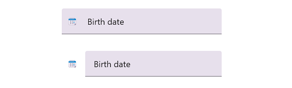
Display any View as a leading icon by setting the LeadingView property. Use the LeadingViewPosition property to position the view inside or outside the container (default: Outside).
The following example shows a Unicode calendar emoji rendered as the leading icon, positioned inside the container:
<VerticalStackLayout>
<inputLayout:SfTextInputLayout Hint="Birth date"
LeadingViewPosition="Inside">
<inputLayout:SfTextInputLayout.LeadingView>
<Label Text="🗓" />
</inputLayout:SfTextInputLayout.LeadingView>
<Entry />
</inputLayout:SfTextInputLayout>
</VerticalStackLayout>var inputLayout = new SfTextInputLayout
{
Hint = "Birth date",
LeadingViewPosition = ViewPosition.Inside,
LeadingView = new Label { Text = "\U0001F5D3" },
Content = new Entry()
};
Content = new VerticalStackLayout
{
Children =
{
inputLayout
}
};
Trailing view
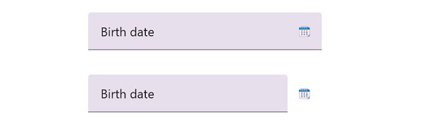
Display any View as a trailing icon by setting the TrailingView property. Use the TrailingViewPosition property to position the view inside or outside the container (default: Inside).
The following example shows a Unicode calendar emoji rendered as the trailing icon, positioned outside the container:
<VerticalStackLayout>
<inputLayout:SfTextInputLayout Hint="Password"
TrailingViewPosition="Outside">
<inputLayout:SfTextInputLayout.TrailingView>
<Label Text="🗓" />
</inputLayout:SfTextInputLayout.TrailingView>
<Entry IsPassword="True" />
</inputLayout:SfTextInputLayout>
</VerticalStackLayout>var inputLayout = new SfTextInputLayout
{
Hint = "Password",
TrailingViewPosition = ViewPosition.Outside,
TrailingView = new Label { Text = "\U0001F5D3" },
Content = new Entry { IsPassword = true }
};
Content = new VerticalStackLayout
{
Children =
{
inputLayout
}
};
Show or hide the leading and trailing views

The ShowLeadingView and ShowTrailingView properties control the visibility of the leading and trailing views. Both default to true.
<VerticalStackLayout>
<inputLayout:SfTextInputLayout Hint="Birth date"
ContainerType="Outlined"
ShowLeadingView="{Binding IsLeadingViewVisible}"
ShowTrailingView="{Binding IsTrailingViewVisible}">
<inputLayout:SfTextInputLayout.LeadingView>
<Label Text="🗓" />
</inputLayout:SfTextInputLayout.LeadingView>
<inputLayout:SfTextInputLayout.TrailingView>
<Label Text="📅" />
</inputLayout:SfTextInputLayout.TrailingView>
<Entry />
</inputLayout:SfTextInputLayout>
<HorizontalStackLayout Spacing="10">
<HorizontalStackLayout>
<CheckBox IsChecked="{Binding IsLeadingViewVisible}" />
<Label Text="ShowLeadingView"
VerticalOptions="Center" />
</HorizontalStackLayout>
<HorizontalStackLayout>
<CheckBox IsChecked="{Binding IsTrailingViewVisible}" />
<Label Text="ShowTrailingView"
VerticalOptions="Center" />
</HorizontalStackLayout>
</HorizontalStackLayout>
</VerticalStackLayout>var textInputLayoutViewModel = new TextInputLayoutViewModel();
BindingContext = textInputLayoutViewModel;
var textInputLayout = new SfTextInputLayout
{
Hint = "Birth date",
ContainerType = ContainerType.Outlined
};
textInputLayout.SetBinding(SfTextInputLayout.ShowLeadingViewProperty, nameof(textInputLayoutViewModel.IsLeadingViewVisible));
textInputLayout.SetBinding(SfTextInputLayout.ShowTrailingViewProperty, nameof(textInputLayoutViewModel.IsTrailingViewVisible));
textInputLayout.LeadingView = new Label
{
Text = "\U0001F5D3"
};
textInputLayout.TrailingView = new Label
{
Text = "\U0001F4C5"
};
textInputLayout.Content = new Entry();
var leadingCheckBox = new CheckBox();
leadingCheckBox.SetBinding(CheckBox.IsCheckedProperty,
nameof(textInputLayoutViewModel.IsLeadingViewVisible));
var trailingCheckBox = new CheckBox();
trailingCheckBox.SetBinding(CheckBox.IsCheckedProperty,
nameof(textInputLayoutViewModel.IsTrailingViewVisible));
Content = new VerticalStackLayout
{
Children = { textInputLayout,
new HorizontalStackLayout
{
Spacing = 10,
Children =
{
new HorizontalStackLayout
{
Children =
{
leadingCheckBox,
new Label
{
Text = "ShowLeadingView",
VerticalOptions = LayoutOptions.Center
}
}
},
new HorizontalStackLayout
{
Children =
{
trailingCheckBox,
new Label
{
Text = "ShowTrailingView",
VerticalOptions = LayoutOptions.Center
}
}
}
}
}
}
};public class TextInputLayoutViewModel : INotifyPropertyChanged
{
private bool isLeadingViewVisible;
private bool isTrailingViewVisible;
public bool IsLeadingViewVisible
{
get => isLeadingViewVisible;
set
{
isLeadingViewVisible = value;
OnPropertyChanged();
}
}
public bool IsTrailingViewVisible
{
get => isTrailingViewVisible;
set
{
isTrailingViewVisible = value;
OnPropertyChanged();
}
}
public TextInputLayoutViewModel()
{
}
public event PropertyChangedEventHandler PropertyChanged;
void OnPropertyChanged([CallerMemberName] string name = null)
{
PropertyChanged?.Invoke(this, new PropertyChangedEventArgs(name));
}
}