Container Types in .NET MAUI Text Input Layout
18 Nov 20188 minutes to read
Containers improve the discoverability of the input view by creating contrast between the input view and the surrounding assistive elements (helper text, error text, character counter, and password toggle).
Prerequisites
Before using the SfTextInputLayout, ensure the following NuGet package is installed in your .NET MAUI project:
Syncfusion.Maui.Core
For a step-by-step setup, refer to the Getting Started documentation.
Available Container Types
The ContainerType property accepts the ContainerType enum. The default value is Outlined.
| Container Type | Visual Style | When to Use |
|---|---|---|
| Filled | Filled background with a bottom stroke that changes color/thickness with state. | Compact forms, dense lists, and Material-style layouts. |
| Outlined | Rounded-corner border around the input view. | Emphasized fields, settings pages, and forms that need clear separation. |
| None | No background; only the standard spacing is preserved. | Inline inputs, embedded editors, and minimalist layouts. |
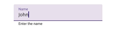
Filled
The background of the input view is filled with the container color, and the bottom stroke color and thickness change based on the input view’s state (normal, hover, focused, error). Enable the filled style by setting the ContainerType property to Filled.
<VerticalStackLayout>
    <inputLayout:SfTextInputLayout Hint="Name"
                                   HelperText="Enter the name"
                                   ContainerType="Filled">
        <Entry Text="John" />
    </inputLayout:SfTextInputLayout>
</VerticalStackLayout>
var inputLayout = new SfTextInputLayout
{
Hint = "Name",
HelperText = "Enter the name",
ContainerType = ContainerType.Filled,
Content = new Entry { Text = "John" }
};
Content = new VerticalStackLayout
{
Children =
{
inputLayout
}
};
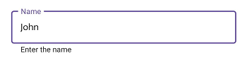
Outlined
When the ContainerType property is set to Outlined, the container is drawn with a rounded-corner border around the input view.
<VerticalStackLayout>
    <inputLayout:SfTextInputLayout Hint="Name"
                                   HelperText="Enter the name"
                                   ContainerType="Outlined">
        <Entry Text="John" />
    </inputLayout:SfTextInputLayout>
</VerticalStackLayout>
var inputLayout = new SfTextInputLayout
{
Hint = "Name",
HelperText = "Enter the name",
ContainerType = ContainerType.Outlined,
Content = new Entry { Text = "John" }
};
Content = new VerticalStackLayout
{
Children =
{
inputLayout
}
};
Customize the corner radius of the outline border
The OutlineCornerRadius property controls the corner radius of the outlined border.
<VerticalStackLayout>
    <inputLayout:SfTextInputLayout Hint="Name"
                                   ContainerType="Outlined"
                                   OutlineCornerRadius="8">
        <Entry />
    </inputLayout:SfTextInputLayout>
</VerticalStackLayout>
var inputLayout = new SfTextInputLayout
{
Hint = "Name",
ContainerType = ContainerType.Outlined,
OutlineCornerRadius = 8,
Content = new Entry()
};
Content = new VerticalStackLayout
{
Children =
{
inputLayout
}
};
OutlineCornerRadiusis only applied whenContainerTypeis set toOutlined. The property is ignored forFilledandNone.
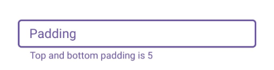
Custom padding
The space between the input view and the outline border can be customized with the InputViewPadding property, which accepts a Thickness value.
<VerticalStackLayout>
    <inputLayout:SfTextInputLayout Hint="Padding"
                                   InputViewPadding="0,5,0,5"
                                   ContainerType="Outlined"
                                   HelperText="Top and bottom padding is 5">
        <Entry />
    </inputLayout:SfTextInputLayout>
</VerticalStackLayout>
var inputLayout = new SfTextInputLayout
{
Hint = "Padding",
InputViewPadding = new Thickness(0, 5, 0, 5), // left, top, right, bottom
ContainerType = ContainerType.Outlined,
HelperText = "Top and bottom padding is 5",
Content = new Entry()
};
Content = new VerticalStackLayout
{
Children =
{
inputLayout
}
};
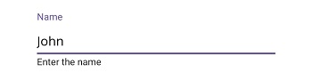
None
When the ContainerType property is set to None, the container renders without a background or border, preserving only the standard spacing between the input view and the surrounding layout.
<VerticalStackLayout>
    <inputLayout:SfTextInputLayout Hint="Name"
                                   HelperText="Enter the name"
                                   ContainerType="None">
        <Entry Text="John" />
    </inputLayout:SfTextInputLayout>
</VerticalStackLayout>
var inputLayout = new SfTextInputLayout
{
Hint = "Name",
HelperText = "Enter the name",
ContainerType = ContainerType.None,
Content = new Entry { Text = "John" }
};
Content = new VerticalStackLayout
{
Children =
{
inputLayout
}
};