Assistive Labels in .NET MAUI Text Input Layout
18 Nov 201810 minutes to read
Assistive labels provide additional information about the text entered in the input view hosted by the .NET MAUI Text Input Layout control.
Prerequisites
Before using the SfTextInputLayout, ensure the following NuGet package is installed in your .NET MAUI project:
Syncfusion.Maui.Core
For a step-by-step setup, refer to the Getting Started documentation.
Overview
The following assistive labels are available:
- Password visibility toggle - show or hide the characters in an Entry control.
- Helper text - additional guidance shown below the input line.
-
Error text - error message shown below the input line when
HasErroris set totrue. - Character counter - live count of characters against a maximum length.
- Reserved space - placeholder space reserved for assistive labels so the layout does not shift when they appear.
Password visibility toggle
The password visibility toggle shows or hides the characters in the input view hosted by the control. Enable it by setting the EnablePasswordVisibilityToggle property to true.
<VerticalStackLayout>
    <inputLayout:SfTextInputLayout Hint="Password"
                                   EnablePasswordVisibilityToggle="True">
        <Entry Text="1234" />
    </inputLayout:SfTextInputLayout>
</VerticalStackLayout>
var inputLayout = new SfTextInputLayout
{
Hint = "Password",
EnablePasswordVisibilityToggle = true,
Content = new Entry { Text = "1234" }
};
Content = new VerticalStackLayout
{
Children =
{
inputLayout
}
};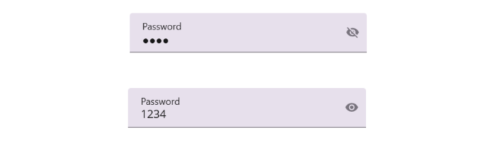
The password visibility toggle can be enabled only for the Entry control. By default, the toggle is disabled.
Helper text
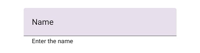
Helper text conveys additional guidance about the input field, such as how the value will be used. Set the helper text using the HelperText property. Disable the helper text by setting ShowHelperText to false (default: true).
<VerticalStackLayout>
    <inputLayout:SfTextInputLayout Hint="Name"
                                   HelperText="Enter your name">
        <Entry />
    </inputLayout:SfTextInputLayout>
</VerticalStackLayout>
var inputLayout = new SfTextInputLayout
{
Hint = "Name",
HelperText = "Enter your name",
Content = new Entry()
};
Content = new VerticalStackLayout
{
Children =
{
inputLayout
}
};
Helper text and error text share the same area below the input line. When
HasErroristrue, the error text replaces the helper text.
Error message
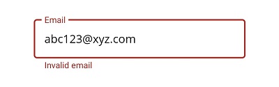
When the entered text is not accepted, an error message can be displayed below the input line until the user provides a valid value. Set the message with the ErrorText property. The error is rendered only when the HasError property is set to true.
<VerticalStackLayout>
    <inputLayout:SfTextInputLayout Hint="Email"
                                   ContainerType="Outlined"
                                   HelperText="Enter your email address"
                                   ErrorText="Invalid email"
                                   HasError="True">
        <Entry />
    </inputLayout:SfTextInputLayout>
</VerticalStackLayout>
var inputLayout = new SfTextInputLayout
{
Hint = "Email",
ContainerType = ContainerType.Outlined,
HelperText = "Enter your email address",
ErrorText = "Invalid email",
HasError = true,
Content = new Entry()
};
Content = new VerticalStackLayout
{
Children =
{
inputLayout
}
};
Validations must be performed in your application logic. Toggle
HasErrorbased on the validation result and clear the error by settingHasError = false.
Toggle the error programmatically
The following example shows how to flip HasError based on the result of a simple email validation. The example uses the TextChanged event of the Entry control.
var inputLayout = new SfTextInputLayout
{
    Hint = "Email",
    HelperText = "Enter your email address",
    ErrorText = "Invalid email"
};

var entry = new Entry();
entry.TextChanged += OnEmailTextChanged;
inputLayout.Content = entry;
Content = new VerticalStackLayout
{
    Children =
    {
        inputLayout
    }
};
The TextChanged event can be handled in C# as follows:
private void OnEmailTextChanged(object? sender, TextChangedEventArgs e)
{
    var isValid = !string.IsNullOrWhiteSpace(e.NewTextValue)
                    && e.NewTextValue.Contains('@')
                    && e.NewTextValue.Contains('.');
    if (sender is Entry parentEntry && parentEntry.Parent is SfTextInputLayout layout)
    {
        layout.HasError = !isValid;
    }
}
Character counter
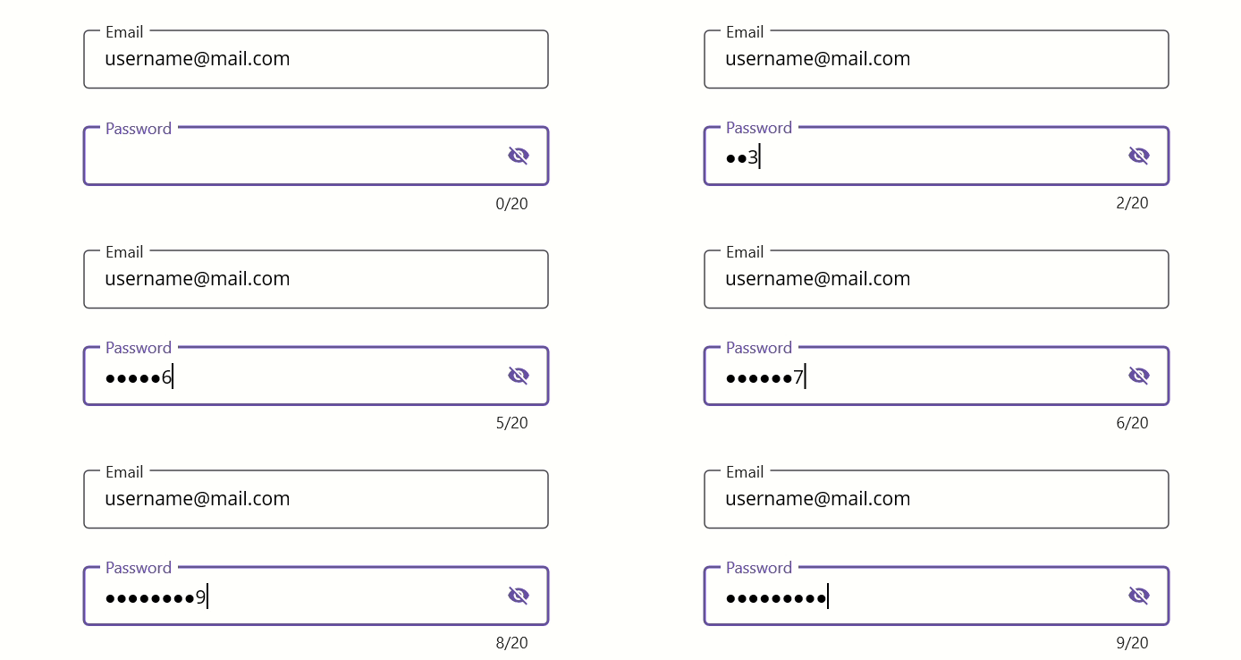
The character counter shows the number of characters entered and the configured maximum. Enable it by setting ShowCharCount to true (default: false) and set the limit with CharMaxLength. The counter updates live as the user types and is displayed in the format current / max (for example, 7 / 20).
<VerticalStackLayout>
    <inputLayout:SfTextInputLayout Hint="Password"
                                   ContainerType="Outlined"
                                   ShowCharCount="True"
                                   CharMaxLength="20"
                                   HelperText="Enter 5 to 20 characters">
        <Entry />
    </inputLayout:SfTextInputLayout>
</VerticalStackLayout>
var inputLayout = new SfTextInputLayout
{
Hint = "Password",
ContainerType = ContainerType.Outlined,
ShowCharCount = true,
CharMaxLength = 20,
HelperText = "Enter 5 to 20 characters",
Content = new Entry()
};
Content = new VerticalStackLayout
{
Children =
{
inputLayout
}
};
When the character count reaches
CharMaxLength, the error color is applied to the hint, border, and counter label. The counter itself does not prevent additional typing; combine it withEntry.MaxLengthif you need to hard-cap input.
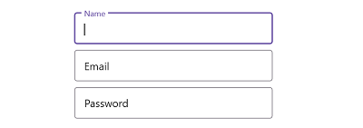
Reserve space for assistive labels
By default, the control reserves vertical space for assistive labels so that the layout does not shift when helper text, error text, or the character counter appear. Disable this reserved space by setting ReserveSpaceForAssistiveLabels to false (default: true).
<VerticalStackLayout>
    <inputLayout:SfTextInputLayout ContainerType="Outlined"
                                   Hint="Name"
                                   ReserveSpaceForAssistiveLabels="False">
        <Entry />
    </inputLayout:SfTextInputLayout>
</VerticalStackLayout>
var inputLayout = new SfTextInputLayout
{
Hint = "Name",
ContainerType = ContainerType.Outlined,
ReserveSpaceForAssistiveLabels = false,
Content = new Entry()
};
Content = new VerticalStackLayout
{
Children =
{
inputLayout
}
};
Set
ReserveSpaceForAssistiveLabelstofalseonly if the host page already provides a fixed area for assistive labels. Otherwise, controls below the input may shift when an error or counter appears.