Supported Input Views in .NET MAUI TextInputLayout (SfTextInputLayout)
12 Sep 202516 minutes to read
Input views can be added to the text input layout control by setting the Content property.
Entry
To enter a single line text input, add Entry.
<inputLayout:SfTextInputLayout Hint="Name"
                               HelperText="Enter the name"
                               ContainerType="Outlined">
   <Entry />
</inputLayout:SfTextInputLayout>
SfTextInputLayout inputLayout = new SfTextInputLayout();
inputLayout.Hint = "Name";
inputLayout.HelperText = "Enter your name"
inputLayout.Content = new Entry();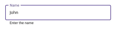
Editor
To enter multi-line text input, add Editor, then set the AutoSize property to TextChanges.
<inputLayout:SfTextInputLayout Hint="About TextInputLayout"
                               HelperText="Enter the brief description of the text input layout"
                               ContainerType="Outlined">
   <Editor AutoSize="TextChanges" />
</inputLayout:SfTextInputLayout>
SfTextInputLayout inputLayout = new SfTextInputLayout();
inputLayout.Hint = "Notes";
inputLayout.Content = new Editor();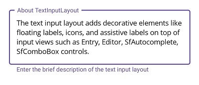
Autocomplete
To initialize the Autocomplete control and launch it in each platform, refer to the getting started with autocomplete documentation.
Selection Mode
There are two different selection modes in Autocomplete control.
NOTE
For more information regarding Autocomplete selection modes, refer to the Single Selection and Multiple Selection documentation.
Single Selection
<inputLayout:SfTextInputLayout Hint="Country" ContainerType="Outlined">
   <autocomplete:SfAutocomplete>
      <autocomplete:SfAutocomplete.ItemsSource>
        <x:Array Type="{x:Type x:String}">
            <x:String>Uganda</x:String>
            <x:String>Ukraine</x:String>
            <x:String>United Arab Emirates</x:String>
            <x:String>United States</x:String>
         </x:Array>
      </autocomplete:SfAutocomplete.ItemsSource>
   </autocomplete:SfAutocomplete>
</inputLayout:SfTextInputLayout>
var autocomplete = new SfAutocomplete();
SfTextInputLayout inputLayout = new SfTextInputLayout();
inputLayout.Hint = "Country";
inputLayout.ContainerType = ContainerType.Outlined;
string[] countryNames = new string[4];
countryNames[0] = "Uganda";
countryNames[1] = "Ukraine";
countryNames[2] = "United Arab Emirates";
countryNames[3] = "United States";
autocomplete.ItemsSource = countryNames;
inputLayout.Content = autocomplete;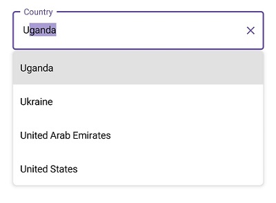
Multiple Selection
<StackLayout Spacing="10">
<inputLayout:SfTextInputLayout Hint="Delimiter" ContainerType="Outlined" WidthRequest="300" HeightRequest="80" >
   <autocomplete:SfAutocomplete SelectionMode="Multiple" Placeholder="Enter" MultiSelectionDisplayMode="Delimiter" >
      <autocomplete:SfAutocomplete.ItemsSource>
        <x:Array Type="{x:Type x:String}">
            <x:String>Uganda</x:String>
            <x:String>Ukraine</x:String>
            <x:String>United Arab Emirates</x:String>
            <x:String>United States</x:String>
         </x:Array>
      </autocomplete:SfAutocomplete.ItemsSource>
   </autocomplete:SfAutocomplete>
</inputLayout:SfTextInputLayout>

<inputLayout:SfTextInputLayout Hint="Token-None" ContainerType="Outlined" WidthRequest="300" HeightRequest="80" >
   <autocomplete:SfAutocomplete SelectionMode="Multiple" Placeholder="Enter" >
      <autocomplete:SfAutocomplete.ItemsSource>
        <x:Array Type="{x:Type x:String}">
            <x:String>Uganda</x:String>
            <x:String>Ukraine</x:String>
            <x:String>United Arab Emirates</x:String>
            <x:String>United States</x:String>
         </x:Array>
      </autocomplete:SfAutocomplete.ItemsSource>
   </autocomplete:SfAutocomplete>
</inputLayout:SfTextInputLayout>

<inputLayout:SfTextInputLayout Hint="Token-AutoSize" ContainerType="Outlined" WidthRequest="300" >
   <autocomplete:SfAutocomplete SelectionMode="Multiple" Placeholder="Enter" TokensWrapMode="Wrap" EnableAutoSize="True" >
      <autocomplete:SfAutocomplete.ItemsSource>
        <x:Array Type="{x:Type x:String}">
            <x:String>Uganda</x:String>
            <x:String>Ukraine</x:String>
            <x:String>United Arab Emirates</x:String>
            <x:String>United States</x:String>
         </x:Array>
      </autocomplete:SfAutocomplete.ItemsSource>
   </autocomplete:SfAutocomplete>
</inputLayout:SfTextInputLayout>
</StackLayout>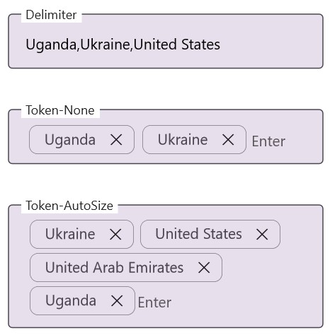
Combo box
To initialize the ComboBox control and launch it in each platform, refer to the getting started with combo box documentation.
Selection Mode
There are two different selection modes in ComboBox control.
NOTE
For more information regarding ComboBox selection modes, refer to the Single Selection and Multiple Selection documentation.
Single Selection
<inputLayout:SfTextInputLayout Hint="Country" ContainerType="Outlined">
   <combobox:SfComboBox>
      <combobox:SfComboBox.ItemsSource>
         <x:Array Type="{x:Type x:String}">
            <x:String>Uganda</x:String>
            <x:String>Ukraine</x:String>
            <x:String>United Arab Emirates</x:String>
            <x:String>United States</x:String>
         </x:Array>
      </combobox:SfComboBox.ItemsSource>
   </combobox:SfComboBox>
</inputLayout:SfTextInputLayout>
var combobox = new SfComboBox();
SfTextInputLayout inputLayout = new SfTextInputLayout();
inputLayout.Hint = "Country";
inputLayout.ContainerType = ContainerType.Outlined;
string[] countryNames = new string[4];
countryNames[0] = "Uganda";
countryNames[1] = "Ukraine";
countryNames[2] = "United Arab Emirates";
countryNames[3] = "United States";
combobox.ItemsSource = countryNames;
inputLayout.Content = combobox;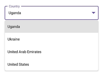
Multiple Selection
<StackLayout Spacing="10">
<inputLayout:SfTextInputLayout Hint="Delimiter" ContainerType="Outlined" WidthRequest="300" HeightRequest="80" >
   <combobox:SfComboBox SelectionMode="Multiple" Placeholder="Enter" MultiSelectionDisplayMode="Delimiter" >
      <combobox:SfComboBox.ItemsSource>
        <x:Array Type="{x:Type x:String}">
            <x:String>Uganda</x:String>
            <x:String>Ukraine</x:String>
            <x:String>United Arab Emirates</x:String>
            <x:String>United States</x:String>
         </x:Array>
      </combobox:SfComboBox.ItemsSource>
   </combobox:SfComboBox>
</inputLayout:SfTextInputLayout>

<inputLayout:SfTextInputLayout Hint="Token-None" ContainerType="Outlined" WidthRequest="300" HeightRequest="80" >
   <combobox:SfComboBox SelectionMode="Multiple" Placeholder="Enter" >
      <combobox:SfComboBox.ItemsSource>
        <x:Array Type="{x:Type x:String}">
            <x:String>Uganda</x:String>
            <x:String>Ukraine</x:String>
            <x:String>United Arab Emirates</x:String>
            <x:String>United States</x:String>
         </x:Array>
      </combobox:SfComboBox.ItemsSource>
   </combobox:SfComboBox>
</inputLayout:SfTextInputLayout>

<inputLayout:SfTextInputLayout Hint="Token-AutoSize" ContainerType="Outlined" WidthRequest="300" >
   <combobox:SfComboBox SelectionMode="Multiple" Placeholder="Enter" TokensWrapMode="Wrap" EnableAutoSize="True" >
      <combobox:SfComboBox.ItemsSource>
        <x:Array Type="{x:Type x:String}">
            <x:String>Uganda</x:String>
            <x:String>Ukraine</x:String>
            <x:String>United Arab Emirates</x:String>
            <x:String>United States</x:String>
         </x:Array>
      </combobox:SfComboBox.ItemsSource>
   </combobox:SfComboBox>
</inputLayout:SfTextInputLayout>
</StackLayout>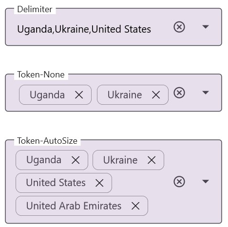
Masked Entry
To initialize the MaskedEntry control and launch it in each platform, refer to the getting started with masked entry documentation.
<inputLayout:SfTextInputLayout Hint="Card number"
                               HelperText="Required *"
                               ContainerType="Outlined">
   <maskedEntry:SfMaskedEntry MaskType="Simple"
                              Mask="0000 0000 0000 0000" />
</inputLayout:SfTextInputLayout>
SfTextInputLayout inputLayout = new SfTextInputLayout();
inputLayout.Hint = "Card number";
inputLayout.HelperText = "Required *";
inputLayout.ContainerType = ContainerType.Outlined;
inputLayout.Content = new SfMaskedEntry() { MaskType = MaskedEntryMaskType.Simple, Mask = "0000 0000 0000 0000" };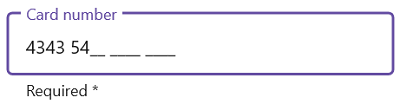
NumericEntry
To initialize the NumericEntry control and launch it in each platform, refer to the getting started with numeric entry documentation.
<inputLayout:SfTextInputLayout Hint="Amount"
                               HelperText="Enter the amount"
                               ContainerType="Outlined">
   <numericEntry:SfNumericEntry Value="100"
                                ShowClearButton="True"
                                UpDownPlacementMode="Inline"/>
</inputLayout:SfTextInputLayout>
SfTextInputLayout inputLayout = new SfTextInputLayout();
inputLayout.Hint = "Amount";
inputLayout.HelperText = "Enter the amount";
inputLayout.ContainerType = ContainerType.Outlined;
inputLayout.Content = new SfNumericEntry() { Value=100,
ShowClearButton=True,
UpDownPlacementMode=NumericEntryUpDownPlacementMode.Inline};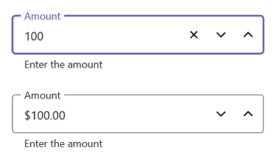
Picker
To initialize the Picker control and launch it in each platform, refer to the getting started with picker documentation.
<inputLayout:SfTextInputLayout Hint="Fruit"
                               HelperText="Select a fruit"
                               ContainerType="Outlined" >
   <Picker SelectedItem="Apple">
        <Picker.ItemsSource>
            <x:Array Type="{x:Type x:String}">
                <x:String>Apple</x:String>
                <x:String>Orange</x:String>
                <x:String>Strawberry</x:String>
            </x:Array>
        </Picker.ItemsSource>
   </Picker>
</inputLayout:SfTextInputLayout>
SfTextInputLayout inputLayout = new SfTextInputLayout();
inputLayout.Hint = "Fruit";
inputLayout.HelperText = "Select a fruit";
inputLayout.ContainerType = ContainerType.Outlined;
var picker = new Picker();
picker.Items.Add("Apple");
picker.Items.Add("Orange");
picker.Items.Add("Strawberry");
picker.SelectedItem = "Apple";
inputLayout.Content = picker;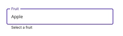
NOTE
Windows platform will not support
.NET MAUI Pickeras input view of the text input layout.TimePicker
To initialize the TimePicker control and launch it in each platform, refer to the getting started with time picker documentation.
<inputLayout:SfTextInputLayout Hint="Time"
                               HelperText="Select a start time"
                               ContainerType="Outlined" >
    <TimePicker/>
 </inputLayout:SfTextInputLayout>
SfTextInputLayout inputLayout = new SfTextInputLayout();
inputLayout.Hint = "Time";
inputLayout.HelperText = "Select a start time";
inputLayout.ContainerType = ContainerType.Outlined;
inputLayout.Content = new TimePicker();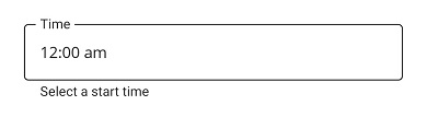
NOTE
Windows platform will not support
.NET MAUI TimePickeras input view of the text input layout.
DatePicker
To initialize the DatePicker control and launch it in each platform, refer to the getting started with date picker documentation.
<inputLayout:SfTextInputLayout Hint="Date of Birth"
                               HelperText="Select birth date"
                               ContainerType="Outlined" >
    <DatePicker/>
</inputLayout:SfTextInputLayout>
SfTextInputLayout inputLayout = new SfTextInputLayout();
inputLayout.Hint = "Date of Birth";
inputLayout.HelperText = "Select birth date";
inputLayout.ContainerType = ContainerType.Outlined;
inputLayout.Content = new DatePicker();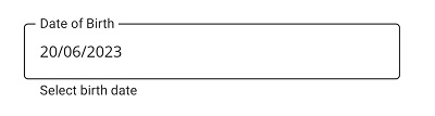
NOTE
Windows platform will not support
.NET MAUI DatePickeras input view of the text input layout.