How can I help you?
Group
Group is a collection of logical content groups that are combined under related Tab. Each group can be defined using content groups or custom content.
Adding Tab Groups
Group items can be added to Tabs by specifying text and corresponding content to be displayed. The content of group can be specified as either with content collection, contentID or customContent.
You can add tab group dynamically in the ribbon control with given tab index, tab group object and group index position by using addTabGroup method.
Adding Content
Add content to Group item which is based on type of content specified. The available types are button, splitButton, toggleButton,gallery, and dropDownList.
Groups and defaults settings can be added with the content. You can add group content dynamically in the ribbon control with given tab index, group index, content, content index and sub group index position by using addTabGroupContent.
Defaults
The tabs.groups.content.defaults.height, tabs.groups.content.defaults.width,
tabs.groups.content.defaults.type, tabs.groups.content.defaults.isBig property to the controls in the group can be specified commonly.
The height & width applicable to button, split button, dropdown list ,Toggle button controls and isBig applicable to only button controls ( button, split , toggle)
Adding Content Groups
Controls such as button, split button, dropdown list, toggle button, gallery in the subgroup of the Ribbon tab can be rendered. All of these can be customized using its corresponding settings property such as buttonSettings, dropdownSettings, etc.
Custom controls or items (such as table, div etc.) can be added when the type set as custom. defaults control settings of group can be specified for an individual group instead of specifying them to groups collection commonly.
Tooltip and Custom Tooltip can be specified for each group controls.
<div id="Ribbon"></div>
	<ul id="ribbon">
		<li>
			<a>FILE</a>
			<ul>
				<li><a>Open</a></li>
			</ul>
		</li>
	</ul>
	<ul id="pasteSplit">
		<li>Paste
		</li>
		<li>Paste Special
		</li>
	</ul>
	<script type="text/javascript">
		$(function () {
			$("#Ribbon").ejRibbon({
				width: "500px",
				applicationTab: {
					type: ej.Ribbon.applicationTabType.menu,
					menuItemID: "ribbon"
				},
				//tab collection
				tabs: [{
					id: "home",
					text: "HOME",
					//group collection of home tab
					groups: [{
						text: "ClipBoard",
						// content collection of group
						content: [{
							groups: [{
								// content group with splitbutton id , text & button settings
								id: "paste",
								text: "Paste",
								toolTip: "Paste",
								isBig: true,
								type: ej.Ribbon.type.splitButton,
								splitButtonSettings: {
									contentType: ej.ContentType.ImageOnly,
									prefixIcon: "e-icon e-ribbon e-ribbonpaste",
									targetID: "pasteSplit"
								}
							}]
						}]
					}, {
						text: "Font",
						//group align type as columns
						alignType: ej.Ribbon.alignType.columns,
						content: [{
							groups: [{
								// content group with toggle button settings
								id: "cut",
								toggleButtonSettings: {
									defaultText: "Cut",
									activeText: "Cut Over"
								}
							}, {
								id: "copy",
								toggleButtonSettings: {
									defaultText: "Copy",
									activeText: "Copy Over"
								}
							}],
							// defaults settings of above group’s control

							defaults: {
								width: 75,
								height: 30,
								type: ej.Ribbon.type.toggleButton
							}
						}],
					}]
				}]
			});
		});
	</script>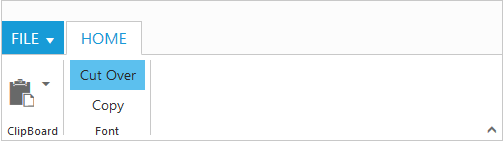
Enable Separator
Separates the control from the next control in the group when group alignType is row. Set “true” to enableSeparator.
<div id="Ribbon"></div>
    <ul id="ribbon">
        <li><a>FILE </a>
            <ul>
                <li><a>New</a></li>
                <li><a>Open</a></li>
            </ul>
        </li>
    </ul>
    <script type="text/javascript">
        $(function () {
            $("#Ribbon").ejRibbon({
                width: "500",
                applicationTab: {
                    type: ej.Ribbon.applicationTabType.menu,
                    menuItemID: "ribbon"
                },
                tabs: [{
                    id: "home",
                    text: "HOME",
                    groups: [{
                        text: "New",

                        // group alignType is "row”
                        alignType: ej.Ribbon.alignType.rows,
                        content: [{
                            groups: [{
                                id: "new",
                                text: "New",
                                toolTip: "New",

                                // separates New and Font controls
                                enableSeparator: true,
                                buttonSettings: {
                                    width: 100,
                                }
                            }, {
                                id: "font",
                                text: "Font",
                                toolTip: "Font",
                                buttonSettings: {
                                    width: 150,
                                }
                            }],
                            defaults: {
                                type: ej.Ribbon.type.button,
                                height: 70
                            }
                        }]
                    }]
                }]
            });
        });
    </script>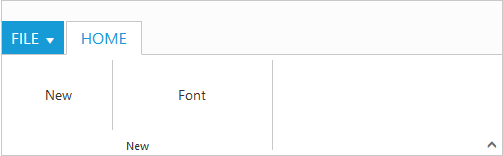
Adding Custom Content
Set group type as custom to add custom items such as div, table and custom controls. With type as custom, content can be added in two ways as specified below.
- HTML contents can be directly added into the groups as string content using
customContentproperty - Custom template id can be specified to render those specific custom template using
contentIDproperty
<div id="Ribbon"></div>
	<ul id="ribbon">
		<li><a>FILE </a>
			<ul>
				<li><a>New</a></li>
			</ul>
		</li>
	</ul>
	<button id="btn">Using Content ID</button>
	<script type="text/javascript">
		$(function () {
			$("#Ribbon").ejRibbon({
				width: "500",
				applicationTab: {
					type: ej.Ribbon.applicationTabType.menu,
					menuItemID: "ribbon"
				},
				tabs: [{
					id: "home",
					text: "HOME",
					groups: [{
						text: "New",
						type: "custom",
						customContent: "<button id='customContent'>Using Custom Content</button>"
					}, {
						text: "Data",
						type: "custom",
						contentID: "btn"
					}]
				}]
			});
		});
	</script>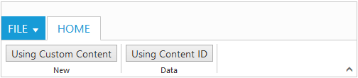
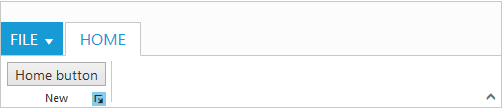
Group Expander
Set enableGroupExpander as true to show Group Expander for each group in Tab. These expanders can be customized using groupExpand event, such as to show popup dialog. To specify tooltip for the group expander of the group tabs.groups.groupExpanderSettings and
tabs.groups.groupExpanderSettings.toolTip can be used.
<div id="Ribbon"></div>
    <ul id="ribbon">
        <li><a>FILE </a>
            <ul>
                <li><a>New</a></li>
            </ul>
        </li>
    </ul>
    <button id="btn">Home button</button>
    <script type="text/javascript">
        $(function () {
            $("#Ribbon").ejRibbon({
                width: "500",
                applicationTab: {
                    type: ej.Ribbon.applicationTabType.menu,
                    menuItemID: "ribbon"
                },
                tabs: [{
                    id: "home",
                    text: "HOME",
                    groups: [{
                        text: "New",
                        alignType: ej.Ribbon.alignType.rows,
                        type: "custom",

                        // group expander enabled
                        enableGroupExpander: true,
                        contentID: "btn"
                    }]
                }],

                // event of group expander
                groupExpand: function (args) {
                    alert("Group expander click triggered");
                }
            });
        });
    </script>