Quick Access Toolbar
27 Sep 20174 minutes to read
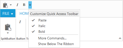
Quick Access Toolbar provides the shortcuts to the most commonly used commands by placing the controls at the Quick Access Toolbar section. It can be placed at the top or bottom of the Ribbon.
Set showQAT as true to enable Quick Access Toolbar in Ribbon. It supports the Button, Split Button, Toggle Button controls. The quickAccessMode is used to change the controls state in Quick Access Toolbar through options as toolbar,menu and none. Default value is none and QAT toolbar is created with specified controls added in Toolbar.
The toolbar option used to set controls visibility in Quick Access Toolbar.The menu option shows the controls in Quick Access Menu and does not show controls in Quick Access Toolbar.
Once the controls are visible in Toolbar , then controls state will be set as ticked in Quick Access Menu and vice versa.
The client side event for Quick Access Toolbar menu click is qatMenuItemClick and it will be triggered with QAT menu item click.
More Commands command provides with Quick Access Menu. This can be customized using qatMenuItemClick event, such as to show popup dialog.
<div id="Ribbon"></div>
		<ul id="ribbon">
			<li>
				<a>FILE</a>
				<ul>
					<li><a>New</a></li>
				</ul>
			</li>
		</ul>
		<ul id="split">
			<li><span>Paste</span></li>
		</ul>
		<script type="text/javascript">
			$(function () {
				$("#Ribbon").ejRibbon({
					width: 500,
					showQAT: true,
					applicationTab: {
						type: ej.Ribbon.applicationTabType.menu,
						menuItemID: "ribbon"
					},
					tabs: [{
						id: "home",
						text: "HOME",
						groups: [{
							text: "SplitButton",
							alignType: ej.Ribbon.alignType.columns,
							content: [{
								groups: [{
									id: "paste",
									text: "paste",
									toolTip: "Paste",
									type: ej.Ribbon.type.splitButton,
									quickAccessMode: ej.Ribbon.quickAccessMode.toolBar,
									splitButtonSettings: {
										contentType: ej.ContentType.ImageOnly,
										targetID: "split",
										prefixIcon: "e-icon e-ribbon e-ribbonpaste",
										buttonMode: "dropdown",
										arrowPosition: "bottom"
									}
								}],
								defaults: {
									type: ej.Ribbon.type.splitButton,
									width: 50,
									height: 70
								}
							}]
						}, {
							text: "Button",
							alignType: ej.Ribbon.alignType.rows,
							content: [{
								groups: [{
									id: "italic",
									text: "Italic",
									toolTip: "Italic",
									type: ej.Ribbon.type.button,
									quickAccessMode: ej.Ribbon.quickAccessMode.toolBar,
									toggleButtonSettings: {
										contentType: ej.ContentType.ImageOnly,
										defaultText: "Italic",
										activeText: "Italic",
										prefixIcon: "e-icon e-ribbon e-ribbonitalic"
									}
								}]
							}]
						}, {
							text: "Toggle",
							alignType: ej.Ribbon.alignType.columns,
							content: [{
								groups: [{
									id: "bold",
									toolTip: "Bold",
									type: ej.Ribbon.type.toggleButton,
									quickAccessMode: ej.Ribbon.quickAccessMode.toolBar,
									toggleButtonSettings: {
										contentType: ej.ContentType.ImageOnly,
										defaultText: "Bold",
										activeText: "Bold",
										defaultPrefixIcon: "e-icon e-ribbon bold",
										activePrefixIcon: "e-icon e-ribbon bold"
									}
								}],

							}]
						}]
					}]
				});
			});
		</script>
	<style>
		.e-ribbon .e-rbnquickaccessbar .e-ribbonpaste:before {
				font-size: 27px;
				left: -5px;
				top: -6px;
			}
			.e-ribbon .e-ribbonpaste:before {
				font-family: 'ej-ribbonfont';
				content: "\e169";
				font-size: 36px;
				position: relative;
				left: -9px;
				top: -4px;
			}
			.e-ribbon .e-ribbonitalic:before ,.e-ribbon .bold:before{
				font-family: 'ej-ribbonfont';
				font-size: 16px;
				left: -1px;
				position: relative;
				top: -1px;
			}
			.e-ribbon .e-ribbonitalic:before ,.e-ribbon .bold:before{
				content: "\e163";
			}
			.e-ribbon .bold:before {
				content: "\e15a";
			}
			.e-ribbon .e-rbnquickaccessbar .e-undo::before {
				font-size: 18px;
				line-height: 12px;
				text-indent: -3px;
			}
	</style>