How can I help you?
Getting Started
This section explains briefly how to create a Ribbon.
Script & CSS Reference
Ribbon have the following list of external script dependencies and these should be referred before ej Script files
-
jQuery1.7.1 and later versions
Also Ribbon have internal dependencies which includes ej.core libraries and child controls. For getting started, you can refer ej.web.all.min.js which includes ej.core and all Syncfusion JavaScript controls.
Add the specific theme reference to your HTML file by referring the appropriate ej.web.all.min.css which contains ej.widgets.core.min.css (layout related CSS) and ej.theme.min.css (theme related CSS) for all the Syncfusion controls.
Create a basic HTML file as shown below to create your Ribbon.
<!DOCTYPE html>
    <html xmlns="http://www.w3.org/1999/xhtml">
    <head>
    <title>Ribbon Control</title>
    <!-- style sheet for default theme(flat azure) -->
    <link href="http://cdn.syncfusion.com/33.1.44/js/web/flat-azure/ej.web.all.min.css" rel="stylesheet" />
    <!—jQuery dependency scripts-->
    <script src="http://cdn.syncfusion.com/js/assets/external/jquery-1.10.2.min.js"></script>
    <script src="http://cdn.syncfusion.com/js/assets/external/jquery.easing.1.3.min.js"></script>
    <!— ej script to render JavaScript control-->
    <script src="http://cdn.syncfusion.com/33.1.44/js/web/ej.web.all.min.js"></script>
    </head>
    <body>
    </body>
    </html>
NOTE
- In case if you don’t want to use
ej.web.all.min.jsfile, you can use ourcustom script generatorto create custom script file with required controls and its dependencies only- Ribbon’s sample level icons can be loaded using
ej.icons.CSSfrom the location (installed location)\ Syncfusion\Essential Studio\13.2.0.29\JavaScript\assets\css\web\ribbon-css”
Control Initialization
The Ribbon can be configured to the HTML<div> element. Add a <div> element with Id of Ribbon.
Ribbon can be initialized with Application Tab and UL list is needed for binding menu to application menu which can be specified through menuItemID which denotes id of UL.
Define the Application Tab with type as menu to render simple Ribbon control.
<div id="Ribbon"></div>
      <ul id="ribbon">
         <li>
            <a>FILE</a>
            <ul>
               <li><a>New</a></li>
               <li><a>Open</a></li>
               <li><a>Save</a></li>
               <li><a>Print</a></li>
            </ul>
         </li>
      </ul>
      <script type="text/javascript">
          $(function () {
              $("#Ribbon").ejRibbon({
                  width: "500px",
                  // application tab item defined here
                  applicationTab: {
                      type: ej.Ribbon.applicationTabType.menu,
                      menuItemID: "ribbon"
                  }
              });
          });
      </script>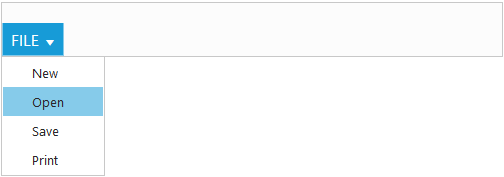
NOTE
Set the required
widthto Ribbon, else default parent container or window width will be considered
Adding Tabs
Tab is a set of related groups which are combined into single item. For creating Tab, id and text properties should be specified.
<div id="Ribbon"></div>
      <ul id="ribbon">
         <li>
            <a>FILE</a>
            <ul>
               <li><a>New</a></li>
               <li><a>Open</a></li>
            </ul>
         </li>
      </ul>
      <script type="text/javascript">
          $(function () {
              $("#Ribbon").ejRibbon({
                  width: "500px",
                  // application tab item defined here
                  applicationTab: {
                      Type: ej.Ribbon.applicationTabType.menu,
                      menuItemID: "ribbon"
                  },
                  // tab item defined here
                  tabs: [{
                      id: "home",
                      text: "HOME"
                  }]
              });
        });
      </script>
   </body>
</html>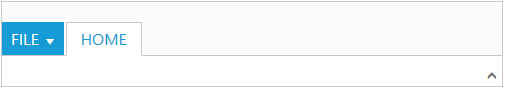
Configuring Groups
List of controls are combined as logical groups into Tab. Group alignment type as row/column, Default is row.
Create group item with text specified and add content group to Groups collection with ejButton control settings.
<div id="Ribbon"></div>
      <ul id="ribbon">
         <li>
            <a>FILE</a>
            <ul>
               <li><a>New</a></li>
            </ul>
         </li>
      </ul>
      <script type="text/javascript">
          $(function () {
             $("#Ribbon").ejRibbon({
                width: "500px",
                applicationTab: {
                    type: ej.Ribbon.applicationTabType.menu,
                    menuItemID: "ribbon"
                },
                // tab item defined here
                tabs: [{
                    id: "home",
                    text: "HOME",
                    // group with content & button settings
                    groups: [{
                        text: "New",
                        content: [{
                            groups: [{
                                id: "new",
                                text: "New",
                                buttonSettings: {
                                    contentType: ej.ContentType.ImageOnly,
                                    prefixIcon: "e-icon e-ribbon e-new",
                                }
                            }]
                        }]
                    }]
                }]
            });
       });
      </script>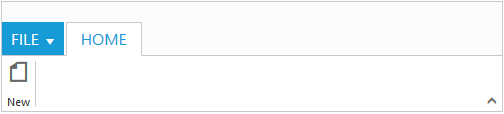
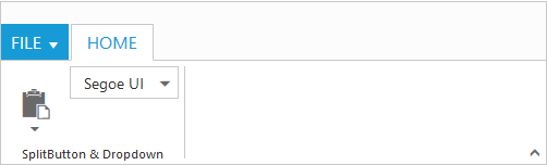
Adding Controls to Group
Syncfusion JavaScript Controls can be added to group’s content with corresponding type specified like button, split button, toggle button, dropdown list, gallery, custom, etc. Default type is button.
<div id="Ribbon"></div>
    <ul id="ribbon">
        <li>
          <a>FILE</a>
          <ul>
              <li><a>New</a></li>
          </ul>
        </li>
    </ul>
    <ul id="split">
        <li><span>Paste</span></li>
    </ul>
    <script type="text/javascript">
            var fontFamily = [{
                value: 1,
                text: "Segoe UI"
            }, {
                value: 2,
                text: "Arial"
            }];
            $(function () {
                $("#Ribbon").ejRibbon({
                    width: 500,
                    applicationTab: {
                        type: ej.Ribbon.applicationTabType.menu,
                        menuItemID: "ribbon"
                    },
                    tabs: [{
                        id: "home",
                        text: "HOME",
                        groups: [{
                            text: "SplitButton & Dropdown",
                            alignType: ej.Ribbon.alignType.columns,
                            content: [{
                                groups: [{
                                    id: "paste",
                                    text: "paste",
                                    // split button settings
                                    splitButtonSettings: {
                                        contentType: ej.ContentType.ImageOnly,
                                        targetID: "split",
                                        prefixIcon: "e-icon e-ribbon e-ribbonpaste",
                                        buttonMode: "dropdown",
                                        arrowPosition: "bottom"
                                    }
                                }],
                                defaults: {
                                    type: ej.Ribbon.type.splitButton,
                                    width: 50,
                                    height: 70
                                }
                            }, {
                                groups: [{
                                    id: "fontFamily",
                                    // dropdown list settings
                                    type: ej.Ribbon.type.dropDownList,
                                    dropdownSettings: {
                                        dataSource: fontFamily,
                                        value: "1",
                                        width: 100
                                    }
                                }]
                            }]
                        }]
                    }]
                });
            });
    </script>