Screen Tips
27 Sep 201724 minutes to read
ScreenTip/Tooltip is used to reduce the controls related Help that are needed to the end user to do control related actions.
HTML Tooltip
Standard html tooltip can be set using tooltip property of each group item.
<div id="Ribbon"></div>
    <ul id="ribbon">
        <li><a>FILE</a>
            <ul>
                <li><a>New</a></li>
                <li><a>Open</a></li>
            </ul>
        </li>
    </ul>
    <script type="text/javascript">
        $(function () {
            $("#Ribbon").ejRibbon({
                width: "20%",
                allowResizing: true,
                applicationTab: {
                    type: ej.Ribbon.applicationTabType.menu,
                    menuItemID: "ribbon",
                },
                tabs: [{
                    id: "home",
                    text: "HOME",
                    groups: [{
                        text: "Clipboard",
                        content: [{
                            groups: [{
                                id: "cut",
                                text: "Cut",

                                // set tooltip to cut button
                                toolTip: "Remove the selection and put it on clipboard"
                            },
                            {
                                id: "copy",
                                text: "Copy",

                                // set tooltip to copy button
                                toolTip: "Put a copy of selection on clipboard",
                                buttonSettings: {
                                    contentType: ej.ContentType.TextAndImage,
                                    prefixIcon: "e-icon e-ribbon e-ribboncopy"
                                }
                            }],
                            defaults: {
                                height: 70,
                                width: 60
                            }
                        }]
                    }]
                }]
            });
        });
    </script>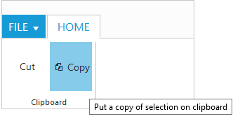
Custom Tooltip
Custom Tooltip is used to set detailed help to the user about the controls. You can set title, content and prefixIcon class to customize the tooltip with icons.
For Groups
Custom tooltip for each group controls can be specified. Such as to the controls button, split button, dropdown list etc.
<div id="Ribbon"></div>
    <script type="text/javascript">
        $(function () {
            $("#Ribbon").ejRibbon({
                width: "450",
                applicationTab: {
                    type: ej.Ribbon.applicationTabType.menu,
                    menuItemID: "ribbon",
                },
                tabs: [{
                    id: "home",
                    text: "HOME",
                    groups: [{
                        text: "Clipboard",
                        content: [{
                            groups: [{
                                id: "paste",
                                text: "Paste",

                                // set custom tooltip to paste button with icon settings
                                customToolTip: {
                                    title: "Paste",
                                    content: "<h6>Paste the content.<br/><br/>Add content on the Clipboard to your document.</h6>",

                                    // class to set icon
                                    prefixIcon: "e-icon e-pastetip"
                                }
                            }, {
                                id: "copy",
                                text: "Copy",

                                // set custom tooltip to copy button
                                customToolTip: {
                                    title: "Copy",
                                    content: "<h6>Copy the content.</h6>"
                                },
                                buttonSettings: {
                                    contentType: ej.ContentType.TextAndImage,
                                    prefixIcon: "e-icon e-ribbon e-ribboncopy"
                                }
                            }],
                            defaults: {
                                height: 70,
                                width: 60
                            }
                        }]
                    }]
                }]
            });
        });
    </script>
    <style type="text/css">
        .e-pastetip {
            background-image: url("../themes/common-images/ribbon/paste.png");
            background-repeat: no-repeat;
            height: 64px;
            width: 64px;
        }
    </style>
    <ul id="ribbon">
        <li><a>FILE</a>
            <ul>
                <li><a>New</a></li>
                <li><a>Open</a></li>
            </ul>
        </li>
    </ul>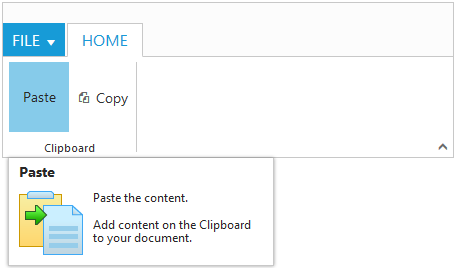
For Gallery
Custom tooltip for each gallery and custom gallery items button control can be specified.
NOTE
Custom gallery item
menuis not supported to Custom tooltip.
<div id="Ribbon"></div>
    <ul id="ribbon">
        <li><a>FILE</a> </li>
    </ul>
    <ul id="customMenu">
        <li>
            <a>New Quick Step</a>
            <ul>
                <li><a>Flag and Move</a></li>
            </ul>
        </li>
    </ul>
    <script type="text/javascript">
        $(function () {
            $("#Ribbon").ejRibbon({
                width: "500",
                applicationTab: {
                    type: ej.Ribbon.applicationTabType.menu,
                    menuItemID: "ribbon"
                },
                tabs: [{
                    id: "home",
                    text: "HOME",
                    groups: [{
                        type: "gallery",
                        text: "Gallery",
                        content: [{
                            groups: [{
                                id: "Gallery",
                                columns: 2,
                                itemHeight: 54,
                                itemWidth: 73,
                                expandedColumns: 3,
                                type: ej.Ribbon.type.gallery,
                                galleryItems: [{
                                    text: "Style 1",

                                    // custom tooltip of style 1 of gallery item
                                    customToolTip: {
                                        title: "Style 1",
                                        content: "<I>Style 1 to customize the table</I>"
                                    },
                                    buttonSettings: {
                                        contentType: ej.ContentType.ImageOnly,
                                        prefixIcon: "e-icon e-gallerycontent1 e-gbtnimg",
                                        cssClass: "e-gbtnposition"
                                    }
                                }, {
                                    text: "Style 2",
                                    customToolTip: {
                                        title: "Style 2",
                                        content: "<I>Style 2 to customize the table</I>"
                                    },
                                    buttonSettings: {
                                        contentType: ej.ContentType.ImageOnly,
                                        prefixIcon: "e-icon e-gallerycontent2 e-gbtnimg",
                                        cssClass: "e-gbtnposition"
                                    }
                                }, {
                                    text: "Style 3",
                                    customToolTip: {
                                        title: "Style 3",
                                        content: "<I>Style 3 to customize the table</I>"
                                    },
                                    buttonSettings: {
                                        contentType: ej.ContentType.ImageOnly,
                                        prefixIcon: "e-icon e-gallerycontent3 e-gbtnimg",
                                        cssClass: "e-gbtnposition"
                                    }
                                }, {
                                    text: "Style 4",
                                    customToolTip: {
                                        title: "Style 4",
                                        content: "<I>Style 4 to customize the table</I>"
                                    },
                                    buttonSettings: {
                                        contentType: ej.ContentType.ImageOnly,
                                        prefixIcon: "e-icon e-gallerycontent4 e-gbtnimg",
                                        cssClass: "e-gbtnposition"
                                    }
                                }],
                                customGalleryItems: [{
                                    text: "Clear Formatting",
                                    toolTip: "Clear Formatting",
                                    customItemType: ej.Ribbon.customItemType.button,

                                    // custom tooltip of style 1 of custom gallery item
                                    customToolTip: {
                                        title: "Clear Format",
                                        content: "<I>To clear formatting</I>"
                                    },
                                    buttonSettings: {
                                        cssClass: "e-extrabtnstyle"
                                    }
                                }, {
                                    customItemType: ej.Ribbon.customItemType.menu,
                                    menuId: "customMenu",
                                    menuSettings: {
                                        openOnClick: false
                                    }
                                }]
                            }]
                        }]
                    }]
                }]
            });
        });
    </script>
    <style type="text/css">
        .e-gallerycontent1 {
            background-position: 0 -105px;
        }
        .e-gallerycontent2 {
            background-position: -69px -105px;
        }
        .e-gallerycontent3 {
            background-position: -136px -105px;
        }
        .e-gallerycontent4 {
            background-position: 0 -53px;
        }
        .e-gbtnposition {
            margin-top: 5px;
        }
        .e-gbtnimg {
            background-image: url("../themes/common-images/ribbon/homegallery.png");
            background-repeat: no-repeat;
            height: 64px;
            width: 64px;
        }
        .e-extracontent .e-extrabtnstyle {
            padding-left: 28px;
            text-align: left;
        }
    </style>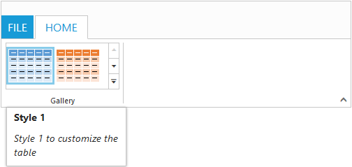
For Expand Pin
Specifies the custom tooltip for expand pin in the Ribbon.
<div id="defaultRibbon"></div>
                 <ul id="ribbon">
				    <li><a>FILE</a>
                       <ul>
                         <li><a>New</a></li>
                         <li><a>Open</a></li>
			    	  </ul>
				   </li>
                </ul>
            </div>
     <script>
        $(function() {
        $("#defaultRibbon").ejRibbon({
            width: "300",
            expandPinSettings: {
                customToolTip: {
                    title: "Collapse the Ribbon",
                    content: "<h6>Click the icon to collapse the Ribbon.</h6>"
                }
            },
            applicationTab: {
                type: ej.Ribbon.applicationTabType.menu,
                menuItemID: "ribbon",
                menuSettings: {
                    openOnClick: false
                }
            },
            tabs: [{
                id: "home",
                text: "HOME",
                groups: [{
                    text: "New",
                    alignType: ej.Ribbon.alignType.rows,
                    content: [{
                        groups: [{
                            id: "new",
                            text: "New",
                            toolTip: "New",
                            buttonSettings: {
                                contentType: ej.ContentType.ImageOnly,
                                imagePosition: ej.ImagePosition.ImageTop,
                                prefixIcon: "e-icon e-ribbon e-new",
                                click: "executeAction"
                            }
                        }],
                        defaults: {
                            type: ej.Ribbon.type.button,
                            width: 60,
                            height: 70
                        }
                    }],
                }],
            }]
        });
    });
     </script>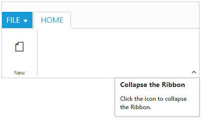
For Collapse Pin
Specifies the custom tooltip for collapse pin in the Ribbon.
<div id="defaultRibbon"></div>
                 <ul id="ribbon">
				    <li><a>FILE</a>
                       <ul>
                         <li><a>New</a></li>
                         <li><a>Open</a></li>
			    	  </ul>
				   </li>
                </ul>
            </div>
     <script>
        $(function() {
        $("#defaultRibbon").ejRibbon({
            width: "300",
            collapsePinSettings: {
                customToolTip: {
                    title: "Pin the Ribbon",
                    content: "<h6>Keep it open while you work</h6>"
                }
            },
            applicationTab: {
                type: ej.Ribbon.applicationTabType.menu,
                menuItemID: "ribbon",
                menuSettings: {
                    openOnClick: false
                }
            },
            tabs: [{
                id: "home",
                text: "HOME",
                groups: [{
                    text: "New",
                    alignType: ej.Ribbon.alignType.rows,
                    content: [{
                        groups: [{
                            id: "new",
                            text: "New",
                            toolTip: "New",
                            buttonSettings: {
                                contentType: ej.ContentType.ImageOnly,
                                imagePosition: ej.ImagePosition.ImageTop,
                                prefixIcon: "e-icon e-ribbon e-new",
                                click: "executeAction"
                            }
                        }],
                        defaults: {
                            type: ej.Ribbon.type.button,
                            width: 60,
                            height: 70
                        }
                    }],
                }],
            }]
        });
    });
     </script>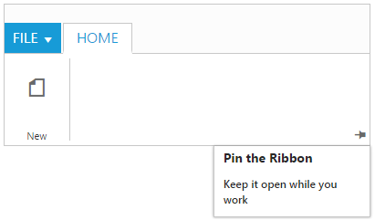
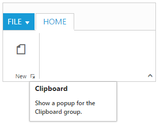
For GroupExpander
Custom tooltip for each group expander can be specified.
<div id="defaultRibbon"></div>
               <ul id="ribbon">
				  <li><a>FILE</a>
                    <ul>
                    <li><a>New</a></li>
                    <li><a>Open</a></li>
			    	</ul>
				</li>
           </ul>
        </div>
     <script>
        $(function() {
        $("#defaultRibbon").ejRibbon({
            width: "300",
            applicationTab: {
                type: ej.Ribbon.applicationTabType.menu,
                menuItemID: "ribbon",
                menuSettings: {
                    openOnClick: false
                }
            },
            tabs: [{
                id: "home",
                text: "HOME",
                groups: [{

                    text: "New",
                    alignType: ej.Ribbon.AlignType.Columns,
                    enableGroupExpander: true,
                    groupExpanderSettings: {
                        customToolTip: {
                            title: "Clipboard",
                            content: "<h6>Show a popup for the Clipboard group.</h6>"
                        }
                    },
                    alignType: ej.Ribbon.alignType.rows,
                    content: [{
                        groups: [{
                            id: "new",
                            text: "New",
                            toolTip: "New",
                            buttonSettings: {
                                contentType: ej.ContentType.ImageOnly,
                                imagePosition: ej.ImagePosition.ImageTop,
                                prefixIcon: "e-icon e-ribbon e-new",
                                click: "executeAction"
                            }
                        }],
                        defaults: {
                            type: ej.Ribbon.type.button,
                            width: 60,
                            height: 70
                        }
                    }],
                }],
            }]
        });
    });
     </script>