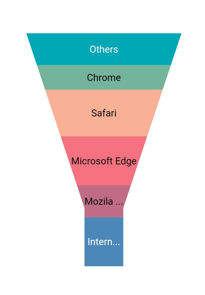
Data label in Flutter Funnel Chart
18 Nov 201816 minutes to read
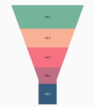
Data labels can be added to a chart series by enabling the isVisible option in the dataLabelSettings. You can use the following properties to customize the appearance.
-
color- used to change the background color of the data label shape. -
borderWidth- used to change the stroke width of the data label shape. -
borderColor- used to change the stroke color of the data label shape. -
alignment- aligns the data label text toChartAlignment.near,ChartAlignment.centerandChartAlignment.far. -
textStyle- used to change the data label text color, size, font family, font style, and font weight. -
color- used to change the data label color. -
fontFamily- used to change the font family for the data label. -
fontStyle- used to change the font style for the data label. -
fontWeight- used to change the font weight for the data label. -
fontSize- used to change the font size for the data label. -
margin- used to change the margin size for data labels. -
opacity- used to control the transparency of the data label. -
labelAlignment- used to align the Funnel data label positions. The available options to customize the positions areChartDataLabelAlignment.outer,ChartDataLabelAlignment.auto,ChartDataLabelAlignment.top,ChartDataLabelAlignment.bottom, andChartDataLabelAlignment.middle. -
borderRadius- used to add the rounded corners to the data label shape. -
angle- used to rotate the labels.
@override
    Widget build(BuildContext context) {
        List<ChartData> chartData = [
            ChartData('Jan', 35),
            ChartData('Feb', 28),
            ChartData('Mar', 38),
            ChartData('Apr', 32),
            ChartData('May', 40)
        ];
        return Scaffold(
            body: Center(
                child: Container(
                    child: SfFunnelChart(
                        series: FunnelSeries<ChartData, String>(
                                dataSource: chartData,
                                xValueMapper: (ChartData data, _) => data.x,
                                yValueMapper: (ChartData data, _) => data.y,
                                dataLabelSettings: DataLabelSettings(
                                    // Renders the data label
                                    isVisible: true
                                )
                            )
                    )
                )
            )
        );
    }
    class ChartData{
        ChartData(this.x, this.y);
        final String x;
        final double? y;
    }
Positioning the labels
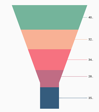
The labelAlignment property is used to position the Funnel chart data labels at the ChartDataLabelAlignment.top, ChartDataLabelAlignment.bottom, ChartDataLabelAlignment.auto, ChartDataLabelAlignment.outer, and ChartDataLabelAlignment.middle positions relative to the actual data point. By default, labels are positioned at ChartDataLabelAlignment.auto. You can move the labels horizontally and vertically using the OffsetX and OffsetY properties respectively.
The labelPosition property is used to place the Funnel series data labels either ChartDataLabelPosition.inside or ChartDataLabelPosition.outside. By default, the Funnel chart label is placed ChartDataLabelPosition.inside the series.
@override
    Widget build(BuildContext context) {
        return Scaffold(
            body: Center(
                child: Container(
                    child: SfFunnelChart(
                        series: FunnelSeries<ChartData, String>(
                                dataSource: chartData,
                                xValueMapper: (ChartData data, _) => data.x,
                                yValueMapper: (ChartData data, _) => data.y,
                                dataLabelSettings: DataLabelSettings(
                                    isVisible: true,
                                    // Positioning the data label
                                    labelPosition: ChartDataLabelPosition.outside
                                )
                            )
                    )
                )
            )
        );
    }
Note: The
labelAlignmentproperty is used to position the Funnel chart labels, whereas thelabelPositionproperty is used to position the Funnel chart labels.
Apply series color
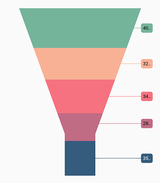
The useSeriesColor property is used to apply the series color to the background color of the data labels. The default value of this property is false.
@override
    Widget build(BuildContext context) {
        return Scaffold(
            body: Center(
                child: Container(
                    child: SfFunnelChart(
                        series: FunnelSeries<ChartData, String>(
                                dataSource: chartData,
                                xValueMapper: (ChartData data, _) => data.x,
                                yValueMapper: (ChartData data, _) => data.y,
                                dataLabelSettings: DataLabelSettings(
                                    isVisible: true,
                                    // Positioning the data label
                                    labelPosition: ChartDataLabelPosition.outside,
                                    // Renders background rectangle and fills it with series color
                                    useSeriesColor: true
                                )
                            )
                    )
                )
            )
        );
    }
Hide data label for 0 value
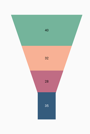
Data labels and their connector lines in the Funnel chart for points with a value of 0 can be hidden using the showZeroValue property. This defaults to true.
@override
    Widget build(BuildContext context) {
        return Scaffold(
            body: Center(
                    child:SfFunnelChart(
                        series: FunnelSeries<ChartData, num>(
                            dataSource: [
                                ChartData(11, 35),
                                ChartData(12, 28),
                                ChartData(13, 0),
                                ChartData(14, 32),
                                ChartData(15, 40)
                            ],
                            xValueMapper: (ChartData data, _) => data.xValue,
                            yValueMapper: (ChartData data, _) => data.yValue,
                            dataLabelSettings: DataLabelSettings(
                                showZeroValue: false,
                                isVisible: true
                            ),
                        )
                    )
            )
        );
    }
Data label saturation color
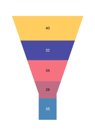
If the user doesn’t provide a text color for the data label, then the saturation color is applied to the data label text by default. That is, if the data point background color intensity is dark, the data label will render in white color (#FFFFFF), and if the data point background color intensity is light, the data label will render in black color (#000000).
Overflow mode
The action for data labels when they overflow their region can be changed based on this property. If the overflowMode property is set to OverflowMode.none, then labelIntersectAction takes priority; otherwise, overflowMode takes priority.
The default is OverflowMode.none.
Note: This is applicable only to pie, doughnut, pyramid, and funnel series types.
Widget build(BuildContext context) {
        return Container(
            child: SfFunnelChart(
            series: FunnelSeries<ChartData, String>(
             dataLabelSettings: DataLabelSettings(
               isVisible: true,
               overflowMode: OverflowMode.trim
                    ),
                ),
            ),
        );
    }