- Schedule Header Customization
- Taskbar Customization
- Dependency line customization
- Weekend background
- Themes
- Configuring CSS Class
- Customize rows and cells
Contact Support
Appearance and Styling
22 Mar 20189 minutes to read
The look and feel of the Gantt control can be customized by applying themes and formatting the schedule header.
Schedule Header Customization
Schedule Header Unit Format
You can change the format of schedule headers in various timescale modes by using DayHeaderFormat, HourHeaderFormat, WeekHeaderFormat, MonthHeaderFormat and YearHeaderFormat properties available in ScheduleHeaderSettings property.
And you can change the background of weekends available in timescale by using WeekendBackground property, please refer the following code example.
@(Html.EJ().Gantt("GanttContainer")
    //...
    .ScheduleHeaderSettings(sh=>
        {
            sh.WeekHeaderFormat("MMM yyyy");
            sh.DayHeaderFormat("d");
            sh.HourHeaderFormat("HH");
            sh.MonthHeaderFormat("MMM");
            sh.YearHeaderFormat("yyyy");
            sh.WeekendBackground("#F2F2F2");
        })
    )
@(Html.EJ().ScriptManager())
The following screenshot shows the customized format schedule header in Gantt control.
Schedule Header Unit Width
Schedule header units width value can be customized by using ScheduleHeaderSettings.TimescaleUnitSize property. The default value of this property was 100%, we can set value for this property from 50% to 500%.
The following code example shows how to use this properties.
@(Html.EJ().Gantt("Gantt")
    //..
    .ScheduleHeaderSettings(sh=>
        {
            sh.TimescaleUnitSize("70%");
        })
    )
@(Html.EJ().ScriptManager())
The following screenshot shows the output of above code example.
Schedule header units with 300% width value
Schedule header units with 70% width value
Taskbar Customization
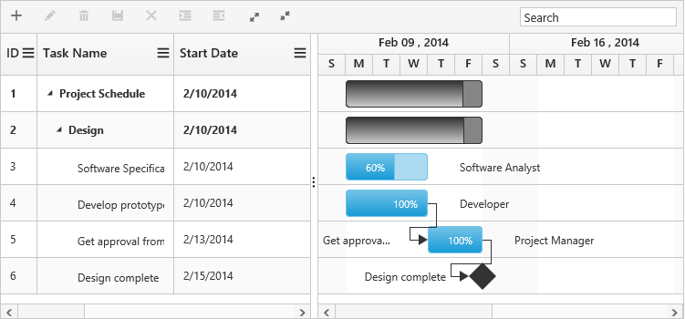
Taskbar Background
Background color of child taskbars and parent taskbars can be customized by using TaskbarBackground and ParentTaskbarBackground properties. The following code example shows how to use this properties.
@(Html.EJ().Gantt("Gantt")
    //..
    .TaskbarBackground("#1764d7")
    .ParentTaskbarBackground("#91dc88")
    )
@(Html.EJ().ScriptManager())
The following screenshot shows the customized parent and child taskbars in Gantt.

Taskbar Height
Height of child taskbars and parent taskbars can be customized by using TaskbarHeight property. The following code example shows how to use the property.
@(Html.EJ().Gantt("Gantt")
    //..
    .TaskbarHeight(30)
    .RowHeight(40)
    )
@(Html.EJ().ScriptManager())
The following screenshot shows the output of above code example.
NOTE
TaskbarHeightvalue should be lower thanRowHeightproperty value.
Progressbar Customization
Background color of child task’s progress bar and parent task’s progress bar can be customized by using ProgressbarBackground and ParentProgressbarBackground properties. Progress bars height can be changed by using ProgressbarHeight property. The visibility of progress status label inside the taskbars can be changed by using ShowProgressStatus property.
The following code example shows how to use this properties.
@(Html.EJ().Gantt("Gantt")
    //..
    .ProgressbarBackground("#8c83b1")
    .ParentProgressbarBackground("#af2f2f")
    .ProgressbarHeight(80)
    .ShowProgressStatus(true)
    )
@(Html.EJ().ScriptManager())
The following screenshot shows the customized progress bar of parent and child tasks in Gantt.

NOTE
ProgressbarHeightproperty value should be in 0 to 100, because this value was considered as percentage value of taskbar height value.
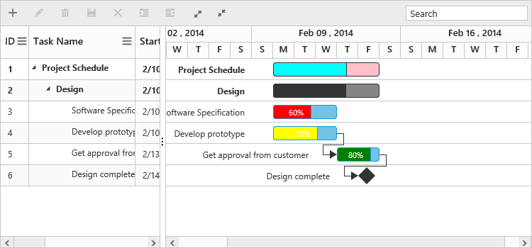
Conditional Formatting
The Taskbar can be customized based on the task information in Gantt control by using QueryTaskbarInfo event. The following code example shows how to customize the Taskbar in Gantt control.
@(Html.EJ().Gantt("Gantt")
    .ClientSideEvents(eve =>
    {
        eve.QueryTaskbarInfo("queryTaskbarInfo");
    })
    )
@(Html.EJ().ScriptManager())
<script type="text/javascript">
       function queryTaskbarInfo(args){
          //queryTaskbarInfo will be triggered when a taskbar is rendered
            if (args.data.level === 0) {
                args.parentTaskbarBackground = "pink";
                args.parentProgressbarBackground = "cyan";
            } else {
                if (args.data.status == "60") {
                    args.progressbarBackground = "red";
                } else if (args.data.status == "70") {
                    args.progressbarBackground = "yellow";
                } else if (args.data.status == "80") {
                    args.progressbarBackground = "green";
                }
            }
		}
</script>
The following screenshot shows the customized taskbar in Gantt control.
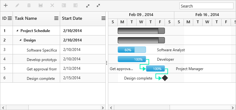
Dependency line customization
Width and background color of dependency line in Gantt can be customized by using ConnectorlineWidth and ConnectorLineBackground properties. The following code example shows how to use this properties.
@(Html.EJ().Gantt("Gantt")
    .ConnectorlineWidth(2)
    .ConnectorLineBackground("#0aecb8")
    )
@(Html.EJ().ScriptManager())
The following screenshot shows the customized dependency lines in Gantt.
Weekend background
Background color of weekends in Gantt can be changed by using weekendBackground property. The following code example shows how to use this properties.
@(Html.EJ().Gantt("Gantt")
         //..
    .WeekendBackground("rgba(116, 195, 231, 0.26)")
    )
@(Html.EJ().ScriptManager())
The following screenshot shows the customized dependency lines in Gantt.

Themes
The following are the types of themes available in Gantt control.
1.Flat Azure
2.Flat Azure Dark
3.Flat Lime
4.Flat Lime Dark
5.Flat Saffron
6.Flat Saffron Dark
7.Gradient Azure
8.Gradient Azure Dark
9.Gradient Lime
10.Gradient Lime Dark
11.Gradient Saffron
12.Gradient Saffron Dark
13.Bootstrap
14.High Contrast 01
15.High Contrast 02
16.Material
17.Office-365
The theme (Gradient lime) can be applied to the Gantt control by using the style sheet from the online link as follows.
<!DOCTYPE html>

<html xmlns="http://www.w3.org/1999/xhtml">
    <head>
    <title>Getting Started with Gantt Control for JavaScript</title>
    <!-- style sheet for default theme(gradient lime) -->
    <link href="http://cdn.syncfusion.com/28.1.33/js/web/flat-azure/ej.web.all.min.css" rel="stylesheet" />
    //...
</html>
The following screenshot shows the Gantt control with Gradient-lime theme.
Configuring CSS Class
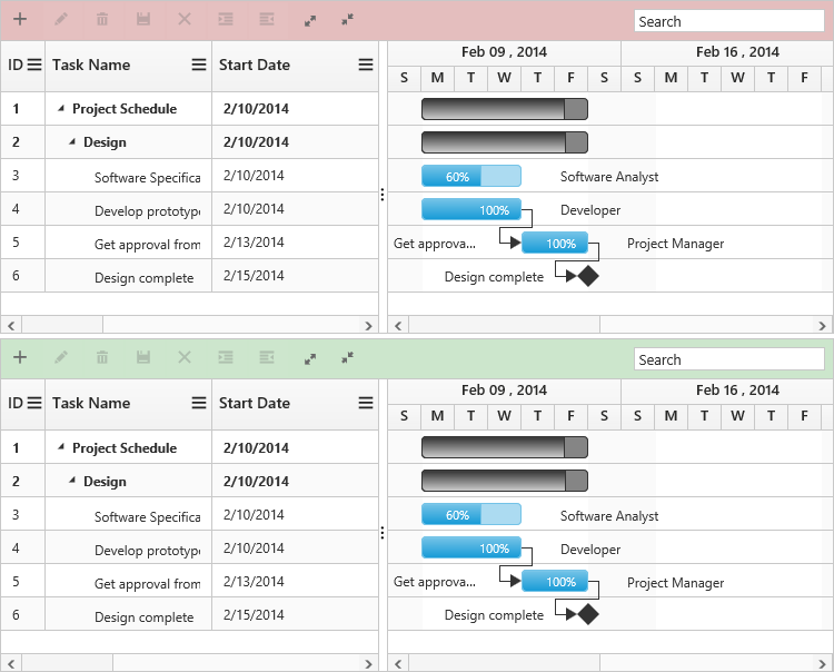
In Gantt CssClass property was used to apply different customized styles to multiple Gantt controls available in same page. The following code example shows how to apply different background color for each Gantt control’s toolbar element.
<style>
    .c-class1.e-gantt .e-toolbar {
        background-color: rgba(169, 45, 45, 0.31);
    }
    .c-class2.e-gantt .e-toolbar {
        background-color: rgba(0, 128, 0, 0.2);
    }
</style>
@(Html.EJ().Gantt("GanttContainer")
    .CssClass("c-class1")
    )
@(Html.EJ().Gantt("GanttContainer1")
    .CssClass("c-class2")
    )
@(Html.EJ().ScriptManager())
The below screenshot shows the output of above code example.
Customize rows and cells
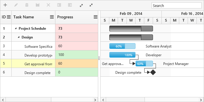
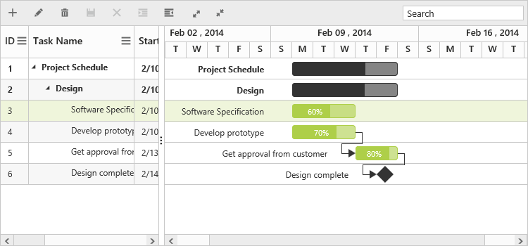
While rendering the rows in Grid part of Gantt RowDataBound event and QueryCellInfo event will be triggered for each rows and cells. Using this event we can customize the rows and cells. The below code example shows how to customize the cell and row element using this events.
@(Html.EJ().Gantt("Gantt")
    .ClientSideEvents(eve =>
    {
        eve.QueryCellInfo("queryCellInfo");
        eve.RowDataBound("rowDataBound");
    })
    )
@(Html.EJ().ScriptManager())
<script type="text/javascript">
    function queryCellInfo(args) {
        if (args.column.mappingName == "progress") {
            if (args.data.item["progress"] < 80)
                $(args.cellElement).css("background-color", "rgba(255, 0, 0, 0.12)");
            else
                $(args.cellElement).css("background-color", "rgba(86, 226, 86, 0.25)");
        }
    }
    function rowDataBound(args) {
        if (args.data.item["taskID"] == 5)
            $(args.rowElement).css("background-color", "rgba(251, 255, 0, 0.24)");
    }
</script>
The below screenshot shows the output of above code example.