Row in ASP.NET Core Grid
22 Jun 202217 minutes to read
It represents the record details that are fetched from the datasource.
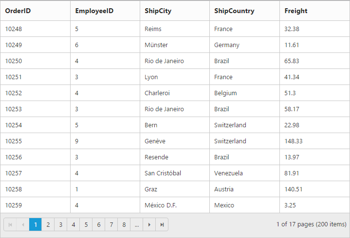
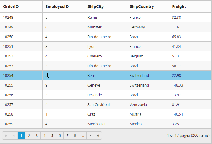
Row hover
You can see the mouse hovering effect on the corresponding Grid rows using the enable-row-hover property, its value is true by default.
The following code example describes the previous behavior.
<ej-grid id="FlatGrid" allow-paging="true" enable-row-hover="true" datasource="ViewBag.DataSource">
        <e-columns>
            <e-column field="OrderID" header-text="OrderID"></e-column>
            <e-column field="EmployeeID" header-text="EmployeeID"></e-column>
            <e-column field="ShipCity" header-text="ShipCity"></e-column>
            <e-column field="ShipCountry" header-text="ShipCountry"></e-column>
            <e-column field="Freight" header-text="Freight"></e-column>
        </e-columns>
   </ej-grid>
namespace MVCSampleBrowser.Controllers
{
public class GridController : Controller
{
public IActionResult GridFeatures()
{
var DataSource = new NorthwindDataContext().OrdersViews.ToList();
ViewBag.DataSource = DataSource;
return View();
}
}
}The following output is displayed as a result of the previous code example.
Details template
It provides a detailed view /additional information about each row of the grid. You can render any type of JsRender template and assign the script template id in the details-template property. Also, you can change HTML elements in detail template row into JavaScript controls using the the details-data-bound event.
On enabling details template, new column will be added in grid with an expander button in it and that can be expanded or collapsed to show or hide the underlying details row respectively.
NOTE
It is a standard way to enclose the template within the
scripttag withtypeas “text/x-jsrender”.
The following code example describes the previous behavior.
<ej-grid id="FlatGrid" allow-paging="true" details-template="#tabGridContents" details-data-bound="detailGridData" datasource="ViewBag.DataSource">
        <e-columns>
            <e-column field="EmployeeID" header-text="EmployeeID"></e-column>
            <e-column field="FirstName" header-text="FirstName"></e-column>
            <e-column field="Title" header-text="Title"></e-column>
            <e-column field="City" header-text="City"></e-column>
            <e-column field="Country" header-text="Country"></e-column>
       </e-columns>
   </ej-grid>
namespace MVCSampleBrowser.Controllers
{
public class GridController : Controller
{
public IActionResult GridFeatures()
{
var DataSource = new NorthwindDataContext().OrdersViews.ToList();
ViewBag.DataSource = DataSource;
return View();
}
}
}<script id="tabGridContents" type="text/x-jsrender">
<div class="tabcontrol" id="Test">
<ul>
<li><a href="#gridTab{{:EmployeeID }}">Stock Grid</a></li>
</ul>
<div id="gridTab{{:EmployeeID }}">
<div id="detailGrid">
</div>
</div>
</div>
</script>
<script src="~/Scripts/jsondata.min.js"></script>
<script type="text/javascript">
function detailGridData(e) {
var filteredData = e.data["EmployeeID"];
// the datasource "window.ordersView" is referred from jsondata.min.js
var data = ej.DataManager(window.ordersView).executeLocal(ej.Query().where("EmployeeID", "equal", parseInt(filteredData), true).take(5));
e.detailsElement.find("#detailGrid").ejGrid({
dataSource: data,
columns: [
{field: "OrderID"},
{field: "EmployeeID"},
{field: "ShipCity"},
{field: "ShipCountry"},
{field: "Freight"}
]
});
e.detailsElement.find(".tabcontrol").ejTab();
}
</script>The following output is displayed as a result of the previous code example.

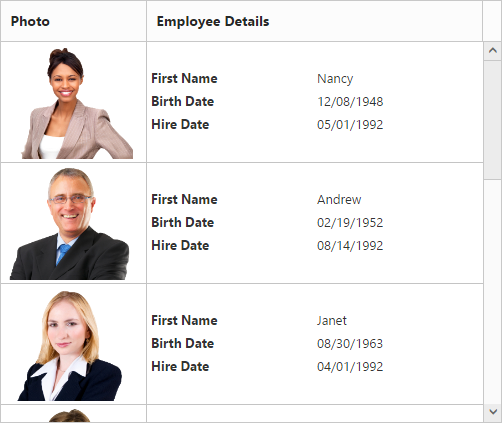
Row template
Row template enables you to set the customized look and behavior to grid all rows.row-template property can be used bind the id of HTML template.
The following code example describes the previous behavior.
<script id="templateData" type="text/x-jsrender">
      <tr>
             <td class="photo">
                 <img style="width:130px;height: 160px" src="/15.1.0.41/themes/web/images/employees/{{:EmployeeID }}.png" alt="{{:EmployeeID }}" />
             </td>
             <td class="details">
                 <table class="CardTable" cellpadding="3" cellspacing="2">
                      <colgroup>
                              <col width="50%">
                              <col width="50%">
                      </colgroup>
                      <tbody>
                          <tr>
                              <td class="CardHeader">First Name</td>
                              <td>{{:FirstName }} </td>
                          </tr>
                          <tr>
                              <td class="CardHeader">Last Name</td>
                              <td>{{:LastName }}</td>
                          </tr>
                          <tr>
                              <td class="CardHeader">Title</td>
                              <td>{{:Title }}</td>
                          </tr>
                      </tbody>
                 </table>
            </td>
      </tr>
</script><style>
.photo img {
width: 130px;
}
.photo, .details {
border-color: #c4c4c4;
border-style: solid;
}
.photo {
border-width: 1px 0px 0px 0px;
}
.details {
border-width: 1px 0px 0px 1px;
}
.details > table {
width: 100%;
}
.CardHeader {
font-weight: bolder;
}
</style><ej-grid id="FlatGrid" allow-paging="true" row-template="#templateData" allow-scrolling="true" datasource="ViewBag.DataSource">
<e-scroll-settings width="500" height="480"></e-scroll-settings>
<e-columns>
<e-column header-text="Photo" width="30"></e-column>
<e-column header-text="Employee Details" width="70"></e-column>
</e-columns>
</ej-grid>namespace MVCSampleBrowser.Controllers
{
public class GridController : Controller
{
public IActionResult GridFeatures()
{
var DataSource = new NorthwindDataContext().OrdersViews.ToList();
ViewBag.DataSource = DataSource;
return View();
}
}
}The following output is displayed as a result of the previous code example.
Alternate row styling
Alternate row styling enhances the readability of grid rows by setting different background color for every alternate row. You can enable the alternative row styling in grid by using the enable-alt-row property.
By default, its value is true, so the following code example describes the how to turn off alternate row behavior.
<ej-grid id="FlatGrid" allow-paging="true" enable-alt-row="false" datasource="ViewBag.DataSource">
        <e-columns>
            <e-column field="OrderID" header-text="OrderID"></e-column>
            <e-column field="EmployeeID" header-text="EmployeeID"></e-column>
            <e-column field="ShipCity" header-text="ShipCity"></e-column>
            <e-column field="ShipCountry" header-text="ShipCountry"></e-column>
            <e-column field="Freight" header-text="Freight"></e-column>
        </e-columns>
   </ej-grid>
namespace MVCSampleBrowser.Controllers
{
public class GridController : Controller
{
public IActionResult GridFeatures()
{
var DataSource = new NorthwindDataContext().OrdersViews.ToList();
ViewBag.DataSource = DataSource;
return View();
}
}
}The following output is displayed as a result of the previous code example.