Display Type in Xamarin Tabbed View (SfTabView)
8 Aug 202211 minutes to read
By default, the tab view control displays the title of each tab item. It can be changed to any of the following types:
- Text only
- Image only
- Image with text
- No header
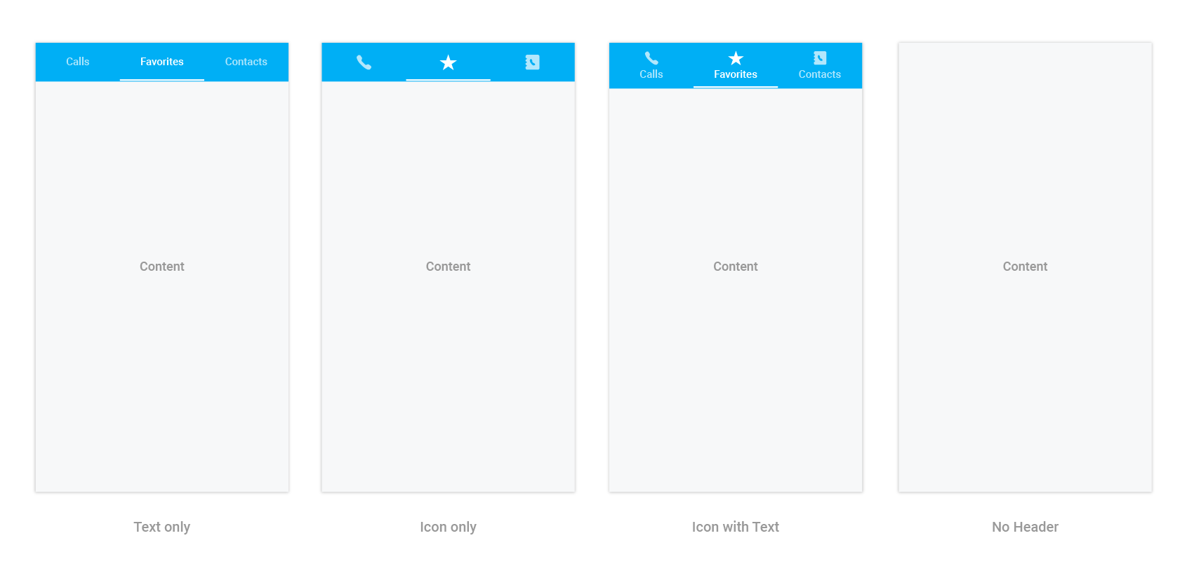
The tab view can be changed by setting the DisplayMode property of SfTabView.
<ContentPage xmlns="http://xamarin.com/schemas/2014/forms"
             xmlns:x="http://schemas.microsoft.com/winfx/2009/xaml"
             xmlns:tabView="clr-namespace:Syncfusion.XForms.TabView;assembly=Syncfusion.SfTabView.XForms"
             x:Class="TabView.TabView">
    <ContentPage.Content>
         <tabView:SfTabView OverflowMode="DropDown"
                            EnableSwiping="false"
                            VisibleHeaderCount="3"
                            DisplayMode="ImageWithText">
            <tabView:SfTabItem Title="Call"
                               SelectionColor="Aqua">
                <tabView:SfTabItem.Content>
                    <StackLayout>
                        <Grid BackgroundColor="Green"/>
                        <Button Text="Contacts" WidthRequest="300" />
                        <Button Text="Location" WidthRequest="300" />
                        <Button Text="Email" WidthRequest="300" />
                    </StackLayout>
                </tabView:SfTabItem.Content>
            </tabView:SfTabItem>
            <tabView:SfTabItem Title="Favorites">
                <tabView:SfTabItem.Content>
                    <Grid BackgroundColor="Green" x:Name="FavoritesGrid"/>
                </tabView:SfTabItem.Content>
            </tabView:SfTabItem>
            <tabView:SfTabItem Title="Contacts">
                <tabView:SfTabItem.Content>
                    <Grid BackgroundColor="Blue" x:Name="ContactsGrid" />
                </tabView:SfTabItem.Content>
            </tabView:SfTabItem>
            <tabView:SfTabItem Title="Location">
                <tabView:SfTabItem.Content>
                    <Grid BackgroundColor="Pink" x:Name="LocationGrid" />
                </tabView:SfTabItem.Content>
            </tabView:SfTabItem>
            <tabView:SfTabItem Title="Email">
                <tabView:SfTabItem.Content>
                    <Grid BackgroundColor="Navy" x:Name="EmailGrid" />
                </tabView:SfTabItem.Content>
            </tabView:SfTabItem>
            <tabView:SfTabItem Title="Alternative">
                <tabView:SfTabItem.Content>
                    <Grid BackgroundColor="Blue" x:Name="AlternativeGrid" />
                </tabView:SfTabItem.Content>
            </tabView:SfTabItem>
        </tabView:SfTabView>
    </ContentPage.Content>
</ContentPage>
using Syncfusion.XForms.TabView;
using Xamarin.Forms;
using Xamarin.Forms.Xaml;
namespace TabView
{
[XamlCompilation(XamlCompilationOptions.Compile)]
public partial class TabView : ContentPage
{
SfTabView tabView;
public TabView ()
{
InitializeComponent ();
tabView = new SfTabView();
var allContactsGrid = new Grid { BackgroundColor = Color.Red };
var favoritesGrid = new Grid { BackgroundColor = Color.Green };
var contactsGrid = new Grid { BackgroundColor = Color.Blue };
var overflowButtonSettings = new OverflowButtonSettings();
overflowButtonSettings.BackgroundColor = Color.Yellow;
overflowButtonSettings.DisplayMode = OverflowButtonDisplayMode.Text;
overflowButtonSettings.Title = "OverFlow";
overflowButtonSettings.TitleFontSize = 10;
overflowButtonSettings.TitleFontColor = Color.Blue;
tabView.OverflowButtonSettings = overflowButtonSettings;
tabView.EnableSwiping = false;
tabView.DisplayMode = TabDisplayMode.ImageWithText;
var tabItems = new TabItemCollection
{
new SfTabItem()
{
Title = "Calls",
Content = allContactsGrid,
SelectionColor = Color.Aqua
},
new SfTabItem()
{
Title = "Favorites",
Content = favoritesGrid
},
new SfTabItem()
{
Title = "Contacts",
Content = contactsGrid
},
new SfTabItem()
{
Title = "Location",
Content = contactsGrid
},
new SfTabItem()
{
Title = "Email",
Content = contactsGrid
},
new SfTabItem()
{
Title = "Alternative",
Content = contactsGrid
}
};
tabView.Items = tabItems;
tabView.BackgroundColor = Color.Aqua;
tabView.OverflowMode = OverflowMode.DropDown;
this.Content = tabView;
}
}
}The “no header” type can be used when the header is not needed for the tab view control. So, the content space will be occupied to the entire available height.
NOTE
Imageappearance in the header can be achieved through font icons.