Layout Customizations in Xamarin Popup (SfPopupLayout)
21 Feb 202324 minutes to read
The SfPopupLayout supports two types of SfPopupLayout.PopupView.AppearanceMode. By default, the AppearanceMode.OneButton is set. You can change the appearance by using the SfPopupLayout.PopupView.AppearanceMode property.
The two different appearance modes in the SfPopupLayout are as follows:
| Modes | Description |
|---|---|
| Shows the SfPopupLayout with one button in the footer view. This is the default value. | |
| Shows the SfPopupLayout with two buttons in the footer view. |
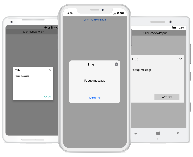
Popup with one button in the footer
In the following code example, set the SfPopupLayout.PopupView.AppearanceMode property as OneButton which displays only the Accept button in the footer view.
<?xml version="1.0" encoding="utf-8" ?>
<ContentPage xmlns="http://xamarin.com/schemas/2014/forms"
             xmlns:x="http://schemas.microsoft.com/winfx/2009/xaml"
             xmlns:local="clr-namespace:GettingStarted"
             x:Class="GettingStarted.MainPage"
             Padding="0,40,0,0"
             xmlns:sfPopup="clr-namespace:Syncfusion.XForms.PopupLayout;assembly=Syncfusion.SfPopupLayout.XForms">
<sfPopup:SfPopupLayout x:Name="popupLayout">
   <sfPopup:SfPopupLayout.PopupView>
            <sfPopup:PopupView AppearanceMode="OneButton" />
   </sfPopup:SfPopupLayout.PopupView>
   <sfPopup:SfPopupLayout.Content>
     <StackLayout x:Name="layout">
       <Button x:Name="clickToShowPopup" Text="ClickToShowPopup" VerticalOptions="Start" HorizontalOptions="FillAndExpand" Clicked += ClickToShowPopup_Clicked/>
     </StackLayout>
    </sfPopup:SfPopupLayout.Content>
  </sfPopup:SfPopupLayout>
</ContentPage>using Syncfusion.XForms.PopupLayout;
namespace GettingStarted
{
public partial class MainPage : ContentPage
{
public MainPage()
{
InitializeComponent();
// Setting the AppearanceMode as OneButton
popupLayout.PopupView.AppearanceMode = AppearanceMode.OneButton;
}
private void ClickToShowPopup_Clicked(object sender, EventArgs e)
{
popupLayout.Show();
}
}
}Executing the above codes renders the following output in Android, iOS and Windows Phone devices respectively.
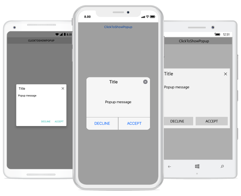
Popup with two buttons in the footer
In the following code example, set the SfPopupLayout.PopupView.AppearanceMode property as TwoButton which displays both Accept button and Decline button in the footer view.
<?xml version="1.0" encoding="utf-8" ?>
<ContentPage xmlns="http://xamarin.com/schemas/2014/forms"
             xmlns:x="http://schemas.microsoft.com/winfx/2009/xaml"
             xmlns:local="clr-namespace:GettingStarted"
             x:Class="GettingStarted.MainPage"
             Padding="0,40,0,0"
             xmlns:sfPopup="clr-namespace:Syncfusion.XForms.PopupLayout;assembly=Syncfusion.SfPopupLayout.XForms">
<sfPopup:SfPopupLayout x:Name="popupLayout">
    <sfPopup:SfPopupLayout.PopupView>
            <sfPopup:PopupView AppearanceMode="TwoButton" />
    </sfPopup:SfPopupLayout.PopupView>
   <sfPopup:SfPopupLayout.Content>
     <StackLayout x:Name="layout">
       <Button x:Name="clickToShowPopup" Text="ClickToShowPopup" VerticalOptions="Start" HorizontalOptions="FillAndExpand" Clicked="ClickToShowPopup_Clicked" />
     </StackLayout>
    </sfPopup:SfPopupLayout.Content>
  </sfPopup:SfPopupLayout>
</ContentPage>using Syncfusion.XForms.PopupLayout;
namespace GettingStarted
{
public partial class MainPage : ContentPage
{
public MainPage()
{
InitializeComponent();
// Setting the AppearanceMode as TwoButton
popupLayout.PopupView.AppearanceMode = AppearanceMode.TwoButton;
}
private void ClickToShowPopup_Clicked(object sender, EventArgs e)
{
popupLayout.Show();
}
}
}Executing the above codes renders the following output in Android, iOS and Windows Phone devices respectively.
Popup without header
You can display the Popup without header by using the property, SfPopupLayout.PopupView.ShowHeader, find the code example of the same below.
<?xml version="1.0" encoding="utf-8" ?>
<ContentPage xmlns="http://xamarin.com/schemas/2014/forms"
             xmlns:x="http://schemas.microsoft.com/winfx/2009/xaml"
             xmlns:local="clr-namespace:GettingStarted"
             x:Class="GettingStarted.MainPage"
             Padding="0,40,0,0"
             xmlns:sfPopup="clr-namespace:Syncfusion.XForms.PopupLayout;assembly=Syncfusion.SfPopupLayout.XForms">
<sfPopup:SfPopupLayout x:Name="popupLayout">
   <sfPopup:SfPopupLayout.PopupView>
            <sfPopup:PopupView ShowHeader="False"/>
   </sfPopup:SfPopupLayout.PopupView>
   <sfPopup:SfPopupLayout.Content>
     <StackLayout x:Name="layout">
       <Button x:Name="clickToShowPopup" Text="ClickToShowPopup" VerticalOptions="Start" HorizontalOptions="FillAndExpand" Clicked += ClickToShowPopup_Clicked/>
     </StackLayout>
    </sfPopup:SfPopupLayout.Content>
  </sfPopup:SfPopupLayout>
</ContentPage>using Syncfusion.XForms.PopupLayout;
namespace GettingStarted
{
public partial class MainPage : ContentPage
{
public MainPage()
{
InitializeComponent();
popupLayout.PopupView.ShowHeader = false;
}
private void ClickToShowPopup_Clicked(object sender, EventArgs e)
{
popupLayout.Show();
}
}
}
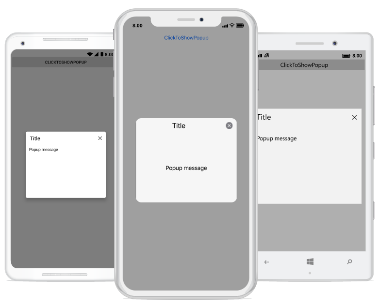
Popup without Footer
You can display the Popup without footer by using the property, SfPopupLayout.PopupView.ShowFooter, find the code example of the same below.
<?xml version="1.0" encoding="utf-8" ?>
<ContentPage xmlns="http://xamarin.com/schemas/2014/forms"
             xmlns:x="http://schemas.microsoft.com/winfx/2009/xaml"
             xmlns:local="clr-namespace:GettingStarted"
             x:Class="GettingStarted.MainPage"
             Padding="0,40,0,0"
             xmlns:sfPopup="clr-namespace:Syncfusion.XForms.PopupLayout;assembly=Syncfusion.SfPopupLayout.XForms">
<sfPopup:SfPopupLayout x:Name="popupLayout">
   <sfPopup:SfPopupLayout.PopupView>
            <sfPopup:PopupView ShowFooter="False"/>
   </sfPopup:SfPopupLayout.PopupView>
   <sfPopup:SfPopupLayout.Content>
     <StackLayout x:Name="layout">
       <Button x:Name="clickToShowPopup" Text="ClickToShowPopup" VerticalOptions="Start" HorizontalOptions="FillAndExpand" Clicked += ClickToShowPopup_Clicked/>
     </StackLayout>
    </sfPopup:SfPopupLayout.Content>
  </sfPopup:SfPopupLayout>
</ContentPage>using Syncfusion.XForms.PopupLayout;
namespace GettingStarted
{
public partial class MainPage : ContentPage
{
public MainPage()
{
InitializeComponent();
popupLayout.PopupView.ShowFooter = false;
}
private void ClickToShowPopup_Clicked(object sender, EventArgs e)
{
popupLayout.Show();
}
}
}
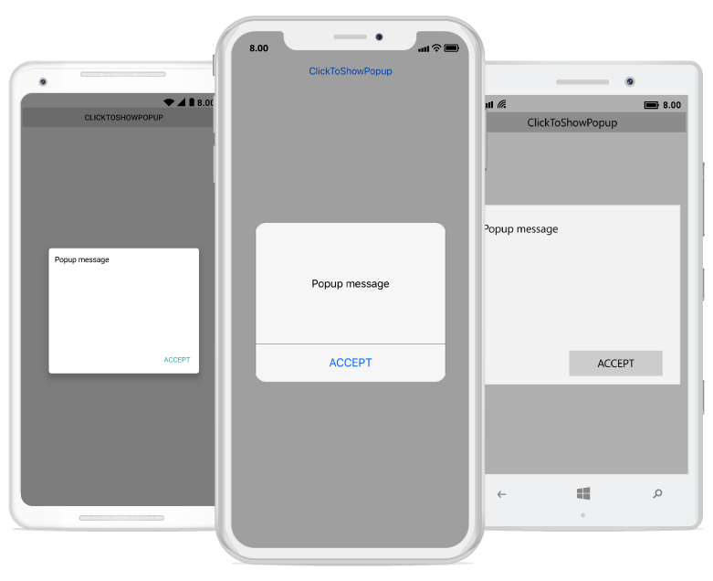
Popup without header and footer
You can display only the content of the SfPopupLayout, by removing the header and footer by using SfPopupLayout.PopupView.ShowHeader and SfPopupLayout.PopupView.ShowFooter, code example of the same below.
<?xml version="1.0" encoding="utf-8" ?>
<ContentPage xmlns="http://xamarin.com/schemas/2014/forms"
             xmlns:x="http://schemas.microsoft.com/winfx/2009/xaml"
             xmlns:local="clr-namespace:GettingStarted"
             x:Class="GettingStarted.MainPage"
             Padding="0,40,0,0"
             xmlns:sfPopup="clr-namespace:Syncfusion.XForms.PopupLayout;assembly=Syncfusion.SfPopupLayout.XForms">
<sfPopup:SfPopupLayout x:Name="popupLayout">
   <sfPopup:SfPopupLayout.PopupView>
            <sfPopup:PopupView ShowFooter="False" ShowHeader="False"/>
   </sfPopup:SfPopupLayout.PopupView>
   <sfPopup:SfPopupLayout.Content>
     <StackLayout x:Name="layout">
       <Button x:Name="clickToShowPopup" Text="ClickToShowPopup" VerticalOptions="Start" HorizontalOptions="FillAndExpand" Clicked += ClickToShowPopup_Clicked/>
     </StackLayout>
    </sfPopup:SfPopupLayout.Content>
  </sfPopup:SfPopupLayout>
</ContentPage>using Syncfusion.XForms.PopupLayout;
namespace GettingStarted
{
public partial class MainPage : ContentPage
{
public MainPage()
{
InitializeComponent();
popupLayout.PopupView.ShowFooter = false;
popupLayout.PopupView.ShowHeader = false;
}
private void ClickToShowPopup_Clicked(object sender, EventArgs e)
{
popupLayout.Show();
}
}
}Customizing popup header
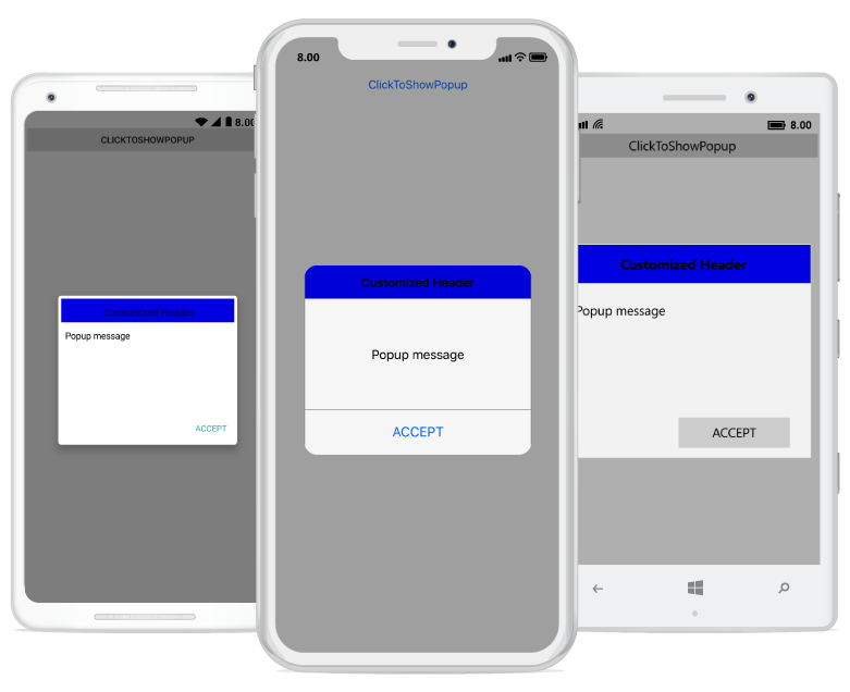
Any view can be added as the header content using the SfPopupLayout.PopupView.HeaderTemplate property. Refer to the following code example in which a label is added as a header content.
<?xml version="1.0" encoding="utf-8" ?>
<ContentPage xmlns="http://xamarin.com/schemas/2014/forms"
             xmlns:x="http://schemas.microsoft.com/winfx/2009/xaml"
             xmlns:local="clr-namespace:GettingStarted"
             x:Class="GettingStarted.MainPage"
             Padding="0,40,0,0"
             xmlns:sfPopup="clr-namespace:Syncfusion.XForms.PopupLayout;assembly=Syncfusion.SfPopupLayout.XForms">
 <sfPopup:SfPopupLayout x:Name="popupLayout">
  <sfPopup:SfPopupLayout.PopupView>
        <sfPopup:PopupView ShowCloseButton="False">
            <sfPopup:PopupView.HeaderTemplate>
                <DataTemplate>
                    <Label Text="Customized Header"
                               FontAttributes="Bold"
                               BackgroundColor="Blue"
                               FontSize="16"
                               HorizontalTextAlignment="Center"
                               VerticalTextAlignment="Center"
                               />
                </DataTemplate>
            </sfPopup:PopupView.HeaderTemplate>
        </sfPopup:PopupView>
    </sfPopup:SfPopupLayout.PopupView>
   <sfPopup:SfPopupLayout.Content>
     <StackLayout x:Name="layout">
       <Button x:Name="clickToShowPopup" Text="ClickToShowPopup" VerticalOptions="Start" HorizontalOptions="FillAndExpand" />
     </StackLayout>
    </sfPopup:SfPopupLayout.Content>
  </sfPopup:SfPopupLayout>
</ContentPage>
using Syncfusion.XForms.PopupLayout;
namespace GettingStarted
{
public partial class MainPage : ContentPage
{
DataTemplate headerTemplateView;
Label headerContent;
public MainPage()
{
InitializeComponent();
clickToShowPopup.Clicked += ClickToShowPopup_Clicked;
headerTemplateView = new DataTemplate(() =>
{
headerContent = new Label();
headerContent.Text = "Customized Header";
headerContent.FontAttributes = FontAttributes.Bold;
headerContent.BackgroundColor = Color.FromRgb(0, 0, 225);
headerContent.FontSize = 16;
headerContent.HorizontalTextAlignment = TextAlignment.Center;
headerContent.VerticalTextAlignment = TextAlignment.Center;
return headerContent;
});
popupLayout.PopupView.ShowCloseButton = false;
// Adding HeaderTemplate of the SfPopupLayout
popupLayout.PopupView.HeaderTemplate = headerTemplateView;
}
private void ClickToShowPopup_Clicked(object sender, EventArgs e)
{
popupLayout.Show();
}
}
}Executing the above codes renders the following output in Android, iOS and Windows Phone devices respectively.
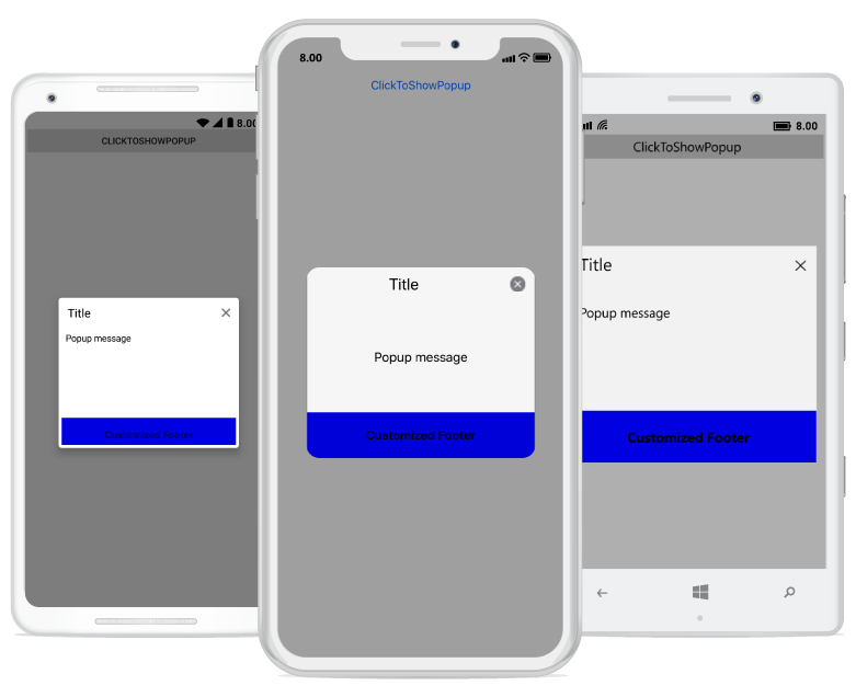
Customizing popup footer
Any view can be added as the footer content using the SfPopupLayout.PopupView.FooterTemplate property. Refer to the following code example in which a label is added as a footer content.
<?xml version="1.0" encoding="utf-8" ?>
<ContentPage xmlns="http://xamarin.com/schemas/2014/forms"
             xmlns:x="http://schemas.microsoft.com/winfx/2009/xaml"
             xmlns:local="clr-namespace:GettingStarted"
             x:Class="GettingStarted.MainPage"
             Padding="0,40,0,0"
             xmlns:sfPopup="clr-namespace:Syncfusion.XForms.PopupLayout;assembly=Syncfusion.SfPopupLayout.XForms">
 <sfPopup:SfPopupLayout x:Name="popupLayout">
    <sfPopup:SfPopupLayout.PopupView>
        <sfPopup:PopupView>
            <sfPopup:PopupView.FooterTemplate>
                <DataTemplate>
                    <Label Text="Customized Footer"
                               FontAttributes="Bold"
                               BackgroundColor="Blue"
                               FontSize="16"
                               HorizontalTextAlignment="Center"
                               VerticalTextAlignment="Center"
                               />
                </DataTemplate>
            </sfPopup:PopupView.FooterTemplate>
        </sfPopup:PopupView>
    </sfPopup:SfPopupLayout.PopupView>
   <sfPopup:SfPopupLayout.Content>
     <StackLayout x:Name="layout">
       <Button x:Name="clickToShowPopup" Text="ClickToShowPopup" VerticalOptions="Start" HorizontalOptions="FillAndExpand" />
     </StackLayout>
    </sfPopup:SfPopupLayout.Content>
  </sfPopup:SfPopupLayout>
</ContentPage>
using Syncfusion.XForms.PopupLayout;
namespace GettingStarted
{
public partial class MainPage : ContentPage
{
DataTemplate footerTemplateView;
Label footerContent;
public MainPage()
{
InitializeComponent();
clickToShowPopup.Clicked += ClickToShowPopup_Clicked;
footerTemplateView = new DataTemplate(() =>
{
footerContent = new Label();
footerContent.Text = "Customized Footer";
footerContent.FontAttributes = FontAttributes.Bold;
footerContent.BackgroundColor = Color.FromRgb(0, 0, 225);
footerContent.FontSize = 16;
footerContent.HorizontalTextAlignment = TextAlignment.Center;
footerContent.VerticalTextAlignment = TextAlignment.Center;
return footerContent;
});
// Adding FooterTemplate of the SfPopupLayout
popupLayout.PopupView.FooterTemplate = footerTemplateView;
}
private void ClickToShowPopup_Clicked(object sender, EventArgs e)
{
popupLayout.Show();
}
}
}Executing the above codes renders the following output in Android, iOS and Windows Phone devices respectively.
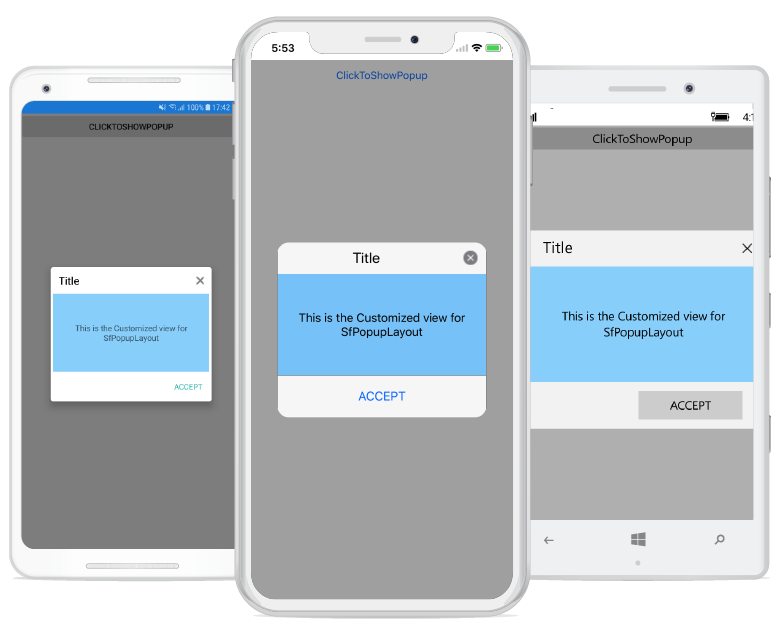
Customizing popup content
Any view can be added as popup content by using the SfPopupLayout.PopupView.ContentTemplate property. Refer to the following code example in which a label is added as a popup content.
<?xml version="1.0" encoding="utf-8" ?>
<ContentPage xmlns="http://xamarin.com/schemas/2014/forms"
             xmlns:x="http://schemas.microsoft.com/winfx/2009/xaml"
             xmlns:local="clr-namespace:GettingStarted"
             x:Class="GettingStarted.MainPage"
             Padding="0,40,0,0"
             xmlns:sfPopup="clr-namespace:Syncfusion.XForms.PopupLayout;assembly=Syncfusion.SfPopupLayout.XForms">
 <sfPopup:SfPopupLayout x:Name="popupLayout">
    <sfPopup:SfPopupLayout.PopupView>
        <sfPopup:PopupView>
            <sfPopup:PopupView.ContentTemplate>
                <DataTemplate>
                    <Label Text="This is SfPopupLayout" BackgroundColor="SkyBlue"
                           HorizontalTextAlignment="Center"/>
                </DataTemplate>
            </sfPopup:PopupView.ContentTemplate>
        </sfPopup:PopupView>
    </sfPopup:SfPopupLayout.PopupView>
   <sfPopup:SfPopupLayout.Content>
     <StackLayout x:Name="layout">
       <Button x:Name="clickToShowPopup" Text="ClickToShowPopup" VerticalOptions="Start"
               HorizontalOptions="FillAndExpand"  Clicked="ClickToShowPopup_Clicked" />
     </StackLayout>
    </sfPopup:SfPopupLayout.Content>
  </sfPopup:SfPopupLayout>
</ContentPage>
using Syncfusion.XForms.PopupLayout;
namespace GettingStarted
{
public partial class MainPage : ContentPage
{
DataTemplate templateView;
Label popupContent;
public MainPage()
{
InitializeComponent();
templateView = new DataTemplate(() =>
{
popupContent = new Label();
popupContent.Text = "This is the SfPopupLayout";
popupContent.BackgroundColor = Color.LightSkyBlue;
popupContent.HorizontalTextAlignment = TextAlignment.Center;
return popupContent;
});
// Adding ContentTemplate of the SfPopupLayout
popupLayout.PopupView.ContentTemplate = templateView;
}
private void ClickToShowPopup_Clicked(object sender, EventArgs e)
{
popupLayout.Show();
}
}
}
To display ListView as content of the Popup, refer to this documentation.