Styles in Xamarin Popup (SfPopupLayout)
19 Sep 202317 minutes to read
The SfPopupLayout applies style to all of its elements by using the SfPopupLayout.PopupView.PopupStyle property.
Styling popup header
The SfPopupLayout allows customizing the header elements with various header customizations as follows:
| Property | Description |
|---|---|
| Gets or sets the background color for the header. | |
| Gets or sets the font attribute for the header title. | |
| Gets or sets the font style for the header title. | |
| Gets or sets the font size for the header title. | |
| Gets or sets the text alignment for the header. | |
| Gets or sets the text color to be applied for the header title. |
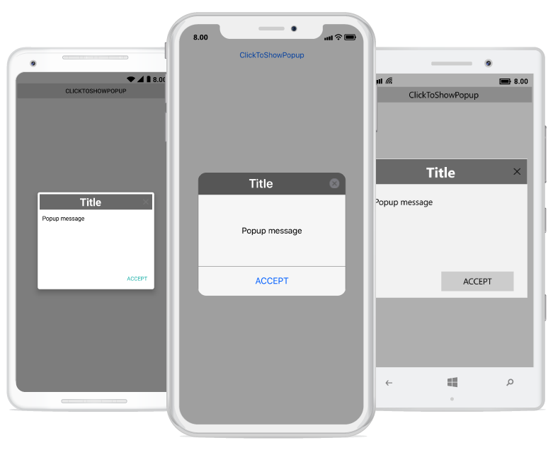
Refer to the following code example for customizing the header elements.
<sfPopup:SfPopupLayout x:Name="popUpLayout">
    <sfPopup:SfPopupLayout.PopupView>
        <sfPopup:PopupView>
            <sfPopup:PopupView.PopupStyle>
                <sfPopup:PopupStyle HeaderBackgroundColor="DimGray"
                                    HeaderFontAttribute="Bold"
                                    HeaderFontFamily="Helvetica-Bold"
                                    HeaderFontSize="25"
                                    HeaderTextAlignment="Center"
                                    HeaderTextColor="White"/>
            </sfPopup:PopupView.PopupStyle>
        </sfPopup:PopupView>
    </sfPopup:SfPopupLayout.PopupView>
</sfPopup:SfPopupLayout>
//MainPage.cs
public MainPage()
{
....
InitializeComponent();
popupLayout.PopupView.PopupStyle.HeaderBackgroundColor = Color.FromRgb(105,105,105);
popupLayout.PopupView.PopupStyle.HeaderFontAttribute = FontAttributes.Bold;
popupLayout.PopupView.PopupStyle.HeaderFontFamily = "Helvetica-Bold";
popupLayout.PopupView.PopupStyle.HeaderFontSize = 25;
popupLayout.PopupView.PopupStyle.HeaderTextAlignment = TextAlignment.Center;
popupLayout.PopupView.PopupStyle.HeaderTextColor = Color.White;
....
}Executing the above codes renders the following output in iOS, Android and Windows Phone devices respectively.
Styling popup footer
The SfPopupLayout allows customizing the footer elements with various footer customizations as follows:
| Property | Description |
|---|---|
| Gets or sets the background color for the footer. | |
| SfPopupLayout.PopupView.PopupStyle.AcceptButtonBackgroundColor |
Gets or sets the background color for the Accept button in the footer. |
| Gets or sets the foreground color for the Accept button in the footer. | |
| SfPopupLayout.PopupView.PopupStyle.DeclineButtonBackgroundColor |
Gets or sets the background color for the Decline button in the footer. |
| Gets or sets the foreground color for the Decline button in the footer. |
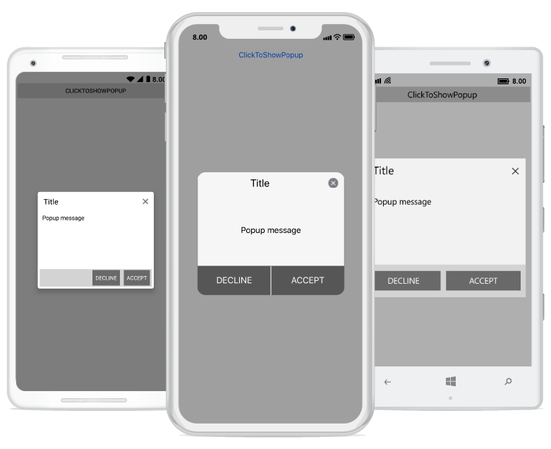
Refer to the following code example for customizing the footer elements.
<sfPopup:SfPopupLayout x:Name="popUpLayout">
    <sfPopup:SfPopupLayout.PopupView>
        <sfPopup:PopupView AppearanceMode="TwoButton">
                <sfPopup:PopupView.PopupStyle>
                    <sfPopup:PopupStyle FooterBackgroundColor="LightGray"
                                        AcceptButtonBackgroundColor ="DimGray"
                                        AcceptButtonTextColor="White"
                                        DeclineButtonBackgroundColor="DimGray"
                                        DeclineButtonTextColor="White"
                                        />
                </sfPopup:PopupView.PopupStyle>
            </sfPopup:PopupView>
    </sfPopup:SfPopupLayout.PopupView>
</sfPopup:SfPopupLayout>
//MainPage.cs
public MainPage()
{
....
InitializeComponent();
// Setting the AppearanceMode as TwoButton
popupLayout.PopupView.AppearanceMode = Syncfusion.XForms.PopupLayout.AppearanceMode.TwoButton;
// Footer customization
popupLayout.PopupView.PopupStyle.FooterBackgroundColor = Color.LightGray;
popupLayout.PopupView.PopupStyle.AcceptButtonBackgroundColor = Color.FromRgb(105, 105, 105);
popupLayout.PopupView.PopupStyle.AcceptButtonTextColor = Color.White;
popupLayout.PopupView.PopupStyle.DeclineButtonBackgroundColor = Color.FromRgb(105, 105, 105);
popupLayout.PopupView.PopupStyle.DeclineButtonTextColor = Color.White;
....
}Executing the above codes renders the following output in iOS, Android and Windows Phone devices respectively.
Border customization
The SfPopupLayout allows customizing the border appearance with various border customizations as follows:
| Property | Description |
|---|---|
| Gets or sets the border color for the PopupView. | |
| Gets or sets the border thickness for the PopupView. | |
| Gets or sets the corner radius for the PopupView. |
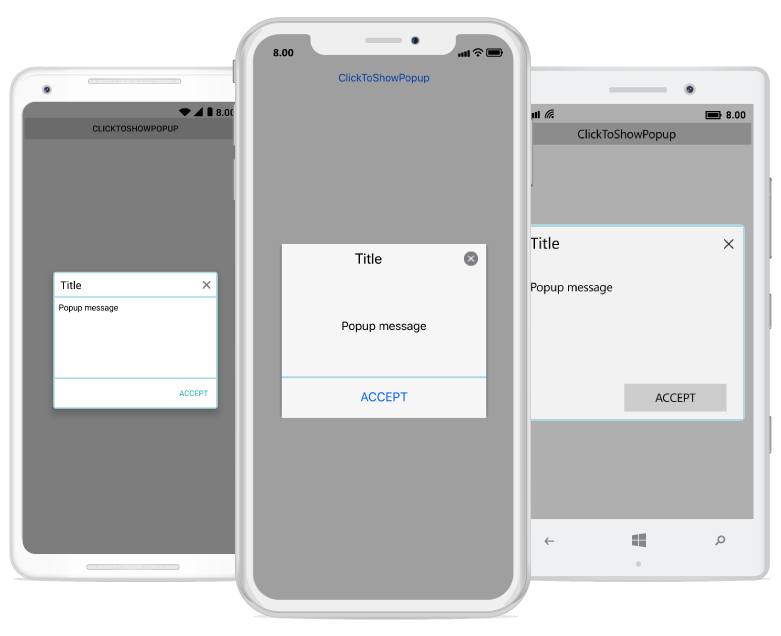
Refer to the following code example for customizing the border elements.
<sfPopup:SfPopupLayout x:Name="popUpLayout">
    <sfPopup:SfPopupLayout.PopupView>
        <sfPopup:PopupView>
            <sfPopup:PopupView.PopupStyle>
                <sfPopup:PopupStyle BorderColor="LightBlue"
                                    BorderThickness="3"
                                    CornerRadius="5"
                                    />
            </sfPopup:PopupView.PopupStyle>
        </sfPopup:PopupView>
    </sfPopup:SfPopupLayout.PopupView>
<sfPopup:SfPopupLayout>
//MainPage.cs
public MainPage()
{
....
InitializeComponent();
popupLayout.PopupView.PopupStyle.BorderColor = Color.LightBlue;
popupLayout.PopupView.PopupStyle.BorderThickness = 3;
popupLayout.PopupView.PopupStyle.CornerRadius = 5;
....
}Executing the above codes renders the following output in iOS, Android and Windows Phone devices respectively.
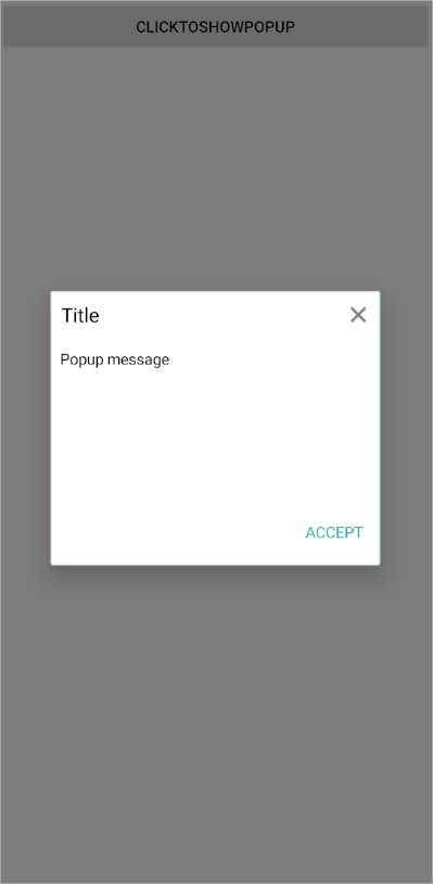
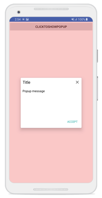
Show or hide separator lines
Customize the visibility of the separator line between the header, footer and the popup content using the ShowSeparator property. The default value is true.
<?xml version="1.0" encoding="utf-8" ?>
<ContentPage xmlns="http://xamarin.com/schemas/2014/forms"
             xmlns:x="http://schemas.microsoft.com/winfx/2009/xaml"
             x:Class="GettingStarted.MainPage"
             xmlns:sfPopup="clr-namespace:Syncfusion.XForms.PopupLayout;assembly=Syncfusion.SfPopupLayout.XForms">
    <sfPopup:SfPopupLayout x:Name="popupLayout">
        <sfPopup:SfPopupLayout.PopupView>
            <sfPopup:PopupView>
                <sfPopup:PopupView.PopupStyle>
                    <sfPopup:PopupStyle BorderColor="LightBlue"
                                        BorderThickness="3"
                                        ShowSeparator="False" />
                </sfPopup:PopupView.PopupStyle>
            </sfPopup:PopupView>
        </sfPopup:SfPopupLayout.PopupView>
        <sfPopup:SfPopupLayout.Content>
            <StackLayout x:Name="mainLayout">
                <Button x:Name="clickToShowPopup" Text="ClickToShowPopup"
                        VerticalOptions="Start" HorizontalOptions="FillAndExpand"
                        Clicked="ClickToShowPopup_Clicked"/>
            </StackLayout>
        </sfPopup:SfPopupLayout.Content>
    </sfPopup:SfPopupLayout>
</ContentPage>
using Syncfusion.XForms.PopupLayout;
namespace GettingStarted
{
public partial class MainPage : ContentPage
{
SfPopupLayout popupLayout;
public MainPage()
{
InitializeComponent();
popupLayout = new SfPopupLayout();
popupLayout.PopupView.PopupStyle.BorderColor = Color.LightBlue;
popupLayout.PopupView.PopupStyle.BorderThickness = 3;
popupLayout.PopupView.PopupStyle.ShowSeparator = false;
}
private void ClickToShowPopup_Clicked(object sender, System.EventArgs e)
{
popupLayout.Show();
}
}
}
Styling overlay background
The SfPopupLayout allows to customize the opacity and the background color of overlay using the SfPopupLayout.PopupView.PopupStyle.OverlayOpacity and SfPopupLayout.PopupView.PopupStyle.OverlayColor properties, respectively.
Refer to the following code example for customizing the overlay opacity and the background color.
<sfPopup:SfPopupLayout x:Name="popUpLayout">
            <sfPopup:SfPopupLayout.PopupView>
                <sfPopup:PopupView>
                    <sfPopup:PopupView.PopupStyle>
                        <sfPopup:PopupStyle OverlayColor="Red" OverlayOpacity="0.2">
                        </sfPopup:PopupStyle>
                    </sfPopup:PopupView.PopupStyle>
                </sfPopup:PopupView>
            </sfPopup:SfPopupLayout.PopupView>
</sfPopup:SfPopupLayout>popUpLayout.PopupView.PopupStyle.OverlayColor = Color.Red;
popUpLayout.PopupView.PopupStyle.OverlayOpacity = 0.2;Executing the above codes renders the following output in Android devices.
Blurred background
The SfPopupLayout allows to blur the background using SfPopupLayout.OverlayMode and SfPopupLayout.PopupView.PopupStyle.BlurIntensity properties, respectively.
<?xml version="1.0" encoding="utf-8" ?>
<ContentPage xmlns="http://xamarin.com/schemas/2014/forms"
             xmlns:x="http://schemas.microsoft.com/winfx/2009/xaml"
             x:Class="GettingStarted.MainPage"
             xmlns:sfPopup="clr-namespace:Syncfusion.XForms.PopupLayout;assembly=Syncfusion.SfPopupLayout.XForms">

    <sfPopup:SfPopupLayout x:Name="popupLayout" OverlayMode="Blur">
        <sfPopup:SfPopupLayout.PopupView>
            <sfPopup:PopupView>
                <sfPopup:PopupView.PopupStyle>
                    <sfPopup:PopupStyle HeaderBackgroundColor="DimGray"
                                        BlurIntensity="ExtraDark" />
                </sfPopup:PopupView.PopupStyle>
            </sfPopup:PopupView>
        </sfPopup:SfPopupLayout.PopupView>
        <sfPopup:SfPopupLayout.Content>
            <StackLayout x:Name="layout">
               <Image Source="Blurred_Background.png" Aspect="AspectFit" VerticalOptions="FillAndExpand" HorizontalOptions="FillAndExpand">
                    <Image.GestureRecognizers>
                        <TapGestureRecognizer Tapped="TapGestureRecognizer_Tapped"/>
                    </Image.GestureRecognizers>
                </Image>
            </StackLayout>
        </sfPopup:SfPopupLayout.Content>
    </sfPopup:SfPopupLayout>

</ContentPage>
using Syncfusion.XForms.PopupLayout;
using System;
using Xamarin.Forms;
namespace GettingStarted
{
public partial class MainPage : ContentPage
{
SfPopupLayout popupLayout;
public MainPage()
{
InitializeComponent();
popupLayout = new SfPopupLayout();
popupLayout.OverlayMode = OverlayMode.Blur;
popupLayout.PopupView.PopupStyle.BlurIntensity = BlurIntensity.ExtraDark;
popupLayout.PopupView.PopupStyle.HeaderBackgroundColor = Color.DimGray;
var layout = new StackLayout();
var image = new Image() { Source = "Blurred_Background.png", Aspect = Aspect.AspectFit, VerticalOptions = LayoutOptions.FillAndExpand, HorizontalOptions = LayoutOptions.FillAndExpand };
TapGestureRecognizer tapGestureRecognizer = new TapGestureRecognizer();
tapGestureRecognizer.Tapped += TapGestureRecognizer_Tapped;
image.GestureRecognizers.Add(tapGestureRecognizer);
layout.Children.Add(image);
Content = popupLayout;
popupLayout.Content = layout;
}
private void TapGestureRecognizer_Tapped(object sender, System.EventArgs e)
{
popupLayout.Show();
}
}
}Executing the above codes renders the following output in Android devices