How can I help you?
Customization in WPF TextInputLayout (SfTextInputLayout)
30 Jun 20224 minutes to read
Based on the text input layout state, the colors will be applied to the hint label, base line, border and assistive labels.
Focused color
When the input view is focused, the value of the FocusedForeground property will be added to the hint label, base line and border.
IMPORTANT
The cursor color of the input view is the same as the
Accentcolor of the application.
<inputLayout:SfTextInputLayout
    Hint="User name"
    FocusedForeground="Green"
    HelperText="Enter your name"
 <TextBox Text="John" />
</inputLayout:SfTextInputLayout>
var inputLayout = new SfTextInputLayout();
inputLayout.Hint = "User name";
inputLayout.FocusedForeground = Brushes.Green;
inputLayout.InputView = new TextBox() { Text = "John" };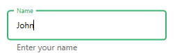
NOTE
The current active color of the text input layout can be obtained from the
ActiveForegroundproperty.
Since error is not a state, the error color will not be set to ActiveForeground when HasError property is set to true.
Unfocused color
When the input view is unfocused, the Foreground property value will be applied to the hint label, base line and border.
<inputLayout:SfTextInputLayout
    Hint="User name"
    Foreground="Gray"
    HelperText="Enter your name"
 <TextBox Text="John" />
</inputLayout:SfTextInputLayout>
var inputLayout = new SfTextInputLayout();
inputLayout.Hint = "User name";
inputLayout.Foreground = Brushes.Gray;
inputLayout.InputView = new TextBox() { Text = "John" };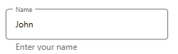
Error color
When the input layout is set to error state, the ErrorForeground property value will be added to the hint label, base line, border and error text.
<inputLayout:SfTextInputLayout
    Hint="Name"
    ErrorForeground="Red"
    ErrorText="Should not contain special characters"
    HasError="True">
    <TextBox Text="John/" />
</inputLayout:SfTextInputLayout>
var inputLayout = new SfTextInputLayout();
inputLayout.Hint = "Name";
inputLayout.ErrorForeground = Brushes.Red;
inputLayout.ErrorText = "Should not contain special characters";
inputLayout.HasError = true;
inputLayout.InputView = new TextBox() { Text = "John/" };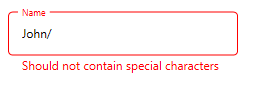
Container color
The color of the container can be customized by setting the ContainerBackground property. It is applicable when the ContainerType property is set to Filled and Outlined.
<inputLayout:SfTextInputLayout
    Hint="Name"
    FocusedForeground="Blue"
    ContainerType="Outlined"
    ContainerBackground="LightBlue">
    <TextBox Text="John" />
</inputLayout:SfTextInputLayout>
var inputLayout = new SfTextInputLayout();
inputLayout.Hint = "Name";
inputLayout.FocusedColor = Brushes.Blue;
inputLayout.ContainerBackground = Brushes.LightBlue;
inputLayout.ContainerType = ContainerType.Outlined;
inputLayout.InputView = new Entry() { TextBox = "John" };
NOTE
Container color is not applicable for `None’ type.
Outline corner radius
The corner radius of the outlined border can be customized by setting OutlineCornerRadius property.
<inputLayout:SfTextInputLayout
    Hint="Name"
    ContainerType="Outlined"
    OutlineCornerRadius="8">
    <TextBox />
</inputLayout:SfTextInputLayout>
var inputLayout = new SfTextInputLayout();
inputLayout.Hint = "Name";
inputLayout.ContainerType = ContainerType.Outlined;
inputLayout.OutlineCornerRadius = 8;
inputLayout.InputView = new TextBox();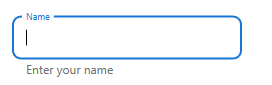
NOTE
It is only applicable to theOutlinedtype of container.