Getting Started with WPF Numeric UpDown
18 Nov 20186 minutes to read
This section explains how to create the WPF Numeric UpDown control and describes its structure.
Structure of WPF Numeric UpDown
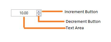
The following are the elements of the WPF Numeric UpDown control:
- Text area - The area where the numeric values are displayed.
- Increment button - A repeat button that can be clicked to increment the current value.
- Decrement button - A repeat button that can be clicked to decrement the current value.
Assembly deployment
Refer to the control dependencies section to get the list of assemblies or NuGet packages that need to be added as a reference to use the control in any application.
Click_here to find more details on how to install nuget packages in WPF application.
Adding WPF Numeric UpDown control via designer
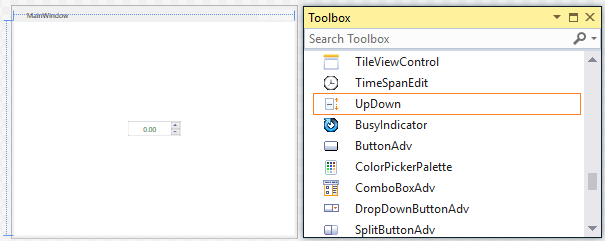
The WPF Numeric UpDown control can be added to an application by dragging it from the toolbox onto a view in the designer. The following dependent assembly will be added automatically:
- Syncfusion.Shared.WPF
Adding WPF Numeric UpDown control via XAML
To add the WPF Numeric UpDown control manually in XAML, follow these steps:
-
Create a new WPF project in Visual Studio.
-
Add the following required assembly reference to the project:
- Syncfusion.Shared.WPF
-
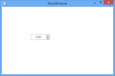
Import the Syncfusion® WPF schema http://schemas.syncfusion.com/wpf and declare the
WPF Numeric UpDowncontrol on the XAML page.<Window x:Class="NumericUpDownSample.MainWindow" xmlns="http://schemas.microsoft.com/winfx/2006/xaml/presentation" xmlns:x="http://schemas.microsoft.com/winfx/2006/xaml" xmlns:syncfusion="http://schemas.syncfusion.com/wpf" Title="MainWindow" Height="350" Width="525"> <Grid x:Name="grid"> <syncfusion:UpDown x:Name="upDown" Width="100" Height="23"/> </Grid> </Window>
Adding WPF Numeric UpDown control via C#
To add the WPF Numeric UpDown control manually in C#, follow these steps:
-
Create a new WPF application in Visual Studio.
-
Add the following required assembly reference to the project:
- Syncfusion.Shared.WPF
-
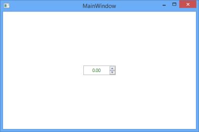
Include the required namespace and create an instance of
WPF Numeric UpDown.// Required usings: // using Syncfusion.Windows.Shared; UpDown updown = new UpDown(); updown.Width = 100; updown.Height = 23; grid.Children.Add(updown);
Value
The Value property is used to set the value of the WPF Numeric UpDown control. The default value is 0 (or null if UseNullOption is enabled).
<syncfusion:UpDown Name="upDown" Height="23" Value="10" Width="85"/>updown.Value = 10;
Step Value
The Step property is used to specify the interval applied to the value when the spin or repeat buttons are pressed. The default value of Step is 1.
<syncfusion:UpDown Name="upDown" Height="25" Value="10" Step="5" Width="90" />updown.Value = 10;
updown.Step = 5;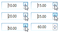
Number formatting
The number formatting of WPF Numeric UpDown control can be customized by setting UpDown.NumberFormatInfo property by specifying the culture-specific group separator, decimal separator, and the number of decimal digits. You can show the group separator by enable the GroupSeparatorEnabled property.
<Window x:Class="NumericUpDownSample.MainWindow"
        xmlns="http://schemas.microsoft.com/winfx/2006/xaml/presentation"
        xmlns:x="http://schemas.microsoft.com/winfx/2006/xaml"
        xmlns:syncfusion="http://schemas.syncfusion.com/wpf"
        xmlns:globalization="clr-namespace:System.Globalization"
        Title="MainWindow" Height="350" Width="525">

    <syncfusion:UpDown x:Name="upDown" Height="25" Width="90" Value="100000" GroupSeperatorEnabled="True">
        <syncfusion:UpDown.NumberFormatInfo>
            <globalization:NumberFormatInfo NumberGroupSeparator="/" NumberDecimalDigits="3" NumberDecimalSeparator="*"/>
        </syncfusion:UpDown.NumberFormatInfo>
    </syncfusion:UpDown>

</Window>updown.Value = 100000;
updown.GroupSeperatorEnabled = true;
//Initialize numberformatinfo
NumberFormatInfo numberFormatInfo = new NumberFormatInfo();
numberFormatInfo.NumberGroupSeparator = "/";
numberFormatInfo.NumberDecimalDigits = 3;
numberFormatInfo.NumberDecimalSeparator = "*";
updown.NumberFormatInfo = numberFormatInfo;
For more number formatting in UpDown, you can use the Culture property. The Culture property is used to format the values based on the selected culture.
<syncfusion:UpDown Name="upDown" Height="25" Width="90" Value="100000" Culture="bs-Latn" GroupSeperatorEnabled="True"/>CultureInfo cultureInfo = new CultureInfo("bs-Latn");
updown.Culture = cultureInfo;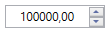
Theme
The WPF Numeric UpDown supports various built-in themes. Refer to the links below to apply themes,
