Interaction in WPF Numeric UpDown
18 Nov 20183 minutes to read
This section explains about how to change the value by using mouse and keyboard in WPF Numeric UpDown control.
Keyboard and Mouse support
The WPF Numeric UpDown control allows you to increase or decrease the value by pressing the up-arrow or down-arrow keys, or by using the mouse wheel over the control. The Step property specifies the increment or decrement interval.
Increment or decrement value with the mouse wheel
You can increase or decrease the current value by scrolling over the WPF Numeric UpDown control. To enable mouse-wheel scrolling, set the IsScrollingOnCircle property to true. Set it to false to disable value changes on mouse scroll. The default value of IsScrollingOnCircle is true.
<syncfusion:UpDown Name="upDown" Width="100" Height="23" IsScrollingOnCircle="True" />UpDown updown = new UpDown();
updown.Value = 10;
updown.IsScrollingOnCircle = true;
grid.Children.Add(updown);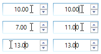
Step
The Step property is used to specify the interval applied to the value when the spin buttons are pressed. For example, if Step is set to 5, the WPF Numeric UpDown value increases or decreases by 5 each time a spin button is pressed. The default value of Step is 1.
You can also increase or decrease the current value by pressing the up-arrow or down-arrow keys.
<syncfusion:UpDown Name="upDown" Value="10" Width="100" Height="23" Step="5"/>updown.Value = 10;
updown.Width = 100;
updown.Height = 23;
updown.Step = 5;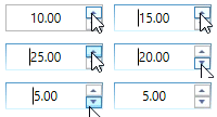
Animation speed
When the value changes via the repeat buttons, the transition from the current value to the new value is animated. The animation speed can be controlled by using the AnimationSpeed property. The value is expressed in seconds, in the range 0 to 1.
A value of
0disables the animation.
<syncfusion:UpDown Name="upDown" Value="10" AnimationSpeed="0.5" Width="100" Height="23"/>updown.Value = 10;
updown.Width = 100;
updown.Height = 23;
updown.AnimationSpeed = 0.5;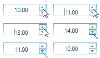
Range Adorner
You can show a visual adorner over the WPF Numeric UpDown control that represents the minimum and maximum range by setting the EnableRangeAdorner property to true. The default value is false. You can also change the background color of the range adorner using the RangeAdornerBackground property.
Both
MinValueandMaxValuemust be set for the range adorner to be visible.
<syncfusion:UpDown Name="upDown" Height="25" Width="90" Value="40" RangeAdornerBackground="Gray" EnableRangeAdorner="True" MinValue="0" MaxValue="100" />updown.MinValue = 0;
updown.MaxValue = 100;
updown.EnableRangeAdorner = true;
updown.RangeAdornerBackground = Brushes.Gray;