How can I help you?
Placeholder in WPF Kanban (SfKanban) control
31 May 20214 minutes to read
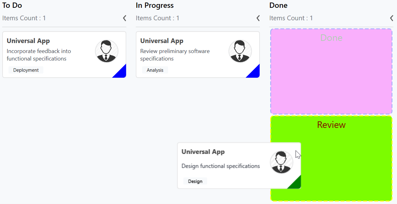
The placeholder is to denote a card’s new position in the KanbanColumn. It will appear while dragging a card over the column.
Placeholder style
PlaceholderStyle property is used to customize the placeholder. Following properties are used to customize its appearance.
-
Fill- This property is used to change the background color of the placeholder. -
Stroke- This property is used to change the border color of the placeholder. -
StrokeThickness- This property is used to change the border width of the placeholder. -
StrokeDashArray- This property is used to change the dashes of the placeholder border. -
FontSize- This is used to change the text size of the placeholder. -
Foreground- This property is used to change the text color of the placeholder. -
RadiusX- This property is used to change the x-radius of the placeholder. -
RadiusY- This property is used to change the y-radius of the placeholder. -
TextHorizontalAlignment- This property is used to change the horizontal alignment of the placeholder text. -
TextVerticalAlignment- This property is used to change the vertical alignment of the placeholder text.
Following properties are used to customize the selected category when you have more than one category in a column.
-
SelectedBackground- This property is used to change the background color of the selected placeholder. -
SelectedStroke- This property is used to change the border color of the selected placeholder. -
SelectedStrokeThickness- This property is used to change the border width of the selected placeholder. -
SelectedStrokeDashArray- This property is used to change the dashes of the selected placeholder. -
SelectedFontSize- This is used to change the font size of the text in selected placeholder. -
SelectedForeground- This property is used to change the color of the text in selected placeholder.
The following code example describes the above behavior.
<kanban:PlaceholderStyle FontSize="20"

                         Foreground="DarkGreen"

                         Fill="Fuchsia"

                         Stroke="Blue"

                         StrokeThickness="2"

                         SelectedFontSize="20"

                         SelectedForeground="Maroon"

                         SelectedStroke="Yellow"

                         SelectedStrokeThickness="2"

                         SelectedBackground="LawnGreen">

</kanban:PlaceholderStyle>
PlaceholderStyle style = new PlaceholderStyle();
style.FontSize = 20;
style.Foreground = new SolidColorBrush(Colors.DarkGreen);
style.Fill = new SolidColorBrush(Colors.Fuchsia);
style.Stroke = new SolidColorBrush(Colors.Blue);
style.StrokeThickness = 2;
style.StrokeDashArray = new DoubleCollection() {1, 1};
style.SelectedFontSize = 20;
style.SelectedForeground = new SolidColorBrush(Colors.Maroon);
style.SelectedStroke = new SolidColorBrush(Colors.Yellow);
style.SelectedBackground = new SolidColorBrush(Colors.LawnGreen);
style.SelectedStrokeThickness = 2;
style.SelectedStrokeDashArray = new DoubleCollection() {2, 1};
sfKanban.PlaceholderStyle = style;The following output demonstrates the above code example.
NOTE
The UI of the placeholder can be replaced entirely using
PlaceholderTemplateproperty.