Column in WPF Kanban Board
18 Nov 20187 minutes to read
Customizing Column Size
By default, the columns are sized smartly to arrange the default elements of the cards with better readability. You can also define the minimum and maximum widths for the columns in SfKanban using the MinColumnWidth and MaxColumnWidth properties, respectively.
The snippets in this document use the
kanban:prefix for the Syncfusion namespace. Make sure the following namespace mapping is declared on the root element:xmlns:kanban="clr-namespace:Syncfusion.UI.Xaml.Kanban;assembly=Syncfusion.SfKanban.WPF".
<kanban:SfKanban MinColumnWidth="300" MaxColumnWidth="340" />using Syncfusion.UI.Xaml.Kanban;
SfKanban kanban = new SfKanban();
kanban.MinColumnWidth = 300;
kanban.MaxColumnWidth = 340;You can also define the exact column width using the ColumnWidth property of SfKanban.
<kanban:SfKanban ColumnWidth="250" />SfKanban kanban = new SfKanban();
kanban.ColumnWidth = 250;Categorizing Columns
Cards are categorized and added to the respective columns using the value of the Category property of KanbanModel when the ItemsSource is a collection of KanbanModel. However, if the ItemsSource is populated with custom objects, the property of the custom object used to categorize the cards must be defined explicitly using the ColumnMappingPath property.
<kanban:SfKanban ColumnMappingPath="Group" />SfKanban kanban = new SfKanban();
kanban.ColumnMappingPath = "Group";Populating the Column with Cards from Different Categories
More than one category can be mapped to a column by assigning multiple values to the Categories collection of KanbanColumn. For example, you can map the “In Progress” and “Validated” categories under the “In Progress” column.
<kanban:SfKanban>
    <kanban:SfKanban.Columns>
        <kanban:KanbanColumn Title="In Progress"
                             Categories="In Progress,Validated">
        </kanban:KanbanColumn>
    </kanban:SfKanban.Columns>
</kanban:SfKanban>
using System.Collections.Generic;
using Syncfusion.UI.Xaml.Kanban;
SfKanban kanban = new SfKanban();
KanbanColumn progressColumn = new KanbanColumn()
{
Title = "In Progress",
Categories = new List<object>() { "In Progress", "Validated" }
};
kanban.Columns.Add(progressColumn);
Column Header
The Header of a column shows the Title, item count, and the minimum and maximum card limits of a column. The UI of the header can be replaced entirely using the ColumnHeaderTemplate property of SfKanban. The following code sample and screenshot illustrate this.
<kanban:SfKanban.ColumnHeaderTemplate>
    <DataTemplate>
        <StackPanel Width="300" Height="40" Background="Silver">
            <TextBlock Margin="10"
                       Text="{Binding Header}"
                       Foreground="Purple"
                       HorizontalAlignment="Left" />
        </StackPanel>
    </DataTemplate>
</kanban:SfKanban.ColumnHeaderTemplate>
Column Tag
The Tags property of KanbanColumn customizes the header of a column. The following properties of ColumnTag are used to customize the column header:
-
CardCount- Gets or sets the count of cards available in the column. -
Maximum- Gets or sets a value that indicates the maximum card limit of theKanbanColumn. -
Minimum- Gets or sets a value that indicates the minimum card limit of theKanbanColumn. -
IsExpanded- Gets or sets a value that indicates whether theKanbanColumnis expanded or collapsed. -
Header- Gets or sets an object which indicates theKanbanColumnheader.
Expand/Collapse Column
The columns can be expanded or collapsed by tapping the toggle button placed at the top-right corner of the column header. The IsExpanded property of KanbanColumn is used to programmatically expand or collapse a column.
<kanban:SfKanban>
    <kanban:SfKanban.Columns>
        <kanban:KanbanColumn Title="In Progress"
                             IsExpanded="False"
                             Categories="In Progress,Validated">
        </kanban:KanbanColumn>
    </kanban:SfKanban.Columns>
</kanban:SfKanban>
using Syncfusion.UI.Xaml.Kanban;
SfKanban kanban = new SfKanban();
KanbanColumn kanbanColumn = new KanbanColumn()
{
Title = "In Progress",
IsExpanded = false
};
kanban.Columns.Add(kanbanColumn);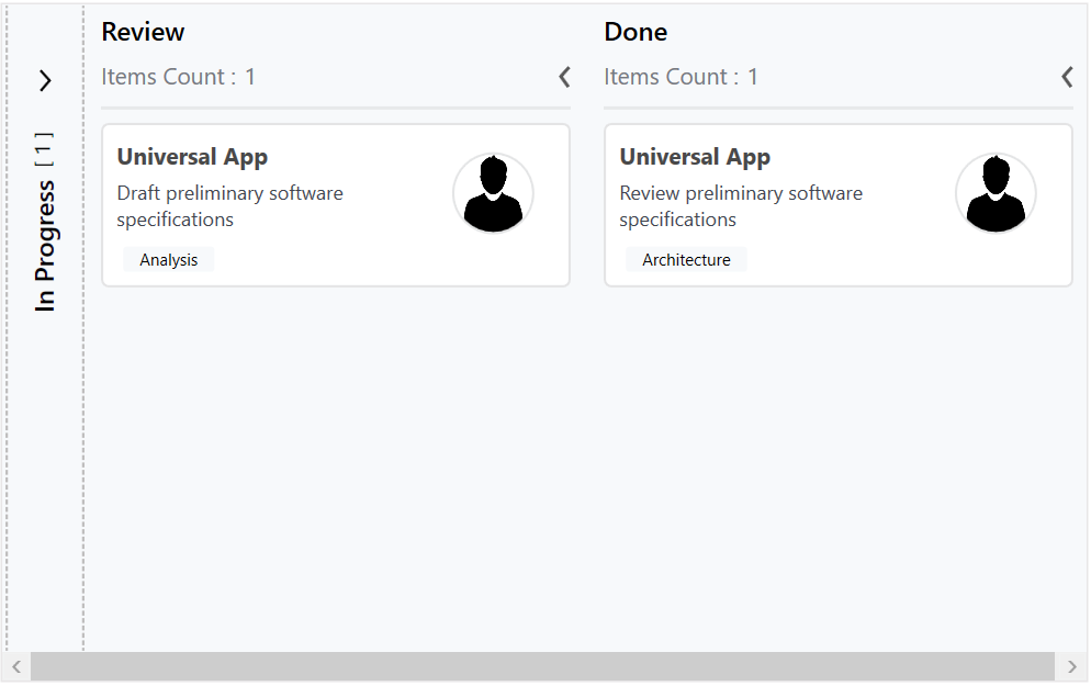
Enable/Disable Drag and Drop
The Kanban control provides built-in support to enable or disable drag-and-drop functionality for both cards and columns, allowing flexible control over user interactions.
Reordering Columns
Columns can be reordered in the WPF Kanban Board control using built-in drag-and-drop. Enable this by setting the AllowColumnReorder property of SfKanban to true. The default value is false.
<kanban:SfKanban AllowColumnReorder="True" />
SfKanban kanban = new SfKanban();
kanban.AllowColumnReorder = true;
Dragging Cards
You can enable or disable the drag-and-drop operation of cards for a particular column using the AllowDrag property of KanbanColumn.
<kanban:SfKanban>
    <kanban:SfKanban.Columns>
        <kanban:KanbanColumn Title="In Progress" AllowDrag="False" />
    </kanban:SfKanban.Columns>
</kanban:SfKanban>
SfKanban kanban = new SfKanban();
KanbanColumn kanbanColumn = new KanbanColumn()
{
Title = "In Progress",
AllowDrag = false
};
kanban.Columns.Add(kanbanColumn);