How can I help you?
Cards in WPF Kanban (SfKanban) control
22 Dec 202524 minutes to read
The default elements of a card can be customized using the below properties of KanbanModel.
-
Title- Used to set the title of a card. -
ImageURL- Used to set the image URL of a card. The image will be displayed at right side in default card template. -
Category- Used to set the category of a card. Based on the category theCardswill be added to the respective columns. -
Description- Used to set the description text of a card. -
ColorKey- Used to specify the indicatorColorKey. TheColorvalue of the correspondingKeyshould be added inIndicatorColorPalettecollection ofSfKanban. -
Tags- Used to specify the tags of a card. The tags will be displayed at bottom in default card template. -
ID- Used to set the ID of a card.
new KanbanModel()
{

    Title = "Universal App",

    ID = "27654",

    Description = "Incorporate feedback into functional specifications",

    Category = "Open",

    ColorKey = "Low",

    Tags = new string[] { "Deployment" },

    ImageURL = new Uri("/images/icon.jpg", UriKind.RelativeOrAbsolute )
};
Following code snippet is used to define the colors for each key.
<kanban:SfKanban.IndicatorColorPalette>

    <kanban:ColorMapping Key="Low" Color="Blue"/>

    <kanban:ColorMapping Key="Normal" Color="Green" />

    <kanban:ColorMapping Key="High" Color="Red" />

</kanban:SfKanban.IndicatorColorPalette>
IndicatorColorPalette indicatorColorPalette = new IndicatorColorPalette();
indicatorColorPalette.Add(new ColorMapping() { Key = "Low", Color = Colors.Blue });
indicatorColorPalette.Add(new ColorMapping() { Key = "High", Color = Colors.Red });
indicatorColorPalette.Add(new ColorMapping() { Key = "Normal", Color = Colors.Green });
sfKanban.IndicatorColorPalette = indicatorColorPalette;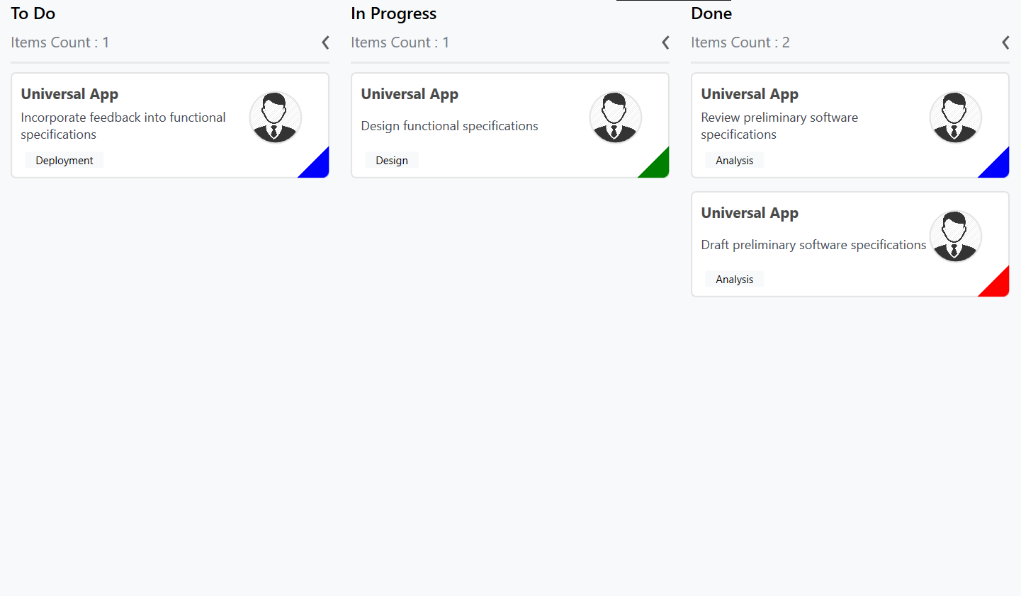
Customizing kanban cards
The CardStyle property customizes the kanban cards. The following properties of CardStyle are used to customize its appearance:
-
Background- Changes the background color of a card. -
BorderBrush- Changes the border brush of a card. -
BorderThickness- Changes the border thickness of a card. -
CornerRadius- Adds rounded corners to a card. -
IconVisibility- Changes the icon visibility of a card. -
IndicatorVisibility- Changes the indicator visibility of a card. -
TagVisibility- Changes the tag panel visibility of a card. -
TitleColor- Changes the header color of a kanban card item. -
TitleFontSize- Changes the font size of a card title. -
TitleHorizontalAlignment- Changes the horizontal alignment of a card title. -
FontSize- Changes the font size of a card description. -
Foreground- Changes the foreground color of a card description. -
TagBackground- Changes the tag’s background color. -
TagForeground- Changes the tag’s foreground color.
Template
You can replace the entire card template with your own design using SfKanban.CardTemplate property. The following code snippet and screenshot illustrates this.
<kanban:SfKanban.CardTemplate>

    <DataTemplate>

        <Border BorderBrush="Black"

                BorderThickness="0.75"

                CornerRadius="10"

                Background="AliceBlue"

                Margin="0,5,0,5">

            <Grid Margin="10,5,5,10">

                <Grid.ColumnDefinitions>

                    <ColumnDefinition Width="7*" />

                    <ColumnDefinition Width="3*" />

                </Grid.ColumnDefinitions>

                <Grid.RowDefinitions>

                    <RowDefinition Height="Auto" />

                    <RowDefinition Height="Auto" />

                </Grid.RowDefinitions>

                <TextBlock Text="{Binding Path=Title}"

                           FontWeight="Bold"

                           FontSize="16" />

                <TextBlock Grid.Row="1"

                           FontSize="14"

                           HorizontalAlignment="Left"

                           Text="{Binding Description}"

                           TextWrapping="WrapWholeWords" />

                <Border Grid.Row="1"

                        Grid.Column="1"

                        Height="50"

                        CornerRadius="50"

                        Width="50"

                        BorderBrush="Silver"

                        BorderThickness=".75">

                    <Border.Background>

                        <ImageBrush ImageSource="{Binding ImageURL}" />

                    </Border.Background>

                </Border>

            </Grid>

        </Border>

    </DataTemplate>

</kanban:SfKanban.CardTemplate>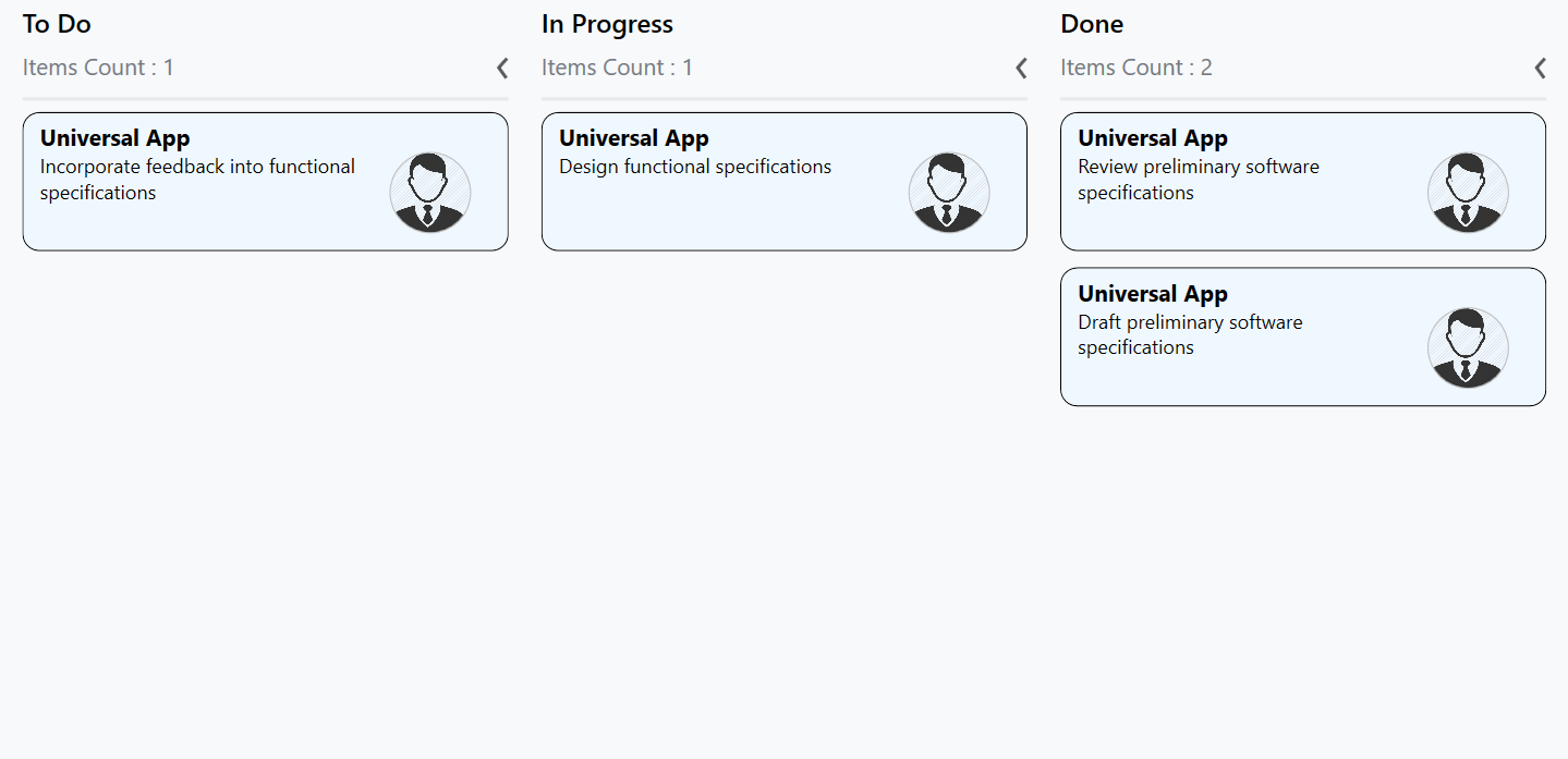
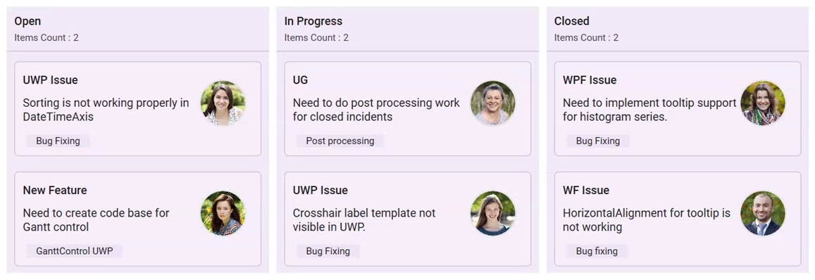
Cards tooltip
An interactive tooltip provides additional details about the cards on hovering the mouse over them.
Enable tooltip for cards
To enable tooltip for the kanban cards, use IsToolTipEnabled property of SfKanban. By default, IsToolTipEnabled is set to false. To provide users with additional information or context about cards, simply set this property to true.
<kanban:SfKanban x:Name="kanban"
                 IsToolTipEnabled="True"
                 ItemsSource="{Binding Tasks}">
    <kanban:SfKanban.DataContext>
        <local:ViewModel/>
    </kanban:SfKanban.DataContext>
</kanban:SfKanban>this.kanban.IsToolTipEnabled = true;public class ViewModel
{
/// <summary>
/// Gets or sets the collection of <see cref="KanbanModel"/> objects representing tasks in various stages.
/// </summary>
public ObservableCollection<KanbanModel> Tasks { get; set; }
/// <summary>
/// Initializes a new instance of the <see cref="ViewModel"/> class.
/// </summary>
public ViewModel()
{
Tasks = new ObservableCollection<KanbanModel>();
KanbanModel task = new KanbanModel();
task.Title = "UWP Issue";
task.Description = "Sorting is not working properly in DateTimeAxis";
task.Category = "Open";
task.Tags = new string[] { "Bug Fixing" };
Tasks.Add(task);
task = new KanbanModel();
task.Title = "New Feature";
task.Description = "Need to create code base for Gantt control";
task.Category = "Open";
task.Tags = new string[] { "GanttControl UWP" };
Tasks.Add(task);
task = new KanbanModel();
task.Title = "UG";
task.Description = "Need to do post processing work for closed incidents";
task.Category = "In Progress";
task.Tags = new string[] { "Post processing" };
Tasks.Add(task);
task = new KanbanModel();
task.Title = "UWP Issue";
task.Description = "Crosshair label template not visible in UWP.";
task.Category = "In Progress";
task.Tags = new string[] { "Bug Fixing" };
Tasks.Add(task);
task = new KanbanModel();
task.Title = "WPF Issue";
task.Description = "Need to implement tooltip support for histogram series.";
task.Category = "Closed";
task.Tags = new string[] { "Bug Fixing" };
Tasks.Add(task);
task = new KanbanModel();
task.Title = "WF Issue";
task.Description = "HorizontalAlignment for tooltip is not working";
task.Category = "Closed";
task.Tags = new string[] { "Bug fixing" };
Tasks.Add(task);
}
}
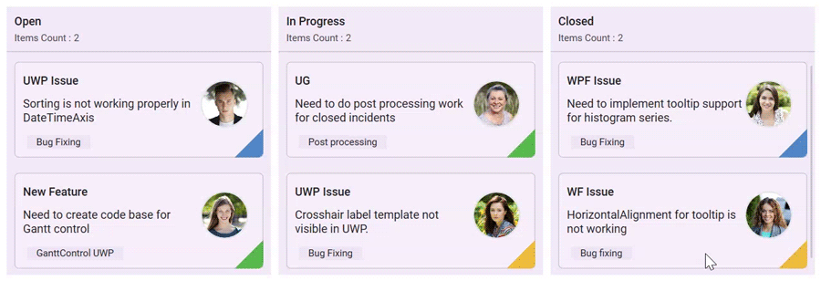
Customize tooltip appearance
You can customize the tooltip appearance by using the ToolTipTemplate property in the SfKanban.
The following code example shows the usage of DataTemplate.
<kanban:SfKanban x:Name="kanban"
                 IsToolTipEnabled="True"
                 ItemsSource="{Binding Tasks}">
    <kanban:SfKanban.ToolTipTemplate>
        <DataTemplate>
            <Border CornerRadius="4" Padding="10" Background="Black">
                <Grid>
                    <Grid.ColumnDefinitions>
                        <ColumnDefinition Width="Auto" />
                        <ColumnDefinition Width="*" />
                    </Grid.ColumnDefinitions>
                    <Rectangle Fill="{Binding ColorKey}" Grid.Column="0" VerticalAlignment="Stretch"
                               HorizontalAlignment="Left" Width="8" Margin="0,0,5,0" />
                    <Grid Grid.Column="1">
                        <Grid.ColumnDefinitions>
                            <ColumnDefinition Width="5*"/>
                            <ColumnDefinition Width="5*"/>
                        </Grid.ColumnDefinitions>
                        <Grid.RowDefinitions >
                            <RowDefinition Height="3.5*"/>
                            <RowDefinition Height="3.5*"/>
                            <RowDefinition Height="3*"/>
                        </Grid.RowDefinitions>
                        <TextBlock Text="Title : " FontSize="10.5" Grid.Row="0" Grid.Column="0"
                                   Margin="0,0,0,8" Foreground="White" />
                        <TextBlock Text="{Binding  Title}" Grid.Row="0" Grid.Column="1"
                                   FontSize="10.5"   Margin="5,0,0,8" Foreground="White" />
                        <TextBlock Text="Status : " Margin="0,0,0,8" Grid.Row="1" Grid.Column="0"
                                   FontSize="10.5" Foreground="White" />
                        <TextBlock Text="{Binding Category}" Grid.Row="1" Grid.Column="1"
                                   FontSize="10.5" Margin="5,0,0,8" Foreground="White" />
                        <TextBlock Text="Description : " Grid.Row="2" Grid.Column="0"
                                   FontSize="10.5" Foreground="White" />
                        <TextBlock Text="{Binding Description}" Margin="5,0,0,0" Width="150"
                                   TextWrapping="Wrap" TextTrimming="CharacterEllipsis"
                                   FontSize="10.5"   Grid.Row="2" Grid.Column="1" Foreground="White" />
                    </Grid>
                </Grid>
            </Border>
        </DataTemplate>
    </kanban:SfKanban.ToolTipTemplate>
    <kanban:SfKanban.DataContext>
        <local:ViewModel/>
    </kanban:SfKanban.DataContext>
</kanban:SfKanban>this.kanban.IsToolTipEnabled = true;
this.kanban.ItemsSource = new ViewModel().Tasks;public class ViewModel
{
/// <summary>
/// Gets or sets the collection of <see cref="KanbanModel"/> objects representing tasks in various stages.
/// </summary>
public ObservableCollection<KanbanModel> Tasks { get; set; }
/// <summary>
/// Initializes a new instance of the <see cref="ViewModel"/> class.
/// </summary>
public ViewModel()
{
Tasks = new ObservableCollection<KanbanModel>();
KanbanModel task = new KanbanModel();
task.Title = "UWP Issue";
task.Description = "Sorting is not working properly in DateTimeAxis";
task.Category = "Open";
task.ColorKey = "#FF5187C6";
task.Tags = new string[] { "Bug Fixing" };
Tasks.Add(task);
task = new KanbanModel();
task.Title = "New Feature";
task.Description = "Need to create code base for Gantt control";
task.Category = "Open";
task.ColorKey = "#FF57B94C";
task.Tags = new string[] { "GanttControl UWP" };
Tasks.Add(task);
task = new KanbanModel();
task.Title = "UG";
task.Description = "Need to do post processing work for closed incidents";
task.Category = "In Progress";
task.ColorKey = "#FF57B94C";
task.Tags = new string[] { "Post processing" };
Tasks.Add(task);
task = new KanbanModel();
task.Title = "UWP Issue";
task.Description = "Crosshair label template not visible in UWP.";
task.Category = "In Progress";
task.ColorKey = "#FFECB93C";
task.Tags = new string[] { "Bug Fixing" };
Tasks.Add(task);
task = new KanbanModel();
task.Title = "WPF Issue";
task.Description = "Need to implement tooltip support for histogram series.";
task.Category = "Closed";
task.ColorKey = "#FF5187C6";
task.Tags = new string[] { "Bug Fixing" };
Tasks.Add(task);
task = new KanbanModel();
task.Title = "WF Issue";
task.Description = "HorizontalAlignment for tooltip is not working";
task.Category = "Closed";
task.ColorKey = "#FFECB93C";
task.Tags = new string[] { "Bug fixing" };
Tasks.Add(task);
}
}
NOTE
- This property will only be applicable when IsToolTipEnabled is set to
true.