Getting Started with WPF Carousel
18 Feb 202524 minutes to read
This section explains how to create a WPF Carousel and explains about its structure.
Structure of Carousel

Assembly deployment
Refer to the Control Dependencies section to get the list of assemblies or NuGet package that needs to be added as a reference to use the control in any application.
Refer to this documentation to find more details about installing nuget packages in a WPF application.
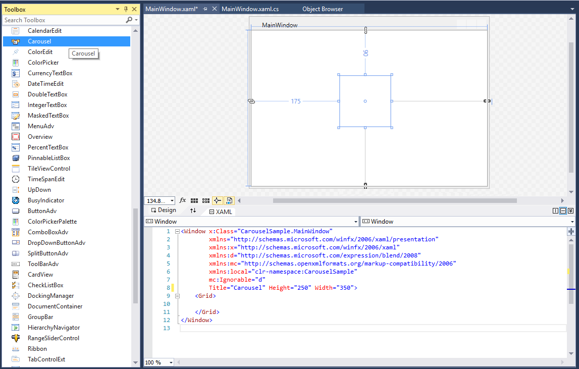
Adding WPF Carousel via designer
-
The WPF
Carouselcan be added to an application by dragging it from the toolbox to a designer view. The following dependent assemblies will be added automatically:- Syncfusion.Shared.WPF
- Set the properties for
Carouselin design mode using the SmartTag feature.
Adding WPF Carousel via XAML
To add the Carousel manually in XAML, follow these steps:
-
Create a new WPF project in Visual Studio.
-
Add the following required assembly references to the project:
- Syncfusion.Shared.WPF
-
Import Syncfusion® WPF schema http://schemas.syncfusion.com/wpf, and declare the Carousel in XAML page.
<Window x:Class="Carousel_sample.MainWindow"
        xmlns="http://schemas.microsoft.com/winfx/2006/xaml/presentation"
        xmlns:x="http://schemas.microsoft.com/winfx/2006/xaml"
        xmlns:d="http://schemas.microsoft.com/expression/blend/2008"
        xmlns:mc="http://schemas.openxmlformats.org/markup-compatibility/2006"
        xmlns:local="clr-namespace:Carousel_sample"
        xmlns:syncfusion="http://schemas.syncfusion.com/wpf"
        mc:Ignorable="d"
        Title="MainWindow" Height="450" Width="800">

    <Grid Name="grid">
        <syncfusion:Carousel Name="carousel"
                             Height="200"
                             Width="200"/>
    </Grid>
</Window>
Adding WPF Carousel via C#
To add the Carousel manually in C#, follow these steps:
-
Create a new WPF application via Visual Studio.
-
Add the following required assembly references to the project:
- Syncfusion.Shared.WPF
-
Include the required namespace.
using Syncfusion.Windows.Shared; -
Create an instance of
Carousel, and add it to the window.// Creating an instance of the Carousel Carousel carousel = new Carousel(); // Setting height and width to Carousel carousel.Height = 200; carousel.Width = 260;
NOTE
Populating items using CarouselItem
You can add the carousel items inside the control using the CarouselItem property.
<syncfusion:Carousel x:Name="carousel"
                     Height="700" Width="500">
    <syncfusion:CarouselItem>
        <syncfusion:CarouselItem.Content>
            <Viewbox Height="100" Width="100">
                <Image Source="Images/Buchanan.png"/>
            </Viewbox>
        </syncfusion:CarouselItem.Content>
    </syncfusion:CarouselItem>
    <syncfusion:CarouselItem>
        <syncfusion:CarouselItem.Content>
            <Viewbox Height="100" Width="100">
                <Image Source="Images/Callahan.png"/>
            </Viewbox>
        </syncfusion:CarouselItem.Content>
    </syncfusion:CarouselItem>
    <syncfusion:CarouselItem>
        <syncfusion:CarouselItem.Content>
            <Viewbox Height="100" Width="100">
                <Image Source="Images/Davolio-1.png"/>
            </Viewbox>
        </syncfusion:CarouselItem.Content>
    </syncfusion:CarouselItem>
    <syncfusion:CarouselItem>
        <syncfusion:CarouselItem.Content>
            <Viewbox Height="100" Width="100">
                <Image Source="Images/Callahan.png"/>
            </Viewbox>
        </syncfusion:CarouselItem.Content>
    </syncfusion:CarouselItem>
    <syncfusion:CarouselItem>
        <syncfusion:CarouselItem.Content>
            <Viewbox Height="100" Width="100">
                <Image Source="Images/dodsworth.png"/>
            </Viewbox>
        </syncfusion:CarouselItem.Content>
    </syncfusion:CarouselItem>
    <syncfusion:CarouselItem>
        <syncfusion:CarouselItem.Content>
            <Viewbox Height="100" Width="100">
                <Image Source="Images/Fuller.png"/>
            </Viewbox>
        </syncfusion:CarouselItem.Content>
    </syncfusion:CarouselItem>
    <syncfusion:CarouselItem>
        <syncfusion:CarouselItem.Content>
            <Viewbox Height="100" Width="100">
                <Image Source="Images/King.png"/>
            </Viewbox>
        </syncfusion:CarouselItem.Content>
    </syncfusion:CarouselItem>
    <syncfusion:CarouselItem>
        <syncfusion:CarouselItem.Content>
            <Viewbox Height="100" Width="100">
                <Image Source="Images/Leverling.png"/>
            </Viewbox>
        </syncfusion:CarouselItem.Content>
    </syncfusion:CarouselItem>
</syncfusion:Carousel>
Carousel carousel = new Carousel()
{
Width=700,
Height = 500
};
Image image = new Image();
Image image1 = new Image();
Image image2 = new Image();
Image image3 = new Image();
Image image4 = new Image();
Image image5 = new Image();
Image image6 = new Image();
Image image7 = new Image();
BitmapImage bitimg1 = new BitmapImage(new Uri("/Sample;component/Images/1.png", UriKind.RelativeOrAbsolute));
BitmapImage bitimg2 = new BitmapImage(new Uri("/Sample;component/Images/2.png", UriKind.RelativeOrAbsolute));
BitmapImage bitimg3 = new BitmapImage(new Uri("/Sample;component/Images/3.png", UriKind.RelativeOrAbsolute));
BitmapImage bitimg4 = new BitmapImage(new Uri("/Sample;component/Images/4.png", UriKind.RelativeOrAbsolute));
BitmapImage bitimg5 = new BitmapImage(new Uri("/Sample;component/Images/5.png", UriKind.RelativeOrAbsolute));
BitmapImage bitimg6 = new BitmapImage(new Uri("/Sample;component/Images/6.png", UriKind.RelativeOrAbsolute));
BitmapImage bitimg7 = new BitmapImage(new Uri("/Sample;component/Images/7.png", UriKind.RelativeOrAbsolute));
BitmapImage bitimg8 = new BitmapImage(new Uri("/Sample;component/Images/8.png", UriKind.RelativeOrAbsolute));
image.Source = bitimg1 as ImageSource;
image1.Source = bitimg2 as ImageSource;
image2.Source = bitimg3 as ImageSource;
image3.Source = bitimg4 as ImageSource;
image4.Source = bitimg5 as ImageSource;
image5.Source = bitimg6 as ImageSource;
image6.Source = bitimg7 as ImageSource;
image7.Source = bitimg8 as ImageSource;
carousel.Items.Add(new CarouselItem() { Content = new Viewbox(){ Child = image }});
carousel.Items.Add(new CarouselItem() { Content = new Viewbox(){ Child = image1 }});
carousel.Items.Add(new CarouselItem() { Content = new Viewbox(){ Child = image2 }});
carousel.Items.Add(new CarouselItem() { Content = new Viewbox(){ Child = image3 }});
carousel.Items.Add(new CarouselItem() { Content = new Viewbox(){ Child = image4 }});
carousel.Items.Add(new CarouselItem() { Content = new Viewbox(){ Child = image5 }});
carousel.Items.Add(new CarouselItem() { Content = new Viewbox(){ Child = image6 }});
carousel.Items.Add(new CarouselItem() { Content = new Viewbox(){ Child = image7 }});
NOTE
Populating items using collection binding
You can populate items to the Carousel control by setting the collection value to the ItemsSource property.
//Model.cs
public class CarouselModel {
	public string Header { get; set; }
}

//ViewModel.cs
public class ViewModel {
	private ObservableCollection<CarouselModel> collection;
	public ObservableCollection<CarouselModel> HeaderCollection
	{
		get {
			return collection;
		}
		set {
			collection = value;
		}
	}
	public ViewModel() {
		HeaderCollection = new ObservableCollection<CarouselModel>();
		HeaderCollection.Add(new CarouselModel() { Header = "Buchanan" });
		HeaderCollection.Add(new CarouselModel() { Header = "Callahan" });
		HeaderCollection.Add(new CarouselModel() { Header = "Davolio" });
		HeaderCollection.Add(new CarouselModel() { Header = "Dodsworth" });
		HeaderCollection.Add(new CarouselModel() { Header = "Fuller" });
		HeaderCollection.Add(new CarouselModel() { Header = "King" });
		HeaderCollection.Add(new CarouselModel() { Header = "Leverling" });
		HeaderCollection.Add(new CarouselModel() { Header = "Suyama" });
	}
}<Window.DataContext>
<local:ViewModel/>
</Window.DataContext>
<Grid>
<syncfusion:Carousel Name="Carousel"
ItemsSource="{Binding HeaderCollection}">
<syncfusion:Carousel.ItemTemplate>
<DataTemplate>
<Border Height="50"
Width="100"
BorderBrush="Purple"
BorderThickness="5"
Background="LightBlue">
<TextBlock HorizontalAlignment="Center"
VerticalAlignment="Center"
Text="{Binding Header}"/>
</Border>
</DataTemplate>
</syncfusion:Carousel.ItemTemplate>
</syncfusion:Carousel>
</Grid>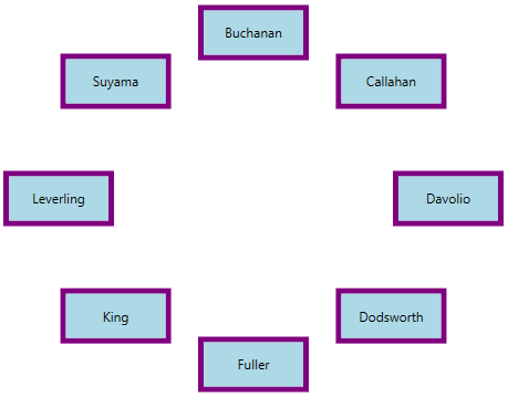
NOTE
Select carousel item
You can select a carousel item by mouse click on the specific item. You can get the selected item and its value by using the SelectedItem and SelectedValue properties. You can also get the selected item index by using the SelectedIndex property. You can only select a single item at a time.
Select carousel item programmatically using property
You can select a particular carousel item programmatically by using the CarouselItem.IsSelected property.
<Window.Resources>
    <Style x:Key="selecteditemStyle" TargetType="syncfusion:CarouselItem" >
        <Style.Triggers>
            <Trigger Property="IsSelected" Value="True">
                <Setter Property="Foreground" Value="Red"/>
                <Setter Property="FontWeight" Value="Bold"/>
            </Trigger>
        </Style.Triggers>
    </Style>
</Window.Resources>
<Grid>
    <syncfusion:Carousel ItemContainerStyle="{StaticResource selecteditemStyle}"
                         x:Name="carousel">
        <syncfusion:CarouselItem Content="Item1"/>
        <syncfusion:CarouselItem Content="Item2"/>
        <syncfusion:CarouselItem Content="Item3" IsSelected="True"/>
        <syncfusion:CarouselItem Content="Item4"/>
        <syncfusion:CarouselItem Content="Item5"/>
    </syncfusion:Carousel>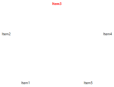
NOTE
Select carousel item programmatically using command and methods
You can select a previous, next, first or last carousel items programmatically by using the commands and methods.
-
SelectFirstItemCommand or SelectFirstItem() - To select the first item.
-
SelectLastItemCommand or SelectLastItem() - To select the last item.
-
SelectPreviousItemCommand or SelectPreviousItem - To select the previous item from the currently selected item
-
SelectNextItemCommand or SelectNextItem() - To select the next item from the currently selected item.
-
SelectPreviousPageCommand or SelectPreviousPage() - To select the previous page item.
-
SelectNextPageCommand or SelectNextPage() - To select the next page item.
NOTE
Rotate carousel item
You can place the carousel item with a specific rotation angle by using the RotationAngle property. You can change the rotation speed of the carousel items by using the RotationSpeed property. You can also disable the rotate animation by using the EnableRotationAnimation property value as false. The default value of RotationAngle property is 0 and RotationSpeed property is 200 and EnableRotationAnimation property is true.
<syncfusion:Carousel RotationAngle="180"
                     RotationSpeed="500"
                     EnableRotationAnimation="True"
                     ItemsSource="{Binding HeaderCollection}"
Name="carousel" />carousel.RotationAngle = 180;
carousel.RotationSpeed = 500;
carousel.EnableRotationAnimation = true;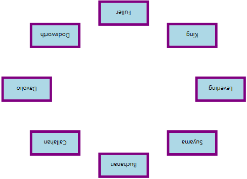
NOTE
Resize the carousel items
If you want to change the size of the carousel items except the selected item, use the ScaleFraction property. You can disable it by setting the ScalingEnabled property value as false. Value range of ScaleFraction property is 0 to 1. The default value ScaleFraction property is 0 and ScalingEnabled property is true.
<syncfusion:Carousel ScaleFraction="0.50"
                     ItemsSource="{Binding HeaderCollection}"
Name="carousel"/>carousel. ScaleFraction = 0.50;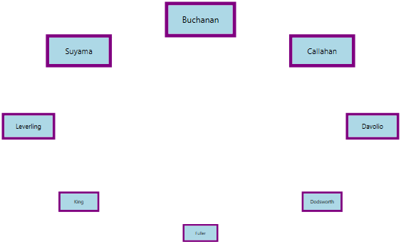
NOTE
Change radius of carousel item
You can change the radius of the Carousel control by setting the value to the RadiusX and RadiusY properties. Based on the radius points , items are arranged. The default value of RadiusX property is 250 and RadiusY property is 150.
<syncfusion:Carousel RadiusX="100"
                     RadiusY="100"
                     ItemsSource="{Binding HeaderCollection}"
Name="carousel"/>carousel.RadiusX = 100;
carousel.RadiusY = 100;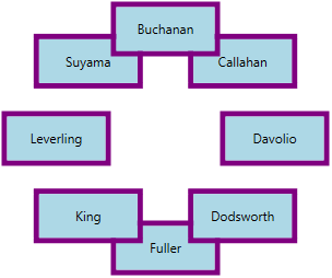
NOTE
Custom UI of carousel item
You can customize the appearance of each carousel item by using the ItemTemplate property. If you want to change the appearance of particular carousel item appearance, use ItemTemplateSelector property. The DataContext of the ItemTemplate property is CarouselItem.
//Model.cs
public class CarouselModel {
	public string Header { get; set; }
}

//ViewModel.cs
public class ViewModel {
	private ObservableCollection<CarouselModel> collection;
	public ObservableCollection<CarouselModel> HeaderCollection	{
		get {
			return collection;
		}
		set {
			collection = value;
		}
	}
	public ViewModel() {
		HeaderCollection = new ObservableCollection<CarouselModel>();
		HeaderCollection.Add(new CarouselModel() { Header = "Buchanan" });
		HeaderCollection.Add(new CarouselModel() { Header = "Callahan" });
		HeaderCollection.Add(new CarouselModel() { Header = "Davolio" });
		HeaderCollection.Add(new CarouselModel() { Header = "Dodsworth" });
		HeaderCollection.Add(new CarouselModel() { Header = "Fuller" });
		HeaderCollection.Add(new CarouselModel() { Header = "King" });
		HeaderCollection.Add(new CarouselModel() { Header = "Leverling" });
		HeaderCollection.Add(new CarouselModel() { Header = "Suyama" });
	}
}<Window.DataContext>
<local:ViewModel/>
</Window.DataContext>
<Grid>
<syncfusion:Carousel ItemsSource="{Binding HeaderCollection}"
ScaleFraction="0.5"
Name="carousel" >
<syncfusion:Carousel.ItemTemplate>
<DataTemplate>
<Grid>
<Ellipse Width="200" Height="100"
Stroke="Green"
StrokeThickness="4"
Fill="Yellow"/>
<TextBlock HorizontalAlignment="Center"
VerticalAlignment="Center"
Text="{Binding Header}"/>
</Grid>
</DataTemplate>
</syncfusion:Carousel.ItemTemplate>
</syncfusion:Carousel>
</Grid>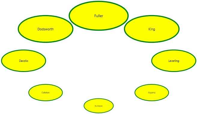
NOTE
Custom display path for carousel items
You can change the custom display path of the carousel items by using the Carousel.Path property. You can enable it by setting the VisualMode property as VisualMode.CustomPath. The default value of Carousel.Path property is null and VisualMode property is Standard.
<syncfusion:Carousel VisualMode="CustomPath"
                     ItemsSource="{Binding HeaderCollection}"
                     Name="carousel">
    <syncfusion:Carousel.Path>
        <Path Data="M0,100 L100,20"
              Stroke="Blue"
              StrokeThickness="2"
              HorizontalAlignment="Stretch"
              VerticalAlignment="Stretch"/>
    </syncfusion:Carousel.Path>
</syncfusion:Carousel>carousel.VisualMode = VisualMode.CustomPath;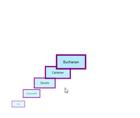
NOTE
Number of items to be visible in Page
By default, all the items are displayed in the Carousel control. If you will be added more items and wants to display less number of items at a time, use the ItemsPerPage property. ItemsPerPage is effective only on VisualMode.CustomPath view mode. The default value of ItemsPerPage property is -1.
<syncfusion:Carousel ItemsPerPage="3"
                     VisualMode="CustomPath"
                     ItemsSource="{Binding HeaderCollection}"
Name="carousel"/>carousel.ItemsPerPage = 3;
carousel.VisualMode = VisualMode.CustomPath;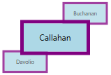
NOTE
Selected item changed notification
The selected item changed in Carousel can be examined using SelectionChanged event. The SelectionChanged event contains the old and newly selected item in the OldValue and NewValue properties.
<syncfusion:Carousel SelectionChanged="Carousel_SelectionChanged"
                      ItemsSource="{Binding HeaderCollection}"
                      Name="carousel"/>
Carousel carousel = new Carousel();
carousel.SelectionChanged += Carousel_SelectionChanged;You can handle the event as follows,
private void Carousel_SelectionChanged(DependencyObject d, DependencyPropertyChangedEventArgs e) {
    //Get old and new selected carousel item
    var oldValue = e.OldValue;
    var newValue = e.NewValue;
}
Theme
Carousel supports various built-in themes. Refer to the below links to apply themes for the Carousel,