How can I help you?
Custom Path in WPF carousel (Carousel)
18 Feb 202518 minutes to read
This section explains about resizing, skewing, page customization and opacity supports available in WPF Carousel control’s custom path mode.
Load carousel items in custom path
If you want to load the carousel items in your custom path, set the path value to the Carousel.Path. You can enable it only by setting the VisualMode property as VisualMode.CustomPath. The default value of VisualMode property is VisualMode.Standard and Carousel.Path property is null.
NOTE
If you not set any path value to
Carousel.Pathproperty onVisualMode.CustomPathmode, carousel items will be loaded in theUshaped path.
//Model.cs
public class CarouselModel {
	public string Header { get; set; }
}

//ViewModel.cs
public class ViewModel {
	private ObservableCollection<CarouselModel> collection;
	public ObservableCollection<CarouselModel> HeaderCollection
	{
		get {
			return collection;
		}
		set {
			collection = value;
		}
	}
	public ViewModel() {
		HeaderCollection = new ObservableCollection<CarouselModel>();
		HeaderCollection.Add(new CarouselModel() { Header = "Buchanan" });
		HeaderCollection.Add(new CarouselModel() { Header = "Callahan" });
		HeaderCollection.Add(new CarouselModel() { Header = "Davolio" });
		HeaderCollection.Add(new CarouselModel() { Header = "Dodsworth" });
		HeaderCollection.Add(new CarouselModel() { Header = "Fuller" });
		HeaderCollection.Add(new CarouselModel() { Header = "King" });
		HeaderCollection.Add(new CarouselModel() { Header = "Leverling" });
		HeaderCollection.Add(new CarouselModel() { Header = "Suyama" });
	}
}<Window.DataContext>
<local:ViewModel/>
</Window.DataContext>
<Grid>
<syncfusion:Carousel Name="Carousel"
VisualMode="CustomPath"
SelectedIndex="3"
ItemsSource="{Binding HeaderCollection}">
<syncfusion:Carousel.Path>
<Path Data="M0,100 L100,20" />
</syncfusion:Carousel.Path>
<syncfusion:Carousel.ItemTemplate>
<DataTemplate>
<Border Height="50"
Width="100"
BorderBrush="Purple"
BorderThickness="5"
Background="LightBlue">
<TextBlock HorizontalAlignment="Center"
VerticalAlignment="Center"
Text="{Binding Header}"/>
</Border>
</DataTemplate>
</syncfusion:Carousel.ItemTemplate>
</syncfusion:Carousel>
</Grid>carousel.VisualMode = VisualMode.CustomPath;
carousel.SelectedIndex = 3;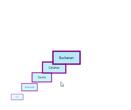
NOTE
Number of items to be visible in a Page
By default, all the items are displayed in the Carousel control. If you will be added more items and wants to display less number of items at a time, use the ItemsPerPage property. ItemsPerPage is effective only on VisualMode.CustomPath view mode. The default value of ItemsPerPage property is -1.
<syncfusion:Carousel ItemsPerPage="3"
                     VisualMode="CustomPath"
                     ItemsSource="{Binding HeaderCollection}"
Name="carousel"/>carousel.ItemsPerPage = 3;
carousel.VisualMode = VisualMode.CustomPath;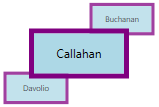
NOTE
Resize carousel items
If you want to change the size of the carousel items except the selected item in the VisualMode.CustomPath mode, use the ScaleFraction property. You can disable it by setting the ScalingEnabled property value as false. Value range of ScaleFraction property is 0 to 1. The default value ScaleFraction property is Double.NaN and ScalingEnabled property is true.
<syncfusion:Carousel ScaleFraction="0.7"
                     ScalingEnabled="True"
                     VisualMode="CustomPath"
                     ItemsSource="{Binding HeaderCollection}"
                     Name="carousel">
    <syncfusion:Carousel.Path>
        <Path Data="M0,0 L100,0" />
    </syncfusion:Carousel.Path>
</syncfusion:Carousel>carousel.ScaleFraction = 0.7;
carousel.ScalingEnabled = true;
carousel.VisualMode = VisualMode.CustomPath;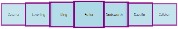
NOTE
Resize specific carousel item
If you want to individually change the size of the next, previous item or selected carousel items in the VisualMode.CustomPath mode, set the fraction values to the ScaleFractions collection property. Value range of resizing is 0 to 1. The default value of ScaleFractions property is null.
NOTE
This will effective only on when setting the
ScalingEnabledproperty value astrue.
<syncfusion:Carousel ScalingEnabled="True"
                     VisualMode="CustomPath"
                     ItemsSource="{Binding HeaderCollection}"
                     Name="carousel">
    <syncfusion:Carousel.Path>
        <Path Data="M0,0 L100,0" />
    </syncfusion:Carousel.Path>

    <syncfusion:Carousel.ScaleFractions>
        <syncfusion:PathFractionCollection>

            <!--Resize next items from the selected item-->
            <syncfusion:FractionValue Fraction="0" Value="0.6"/>

            <!--Resize selected item-->
            <syncfusion:FractionValue Fraction="0.5" Value="0.9"/>

            <!--Resize previous items from the selected item-->
            <syncfusion:FractionValue Fraction="1" Value="0"/>
        </syncfusion:PathFractionCollection>
    </syncfusion:Carousel.ScaleFractions>
</syncfusion:Carousel>
FractionValue NextItemfraction = new FractionValue() { Fraction = 0, Value = 0.6 };
FractionValue selectedItemfraction = new FractionValue() { Fraction = 0.5, Value = 0.9 };
FractionValue PreviousItemfraction = new FractionValue() { Fraction = 1, Value = 0 };
PathFractionCollection pathFraction = new PathFractionCollection();
pathFraction.Add(NextItemfraction);
pathFraction.Add(selectedItemfraction);
pathFraction.Add(PreviousItemfraction);
//Adding scale fractions to the carousel items
carousel.ScaleFractions = pathFraction;
carousel.ScalingEnabled = true;
carousel.VisualMode = VisualMode.CustomPath;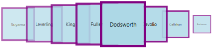
NOTE
Opacity for carousel items
If you want to change the opacity of the carousel items except the selected item in the VisualMode.CustomPath mode, set the fraction value to the OpacityFraction property. You can disable it by setting the OpacityEnabled property value as false. Value range of OpacityFraction property is 0 to 1. The default value of OpacityFraction property is Double.NaN and OpacityEnabled property is true.
<syncfusion:Carousel OpacityFraction="0.9"
                     OpacityEnabled="True"
                     VisualMode="CustomPath"
                     ItemsSource="{Binding HeaderCollection}"
                     Name="carousel">
    <syncfusion:Carousel.Path>
        <Path Data="M0,0 L100,0" />
    </syncfusion:Carousel.Path>
</syncfusion:Carousel>carousel.OpacityFraction = 0.9;
carousel.OpacityEnabled = true;
carousel.VisualMode = VisualMode.CustomPath;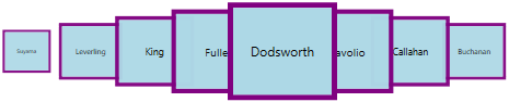
NOTE
Opacity for specific carousel item
If you want to individually change the opacity of the next, previous items or selected carousel items in the VisualMode.CustomPath mode, set the fraction values to the OpacityFractions collection property. Value range of opacity is 0 to 1. The default value of OpacityFractions property is null.
NOTE
This will effective only on when setting the
OpacityEnabledproperty value astrue.
<syncfusion:Carousel OpacityEnabled="True"
                     VisualMode="CustomPath"
                     ItemsSource="{Binding HeaderCollection}"
                     Name="carousel">
    <syncfusion:Carousel.Path>
        <Path Data="M0,0 L100,0" />
    </syncfusion:Carousel.Path>

    <syncfusion:Carousel.OpacityFractions>
        <syncfusion:PathFractionCollection>

            <!--Opacity for next items from the selected item-->
            <syncfusion:FractionValue Fraction="0" Value="0"/>

            <!--Opacity for selected item-->
            <syncfusion:FractionValue Fraction="0.5" Value="0.9"/>

            <!--Opacity for previous items from the selected item-->
            <syncfusion:FractionValue Fraction="1" Value="0.7"/>
        </syncfusion:PathFractionCollection>
    </syncfusion:Carousel.OpacityFractions>
</syncfusion:Carousel>
FractionValue NextItemfraction = new FractionValue() { Fraction = 0, Value = 0 };
FractionValue selectedItemfraction = new FractionValue() { Fraction = 0.5, Value = 0.9 };
FractionValue PreviousItemfraction = new FractionValue() { Fraction = 1, Value = 0.7 };
PathFractionCollection pathFraction = new PathFractionCollection();
pathFraction.Add(NextItemfraction);
pathFraction.Add(selectedItemfraction);
pathFraction.Add(PreviousItemfraction);
//Adding opacity fractions to the carousel items
carousel.OpacityFractions = pathFraction;
carousel.OpacityEnabled = true;
carousel.VisualMode = VisualMode.CustomPath;
NOTE
Skewing the carousel items
If you want to skewing the carousel items with particular X-Y fraction angle, use the SkewAngleXFraction and SkewAngleYFraction properties. You can enable it by setting the SkewAngleXEnabled and SkewAngleYEnabled property value as true. The default value SkewAngleXFraction and SkewAngleYFraction properties is Double.NaN and default value of SkewAngleXEnabled & SkewAngleYEnabled property is false.
<syncfusion:Carousel SkewAngleXFraction="5"
                     SkewAngleYFraction="30"
                     SkewAngleXEnabled="True"
                     SkewAngleYEnabled="True"
                     VisualMode="CustomPath"
                     ItemsSource="{Binding HeaderCollection}"
                     Name="carousel">
    <syncfusion:Carousel.Path>
        <Path Data="M0,0 L100,0" />
    </syncfusion:Carousel.Path>
</syncfusion:Carousel>carousel.SkewAngleXFraction = 5;
carousel.SkewAngleYFraction = 30;
carousel.SkewAngleXEnabled = true;
carousel.SkewAngleYEnabled = true;
carousel.VisualMode = VisualMode.CustomPath;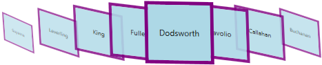
NOTE
Skewing the specific carousel item
If you want to individually skewing the next, previous item or selected carousel items in the VisualMode.CustomPath mode, set the X-Y fraction angle values to the SkewAngleXFractions and SkewAngleYFractions collection property. The default value of SkewAngleXFractions and SkewAngleYFractions property is null.
NOTE
This will effective only on when setting the
SkewAngleXEnabledandSkewAngleYEnabledproperties value astrue.
<syncfusion:Carousel SkewAngleXEnabled="True"
                     SkewAngleYEnabled="True"
                     VisualMode="CustomPath"
                     ItemsSource="{Binding HeaderCollection}"
                     Name="carousel">
    <syncfusion:Carousel.Path>
        <Path Data="M0,0 L100,0" />
    </syncfusion:Carousel.Path>

    <syncfusion:Carousel.SkewAngleXFractions>
        <syncfusion:PathFractionCollection>

            <!--Skewing X angle of next items from the selected item-->
            <syncfusion:FractionValue Fraction="0" Value="10"/>

            <!--Skewing X angle of selected item-->
            <syncfusion:FractionValue Fraction="0.5" Value="0"/>

            <!--Skewing X angle of previous items from the selected item-->
            <syncfusion:FractionValue Fraction="1" Value="40"/>
        </syncfusion:PathFractionCollection>
    </syncfusion:Carousel.SkewAngleXFractions>

    <syncfusion:Carousel.SkewAngleYFractions>
        <syncfusion:PathFractionCollection>

            <!--Skewing Y angle of next items from the selected item-->
            <syncfusion:FractionValue Fraction="0" Value="10"/>

            <!--Skewing Y angle of selected item-->
            <syncfusion:FractionValue Fraction="0.5" Value="0"/>

            <!--Skewing Y angle of previous items from the selected item-->
            <syncfusion:FractionValue Fraction="1" Value="40"/>
        </syncfusion:PathFractionCollection>
    </syncfusion:Carousel.SkewAngleYFractions>
</syncfusion:Carousel>carousel.SkewAngleXEnabled = true;
carousel.SkewAngleYEnabled = true;
carousel.VisualMode = VisualMode.CustomPath;
NOTE