RibbonGallery in WinUI Ribbon
14 Jul 202624 minutes to read
The RibbonGallery displays a list of scrollable gallery items or commands in a visually rich format that can be organized as multiple subsets of categorized items in a Ribbon control.
Add gallery item
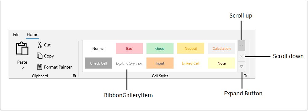
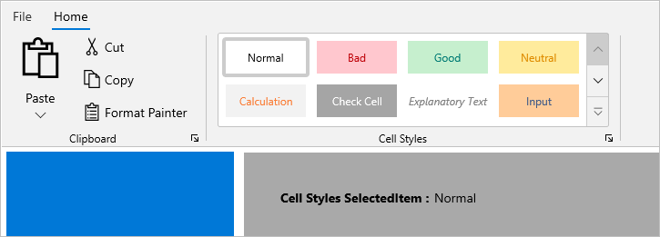
The RibbonGalleryItem can be added by using the Items property of the RibbonGallery control. The RibbonGallery allows you to view all gallery items in a popup by clicking the expand button in a control.
<ribbon:RibbonGroup Header="Cell Styles">
    <ribbon:RibbonGallery ItemHeight="48"
                          ItemWidth="100">
        <ribbon:RibbonGallery.Items>
            <ribbon:RibbonGalleryItem HorizontalContentAlignment="Center"
                                      VerticalContentAlignment="Center"
                                      Background="White"
                                      Content="Normal"
                                      Foreground="Black" />
            <ribbon:RibbonGalleryItem HorizontalContentAlignment="Center"
                                      VerticalContentAlignment="Center"
                                      Background="#ffc7ce"
                                      Content="Bad"
                                      Foreground="#be0006" />
            <ribbon:RibbonGalleryItem HorizontalContentAlignment="Center"
                                      VerticalContentAlignment="Center"
                                      Background="#c6efce"
                                      Content="Good"
                                      Foreground="#007b74" />
            <ribbon:RibbonGalleryItem HorizontalContentAlignment="Center"
                                      VerticalContentAlignment="Center"
                                      Background="#ffeb9c"
                                      Content="Neutral"
                                      Foreground="#df8c00" />
            <ribbon:RibbonGalleryItem Content="Calculation"
                                      Background="#f2f2f2"
                                      HorizontalContentAlignment="Center"
                                      VerticalContentAlignment="Center"
                                      Foreground="#fa7d36" />
            <ribbon:RibbonGalleryItem HorizontalContentAlignment="Center"
                                      VerticalContentAlignment="Center"
                                      Background="#a5a5a5"
                                      Content="Check Cell"
                                      Foreground="White" />
            <ribbon:RibbonGalleryItem HorizontalContentAlignment="Center"
                                      VerticalContentAlignment="Center"
                                      Foreground="#7f7f7f"
                                      Content="Explanatory Text"
                                      FontStyle="Italic" />
            <ribbon:RibbonGalleryItem Content="Input"
                                      HorizontalContentAlignment="Center"
                                      VerticalContentAlignment="Center"
                                      Foreground="#3f5a88"
                                      Background="#ffcc99" />
            <ribbon:RibbonGalleryItem HorizontalContentAlignment="Center"
                                      VerticalContentAlignment="Center"
                                      Content="Linked Cell"
                                      Foreground="Orange" />
            <ribbon:RibbonGalleryItem  Background="#ffffcc"
                                       Content="Note"
                                       HorizontalContentAlignment="Center"
                                       VerticalContentAlignment="Center"
                                       Foreground="#3a0000" />
            <ribbon:RibbonGalleryItem Content="Output"
                                      Background="#f2f2f2"
                                      FontWeight="Bold"
                                      Foreground="#3f3f3f"
                                      HorizontalContentAlignment="Center"
                                      VerticalContentAlignment="Center" />
            <ribbon:RibbonGalleryItem HorizontalContentAlignment="Center"
                                      VerticalContentAlignment="Center"
                                      Content="Warning Text"
                                      Foreground="Red" />
        </ribbon:RibbonGallery.Items>
    </ribbon:RibbonGallery>
</ribbon:RibbonGroup>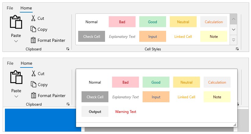
Grouping gallery items
The RibbonGallery includes built-in grouping support, allowing you to organize gallery items in a gallery popup based on the GroupName property value. By clicking the expand button in a RibbonGallery, the entire gallery (either grouped or non-grouped) items can be viewed in a resizable popup view. All gallery items can be viewed in a RibbonGallery view by using the scroll up and down buttons.
<ribbon:RibbonGallery ItemHeight="48"
                      ItemWidth="100">
    <ribbon:RibbonGallery.Items>
        <ribbon:RibbonGalleryItem HorizontalContentAlignment="Center"
                                  VerticalContentAlignment="Center"
                                  Background="White"
                                  GroupName="Good, Bad and Neutral"
                                  Content="Normal"
                                  Foreground="Black" />
        <ribbon:RibbonGalleryItem HorizontalContentAlignment="Center"
                                  VerticalContentAlignment="Center"
                                  Background="#ffc7ce"
                                  Content="Bad"
                                  GroupName="Good, Bad and Neutral"
                                  Foreground="#be0006" />
        <ribbon:RibbonGalleryItem HorizontalContentAlignment="Center"
                                  VerticalContentAlignment="Center"
                                  Background="#c6efce"
                                  Content="Good"
                                  GroupName="Good, Bad and Neutral"
                                  Foreground="#007b74" />
        <ribbon:RibbonGalleryItem HorizontalContentAlignment="Center"
                                  VerticalContentAlignment="Center"
                                  Background="#ffeb9c"
                                  Content="Neutral"
                                  GroupName="Good, Bad and Neutral"
                                  Foreground="#df8c00" />
        <ribbon:RibbonGalleryItem Content="Calculation"
                                  Background="#f2f2f2"
                                  GroupName="Data and DataModel"
                                  HorizontalContentAlignment="Center"
                                  VerticalContentAlignment="Center"
                                  Foreground="#fa7d36" />
        <ribbon:RibbonGalleryItem HorizontalContentAlignment="Center"
                                  VerticalContentAlignment="Center"
                                  Background="#a5a5a5"
                                  Content="Check Cell"
                                  GroupName="Data and DataModel"
                                  Foreground="White" />
        <ribbon:RibbonGalleryItem HorizontalContentAlignment="Center"
                                  VerticalContentAlignment="Center"
                                  Foreground="#7f7f7f"
                                  GroupName="Data and DataModel"
                                  Content="Explanatory Text"
                                  FontStyle="Italic" />
        <ribbon:RibbonGalleryItem Content="Input"
                                  GroupName="Data and DataModel"
                                  HorizontalContentAlignment="Center"
                                  VerticalContentAlignment="Center"
                                  Foreground="#3f5a88"
                                  Background="#ffcc99" />
        <ribbon:RibbonGalleryItem HorizontalContentAlignment="Center"
                                  VerticalContentAlignment="Center"
                                  Content="Linked Cell"
                                  GroupName="Data and DataModel"
                                  Foreground="Orange" />
        <ribbon:RibbonGalleryItem  Background="#ffffcc"
                                   Content="Note"
                                   GroupName="Data and DataModel"
                                   HorizontalContentAlignment="Center"
                                   VerticalContentAlignment="Center"
                                   Foreground="#3a0000" />
        <ribbon:RibbonGalleryItem Content="Output"
                                  Background="#f2f2f2"
                                  GroupName="Data and DataModel"
                                  FontWeight="Bold"
                                  Foreground="#3f3f3f"
                                  HorizontalContentAlignment="Center"
                                  VerticalContentAlignment="Center" />
        <ribbon:RibbonGalleryItem HorizontalContentAlignment="Center"
                                  VerticalContentAlignment="Center"
                                  Content="Warning Text"
                                  GroupName="Data and DataModel"
                                  Foreground="Red" />
        <ribbon:RibbonGalleryItem HorizontalContentAlignment="Center"
                                  VerticalContentAlignment="Center"
                                  Background="#d9e1f2"
                                  Content="20%-Accent1"
                                  Foreground="#000000"
                                  GroupName="Themed Cell Styles" />
        <ribbon:RibbonGalleryItem HorizontalContentAlignment="Center"
                                  VerticalContentAlignment="Center"
                                  Background="#fce4d6"
                                  Content="20%-Accent2"
                                  Foreground="#000000"
                                  GroupName="Themed Cell Styles" />
        <ribbon:RibbonGalleryItem HorizontalContentAlignment="Center"
                                  VerticalContentAlignment="Center"
                                  Background="#ededed"
                                  Content="20%-Accent3"
                                  Foreground="#000000"
                                  GroupName="Themed Cell Styles" />
        <ribbon:RibbonGalleryItem HorizontalContentAlignment="Center"
                                  VerticalContentAlignment="Center"
                                  Background="#fff2cc"
                                  Content="20%-Accent4"
                                  Foreground="#000000"
                                  GroupName="Themed Cell Styles" />
        <ribbon:RibbonGalleryItem HorizontalContentAlignment="Center"
                                  VerticalContentAlignment="Center"
                                  Background="#ddebf7"
                                  Content="20%-Accent5"
                                  Foreground="#000000"
                                  GroupName="Themed Cell Styles" />
        <ribbon:RibbonGalleryItem HorizontalContentAlignment="Center"
                                  VerticalContentAlignment="Center"
                                  Background="#e2efda"
                                  Content="20%-Accent6"
                                  Foreground="#000000"
                                  GroupName="Themed Cell Styles" />
        <ribbon:RibbonGalleryItem HorizontalContentAlignment="Center"
                                  VerticalContentAlignment="Center"
                                  Content="Comma"
                                  GroupName="Number Format" />
        <ribbon:RibbonGalleryItem HorizontalContentAlignment="Center"
                                  VerticalContentAlignment="Center"
                                  Content="Comma [0]"
                                  GroupName="Number Format" />
        <ribbon:RibbonGalleryItem HorizontalContentAlignment="Center"
                                  VerticalContentAlignment="Center"
                                  Content="Currency"
                                  GroupName="Number Format" />
        <ribbon:RibbonGalleryItem HorizontalContentAlignment="Center"
                                  VerticalContentAlignment="Center"
                                  Content="Currency [0]"
                                  GroupName="Number Format" />
        <ribbon:RibbonGalleryItem HorizontalContentAlignment="Center"
                                  VerticalContentAlignment="Center"
                                  Content="Percent"
                                  GroupName="Number Format" />
    </ribbon:RibbonGallery.Items>
</ribbon:RibbonGallery>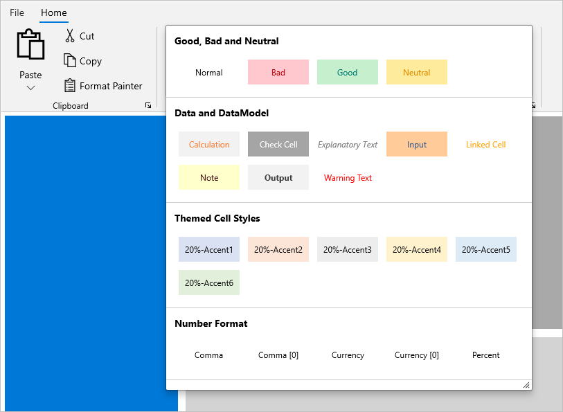
Selection
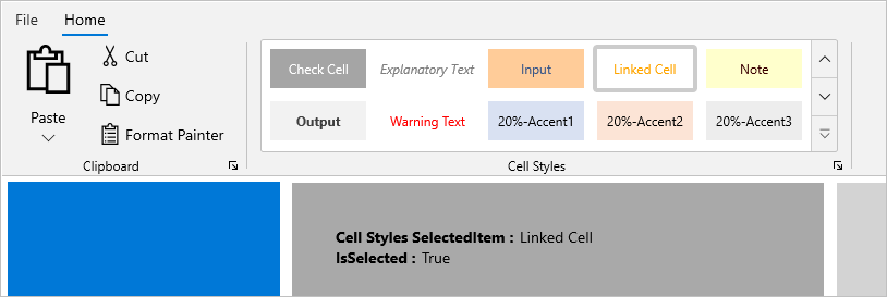
The SelectedItem property specifies the currently selected gallery item in a RibbonGallery.
Detecting selection changes in ribbon gallery
The SelectionChanged event occurs when a gallery item is clicked or the selected item is changed in a RibbonGallery. The SelectionChanged event handler receives two arguments:
- The sender argument is the
RibbonGallery. This argument is of type object but can be cast to theRibbonGallerytype. - The second argument is a
SelectionChangedEventArgsthat receives the old and newly selected gallery items.
<ribbon:RibbonGallery ItemHeight="96"
                      MaxColumnCount="4"
                      SelectionChanged="RibbonGallery_SelectionChanged"
                      SelectedItem="{Binding SelectedItem, Mode=TwoWay}"
                      ItemWidth="100">
    <ribbon:RibbonGallery.Items>
       <!-- Add gallery items here... -->
    </ribbon:RibbonGallery.Items>
</ribbon:RibbonGallery>
private void RibbonGallery_SelectionChanged(object sender, SelectionChangedEventArgs e)
{
// Write your code here
}
The IsSelected property returns true or false on the gallery item, indicating whether an item is currently selected or not. The property value associated with an item can be obtained from the SelectionChanged event.
private void RibbonGallery_SelectionChanged(object sender, SelectionChangedEventArgs e)
{
    if((e.AddedItems[0] as RibbonGalleryItem).IsSelected)
    {
         // Write code here if selected
    }
}
The SelectsOnInvoked property indicates whether a gallery item is selected when it is invoked (default is True). It is not possible to interact with any gallery item if SelectsOnInvoked is set to False.
<ribbon:RibbonGallery ItemHeight="48"
                      ItemWidth="100">
    <ribbon:RibbonGallery.Items>
        <ribbon:RibbonGalleryItem SelectsOnInvoked="False"
                          HorizontalContentAlignment="Center"
                          VerticalContentAlignment="Center"
                          Background="White"
                          GroupName="Good, Bad and Neutral"
                          Content="Normal"
                          Foreground="Black" />
        <!-- Add more items here... -->
    </ribbon:RibbonGallery.Items>
</ribbon:RibbonGallery>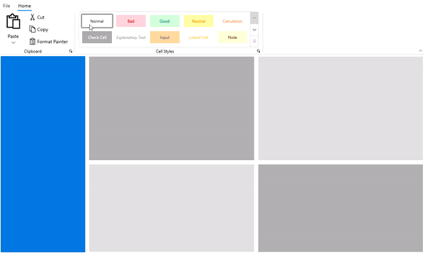
Customize the gallery item
Gallery items’ width and height can be changed using the ItemWidth and ItemHeight properties of RibbonGallery.
<ribbon:RibbonGallery ItemHeight="96"
                      ItemWidth="100">
    <ribbon:RibbonGallery.Items>
        <!-- Add gallery items here... -->
    </ribbon:RibbonGallery.Items>
</ribbon:RibbonGallery>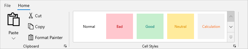
The MaxColumnCount in a RibbonGallery allows you to set the maximum number of gallery items displayed in a column. The default value is 5, which indicates the maximum number of columns.
<ribbon:RibbonGallery ItemHeight="48"
                      MaxColumnCount="4"
                      ItemWidth="100">
    <ribbon:RibbonGallery.Items>
        <!-- Add gallery items here... -->
    </ribbon:RibbonGallery.Items>
</ribbon:RibbonGallery>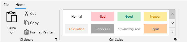
Ribbon gallery in simplified layout
The DisplayOptions property in a RibbonGallery is an enum type property that allows you to display a RibbonGallery in a specific layout based on LayoutModeOptions such as Normal and Simplified state of the Ribbon. The DisplayOptions property is set to Normal and Simplified mode by default.
The image below shows how the RibbonGallery can be displayed in a Simplified mode of the Ribbon’s LayoutModeOptions when DisplayOptions is set to Simplified.
<ribbon:RibbonGallery ItemHeight="48"
                      MaxColumnCount="4"
                      DisplayOptions="Simplified"
                      ItemWidth="100">
    <ribbon:RibbonGallery.Items>
        <!-- Add gallery items here... -->
    </ribbon:RibbonGallery.Items>
</ribbon:RibbonGallery>
Ribbon gallery preview
The RibbonGallery preview feature is used to inspect the items before selecting them. Users can activate and deactivate the preview support using the ItemPointerEnter and ItemPointerExit events respectively.
<ribbon:RibbonGallery  ItemHeight="70"
                       ItemWidth="100"
                       SelectedItem="{x:Bind ribbongalitem}"
                       ItemPointerEnter="fontGallery_ItemPointerEnter"
                       ItemPointerExit="fontGallery_ItemPointerExit"
                       ItemsSource="{x:Bind FontList}"
                       ItemTemplate="{StaticResource PreviewTemplate}">
</ribbon:RibbonGallery>
private void fontGallery_ItemPointerEnter(object sender, RibbonRoutedEventArgs e)
{
FontInfo selecteditem = (FontInfo)(e.Source as RibbonGalleryItem).Content;
if (selecteditem != null)
{
FontViewModel.FontSize = selecteditem.FontSize;
FontViewModel.FontWeight = selecteditem.FontWeight;
}
}
private void fontGallery_ItemPointerExit(object sender, RibbonRoutedEventArgs e)
{
FontInfo selecteditem = (FontInfo)(sender as RibbonGallery).SelectedItem;
if (selecteditem != null)
{
FontViewModel.FontSize = selecteditem.FontSize;
FontViewModel.FontWeight = selecteditem.FontWeight;
}
}The RibbonGallery preview support is demonstrated in the gif below.
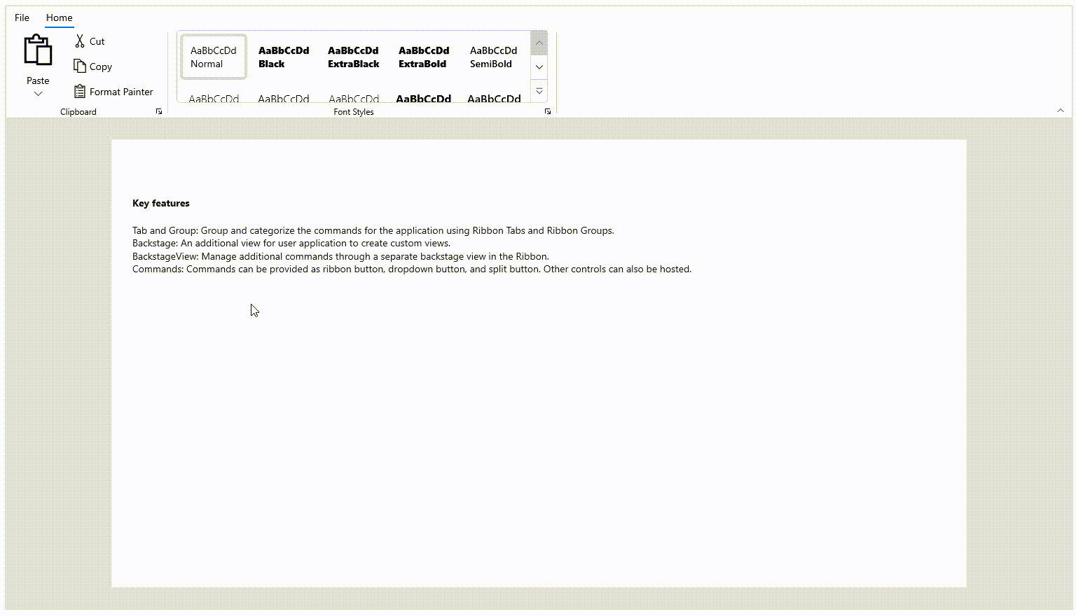
Populate ribbon gallery with MVVM
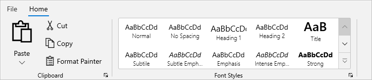
The RibbonGallery provides MVVM support that supports data binding and manual data population.
The following example demonstrates how data items are populated using the ItemsSource property and wrapped using the ItemTemplate property. The ItemContainerStyle property allows you to override the container style in a RibbonGallery.
<DataTemplate x:Name="RibbonGalleryItemTemplate"
              x:DataType="local:FontStyleInfo">
    <StackPanel>
        <TextBlock Margin="{x:Bind Margin}"
                   HorizontalAlignment="Center"
                   VerticalAlignment="Center"
                   FontSize="{x:Bind FontSize}"
                   FontStyle="{x:Bind FontStyle}"
                   FontWeight="{x:Bind FontWeight}"
                   Text="{x:Bind FontText}"
                   TextTrimming="Clip" />
        <TextBlock Margin="2,0,2,0"
                   HorizontalAlignment="Center"
                   VerticalAlignment="Bottom"
                   FontWeight="Light"
                   Text="{x:Bind FontDescription}"
                   TextTrimming="CharacterEllipsis" />
    </StackPanel>
</DataTemplate>

<ribbon:RibbonGroup Header="Font Styles">
    <ribbon:RibbonGallery ItemHeight="56"
                              ItemTemplate="{StaticResource RibbonGalleryItemTemplate}"
                              ItemsSource="{Binding FontStyleCollection}"
                              SelectedItem="{Binding SelectedItem, Mode=TwoWay}" />
</ribbon:RibbonGroup>this.fontStyleCollection = new List<FontStyleInfo>();
this.fontStyleCollection = GetFontStyleCollection();
private List<FontStyleInfo> fontStyleCollection;
public List<FontStyleInfo> FontStyleCollection
{
get { return fontStyleCollection; }
set { fontStyleCollection = value; }
}
private List<FontStyleInfo> GetFontStyleCollection()
{
fontStyleCollection.Add(new FontStyleInfo() { FontText = "AaBbCcDd", FontDescription = "Normal" , FontWeight = FontWeights.Normal});
fontStyleCollection.Add(new FontStyleInfo() { FontText = "AaBbCcDd", FontDescription = "No Spacing", FontWeight = FontWeights.Normal });
fontStyleCollection.Add(new FontStyleInfo() { FontText = "AaBbCcDd", FontDescription = "Heading 1", FontSize = 17 });
fontStyleCollection.Add(new FontStyleInfo() { FontText = "AaBbCcDd", FontDescription = "Heading 2" });
fontStyleCollection.Add(new FontStyleInfo() { FontText = "AaB", FontDescription = "Title", FontWeight = FontWeights.SemiBold, FontSize = 26, Margin = new Microsoft.UI.Xaml.Thickness() { Left = 0, Top = -10, Right = 2, Bottom = 0 } });
fontStyleCollection.Add(new FontStyleInfo() { FontText = "AaBbCcDd", FontDescription = "Subtitle" });
fontStyleCollection.Add(new FontStyleInfo() { FontText = "AaBbCcDd", FontDescription = "Subtle Emphasis" , FontStyle = FontStyle.Italic });
fontStyleCollection.Add(new FontStyleInfo() { FontText = "AaBbCcDd", FontDescription = "Emphasis" });
fontStyleCollection.Add(new FontStyleInfo() { FontText = "AaBbCcDd", FontDescription = "Intense Emphasis", FontStyle = FontStyle.Italic });
fontStyleCollection.Add(new FontStyleInfo() { FontText = "AaBbCcDd", FontDescription = "Strong", FontWeight = FontWeights.Bold });
fontStyleCollection.Add(new FontStyleInfo() { FontText = "AaBbCcDd", FontDescription = "Quote", FontStyle = FontStyle.Italic });
fontStyleCollection.Add(new FontStyleInfo() { FontText = "AaBbCcDd", FontDescription = "Intense Quote" });
fontStyleCollection.Add(new FontStyleInfo() { FontText = "AaBbCcDd", FontDescription = "Subtle Reference" });
fontStyleCollection.Add(new FontStyleInfo() { FontText = "AaBbCcDd", FontDescription = "Intense Reference" });
fontStyleCollection.Add(new FontStyleInfo() { FontText = "AaBbCcDd", FontDescription = "Book Title", FontStyle = FontStyle.Italic, FontWeight = FontWeights.Bold });
fontStyleCollection.Add(new FontStyleInfo() { FontText = "AaBbCcDd", FontDescription = "List Paragraph" });
return fontStyleCollection;
}