Dealing with Ribbon Items in WinUI Ribbon
18 Nov 201824 minutes to read
The following section describes Ribbon items and their features.
Changing the size of the ribbon items
The size of the Ribbon items such as RibbonButton, RibbonDropDownButton, RibbonSplitButton, RibbonGallery and RibbonItemHost controls can be changed using the AllowedSizeModes property.
The AllowedSizeModes property is an enum type used to arrange Ribbon items inside a RibbonGroup with Small, Normal, and Large sizes.
- Small : Displays only the image.
- Normal : Displays an image along with the text in horizontal alignment.
- Large : Displays an image along with the text in vertical alignment.
<ribbon:SfRibbon x:Name="ribbon"
BackstageMenuButtonContent="File">
<ribbon:SfRibbon.Tabs>
<ribbon:RibbonTab Header="Home">
<ribbon:RibbonGroup Header="Clipboard">
<ribbon:RibbonSplitButton x:Name="pasteButton"
Icon="Paste"
Content="Paste"
AllowedSizeModes="Large">
<ribbon:RibbonSplitButton.Flyout>
<MenuFlyout>
<MenuFlyoutItem Text="Paste" />
<MenuFlyoutItem Text="Paste Special" />
<MenuFlyoutItem Text="Set Default Paste" />
</MenuFlyout>
</ribbon:RibbonSplitButton.Flyout>
</ribbon:RibbonSplitButton>
<ribbon:RibbonButton x:Name="cutButton"
Icon="Cut"
Content="Cut"
AllowedSizeModes="Normal" />
<ribbon:RibbonButton x:Name="copyButton"
Icon="Copy"
Content="Copy"
AllowedSizeModes="Normal" />
<ribbon:RibbonButton x:Name="formatPainterButton"
Content="Format Painter"
AllowedSizeModes="Normal">
<ribbon:RibbonButton.Icon>
<FontIcon Glyph="" />
</ribbon:RibbonButton.Icon>
</ribbon:RibbonButton>
</ribbon:RibbonGroup>
<ribbon:RibbonGroup Header="File">
<ribbon:RibbonDropDownButton x:Name="newFileButton"
Content="New File"
AllowedSizeModes="Large">
<ribbon:RibbonDropDownButton.Icon>
<FontIcon Glyph="" />
</ribbon:RibbonDropDownButton.Icon>
<ribbon:RibbonDropDownButton.Flyout>
<MenuFlyout>
<MenuFlyoutItem Text="Empty File" />
<MenuFlyoutItem Text="Template File" />
</MenuFlyout>
</ribbon:RibbonDropDownButton.Flyout>
</ribbon:RibbonDropDownButton>
<ribbon:RibbonButton x:Name="openButton"
Content="Open"
AllowedSizeModes="Normal">
<ribbon:RibbonButton.Icon>
<FontIcon FontFamily="Segoe MDL2 Assets"
Glyph="" />
</ribbon:RibbonButton.Icon>
</ribbon:RibbonButton>
<ribbon:RibbonButton x:Name="shareButton"
Icon="Share"
Content="Share"
AllowedSizeModes="Normal" />
<ribbon:RibbonButton x:Name="printButton"
Icon="Print"
Content="Print"
AllowedSizeModes="Normal" />
</ribbon:RibbonGroup>
<ribbon:RibbonGroup Header="Font">
<ribbon:RibbonItemHost Margin="0,12,0,0">
<ribbon:RibbonItemHost.ItemTemplate>
<ComboBox x:Name="FontComboBox"
PlaceholderText="Select Font"
PlaceholderForeground="#A2A2A2"
Width="173">
<ComboBoxItem Content="Calibri"
IsSelected="True" />
<ComboBoxItem Content="Arial" />
<ComboBoxItem Content="Segoe UI" />
</ComboBox>
</ribbon:RibbonItemHost.ItemTemplate>
</ribbon:RibbonItemHost>
<ribbon:RibbonItemHost Margin="0,12,0,0">
<ribbon:RibbonItemHost.ItemTemplate>
<StackPanel Orientation="Horizontal">
<ToggleButton x:Name="Bold"
Background="{ThemeResource SystemChromeLowColor}">
<ToggleButton.Content>
<SymbolIcon Symbol="Bold" />
</ToggleButton.Content>
</ToggleButton>
<ToggleButton x:Name="Italic"
Background="{ThemeResource SystemChromeLowColor}">
<ToggleButton.Content>
<SymbolIcon Symbol="Italic" />
</ToggleButton.Content>
</ToggleButton>
<ribbon:RibbonSplitButton x:Name="underlineButton"
AllowedSizeModes="Small"
Icon="Underline"
Content="Underline">
<ribbon:RibbonSplitButton.Flyout>
<MenuFlyout>
<MenuFlyoutItem Text="Underline" />
<MenuFlyoutItem Text="Double underline" />
<MenuFlyoutItem Text="Thick underline" />
<MenuFlyoutItem Text="Dotted underline" />
</MenuFlyout>
</ribbon:RibbonSplitButton.Flyout>
</ribbon:RibbonSplitButton>
<ribbon:RibbonButton x:Name="fontSizeButton"
Icon="FontSize"
AllowedSizeModes="Small"
Content="FontSize" />
</StackPanel>
</ribbon:RibbonItemHost.ItemTemplate>
</ribbon:RibbonItemHost>
</ribbon:RibbonGroup>
</ribbon:RibbonTab>
<ribbon:RibbonTab Header="Insert" />
<ribbon:RibbonTab Header="View" />
</ribbon:SfRibbon.Tabs>
</ribbon:SfRibbon>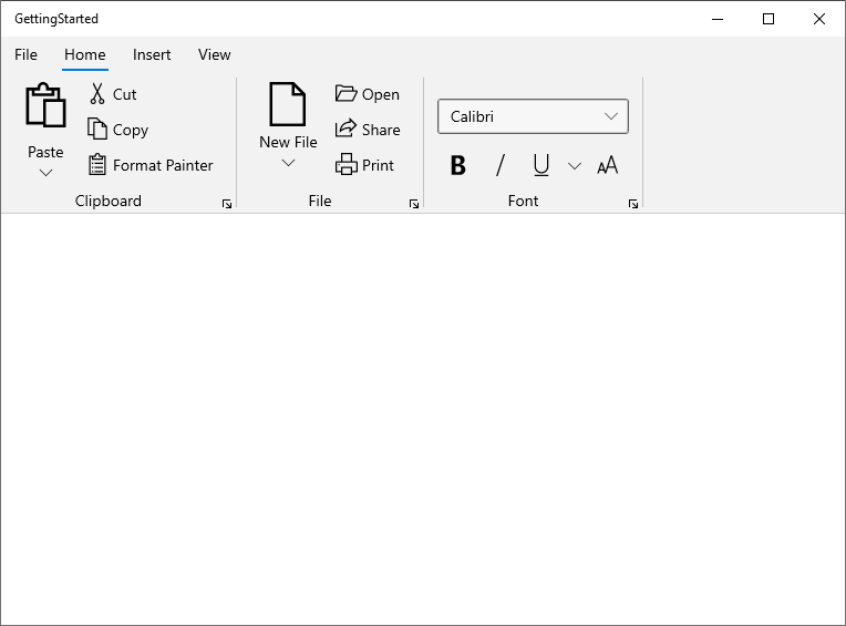
Ribbon group launcher button
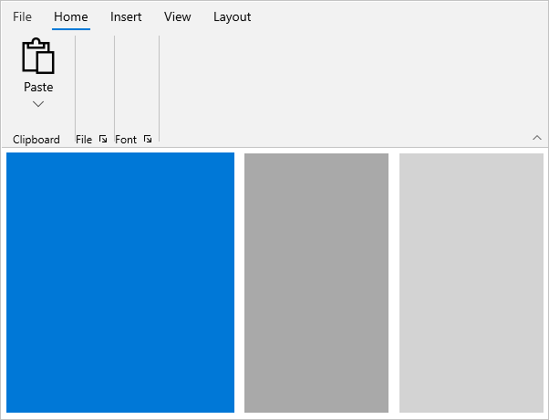
The Launcher button is like a normal button, used to add additional features and options in that RibbonGroup section. The launcher button is not visible by default; set ShowLauncherButton="True" on the RibbonGroup to display it.

Launcher button click event
The RibbonGroup provides a LauncherButtonClick event to notify when the launcher button is clicked.
<ribbon:SfRibbon>
    <ribbon:SfRibbon.Tabs>
        <ribbon:RibbonTab Header="Home">
            <ribbon:RibbonGroup LauncherButtonClick="RibbonGroup_LauncherButtonClick"
                                ShowLauncherButton="True"
                                Header="Clipboard">
                <ribbon:RibbonDropDownButton Icon="Paste"
                                             AllowedSizeModes="Large"
                                             Content="Paste" />
            </ribbon:RibbonGroup>
            <ribbon:RibbonGroup Header="File" />
            <ribbon:RibbonGroup Header="Font" />
        </ribbon:RibbonTab>
        <ribbon:RibbonTab Header="Insert" />
        <ribbon:RibbonTab Header="View" />
        <ribbon:RibbonTab Header="Layout" />
    </ribbon:SfRibbon.Tabs>
</ribbon:SfRibbon>
using Syncfusion.UI.Xaml.Ribbon;
private void RibbonGroup_LauncherButtonClick(RibbonGroup sender, object args)
{
// Write your code here...
}Launcher button command
The command for the launcher button in a RibbonGroup can be set using the LauncherButtonCommand property. The following example shows the same scenario using a command instead of an event.
<ribbon:SfRibbon>
    <ribbon:SfRibbon.Tabs>
        <ribbon:RibbonTab Header="Home">
            <ribbon:RibbonGroup LauncherButtonCommand="{Binding LauncherButtonCommand, Mode=TwoWay}"
                                ShowLauncherButton="True"
                                Header="Clipboard">
                <ribbon:RibbonDropDownButton Icon="Paste"
                                             AllowedSizeModes="Large"
                                             Content="Paste" />
            </ribbon:RibbonGroup>
            <ribbon:RibbonGroup Header="File" />
            <ribbon:RibbonGroup Header="Font" />
        </ribbon:RibbonTab>
        <ribbon:RibbonTab Header="Insert" />
        <ribbon:RibbonTab Header="View" />
        <ribbon:RibbonTab Header="Layout" />
    </ribbon:SfRibbon.Tabs>
</ribbon:SfRibbon>
public ICommand LauncherButtonCommand { get; set; }
this.LauncherButtonCommand = new DelegateCommand(ExecuteLauncherButtonCommand, CanExecuteCommand);
private void ExecuteLauncherButtonCommand(object obj)
{
// Write your code here...
}
private bool CanExecuteCommand(object parameter)
{
return true;
}Launcher button visibility
The RibbonGroup allows you to show or hide the launcher button by using the ShowLauncherButton property. By default, the launcher button is not visible (False).
<ribbon:SfRibbon>
    <ribbon:SfRibbon.Tabs>
        <ribbon:RibbonTab Header="Home">
            <ribbon:RibbonGroup ShowLauncherButton="False"
                                Header="Clipboard">
                <ribbon:RibbonDropDownButton Icon="Paste"
                                             AllowedSizeModes="Large"
                                             Content="Paste" />
            </ribbon:RibbonGroup>
            <ribbon:RibbonGroup Header="File" />
            <ribbon:RibbonGroup Header="Font" />
        </ribbon:RibbonTab>
        <ribbon:RibbonTab Header="Insert" />
        <ribbon:RibbonTab Header="View" />
        <ribbon:RibbonTab Header="Layout" />
    </ribbon:SfRibbon.Tabs>
</ribbon:SfRibbon>