Getting Started with WinUI Ribbon
14 Jul 202624 minutes to read
This section explains the steps required to add the Ribbon control and its elements such as ribbon tabs, ribbon groups, built-in ribbon items, custom ribbon items, right pane, backstage and its items. This section also covers the basic features needed to get started with Syncfusion® ribbon control.
Creating an application with WinUI Ribbon
-
Create a WinUI 3 desktop app for C# and .NET 5.
-
Add a reference to the Syncfusion.Ribbon.WinUI NuGet package.
-
Import the control namespace
Syncfusion.UI.Xaml.Ribbonin XAML or C# code. -
Initialize the SfRibbon control.
<Page
    x:Class="GettingStarted.MainPage"
    xmlns="http://schemas.microsoft.com/winfx/2006/xaml/presentation"
    xmlns:x="http://schemas.microsoft.com/winfx/2006/xaml"
    xmlns:local="using:GettingStarted"
    xmlns:d="http://schemas.microsoft.com/expression/blend/2008"
    xmlns:mc="http://schemas.openxmlformats.org/markup-compatibility/2006"
    xmlns:ribbon="using:Syncfusion.UI.Xaml.Ribbon"
    mc:Ignorable="d"
    Background="{ThemeResource ApplicationPageBackgroundThemeBrush}">

    <Grid x:Name="rootGrid">
        <ribbon:SfRibbon x:Name="sfRibbon"/>
    </Grid>

</Page>
using Syncfusion.UI.Xaml.Ribbon; namespace GettingStarted { public sealed partial class MainPage : Page { public MainPage() { this.InitializeComponent(); SfRibbon sfRibbon = new SfRibbon(); rootGrid.Children.Add(sfRibbon); } } }
Add ribbon tab
Categorize the command using the RibbonTab. Any number of tab elements can be added to the ribbon using the Tabs property and the Header property can be used to name the tab.
<Grid x:Name="rootGrid">
    <ribbon:SfRibbon x:Name="sfRibbon">
        <ribbon:SfRibbon.Tabs>
            <ribbon:RibbonTab Header="Home" />
            <ribbon:RibbonTab Header="Insert" />
            <ribbon:RibbonTab Header="View" />
            <ribbon:RibbonTab Header="Layout" />
        </ribbon:SfRibbon.Tabs>
    </ribbon:SfRibbon>
</Grid>
SfRibbon sfRibbon = new SfRibbon();
RibbonTab homeTab = new RibbonTab() { Header = "Home" };
RibbonTab insertTab = new RibbonTab() { Header = "Insert" };
RibbonTab viewTab = new RibbonTab() { Header = "View" };
RibbonTab layoutTab = new RibbonTab() { Header = "Layout" };
sfRibbon.Tabs.Add(homeTab);
sfRibbon.Tabs.Add(insertTab);
sfRibbon.Tabs.Add(viewTab);
sfRibbon.Tabs.Add(layoutTab);
this.rootGrid.Children.Add(sfRibbon);
Add ribbon group
The commands in the ribbon tab can be grouped using a RibbonGroup. It allows you to add built-in ribbon items such as RibbonButton, RibbonDropDownButton and RibbonSplitButton. Other controls such as checkboxes, comboboxes, and radio buttons, etc. can also be added.
<Grid x:Name="rootGrid">
    <ribbon:SfRibbon x:Name="sfRibbon">
        <ribbon:SfRibbon.Tabs>
            <ribbon:RibbonTab Header="Home">
                <ribbon:RibbonGroup Header="Clipboard" />
                <ribbon:RibbonGroup Header="File" />
                <ribbon:RibbonGroup Header="Font" />
                <ribbon:RibbonGroup Header="Editing" />
                <ribbon:RibbonGroup Header="Paragraph" />
                <ribbon:RibbonGroup Header="Voice" />
            </ribbon:RibbonTab>
            <ribbon:RibbonTab Header="Insert" />
            <ribbon:RibbonTab Header="View" />
            <ribbon:RibbonTab Header="Layout" />
        </ribbon:SfRibbon.Tabs>
    </ribbon:SfRibbon>
</Grid>
SfRibbon sfRibbon = new SfRibbon();
RibbonTab homeTab = new RibbonTab() { Header = "Home" };
RibbonTab insertTab = new RibbonTab() { Header = "Insert" };
RibbonTab viewTab = new RibbonTab() { Header = "View" };
RibbonTab layoutTab = new RibbonTab() { Header = "Layout" };
RibbonGroup clipboardGroup = new RibbonGroup() { Header = "Clipboard" };
RibbonGroup fileGroup = new RibbonGroup() { Header = "File" };
RibbonGroup fontGroup = new RibbonGroup() { Header = "Font" };
RibbonGroup editingGroup = new RibbonGroup() { Header = "Editing" };
RibbonGroup paragraphGroup = new RibbonGroup() { Header = "Paragraph" };
RibbonGroup voiceGroup = new RibbonGroup() { Header = "Voice" };
homeTab.Items.Add(clipboardGroup);
homeTab.Items.Add(fileGroup);
homeTab.Items.Add(fontGroup);
homeTab.Items.Add(editingGroup);
homeTab.Items.Add(paragraphGroup);
homeTab.Items.Add(voiceGroup);
sfRibbon.Tabs.Add(homeTab);
sfRibbon.Tabs.Add(insertTab);
sfRibbon.Tabs.Add(viewTab);
sfRibbon.Tabs.Add(layoutTab);
this.rootGrid.Children.Add(sfRibbon);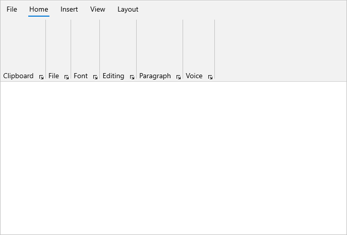
Add ribbon button
The RibbonButton represents a normal button and can be added to a ribbon group with different sizes using the AllowedSizeModes property. Use the Content and Icon properties to set the label and icon to the button.
<ribbon:SfRibbon x:Name="sfRibbon"
SelectedIndex="1">
<ribbon:SfRibbon.Tabs>
<ribbon:RibbonTab Header="Home" />
<ribbon:RibbonTab Header="Insert">
<ribbon:RibbonGroup Header="Illustrations">
<ribbon:RibbonButton Content="Pictures"
AllowedSizeModes="Large">
<ribbon:RibbonButton.Icon>
<SymbolIcon Symbol="Pictures" />
</ribbon:RibbonButton.Icon>
</ribbon:RibbonButton>
<ribbon:RibbonButton Content="Shapes"
AllowedSizeModes="Normal">
<ribbon:RibbonButton.Icon>
<FontIcon Glyph="" />
</ribbon:RibbonButton.Icon>
</ribbon:RibbonButton>
<ribbon:RibbonButton Content="Icons"
AllowedSizeModes="Normal">
<ribbon:RibbonButton.Icon>
<FontIcon Glyph="" />
</ribbon:RibbonButton.Icon>
</ribbon:RibbonButton>
<ribbon:RibbonButton Icon="DisconnectDrive"
Content="3D Models"
AllowedSizeModes="Normal" />
<ribbon:RibbonButton AllowedSizeModes="Small">
<ribbon:RibbonButton.Icon>
<BitmapIcon UriSource="ms-appx:///Assets/Bookmarks.png" />
</ribbon:RibbonButton.Icon>
</ribbon:RibbonButton>
<ribbon:RibbonButton Icon="Character"
AllowedSizeModes="Small" />
<ribbon:RibbonButton Icon="FullScreen"
AllowedSizeModes="Small" />
</ribbon:RibbonGroup>
</ribbon:RibbonTab>
<ribbon:RibbonTab Header="View" />
<ribbon:RibbonTab Header="Layout" />
</ribbon:SfRibbon.Tabs>
</ribbon:SfRibbon>SfRibbon sfRibbon = new SfRibbon();
sfRibbon.SelectedIndex = 1;
RibbonTab homeTab = new RibbonTab() { Header = "Home" };
RibbonTab insertTab = new RibbonTab() { Header = "Insert" };
RibbonTab viewTab = new RibbonTab() { Header = "View" };
RibbonTab layoutTab = new RibbonTab() { Header = "Layout" };
RibbonGroup illustrationsGroup = new RibbonGroup() { Header = "Illustrations" };
RibbonButton pictureButton = new RibbonButton() { Content = "Pictures" , AllowedSizeModes= AllowedSizeModes.Large, Icon = new SymbolIcon(Symbol.Pictures)};
RibbonButton shapesButton = new RibbonButton() { Content = "Shapes" , AllowedSizeModes= AllowedSizeModes.Normal, Icon = new FontIcon() { Glyph= "\xF158" } };
RibbonButton iconsButton = new RibbonButton() { Content = "Icons" , AllowedSizeModes= AllowedSizeModes.Normal, Icon = new FontIcon() { Glyph= "\xECAA" } };
RibbonButton disconnectDriveButton = new RibbonButton() { Content = "3D Models" , AllowedSizeModes= AllowedSizeModes.Small, Icon = new SymbolIcon(Symbol.DisconnectDrive) };
RibbonButton bookmarksButton = new RibbonButton() { AllowedSizeModes = AllowedSizeModes.Small, Icon = new BitmapIcon() { UriSource = new Uri("ms-appx:///Assets/Bookmarks.png") } };
RibbonButton characterButton = new RibbonButton() { AllowedSizeModes= AllowedSizeModes.Small, Icon = new SymbolIcon(Symbol.Character) };
RibbonButton fullScreenButton = new RibbonButton() { AllowedSizeModes = AllowedSizeModes.Small, Icon = new SymbolIcon(Symbol.FullScreen) };
illustrationsGroup.Items.Add(pictureButton);
illustrationsGroup.Items.Add(shapesButton);
illustrationsGroup.Items.Add(iconsButton);
illustrationsGroup.Items.Add(disconnectDriveButton);
illustrationsGroup.Items.Add(bookmarksButton);
illustrationsGroup.Items.Add(characterButton);
illustrationsGroup.Items.Add(fullScreenButton);
insertTab.Items.Add(illustrationsGroup);
sfRibbon.Tabs.Add(homeTab);
sfRibbon.Tabs.Add(insertTab);
sfRibbon.Tabs.Add(viewTab);
sfRibbon.Tabs.Add(layoutTab);
this.rootGrid.Children.Add(sfRibbon);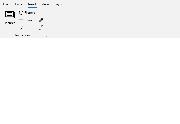
Add ribbon drop down button
The RibbonDropDownButton represents a dropdown button that displays the drop-down menu items when clicked. It allows you to arrange a button with different sizes within a ribbon group using the AllowedSizeModes property. Use the Content and Icon properties to set the label and icon of the button, and populate the drop-down menu items using the Flyout control in the button.
<Grid x:Name="rootGrid">
<ribbon:SfRibbon x:Name="sfRibbon">
<ribbon:SfRibbon.Tabs>
<ribbon:RibbonTab Header="Home">
<ribbon:RibbonGroup Header="File">
<ribbon:RibbonDropDownButton Content="New File"
AllowedSizeModes="Large">
<ribbon:RibbonDropDownButton.Icon>
<FontIcon FontFamily="Segoe MDL2 Assets" Glyph="" />
</ribbon:RibbonDropDownButton.Icon>
<ribbon:RibbonDropDownButton.Flyout>
<MenuFlyout>
<MenuFlyoutItem Text="Empty File" />
<MenuFlyoutItem Text="Template File" />
</MenuFlyout>
</ribbon:RibbonDropDownButton.Flyout>
</ribbon:RibbonDropDownButton>
</ribbon:RibbonGroup>
</ribbon:RibbonTab>
<ribbon:RibbonTab Header="Insert" />
<ribbon:RibbonTab Header="View" />
<ribbon:RibbonTab Header="Layout" />
</ribbon:SfRibbon.Tabs>
</ribbon:SfRibbon>
</Grid>SfRibbon sfRibbon = new SfRibbon();
RibbonTab homeTab = new RibbonTab() { Header = "Home" };
RibbonTab insertTab = new RibbonTab() { Header = "Insert" };
RibbonTab viewTab = new RibbonTab() { Header = "View" };
RibbonTab layoutTab = new RibbonTab() { Header = "Layout" };
RibbonGroup fileGroup = new RibbonGroup() { Header = "File" };
RibbonDropDownButton newFileButton = new RibbonDropDownButton() { Content = "New File", AllowedSizeModes = AllowedSizeModes.Large, Icon = new FontIcon() { Glyph = "\xE7C3", FontFamily = new FontFamily("Segoe MDL2 Assets") } };
MenuFlyout flyout = new MenuFlyout();
MenuFlyoutItem emptyFileMenuFlyoutItem = new MenuFlyoutItem() { Text = "Empty File" };
MenuFlyoutItem templateFileMenuFlyoutItem = new MenuFlyoutItem() { Text = "Template File" };
flyout.Items.Add(emptyFileMenuFlyoutItem);
flyout.Items.Add(templateFileMenuFlyoutItem);
newFileButton.Flyout = flyout;
fileGroup.Items.Add(newFileButton);
homeTab.Items.Add(fileGroup);
sfRibbon.Tabs.Add(homeTab);
sfRibbon.Tabs.Add(insertTab);
sfRibbon.Tabs.Add(viewTab);
sfRibbon.Tabs.Add(layoutTab);
this.rootGrid.Children.Add(sfRibbon);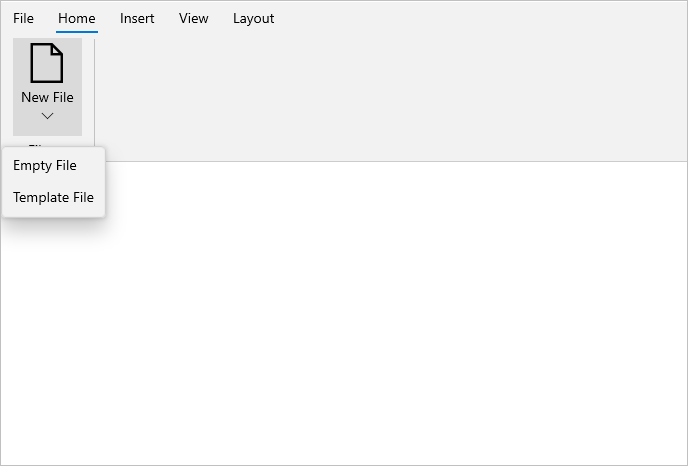
Add ribbon split button
The RibbonSplitButton represents a combined control that has a primary button which responds to a Click event and a secondary button that acts like a drop-down menu with a list of values. It allows you to arrange a button with different sizes within a ribbon group using the AllowedSizeModes property. Use the Content and Icon properties to set the label and icon of the button, and populate the drop-down menu items using the Flyout control in the button.
<Grid x:Name="rootGrid">
    <ribbon:SfRibbon x:Name="sfRibbon">
        <ribbon:SfRibbon.Tabs>
            <ribbon:RibbonTab Header="Home">
                <ribbon:RibbonGroup Header="Voice">
                    <ribbon:RibbonSplitButton Icon="Microphone"
                                        Content="Dictate"
                                        AllowedSizeModes="Large">
                        <ribbon:RibbonSplitButton.Flyout>
                            <MenuFlyout>
                                <MenuFlyoutItem Text="Chinese" />
                                <MenuFlyoutItem Text="English" />
                                <MenuFlyoutItem Text="French" />
                                <MenuFlyoutItem Text="German" />
                            </MenuFlyout>
                        </ribbon:RibbonSplitButton.Flyout>
                    </ribbon:RibbonSplitButton>
                </ribbon:RibbonGroup>
            </ribbon:RibbonTab>
            <ribbon:RibbonTab Header="Insert" />
            <ribbon:RibbonTab Header="View" />
            <ribbon:RibbonTab Header="Layout" />
        </ribbon:SfRibbon.Tabs>
    </ribbon:SfRibbon>
</Grid>
SfRibbon sfRibbon = new SfRibbon();
RibbonTab homeTab = new RibbonTab() { Header = "Home" };
RibbonTab insertTab = new RibbonTab() { Header = "Insert" };
RibbonTab viewTab = new RibbonTab() { Header = "View" };
RibbonTab layoutTab = new RibbonTab() { Header = "Layout" };
RibbonGroup voiceGroup = new RibbonGroup() { Header = "Voice" };
RibbonSplitButton splitButton = new RibbonSplitButton() { Content = "Dictate", AllowedSizeModes = AllowedSizeModes.Large, Icon = new SymbolIcon(Symbol.Microphone) };
MenuFlyout flyout = new MenuFlyout();
MenuFlyoutItem chineseMenuFlyoutItem = new MenuFlyoutItem() { Text = "Chinese" };
MenuFlyoutItem englishMenuFlyoutItem = new MenuFlyoutItem() { Text = "English" };
MenuFlyoutItem frenchMenuFlyoutItem = new MenuFlyoutItem() { Text = "French" };
MenuFlyoutItem germanMenuFlyoutItem = new MenuFlyoutItem() { Text = "German" };
flyout.Items.Add(chineseMenuFlyoutItem);
flyout.Items.Add(englishMenuFlyoutItem);
flyout.Items.Add(frenchMenuFlyoutItem);
flyout.Items.Add(germanMenuFlyoutItem);
splitButton.Flyout = flyout;
voiceGroup.Items.Add(splitButton);
homeTab.Items.Add(voiceGroup);
sfRibbon.Tabs.Add(homeTab);
sfRibbon.Tabs.Add(insertTab);
sfRibbon.Tabs.Add(viewTab);
sfRibbon.Tabs.Add(layoutTab);
this.rootGrid.Children.Add(sfRibbon);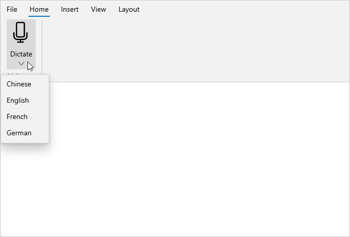
Add ribbon toggle button
The RibbonToggleButton represents a toggle button. It allows the user to perform a toggle (on/off) action between checked and unchecked states. Also, it can be added to a ribbon group with different sizes using the AllowedSizeModes property. Use the Content and Icon properties to set the label and icon of the ribbon toggle button.
<Grid x:Name="rootGrid">
        <ribbon:SfRibbon x:Name="sfRibbon" >
            <ribbon:SfRibbon.Tabs>
                <ribbon:RibbonTab Header="Home">
                    <ribbon:RibbonGroup Header="Font">
                        <ribbon:RibbonToggleButton  DisplayOptions="Normal,Simplified" Command="{Binding ButtonCommand}" CommandParameter="Bold" Content="Bold"
                                     AllowedSizeModes="Large">
                            <ribbon:RibbonToggleButton.Icon>
                                <SymbolIcon Symbol="Bold" />
                            </ribbon:RibbonToggleButton.Icon>
                        </ribbon:RibbonToggleButton>
                        <ribbon:RibbonToggleButton DisplayOptions="Normal,Simplified" Command="{Binding ButtonCommand}" CommandParameter="Italic" Content="Italic"
                                     AllowedSizeModes="Normal">
                            <ribbon:RibbonToggleButton.Icon>
                                <SymbolIcon Symbol="Italic" />
                            </ribbon:RibbonToggleButton.Icon>
                        </ribbon:RibbonToggleButton>
                        <ribbon:RibbonToggleButton Command="{Binding ButtonCommand}" AllowedSizeModes="Small"
                                                                      CommandParameter="Underline"
                                                                      Content="Underline" Icon="Underline"
                                                                      DisplayOptions="Normal,Simplified" IsEnabled="True" >
                        </ribbon:RibbonToggleButton>
                    </ribbon:RibbonGroup>
                </ribbon:RibbonTab>
                <ribbon:RibbonTab Header="Insert" />
                <ribbon:RibbonTab Header="View" />
                <ribbon:RibbonTab Header="Layout" />
            </ribbon:SfRibbon.Tabs>
        </ribbon:SfRibbon>
    </Grid>
SfRibbon sfRibbon = new SfRibbon();
RibbonTab homeTab = new RibbonTab() { Header = "Home" };
RibbonTab insertTab = new RibbonTab() { Header = "Insert" };
RibbonTab viewTab = new RibbonTab() { Header = "View" };
RibbonTab layoutTab = new RibbonTab() { Header = "Layout" };
RibbonGroup fontGroup = new RibbonGroup() { Header = "Font" };
RibbonToggleButton boldButton = new RibbonToggleButton() { DisplayOptions = DisplayOptions.Normal, Content = "Bold", AllowedSizeModes = RibbonElementSizeModes.Large, Icon = new SymbolIcon(Symbol.Bold) };
RibbonToggleButton italicButton = new RibbonToggleButton() { DisplayOptions = DisplayOptions.Normal, Content = "Italic", AllowedSizeModes = RibbonElementSizeModes.Normal, Icon = new SymbolIcon(Symbol.Italic) };
RibbonToggleButton underlineButton = new RibbonToggleButton() { DisplayOptions = DisplayOptions.Normal, Content = "Underline", AllowedSizeModes = RibbonElementSizeModes.Small, Icon = new SymbolIcon(Symbol.Underline) };
sfRibbon.Tabs.Add(homeTab);
homeTab.Items.Add(fontGroup);
fontGroup.Items.Add(boldButton);
fontGroup.Items.Add(italicButton);
fontGroup.Items.Add(underlineButton);
sfRibbon.Tabs.Add(insertTab);
sfRibbon.Tabs.Add(viewTab);
sfRibbon.Tabs.Add(layoutTab);
rootGrid.Children.Add(sfRibbon);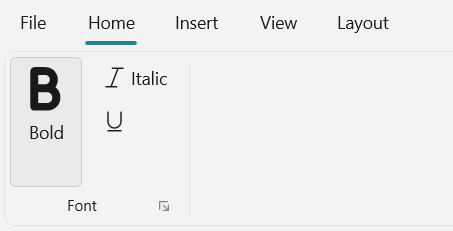
NOTE
Other icon element types, such as BitmapIcon, FontIcon, PathIcon and SymbolIcon, can be used for the Ribbon items such as RibbonButton, RibbonDropDownButton, RibbonSplitButton, RibbontToggleButton, and RibbonItemHost controls.
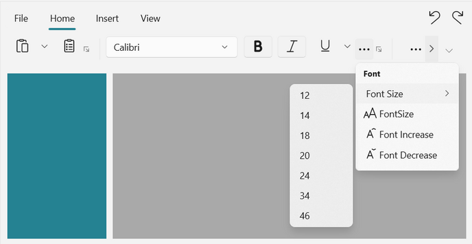
Add ribbon combobox
The RibbonComboBox control combines a text box and a drop-down list box, allowing users to choose items from the list or add new values. It can be displayed in the normal, simplified, and overflow layouts of the ribbon. Use the DisplayOptions property to set the control in different layouts.
In the overflow menu, the RibbonComboBox template has been changed to look like a dropdown button. When the ribbon combobox is clicked in the overflow menu, the flyout will open on either the right or left side and displays the ribbon combobox items.
<Grid x:Name="rootGrid">
    <ribbon:RibbonComboBox Header="Font Family"
                           Width="200"
                           DisplayOptions="Normal,Simplified">
        <ribbon:RibbonComboBoxItem Content="Calibri"/>
        <ribbon:RibbonComboBoxItem Content="Arial" />
        <ribbon:RibbonComboBoxItem Content="Segoe UI" />
    </ribbon:RibbonComboBox>
    <ribbon:RibbonComboBox Header="Font Size"
                           Width="97"
                           DisplayOptions="Normal,Overflow">
        <ribbon:RibbonComboBoxItem Content="12" />
        <ribbon:RibbonComboBoxItem Content="14" />
        <ribbon:RibbonComboBoxItem Content="18" />
        <ribbon:RibbonComboBoxItem Content="20" />
        <ribbon:RibbonComboBoxItem Content="24" />
        <ribbon:RibbonComboBoxItem Content="34" />
        <ribbon:RibbonComboBoxItem Content="46" />
    </ribbon:RibbonComboBox>
</Grid>
RibbonComboBox ribbonComboBox = new RibbonComboBox() { Header = "Font Family", Width = 200, DisplayOptions = DisplayOptions.Normal | DisplayOptions.Simplified };
RibbonComboBoxItem ribbonComboBoxItem = new RibbonComboBoxItem() { Content = "Calibri" };
RibbonComboBoxItem ribbonComboBoxItem1 = new RibbonComboBoxItem() { Content= "Arial" };
RibbonComboBoxItem ribbonComboBoxItem2 = new RibbonComboBoxItem() { Content= "Segoe UI" };
ribbonComboBox.Items.Add(ribbonComboBoxItem);
ribbonComboBox.Items.Add(ribbonComboBoxItem1);
ribbonComboBox.Items.Add(ribbonComboBoxItem2);
RibbonComboBox ribbonComboBox1 = new RibbonComboBox() { Header = "Font size", Width = 97, DisplayOptions = DisplayOptions.Normal | DisplayOptions.Overflow };
RibbonComboBoxItem ribbonComboBoxItemSize = new RibbonComboBoxItem() { Content = "12" };
RibbonComboBoxItem ribbonComboBoxItemSize1 = new RibbonComboBoxItem() { Content = "14" };
RibbonComboBoxItem ribbonComboBoxItemSize2 = new RibbonComboBoxItem() { Content = "16" };
ribbonComboBox1.Items.Add(ribbonComboBoxItemSize);
ribbonComboBox1.Items.Add(ribbonComboBoxItemSize1);
ribbonComboBox1.Items.Add(ribbonComboBoxItemSize2);
rootGrid.Children.Add(ribbonComboBox);
rootGrid.Children.Add(ribbonComboBox1);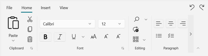
Add ribbon gallery
The example below shows how to include the RibbonGallery control within a RibbonGroup.
<Grid x:Name="rootGalleryGrid">
    <ribbon:SfRibbon>
        <ribbon:SfRibbon.Tabs>
            <ribbon:RibbonTab Header="Home">
                <ribbon:RibbonGroup Header="Styles">
                    <ribbon:RibbonGallery />
                </ribbon:RibbonGroup>
            </ribbon:RibbonTab>
            <ribbon:RibbonTab Header="Insert" />
        </ribbon:SfRibbon.Tabs>
    </ribbon:SfRibbon>
</Grid>
SfRibbon sfRibbon = new SfRibbon();
RibbonTab homeTab = new RibbonTab() { Header = "Home" };
RibbonGroup stylesGroup = new RibbonGroup() { Header = "Styles" };
RibbonGallery ribbonGallery = new RibbonGallery();
stylesGroup.Items.Add(ribbonGallery);
homeTab.Items.Add(stylesGroup);
sfRibbon.Tabs.Add(homeTab);
rootGalleryGrid.Children.Add(sfRibbon);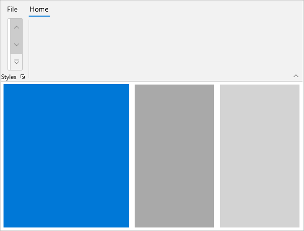
Host a custom control
The Ribbon allows you to host other controls such as checkboxes, radio buttons, and comboboxes, etc., in a ribbon group using the ItemTemplate property of RibbonItemHost.
<ribbon:SfRibbon x:Name="sfRibbon">
    <ribbon:SfRibbon.Tabs>
        <ribbon:RibbonTab Header="Home">
            <ribbon:RibbonGroup Header="Font">
                <ribbon:RibbonItemHost Margin="0,12,0,0">
                    <ribbon:RibbonItemHost.ItemTemplate>
                        <StackPanel Orientation="Horizontal">
                            <ComboBox x:Name="FontComboBox"
                                      Width="120"
                                      PlaceholderText="Select Font"
                                      PlaceholderForeground="#A2A2A2">
                                <ComboBoxItem Content="Calibri"
                                              IsSelected="True" />
                                <ComboBoxItem Content="Arial" />
                                <ComboBoxItem Content="Segoe UI" />
                            </ComboBox>
                            <ComboBox Margin="3,0"
                                      x:Name="FontSizeComboBox"
                                      PlaceholderText="Select Font Size"
                                      PlaceholderForeground="#A2A2A2">
                                <ComboBoxItem Content="11"
                                              IsSelected="True" />
                                <ComboBoxItem Content="12" />
                            </ComboBox>
                        </StackPanel>
                    </ribbon:RibbonItemHost.ItemTemplate>
                </ribbon:RibbonItemHost>
                <ribbon:RibbonItemHost Margin="0,12,0,0">
                    <ribbon:RibbonItemHost.ItemTemplate>
                        <StackPanel Orientation="Horizontal">
                            <ToggleButton x:Name="Bold"
                                          Background="{ThemeResource SystemChromeLowColor}">
                                <ToggleButton.Content>
                                    <SymbolIcon Symbol="Bold" />
                                </ToggleButton.Content>
                            </ToggleButton>
                            <ToggleButton x:Name="Italic"
                                          Background="{ThemeResource SystemChromeLowColor}">
                                <ToggleButton.Content>
                                    <SymbolIcon Symbol="Italic" />
                                </ToggleButton.Content>
                            </ToggleButton>
                            <ribbon:RibbonSplitButton x:Name="underlineButton"
                                                      AllowedSizeModes="Small"
                                                      Icon="Underline"
                                                      Content="Underline">
                                <ribbon:RibbonSplitButton.Flyout>
                                    <MenuFlyout>
                                        <MenuFlyoutItem Text="Underline" />
                                        <MenuFlyoutItem Text="Double underline" />
                                        <MenuFlyoutItem Text="Thick underline" />
                                        <MenuFlyoutItem Text="Dotted underline" />
                                    </MenuFlyout>
                                </ribbon:RibbonSplitButton.Flyout>
                            </ribbon:RibbonSplitButton>
                            <ribbon:RibbonButton x:Name="fontSizeButton"
                                                 Icon="FontSize"
                                                 AllowedSizeModes="Small"
                                                 Content="FontSize" />
                        </StackPanel>
                    </ribbon:RibbonItemHost.ItemTemplate>
                </ribbon:RibbonItemHost>
            </ribbon:RibbonGroup>
        </ribbon:RibbonTab>
    </ribbon:SfRibbon.Tabs>
</ribbon:SfRibbon>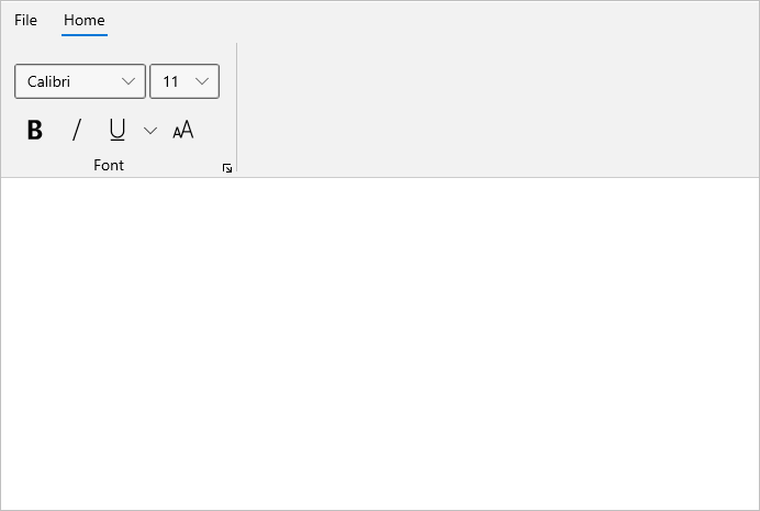
Add ribbon backstage
The RibbonBackstage provides a separate view to the ribbon and can be added by using the Backstage property of ribbon control. View the ribbon backstage by clicking the backstage menu button named as File by default, which is placed before the ribbon tabs.
<ribbon:SfRibbon x:Name="sfRibbon">
    <ribbon:SfRibbon.Backstage>
        <ribbon:RibbonBackstage>
            <Grid>
                <Grid.RowDefinitions>
                    <RowDefinition Height="*" />
                    <RowDefinition Height="Auto" />
                </Grid.RowDefinitions>
                <Grid Grid.Row="0"
                      Padding="0,0,0,1"
                      VerticalAlignment="Top"
                      BorderBrush="LightGray"
                      BorderThickness="0,0,0,1">
                    <Grid.RowDefinitions>
                        <RowDefinition Height="Auto" />
                        <RowDefinition Height="481" />
                    </Grid.RowDefinitions>
                    <Grid.ColumnDefinitions>
                        <ColumnDefinition />
                        <ColumnDefinition />
                    </Grid.ColumnDefinitions>
                    <TextBlock Grid.Row="0"
                               Padding="15"
                               FontSize="24"
                               FontWeight="SemiBold"
                               Text="Settings" />
                    <StackPanel Grid.Row="1"
                                Margin="15,15,15,0"
                                BorderBrush="LightGray"
                                BorderThickness="0,0,0,0">
                        <TextBlock Padding="0,0,0,5"
                                   FontSize="16"
                                   Text="User Information" />
                        <TextBlock Padding="0,5,0,5"
                                   FontSize="14"
                                   Text="Name : John" />
                        <HyperlinkButton Content="Change photo" />
                        <HyperlinkButton Content="Sign Out" />
                        <HyperlinkButton Content="Switch Account" />
                        <TextBlock Padding="0,5,0,5"
                                   Text="Theme Mode" />
                        <RadioButton Content="Light" />
                        <RadioButton Content="Dark" />
                        <RadioButton Content="Use system setting" />
                    </StackPanel>
                    <StackPanel Grid.Row="1"
                                Grid.Column="1"
                                Padding="15,15,15,0"
                                BorderBrush="LightGray"
                                BorderThickness="1,0,0,0">
                        <TextBlock Padding="0,0,0,5"
                                   FontSize="16"
                                   Text="Product Information" />
                        <HyperlinkButton Content="About product" />
                        <HyperlinkButton Content="Help" />
                        <HyperlinkButton Content="Updates" />
                    </StackPanel>
                </Grid>
                <StackPanel Grid.Row="1"
                            Grid.ColumnSpan="2"
                            Padding="120,0,5,5"
                            HorizontalAlignment="Right"
                            BorderBrush="LightGray"
                            BorderThickness="0,0,0,0"
                            Orientation="Horizontal">
                    <Button Margin="5"
                            Content="Options"
                            CornerRadius="0" />
                    <Button Margin="5"
                            Content="Exit Backstage"
                            CornerRadius="0" />
                </StackPanel>
            </Grid>
        </ribbon:RibbonBackstage>
    </ribbon:SfRibbon.Backstage>
</ribbon:SfRibbon>
Backstage view
Host BackstageView inside the ribbon backstage and use it to manage the settings and options for the application in a separate backstage view.
<Grid x:Name="rootGrid">
    <ribbon:SfRibbon x:Name="sfRibbon">
        <ribbon:SfRibbon.Backstage>
            <ribbon:RibbonBackstage>
                 <ribbon:BackstageView/>
            </ribbon:RibbonBackstage>
        </ribbon:SfRibbon.Backstage>
    </ribbon:SfRibbon>
</Grid>
SfRibbon sfRibbon = new SfRibbon();
RibbonBackstage ribbonBackstage = new RibbonBackstage();
BackstageView backstageView = new BackstageView();
ribbonBackstage.Content = backstageView;
sfRibbon.Backstage = ribbonBackstage;
this.rootGrid.Children.Add(sfRibbon);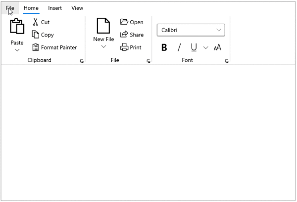
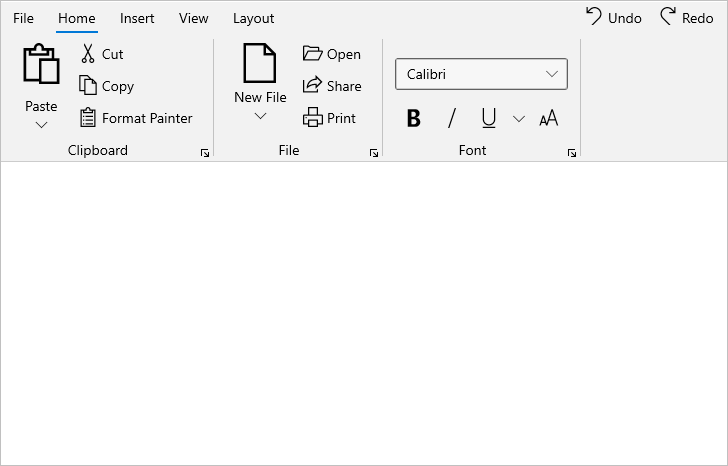
Add right pane
The Right pane is located at the right side of the ribbon tab. Any controls can be placed inside the pane. The contents in the right pane are shown irrespective of the currently selected tab.
For example, below a stack panel is added with two ribbon buttons inside the right pane.
<Grid x:Name="rootGrid">
    <ribbon:SfRibbon x:Name="sfRibbon">
        <ribbon:SfRibbon.RightPane>
            <StackPanel Orientation="Horizontal">
                <ribbon:RibbonButton Icon="Undo" Content="Undo" />
                <ribbon:RibbonButton Icon="Redo" Content="Redo" />
            </StackPanel>
        </ribbon:SfRibbon.RightPane>
    </ribbon:SfRibbon>
</Grid>
SfRibbon sfRibbon = new SfRibbon();
StackPanel customPanel = new StackPanel() { Orientation = Orientation.Horizontal };
RibbonButton undoButton = new RibbonButton() { Content = "Undo", Icon = new SymbolIcon(Symbol.Undo) };
RibbonButton redoButton = new RibbonButton() { Content = "Redo", Icon = new SymbolIcon(Symbol.Redo) };
customPanel.Children.Add(undoButton);
customPanel.Children.Add(redoButton);
sfRibbon.RightPane = customPanel;
this.rootGrid.Children.Add(sfRibbon);