Getting Started with Syncfusion® WinUI NumberBox
18 Nov 201815 minutes to read
This section explains the steps required to add the WinUI NumberBox control in the WinUI application and utilize the various functions provided.
Structure of NumberBox control
The following image illustrates the structural elements of the NumberBox control. Refer to the NumberBox overview for a description of each element.

Creating an application with WinUI NumberBox
In this walkthrough, you will create a WinUI application that contains the NumberBox control.
Adding control manually in XAML
To add NumberBox control manually in XAML, follow the below steps.
- Create a WinUI 3 desktop application using C# and .NET 8 or later.
-
Download and refer the following NuGet package in the project.
You can also install the package using the Package Manager Console:
Install-Package Syncfusion.Editors.WinUI.
- Import the control namespace
Syncfusion.UI.Xaml.Editorsin XAML page. -
Initialize the
NumberBoxcontrol.<Page x:Class="GettingStarted.MainPage" xmlns="http://schemas.microsoft.com/winfx/2006/xaml/presentation" xmlns:x="http://schemas.microsoft.com/winfx/2006/xaml" xmlns:local="using:GettingStarted" xmlns:d="http://schemas.microsoft.com/expression/blend/2008" xmlns:mc="http://schemas.openxmlformats.org/markup-compatibility/2006" xmlns:editors="using:Syncfusion.UI.Xaml.Editors" mc:Ignorable="d" Background="{ThemeResource ApplicationPageBackgroundThemeBrush}"> <Grid Name="grid"> <!--Adding NumberBox control --> <editors:SfNumberBox HorizontalAlignment="Center" VerticalAlignment="Center" Value="15.35" /> </Grid> </Page>
Adding control manually in C#
To add NumberBox control manually in C#, follow the below steps.
- Create a WinUI 3 desktop app for C# and .NET 5.
-
Download and refer to the following NuGet package in the project.
- Import the control namespace
Syncfusion.UI.Xaml.Editorsin C# page. -
Initialize the
NumberBoxcontrol.namespace GettingStarted { public sealed partial class MainPage : Page { public MainPage() { this.InitializeComponent(); // Creating an instance of the NumberBox control SfNumberBox sfNumberBox = new SfNumberBox(); sfNumberBox.HorizontalAlignment = HorizontalAlignment.Center; sfNumberBox.VerticalAlignment = VerticalAlignment.Center; sfNumberBox.Value = 15.35; } } }

Editing the value
By default, the NumberBox control allows you to enter numeric input and restricts the alphabetic input. Once Enter key is pressed or control focus is lost, the value of the NumberBox control is validated and updated based on the format applied.
<editors:SfNumberBox HorizontalAlignment="Center"
                     VerticalAlignment="Center"
                     CustomFormat="0.000" />
using Syncfusion.UI.Xaml.Editors;
SfNumberBox sfNumberBox = new SfNumberBox();
sfNumberBox.HorizontalAlignment = HorizontalAlignment.Center;
sfNumberBox.VerticalAlignment = VerticalAlignment.Center;
sfNumberBox.CustomFormat = "0.000";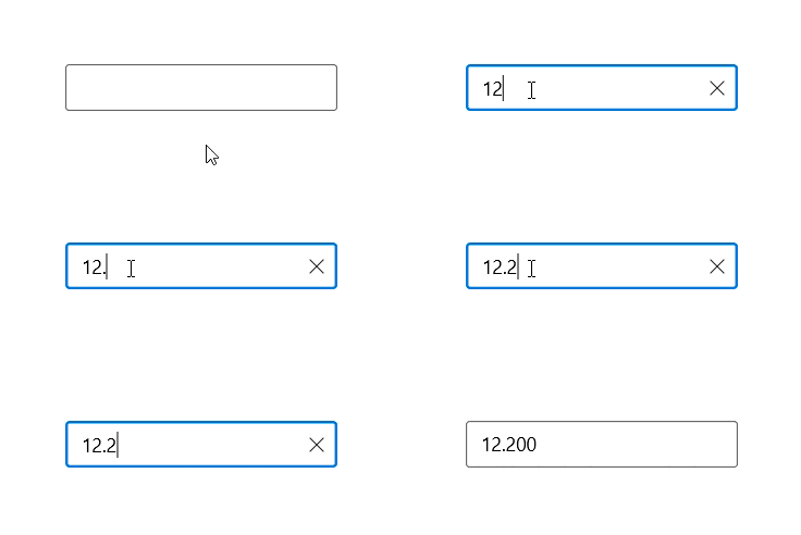
Supported data types
Here are the supported data types in SfNumberBox:
- Double
- Decimal
- Float
- Long
- Int, UInt
- Byte, SByte
You can assign the data type for SfNumberBox using the ValueType property. It allows the control to accept values of the specified data type. By default, the ValueType property is double.
<editors:SfNumberBox x:Name="datatype" Width="300"
                     ValueType="Decimal"
                     Value="3213124.20076757593434242423224356397"
                     Minimum="2000.87654678656765"
Maximum="5100000.24738787437884"/>datatype.ValueType = Syncfusion.UI.Xaml.Editors.NumericType.Decimal;
datatype.Value = 3213124.20076757593434242423224356397M;
datatype.Minimum = 2000.87654678656765M;
datatype.Maximum = 5100000.24738787437884M;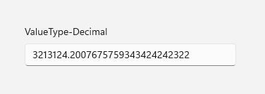
Minimum and Maximum must match the ValueType. For example, when using ValueType=”Decimal”, specify Minimum and Maximum using decimal literals to avoid type‑casting issues and ensure correct validation.
When changing
ValueTypeat runtime, reassignValue,Minimum, andMaximumto values of the matching type to avoid validation errors.
Change number format
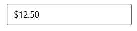
You can change the format in which the value should be displayed using the CustomFormat property and NumberFormatter property. By default, value of the CustomFormat property and NumberFormatter property is null. You can apply various custom formats available in this link to the NumberBox control using CustomFormat property.
<editors:SfNumberBox HorizontalAlignment="Center"
                     VerticalAlignment="Center"
                     Value="12.5"
                     CustomFormat="C2" />
SfNumberBox sfNumberBox = new SfNumberBox();
sfNumberBox.HorizontalAlignment = HorizontalAlignment.Center;
sfNumberBox.VerticalAlignment = VerticalAlignment.Center;
sfNumberBox.Value = 12.5;
sfNumberBox.CustomFormat = "C2";You can also change the format of the value of NumberBox control using NumberFormatter property with different formatters available.
<editors:SfNumberBox x:Name="sfNumberBox"
                     HorizontalAlignment="Center"
                     VerticalAlignment="Center"
                     Value="12.5" />
using System.Globalization;
using Windows.Globalization.NumberFormatting;
CultureInfo ci = new CultureInfo("en-US");
string currencyCode = new RegionInfo(ci.LCID).ISOCurrencySymbol;
sfNumberBox.NumberFormatter = new CurrencyFormatter(currencyCode, new string[] { ci.Name }, "ZZ")
{
IntegerDigits = 1,
FractionDigits = 2,
Mode = CurrencyFormatterMode.UseCurrencyCode
};
Accept null value
By default, NumberBox control allows null value. A null value is assigned when the user clicks the clear button or clears the input. You can disable this by setting the value of AllowNull property as false. When value of the AllowNull property is set to false and the input is cleared, the NumberBox control returns it to 0.
<editors:SfNumberBox HorizontalAlignment="Center"
                     VerticalAlignment="Center"
                     AllowNull="False" />
using Syncfusion.UI.Xaml.Editors;
SfNumberBox sfNumberBox = new SfNumberBox();
sfNumberBox.HorizontalAlignment = HorizontalAlignment.Center;
sfNumberBox.VerticalAlignment = VerticalAlignment.Center;
sfNumberBox.AllowNull = false;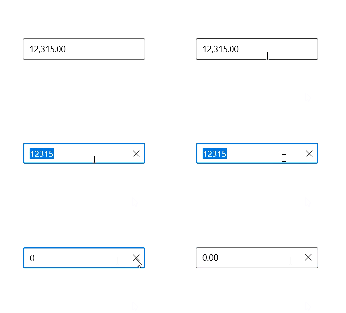
Header and description
This section explains the Header and Description properties of the NumberBox control.
Header
The Header property is used to display the title for the NumberBox control.
<editors:SfNumberBox x:Name="numberBox"
                     Height="75"
                     Width="300"
                     Header="Amount to withdraw"
                     Value="100" />
SfNumberBox sfNumberBox = new SfNumberBox();
sfNumberBox.Header = "Amount to withdraw";
Header customization
By using the control’s HeaderTemplate property, you can customize the appearance of the control’s header. The following code sample shows how to use a header template to customize the header.
<editors:SfNumberBox Value="100" CustomFormat="#,0.00" Width="250" Height="75">
<editors:SfNumberBox.HeaderTemplate>
<DataTemplate>
<StackPanel Orientation="Horizontal">
<FontIcon FontFamily="Segoe MDL2 Assets" Glyph=""/>
<TextBlock Text="Amount" FontSize="14" Margin="5"/>
</StackPanel>
</DataTemplate>
</editors:SfNumberBox.HeaderTemplate>
</editors:SfNumberBox>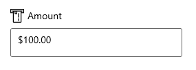
Description
The Description property is used to display content beneath the control and to provide guidance on the input that the control expects.
<editors:SfNumberBox x:Name="numberBox"
                      Height="75"
                      Width="300"
                      Value="10"
                      Description="Please enter only positive digit."/>
SfNumberBox sfNumberBox = new SfNumberBox();
sfNumberBox.Description = "Please enter only positive digit.";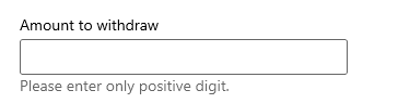
Setting placeholder text
You can prompt the user with any information by using the PlaceholderText property. Placeholder text will be displayed only when the value of the AllowNull property is true and the value of NumberBox control is null. The default value of PlaceholderText property is string.Empty (No string will be displayed).
<editors:SfNumberBox HorizontalAlignment="Center"
                     VerticalAlignment="Center"
                     PlaceholderText="Enter input here..." />
using Syncfusion.UI.Xaml.Editors;
SfNumberBox sfNumberBox= new SfNumberBox();
sfNumberBox.PlaceholderText = "Enter input here...";
sfNumberBox.HorizontalAlignment = HorizontalAlignment.Center;
sfNumberBox.VerticalAlignment = VerticalAlignment.Center;
Clear button visibility
The ShowClearButton property is used to show or hide the clear button in the NumberBox. By default, visibility of the clear button is enabled.
The clear button appears only when the text box is focused and the IsEditable property value is set to true.
<editors:SfNumberBox x:Name="numberBox"
            Height="75"
            Width="300"
            ShowClearButton="True"
            IsEditable="True"
            Value="10"/>
using Syncfusion.UI.Xaml.Editors;
SfNumberBox sfNumberBox = new SfNumberBox();
sfNumberBox.ShowClearButton = true;
sfNumberBox.IsEditable = true;When IsEditable is true

When IsEditable is false

Value changed notification
The ValueChanged event is triggered when the Value property of the NumberBox control is changed. The Value is updated after validation is performed on the Enter keypress or when the focus is lost in the control. The ValueChangedEventArgs contains the following properties.
-
NewValue- Contains the new input value. -
OldValue- Contains the previous input value.
<editors:SfNumberBox HorizontalAlignment="Center"
                     VerticalAlignment="Center"
                     x:Name="sfNumberBox"
                     ValueChanged="sfNumberBox_ValueChanged" />
SfNumberBox sfNumberBox = new SfNumberBox();
sfNumberBox.HorizontalAlignment = HorizontalAlignment.Center;
sfNumberBox.VerticalAlignment = VerticalAlignment.Center;
sfNumberBox.ValueChanged += sfNumberBox_ValueChanged;You can handle the event as follows.
private void sfNumberBox_ValueChanged(object sender, ValueChangedEventArgs e)
{
    var oldValue = e.OldValue;
    var newValue = e.NewValue;
}