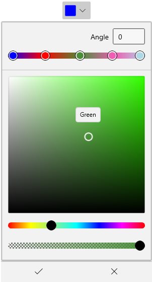
Customization of Color Picker in WinUI DropDown Color Picker
18 Nov 20181 minute to read
This section describes how to customize the Color Picker embedded in the WinUI DropDown Color Picker control.
Add the following namespace declaration to your XAML page:
xmlns:editors="using:Syncfusion.UI.Xaml.Editors"Customizing the Color Picker inside the DropDown
You can customize the control displayed in the drop-down of the DropDown Color Picker by using the AttachedFlyout and DropDownFlyout properties. AttachedFlyout lets you attach any flyout to the control, while DropDownFlyout is the default flyout used by the DropDown Color Picker.
You can refer to the Color Picker documentation page to learn about all the customization options available in the
SfColorPickercontrol.
<editors:SfDropDownColorPicker Name="sfDropDownColorPicker">
    <FlyoutBase.AttachedFlyout>
        <editors:DropDownFlyout>
            <editors:SfColorPicker BrushTypeOptions="LinearGradientBrush"
                                   Width="250" />
        </editors:DropDownFlyout>
    </FlyoutBase.AttachedFlyout>
</editors:SfDropDownColorPicker>
The BrushTypeOptions property accepts a bitwise combination of SolidColorBrush and LinearGradientBrush values; the default is SolidColorBrush | LinearGradientBrush.