Getting Started with WinUI Color Picker
18 Nov 201814 minutes to read
This section describes how to create a WinUI Color Picker control in a WinUI application and overview of its basic functionalities.
Structure of Color Picker control
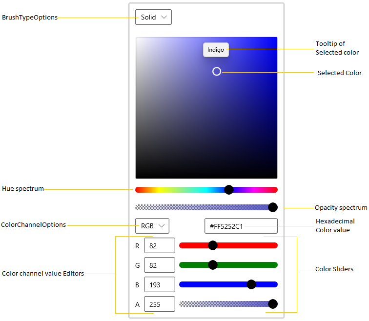
- Color spectrum with picker handle
- Hue spectrum slider
- Color channel editors (RGB/HSV/HSL/CMYK)
- Hexadecimal value editor
- Alpha (opacity) value editor
- Brush type selector (Solid/Linear/Radial)
Creating an application with WinUI Color Picker
- Create a WinUI 3 desktop application using C# and .NET 8 or later.
- Add reference to the latest Syncfusion.Editors.WinUI NuGet package.
- Import the control namespace
Syncfusion.UI.Xaml.Editorsin XAML or C# code. -
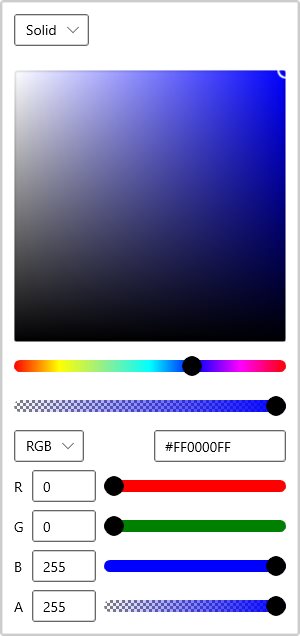
Initialize the
SfColorPickercontrol.<Page x:Class="GettingStarted.MainPage" xmlns="http://schemas.microsoft.com/winfx/2006/xaml/presentation" xmlns:x="http://schemas.microsoft.com/winfx/2006/xaml" xmlns:local="using:GettingStarted" xmlns:d="http://schemas.microsoft.com/expression/blend/2008" xmlns:mc="http://schemas.openxmlformats.org/markup-compatibility/2006" xmlns:editors="using:Syncfusion.UI.Xaml.Editors" mc:Ignorable="d" Background="{ThemeResource ApplicationPageBackgroundThemeBrush}"> <Grid Name="grid"> <!--Adding Color Picker control --> <editors:SfColorPicker Name="colorPicker"/> </Grid> </Page>using Syncfusion.UI.Xaml.Editors; namespace GettingStarted { /// <summary> /// An empty page that can be used on its own or navigated to within a Frame. /// </summary> public sealed partial class MainPage : Page { public MainPage() { this.InitializeComponent(); // Creating an instance of the Color Picker control SfColorPicker colorPicker = new SfColorPicker(); // Setting height and width to ColorPicker control colorPicker.Height = 300; colorPicker.Width = 300; grid.Children.Add(colorPicker); } } }
Download demo application from GitHub
Select solid brush
You can select the solid color brush programmatically by setting the solid color brush value to the SelectedBrush property of type Brush. The XAML Brush type converter accepts standard color names (e.g., Yellow). You can select any solid color brush at runtime by clicking on the respective solid color brush area. You can also choose various solid color brushes from different standard color models such as RGB, HSV, HSL, and CMYK formats. The default value of the SelectedBrush property is SolidColorBrush(Colors.Blue).
<editors:SfColorPicker x:Name="colorPicker"
                        SelectedBrush="Yellow"/>
using Syncfusion.UI.Xaml.Editors;
using Microsoft.UI;
using Windows.UI;
SfColorPicker colorPicker = new SfColorPicker();
colorPicker.SelectedBrush = new SolidColorBrush(Colors.Yellow);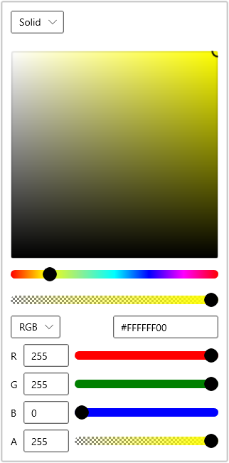
Download demo application from GitHub
Switch between color channels
You can select the color model by setting the required color model to the ColorChannelOptions property or by selecting it from the drop-down list. Supported values are RGB, HSV, HSL, and CMYK. The default value of the ColorChannelOptions property is RGB.
<editors:SfColorPicker x:Name="colorPicker"
                        ColorChannelOptions="HSV"/>
using Syncfusion.UI.Xaml.Editors;
SfColorPicker colorPicker = new SfColorPicker();
colorPicker.ColorChannelOptions = ColorChannelOptions.HSV;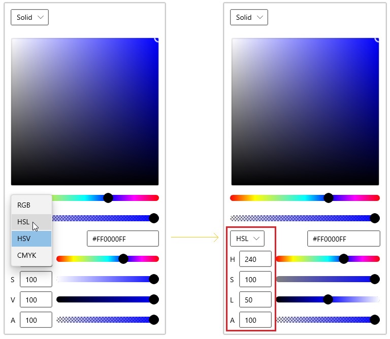
Download demo application from GitHub
Change opacity of solid brush
You can change the opacity of the selected solid color brush by using the alpha value editor or dedicated slider in the Color Picker. You can hide the alpha slider by setting the AlphaInputOptions property to TextInput, SliderInput, or None. The default value of the AlphaInputOptions property is All.
<editors:SfColorPicker AlphaInputOptions="TextInput"
                       Name="colorPicker"/>
using Syncfusion.UI.Xaml.Editors;
colorPicker.AlphaInputOptions = ColorInputOptions.TextInput;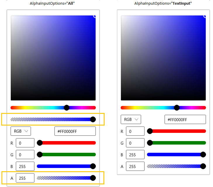
Download demo application from GitHub
Hexadecimal editor
You can select a solid color brush by entering the hexadecimal color value to the hexadecimal value editor. You can also get the selected color hexadecimal value by using the hexadecimal value editor. You can hide the hexadecimal value editor by setting the IsHexInputVisible property value as false. The default value of IsHexInputVisible property is true.
<editors:SfColorPicker IsHexInputVisible="False"
                       Name="colorPicker"/>
using Syncfusion.UI.Xaml.Editors;
colorPicker.IsHexInputVisible = false;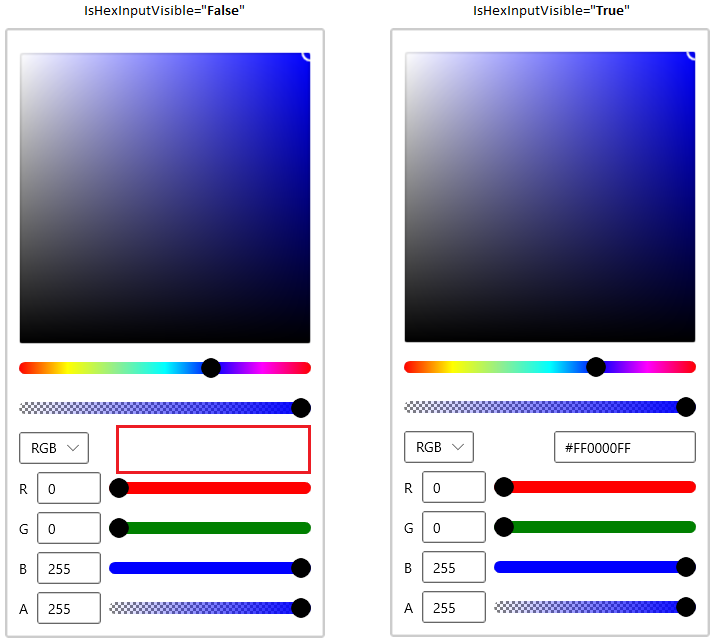
Download demo application from GitHub
Select linear gradient brush
Linear Gradient color brush can be selected by the multiple colors and their location along the gradient axis using the GradientStop objects and StartPoint and EndPoint properties. Based on the StartPoint and EndPoint, the selected color brush will be combined in linear manner.
<editors:SfColorPicker x:Name="colorPicker">
    <editors:SfColorPicker.SelectedBrush>
        <LinearGradientBrush StartPoint="0,0" EndPoint="1,1">
            <GradientStop Color="Yellow" Offset="0.0" />
            <GradientStop Color="Red" Offset="0.25" />
            <GradientStop Color="Blue" Offset="0.75" />
            <GradientStop Color="LimeGreen" Offset="1.0" />
        </LinearGradientBrush>
    </editors:SfColorPicker.SelectedBrush>
</editors:SfColorPicker>
using Syncfusion.UI.Xaml.Editors;
using Microsoft.UI;
using Microsoft.UI.Xaml.Media;
using Windows.Foundation;
using Windows.UI;
//Creating the linear gradient brush
LinearGradientBrush linearGradient = new LinearGradientBrush();
linearGradient.StartPoint = new Point(0, 0);
linearGradient.EndPoint = new Point(1, 1);
linearGradient.GradientStops.Add(
new GradientStop() { Color = Colors.Yellow, Offset = 0.0 });
linearGradient.GradientStops.Add(
new GradientStop() { Color = Colors.Red, Offset = 0.25 });
linearGradient.GradientStops.Add(
new GradientStop() { Color = Colors.Blue, Offset = 0.75 });
linearGradient.GradientStops.Add(
new GradientStop() { Color = Colors.LimeGreen, Offset = 1.0 });
//Assigning a linear gradient brush to Color Picker
colorPicker.SelectedBrush = linearGradient;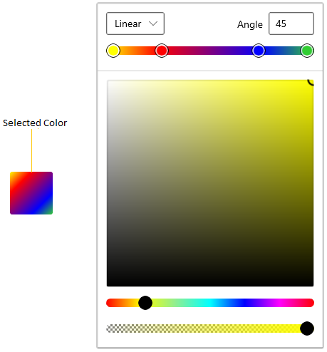
Download demo application from GitHub
Select linear gradient brush interactively
You can directly select a required linear gradient color brush at runtime by setting the BrushTypeOptions property value to LinearGradientBrush. The default value of the BrushTypeOptions property is All. Use a comma-separated list in XAML or a bitwise OR in C# to enable multiple brush modes.
<editors:SfColorPicker BrushTypeOptions="LinearGradientBrush"
                       Name="colorPicker"/>
using Syncfusion.UI.Xaml.Editors;
colorPicker.BrushTypeOptions = BrushTypeOptions.LinearGradientBrush;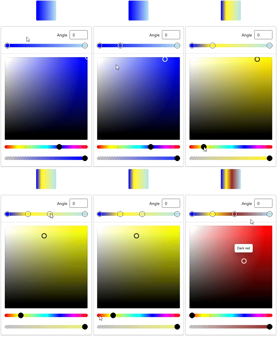
Download demo application from GitHub
Select radial gradient brush
Radial Gradient color brush is similar to Linear Gradient color brush, except for the axis defined by the circle. Based on the GradientOrigin, Center and radius point values, the selected gradient color brush are combined in a circle manner.
<editors:SfColorPicker x:Name="colorPicker">
    <editors:SfColorPicker.SelectedBrush>
        <RadialGradientBrush GradientOrigin="0.5,0.5"
                             Center="0.5,0.5"
                             RadiusX="0.5" RadiusY="0.5">
            <GradientStop Color="Yellow" Offset="0" />
            <GradientStop Color="Red" Offset="0.25" />
            <GradientStop Color="Blue" Offset="0.75" />
            <GradientStop Color="LimeGreen" Offset="1" />
        </RadialGradientBrush>
    </editors:SfColorPicker.SelectedBrush>
</editors:SfColorPicker>
using Syncfusion.UI.Xaml.Editors;
using Microsoft.UI;
using Microsoft.UI.Xaml.Media;
using Windows.Foundation;
using Windows.UI;
//Creating a radial gradient brush
RadialGradientBrush radialGradient = new RadialGradientBrush();
radialGradient.GradientOrigin = new Point(0.5, 0.5);
radialGradient.Center = new Point(0.5, 0.5);
radialGradient.RadiusX = 0.5;
radialGradient.RadiusY = 0.5;
radialGradient.GradientStops.Add(
new GradientStop() {Color=Colors.Yellow, Offset= 0.0 });
radialGradient.GradientStops.Add(
new GradientStop() {Color=Colors.Red, Offset = 0.25 });
radialGradient.GradientStops.Add(
new GradientStop() {Color=Colors.Blue, Offset = 0.75 });
radialGradient.GradientStops.Add(
new GradientStop() {Color=Colors.LimeGreen, Offset = 1.0 });
//Assigning a radial gradient brush to Color Picker
colorPicker.SelectedBrush = radialGradient;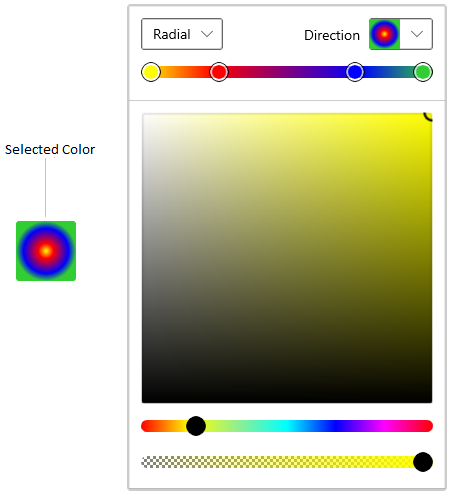
Download demo application from GitHub
Select radial gradient brush interactively
You can directly select a required radial gradient color brush at runtime by setting the BrushTypeOptions property value as RadialGradientBrush.
<editors:SfColorPicker BrushTypeOptions="RadialGradientBrush"
                       Name="colorPicker"/>
using Syncfusion.UI.Xaml.Editors;
colorPicker.BrushTypeOptions = BrushTypeOptions.RadialGradientBrush;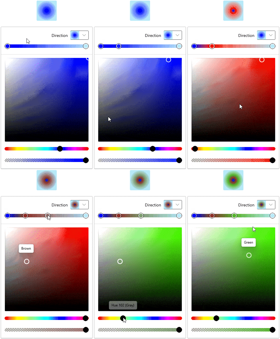
Download demo application from GitHub
Switch between solid, linear and radial gradient brush mode
You can allow the user to choose any combination of Solid, Linear, or Radial gradient brushes by using the BrushTypeOptions property. The BrushTypeOptions enum supports the values All, SolidColorBrush, LinearGradientBrush, and RadialGradientBrush.
<editors:SfColorPicker BrushTypeOptions="SolidColorBrush,RadialGradientBrush"
                       Name="colorPicker">
using Syncfusion.UI.Xaml.Editors;
colorPicker.BrushTypeOptions = BrushTypeOptions.SolidColorBrush | BrushTypeOptions.RadialGradientBrush;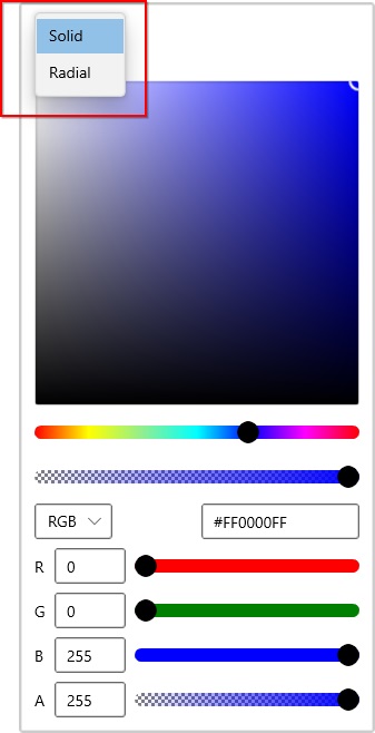
Download demo application from GitHub
Switch between solid, linear and radial gradient brush mode interactively
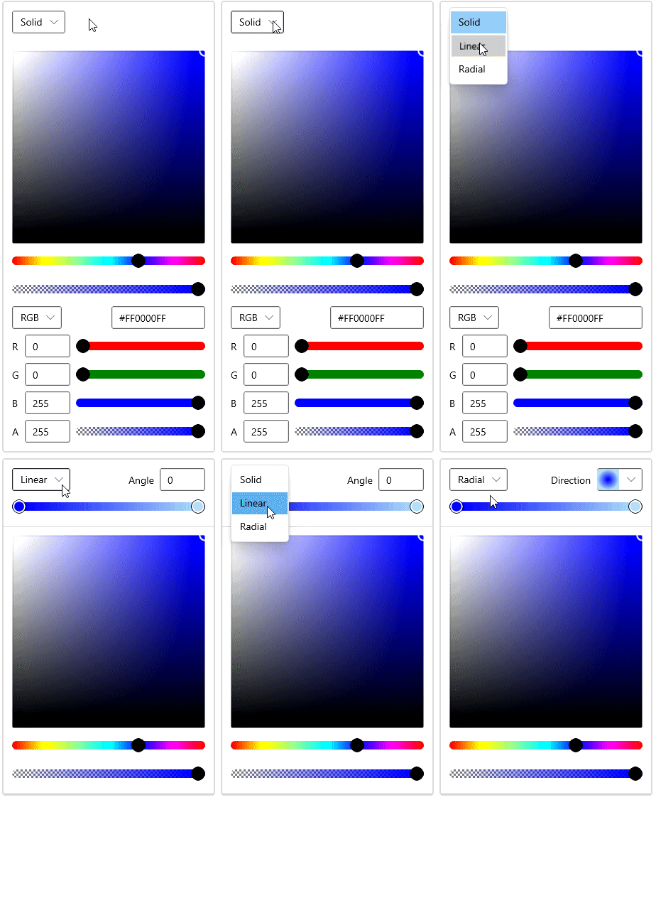
You can change the color selection mode directly at runtime by clicking on the corresponding Solid, Linear, or Radial gradient brush mode drop-down options that are placed at the top of the Color Picker control.
Download demo application from GitHub
Selected brush changed notification
You will be notified when the selected brush changes in Color Picker by using the SelectedBrushChanged event. You can get the old and newly selected brush by using the OldBrush and NewBrush properties of the SelectedBrushChangedEventArgs class.
<editors:SfColorPicker SelectedBrushChanged="ColorPicker_SelectedBrushChanged"
Name="colorPicker"/>colorPicker.SelectedBrushChanged += ColorPicker_SelectedBrushChanged;You can handle the event as follows.
private void ColorPicker_SelectedBrushChanged(object sender, SelectedBrushChangedEventArgs args)
{
    var oldSelectedBrush = args.OldBrush;
    var newSelectedBrush = args.NewBrush;
}