Axis in .NET MAUI Radial Gauge
18 Nov 201824 minutes to read
The Radial Axis is a circular arc in which a set of values are displayed along a linear or custom scale based on the design requirements. Axis elements such as labels, ticks, and the axis line can be easily customized.
Prerequisite: Ensure that the required NuGet package is installed, the necessary namespaces are imported, and the SfRadialGauge control is properly configured in your application. For detailed setup and configuration instructions, refer to the Getting Started guide.
Axis customization
This section will cover the axis customization options.
Background content
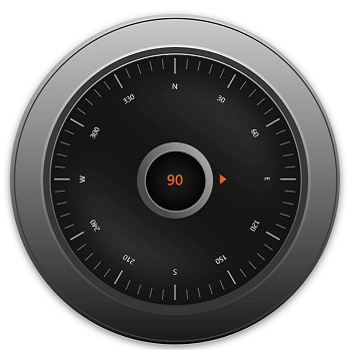
Radial axis allows you to add any visual contents as its background using the BackgroundContent property.
<gauge:SfRadialGauge x:Name = "gauge">
    <gauge:SfRadialGauge.Axes>
        <gauge:RadialAxis x:Name = "axis"
                          ShowAxisLine = "False"
                          RadiusFactor = "1"
                          CanRotateLabels = "True"
                          TickOffset = "0.32"
                          OffsetUnit = "Factor"
                          LabelCreated = "RadialAxis_LabelCreated"
                          StartAngle = "270"
                          EndAngle = "270"
                          LabelOffset = "0.05"
                          Maximum = "360"
                          Minimum = "0"
                          Interval = "30"
                          MinorTicksPerInterval = "4">
            <gauge:RadialAxis.AxisLabelStyle>
                 <gauge:GaugeLabelStyle TextColor = "White" FontSize = "11"/>
            </gauge:RadialAxis.AxisLabelStyle>
            <gauge:RadialAxis.MajorTickStyle>
                 <gauge:RadialTickStyle Length = "0.087" LengthUnit = "Factor"
                                        Stroke = "#FF949494" StrokeThickness = "2.3"/>
            </gauge:RadialAxis.MajorTickStyle>
            <gauge:RadialAxis.MinorTickStyle>
                 <gauge:RadialTickStyle Length = "0.058" LengthUnit = "Factor"
                                        Stroke = "#FF616161" StrokeThickness = "1.6"/>
            </gauge:RadialAxis.MinorTickStyle>

            <gauge:RadialAxis.BackgroundContent>
                <Image  Source = "axisbackground.png"/>
            </gauge:RadialAxis.BackgroundContent>

            <gauge:RadialAxis.Pointers>
                <gauge:ShapePointer Value = "90"
                                    Fill = "#FFDF5F2D"
                                    EnableAnimation = "True"
                                    AnimationDuration = "1200"
                                    AnimationEasing = "{x:Static Easing.SpringOut}"
                                    Offset = "0.71"
                                    OffsetUnit = "Factor"
                                    ShapeType = "Triangle"
                                    ShapeHeight = "10"
                                    ShapeWidth = "15">
                </gauge:ShapePointer>
            </gauge:RadialAxis.Pointers>

            <gauge:RadialAxis.Annotations>
                <gauge:GaugeAnnotation DirectionValue = "270">
                    <gauge:GaugeAnnotation.Content>
                         <Label Text = "90" TextColor = "#FFDF5F2D"
                                FontAttributes = "Bold"
                                FontSize = "22" />
                    </gauge:GaugeAnnotation.Content>
                </gauge:GaugeAnnotation>
            </gauge:RadialAxis.Annotations>
        </gauge:RadialAxis>
    </gauge:SfRadialGauge.Axes>
</gauge:SfRadialGauge>
SfRadialGauge sfRadialGauge = new SfRadialGauge();
RadialAxis radialAxis = new RadialAxis();
radialAxis.ShowAxisLine = false;
radialAxis.RadiusFactor = 1;
radialAxis.CanRotateLabels = true;
radialAxis.TickOffset = 0.32;
radialAxis.OffsetUnit = SizeUnit.Factor;
radialAxis.LabelCreated += RadialAxis_LabelCreated;
radialAxis.StartAngle = 270;
radialAxis.EndAngle = 270;
radialAxis.LabelOffset = 0.05;
radialAxis.Maximum = 360;
radialAxis.Minimum = 0;
radialAxis.Interval = 30;
radialAxis.MinorTicksPerInterval = 4;
radialAxis.AxisLabelStyle = new GaugeLabelStyle()
{
TextColor = Colors.White,
FontSize = 11
};
radialAxis.MajorTickStyle = new RadialTickStyle()
{
Length = 0.087,
LengthUnit = SizeUnit.Factor,
Stroke = new SolidColorBrush(Color.FromHex("FF949494")),
StrokeThickness = 2.3
};
radialAxis.MinorTickStyle = new RadialTickStyle()
{
Length = 0.058,
LengthUnit = SizeUnit.Factor,
Stroke = new SolidColorBrush(Color.FromHex("FF616161")),
StrokeThickness = 2.3
};
Image image = new Image { Source = "axisbackground.png" };
radialAxis.BackgroundContent = image;
sfRadialGauge.Axes.Add(radialAxis);
ShapePointer markerPointer = new ShapePointer();
markerPointer.Value = 90;
markerPointer.Fill = new SolidColorBrush(Color.FromRgb(223, 95, 45));
markerPointer.EnableAnimation = true;
markerPointer.AnimationDuration = 1200;
markerPointer.Offset = 0.71;
markerPointer.OffsetUnit = SizeUnit.Factor;
markerPointer.ShapeType = MarkerType.Triangle;
markerPointer.ShapeHeight = 10;
markerPointer.ShapeWidth = 15;
radialAxis.Pointers.Add(markerPointer);
GaugeAnnotation gaugeAnnotation = new GaugeAnnotation();
gaugeAnnotation.DirectionValue = 270;
Label label = new Label();
label.Text = "90";
label.TextColor = Color.FromRgb(223, 95, 45);
label.FontAttributes = FontAttributes.Bold;
label.FontSize = 22;
gaugeAnnotation.Content = label;
radialAxis.Annotations.Add(gaugeAnnotation);
this.Content = sfRadialGauge;
// LabelCreated event handler.
private void RadialAxis_LabelCreated(object sender, LabelCreatedEventArgs e)
{
if (e.Text == "90")
{
e.Text = "E";
}
else if (e.Text == "360")
{
e.Text = string.Empty;
}
else
{
if (e.Text == "0")
{
e.Text = "N";
}
else if (e.Text == "180")
{
e.Text = "S";
}
else if (e.Text == "270")
{
e.Text = "W";
}
}
}
Setting axis minimum and maximum
The Minimum and Maximum properties of an axis can be used to customize the axis scale range. The default value of Minimum is 0 and Maximum is 100.
<gauge:SfRadialGauge>
    <gauge:SfRadialGauge.Axes>
        <gauge:RadialAxis Minimum = "-60"
                          Maximum = "60" />
    </gauge:SfRadialGauge.Axes>
</gauge:SfRadialGauge>
SfRadialGauge sfRadialGauge = new SfRadialGauge();
RadialAxis radialAxis = new RadialAxis();
radialAxis.Minimum = -60;
radialAxis.Maximum = 60;
sfRadialGauge.Axes.Add(radialAxis);
this.Content = sfRadialGauge;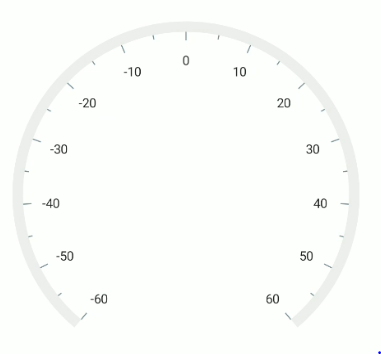
Interval
The interval between labels can be customized using the Interval property. By default, auto-interval will be calculated based on available scale range and size. If you need to change the default interval, use this property.
<gauge:SfRadialGauge>
    <gauge:SfRadialGauge.Axes>
        <gauge:RadialAxis Interval = "20" />
    </gauge:SfRadialGauge.Axes>
</gauge:SfRadialGauge>
SfRadialGauge sfRadialGauge = new SfRadialGauge();
RadialAxis radialAxis = new RadialAxis();
radialAxis.Interval = 20;
sfRadialGauge.Axes.Add(radialAxis);
this.Content = sfRadialGauge;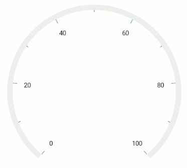
Angle customization
The start and end angles of radial axis can be customized using the StartAngle and EndAngle properties.
<gauge:SfRadialGauge>
    <gauge:SfRadialGauge.Axes>
        <gauge:RadialAxis StartAngle = "180"
                          EndAngle = "90" />
    </gauge:SfRadialGauge.Axes>
</gauge:SfRadialGauge>
SfRadialGauge sfRadialGauge = new SfRadialGauge();
RadialAxis radialAxis = new RadialAxis();
radialAxis.StartAngle = 180;
radialAxis.EndAngle = 90;
sfRadialGauge.Axes.Add(radialAxis);
this.Content = sfRadialGauge;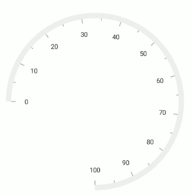
Radius customization
The radius of the radial axis can be customized using the RadiusFactor property. The default value of the RadiusFactor is 0.8. The value of RadiusFactor ranges from 0 to 1. For example, When the RadiusFactor value is 1, the full radius will be considered for rendering the axis and when the RadiusFactor value is 0.5, then half of the radius value will be considered for rendering the axis circle.
<gauge:SfRadialGauge>
    <gauge:SfRadialGauge.Axes>
        <gauge:RadialAxis />
        <gauge:RadialAxis RadiusFactor = "0.5" />
    </gauge:SfRadialGauge.Axes>
</gauge:SfRadialGauge>
SfRadialGauge sfRadialGauge = new SfRadialGauge();
RadialAxis radialAxis1 = new RadialAxis();
sfRadialGauge.Axes.Add(radialAxis1);
RadialAxis radialAxis2 = new RadialAxis();
radialAxis2.RadiusFactor = 0.5;
sfRadialGauge.Axes.Add(radialAxis2);
this.Content = sfRadialGauge;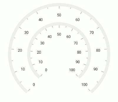
Positioning axis based on its angle
The CanScaleToFit property of radial axis is used to fit the axis position on available size based on the provided StartAngle and EndAngle. By default, the CanScaleToFit is true.
<gauge:SfRadialGauge BackgroundColor = "#FFF8B195">
    <gauge:SfRadialGauge.Axes>
        <gauge:RadialAxis CanScaleToFit = "False" StartAngle = "180"
                          EndAngle = "0"
                          Interval = "10" >
            <gauge:RadialAxis.AxisLineStyle>
                <gauge:RadialLineStyle Fill = "#FF355C7D"/>
            </gauge:RadialAxis.AxisLineStyle>
        </gauge:RadialAxis>
    </gauge:SfRadialGauge.Axes>
</gauge:SfRadialGauge>
VerticalStackLayout layout = new VerticalStackLayout();
layout.Padding = new Thickness(5);
SfRadialGauge sfRadialGauge = new SfRadialGauge();
sfRadialGauge.BackgroundColor = Color.FromRgb(248, 177, 149);
RadialAxis radialAxis = new RadialAxis();
radialAxis.StartAngle = 180;
radialAxis.CanScaleToFit = false;
radialAxis.EndAngle = 0;
radialAxis.Interval = 10;
radialAxis.AxisLineStyle.Fill = new SolidColorBrush(Color.FromRgb(53, 92, 125));
sfRadialGauge.Axes.Add(radialAxis);
layout.Add(sfRadialGauge);
this.Content = layout;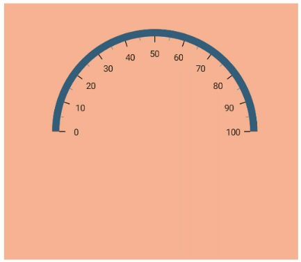
Axis label rotation
The axis label can be rotated based on its current angle using the CanRotateLabels property. The default value of CanRotateLabels is false.
<gauge:SfRadialGauge>
    <gauge:SfRadialGauge.Axes>
        <gauge:RadialAxis CanRotateLabels = "True" />
    </gauge:SfRadialGauge.Axes>
</gauge:SfRadialGauge>
SfRadialGauge sfRadialGauge = new SfRadialGauge();
RadialAxis radialAxis = new RadialAxis();
radialAxis.CanRotateLabels = true;
sfRadialGauge.Axes.Add(radialAxis);
this.Content = sfRadialGauge;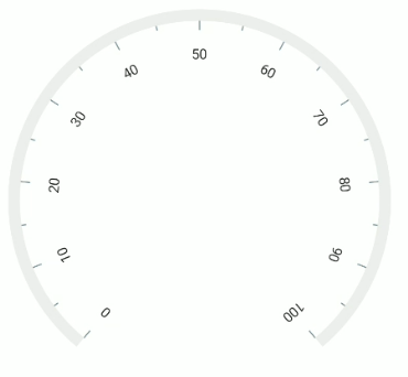
Edge label customization
The visibility of the first and last labels of an axis can be customized using the ShowFirstLabel and ShowLastLabel properties.
-
ShowFirstLabel– Enables or disables the first label of the axis. -
ShowLastLabel– Enables or disables the last label of the axis.
The default value of both the ShowFirstLabel and ShowLastLabel properties is true.
<gauge:SfRadialGauge>
    <gauge:SfRadialGauge.Axes>
        <gauge:RadialAxis Minimum = "0"
                          Maximum = "12"
                          Interval = "1"
                          StartAngle = "270"
                          EndAngle = "270"
                          ShowFirstLabel = "False" />
    </gauge:SfRadialGauge.Axes>
</gauge:SfRadialGauge>
SfRadialGauge sfRadialGauge = new SfRadialGauge();
RadialAxis radialAxis = new RadialAxis();
radialAxis.Minimum = 0;
radialAxis.Maximum = 12;
radialAxis.Interval = 1;
radialAxis.StartAngle = 270;
radialAxis.EndAngle = 270;
radialAxis.ShowFirstLabel = false;
sfRadialGauge.Axes.Add(radialAxis);
this.Content = sfRadialGauge;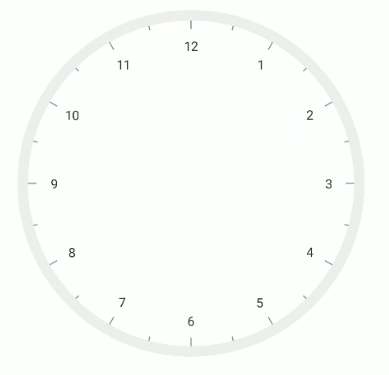
Axis direction customization
The direction of radial axis can be customized by its IsInversed property.
When the IsInversed property is true, the axis can be placed in counter-clockwise direction. When the IsInversed property is set to false, the axis will be positioned in clockwise direction.
<gauge:SfRadialGauge>
    <gauge:SfRadialGauge.Axes>
        <gauge:RadialAxis IsInversed = "True" />
    </gauge:SfRadialGauge.Axes>
</gauge:SfRadialGauge>
SfRadialGauge sfRadialGauge = new SfRadialGauge();
RadialAxis radialAxis = new RadialAxis();
radialAxis.IsInversed = true;
sfRadialGauge.Axes.Add(radialAxis);
this.Content = sfRadialGauge;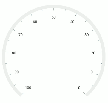
Maximum number of labels per 100 logical pixels
By default, a maximum of three labels are displayed for each 100 logical pixels in an axis. The maximum number of labels that should present within 100 logical pixels length can be customized using the MaximumLabelsCount property of the axis. This property is applicable only for automatic range calculation and will not work, if you set value for interval property of an axis.
<gauge:SfRadialGauge>
    <gauge:SfRadialGauge.Axes>
        <gauge:RadialAxis MaximumLabelsCount = "5" />
    </gauge:SfRadialGauge.Axes>
</gauge:SfRadialGauge>
SfRadialGauge sfRadialGauge = new SfRadialGauge();
RadialAxis radialAxis = new RadialAxis();
radialAxis.MaximumLabelsCount = 5;
sfRadialGauge.Axes.Add(radialAxis);
this.Content = sfRadialGauge;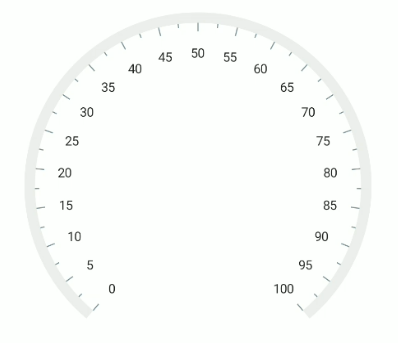
Axis line customization
The radial axis line can be customized using the AxisLineStyle of the RadialAxis. The following properties are available in the RadialLineStyle class:
-
Thickness, of typedouble, customizes the thickness of the axis line. -
ThicknessUnit, of theSizeUnitenum, specifies whether the thickness value is interpreted in pixels or as a factor of the axis radius. Its default value isSizeUnit.Pixel. -
Fill, of typeBrush, customizes the color of the axis line. -
GradientStops, of typeObservableCollection<GaugeGradientStop>, allows you to apply a gradient brush to the axis line.
Axis line width in pixel
If the ThicknessUnit is set as a pixel, the axis line will be rendered based on the pixel values given in Thickness.
<gauge:SfRadialGauge>
    <gauge:SfRadialGauge.Axes>
        <gauge:RadialAxis>
            <gauge:RadialAxis.AxisLineStyle>
                <gauge:RadialLineStyle ThicknessUnit = "Pixel" Thickness = "30"/>
            </gauge:RadialAxis.AxisLineStyle>
        </gauge:RadialAxis>
    </gauge:SfRadialGauge.Axes>
</gauge:SfRadialGauge>
SfRadialGauge sfRadialGauge = new SfRadialGauge();
RadialAxis radialAxis = new RadialAxis();
radialAxis.AxisLineStyle.Thickness = 30;
radialAxis.AxisLineStyle.ThicknessUnit = SizeUnit.Pixel;
sfRadialGauge.Axes.Add(radialAxis);
this.Content = sfRadialGauge;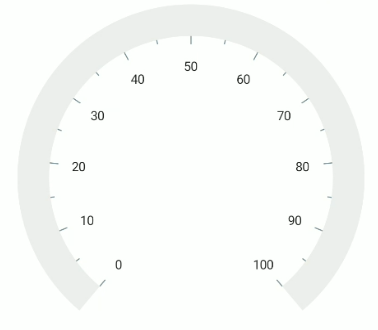
Axis line width in factor
If the ThicknessUnit is set to factor, the given factor value in the Thickness is multiplied by the axis radius. The value of the factor ranges from 0 to 1.
<gauge:SfRadialGauge>
    <gauge:SfRadialGauge.Axes>
        <gauge:RadialAxis>
            <gauge:RadialAxis.AxisLineStyle>
                <gauge:RadialLineStyle ThicknessUnit = "Factor" Thickness = "0.1"/>
            </gauge:RadialAxis.AxisLineStyle>
        </gauge:RadialAxis>
    </gauge:SfRadialGauge.Axes>
</gauge:SfRadialGauge>
SfRadialGauge sfRadialGauge = new SfRadialGauge();
RadialAxis radialAxis = new RadialAxis();
radialAxis.AxisLineStyle.Thickness = 0.1;
radialAxis.AxisLineStyle.ThicknessUnit = SizeUnit.Factor;
sfRadialGauge.Axes.Add(radialAxis);
this.Content = sfRadialGauge;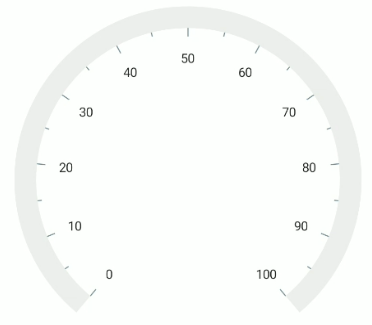
Setting axis line fill brush
To apply a brush to the axis line, use the Fill property of RadialLineStyle.
<gauge:SfRadialGauge>
    <gauge:SfRadialGauge.Axes>
        <gauge:RadialAxis>
            <gauge:RadialAxis.AxisLineStyle>
                 <gauge:RadialLineStyle ThicknessUnit = "Factor"
                                        Thickness = "0.1"
                                        Fill = "BlueViolet"/>
            </gauge:RadialAxis.AxisLineStyle>
        </gauge:RadialAxis>
    </gauge:SfRadialGauge.Axes>
</gauge:SfRadialGauge>
SfRadialGauge sfRadialGauge = new SfRadialGauge();
RadialAxis radialAxis = new RadialAxis();
radialAxis.AxisLineStyle.Thickness = 0.1;
radialAxis.AxisLineStyle.ThicknessUnit = SizeUnit.Factor;
radialAxis.AxisLineStyle.Fill = new SolidColorBrush(Colors.BlueViolet);
sfRadialGauge.Axes.Add(radialAxis);
this.Content = sfRadialGauge;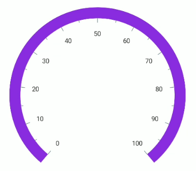
Setting gradient brush to axis line
The GradientStops property of radial axis allows you to specify the gradient brush to the axis line by specifying the different colors based on provided axis value.
<gauge:SfRadialGauge>
    <gauge:SfRadialGauge.Axes>
        <gauge:RadialAxis>
            <gauge:RadialAxis.AxisLineStyle>
                 <gauge:RadialLineStyle ThicknessUnit = "Factor"
                                        Thickness = "0.1">
                    <gauge:RadialLineStyle.GradientStops>
                        <gauge:GaugeGradientStop Value = "25"
                                                 Color = "#FFFF7676" />
                        <gauge:GaugeGradientStop Value = "75"
                                                 Color = "#FFF54EA2" />
                    </gauge:RadialLineStyle.GradientStops>
                </gauge:RadialLineStyle>
            </gauge:RadialAxis.AxisLineStyle>
        </gauge:RadialAxis>
    </gauge:SfRadialGauge.Axes>
</gauge:SfRadialGauge>
SfRadialGauge sfRadialGauge = new SfRadialGauge();
RadialAxis radialAxis = new RadialAxis();
radialAxis.AxisLineStyle.Thickness = 0.1;
radialAxis.AxisLineStyle.ThicknessUnit = SizeUnit.Factor;
GaugeGradientStop gaugeGradientStop1 = new GaugeGradientStop();
gaugeGradientStop1.Value = 25;
gaugeGradientStop1.Color = Color.FromRgb(255, 118, 118);
radialAxis.AxisLineStyle.GradientStops.Add(gaugeGradientStop1);
GaugeGradientStop gaugeGradientStop2 = new GaugeGradientStop();
gaugeGradientStop2.Value = 75;
gaugeGradientStop2.Color = Color.FromRgb(245, 78, 162);
radialAxis.AxisLineStyle.GradientStops.Add(gaugeGradientStop2);
sfRadialGauge.Axes.Add(radialAxis);
this.Content = sfRadialGauge;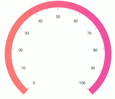
Axis line visibility
The visibility of the axis line can be customized using the ShowAxisLine property of axis. By default, this property is set to true.
<gauge:SfRadialGauge>
    <gauge:SfRadialGauge.Axes>
        <gauge:RadialAxis ShowAxisLine = "False" />
    </gauge:SfRadialGauge.Axes>
</gauge:SfRadialGauge>
SfRadialGauge sfRadialGauge = new SfRadialGauge();
RadialAxis radialAxis = new RadialAxis();
radialAxis.ShowAxisLine = false;
sfRadialGauge.Axes.Add(radialAxis);
this.Content = sfRadialGauge;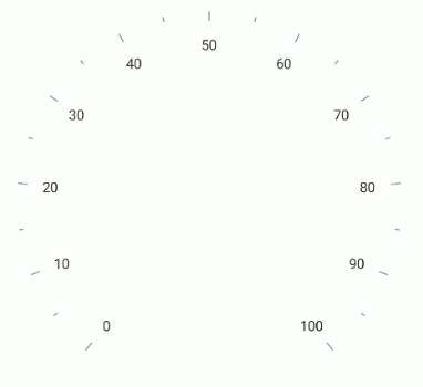
Axis label customization
The axis labels can be customized using the AxisLabelStyle of the RadialAxis. The following properties are available in the GaugeLabelStyle class:
-
TextColor, of typeColor, customizes the color of the labels. -
FontAttributes, of theFontAttributesenum, specifies the font attribute (such as bold or italic) for the labels. -
FontSize, of typedouble, specifies the font size for the labels. -
FontFamily, of typestring, specifies the font family for the labels.
<gauge:SfRadialGauge>
    <gauge:SfRadialGauge.Axes>
        <gauge:RadialAxis>
            <gauge:RadialAxis.AxisLabelStyle>
                 <gauge:GaugeLabelStyle TextColor = "Red"
                                        FontAttributes = "Bold"
                                        FontSize = "15"/>
            </gauge:RadialAxis.AxisLabelStyle>
        </gauge:RadialAxis>
    </gauge:SfRadialGauge.Axes>
</gauge:SfRadialGauge>
SfRadialGauge sfRadialGauge = new SfRadialGauge();
RadialAxis radialAxis = new RadialAxis();
radialAxis.AxisLabelStyle.FontSize = 15;
radialAxis.AxisLabelStyle.TextColor = Colors.Red;
radialAxis.AxisLabelStyle.FontAttributes = FontAttributes.Bold;
sfRadialGauge.Axes.Add(radialAxis);
this.Content = sfRadialGauge;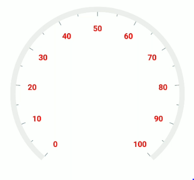
Formatting axis label
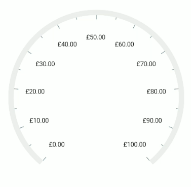
The following property of the axis allows you to customize the axis label text.
-
LabelFormat- Allows you to customize the axis label with the globalized label format.<gauge:SfRadialGauge> <gauge:SfRadialGauge.Axes> <gauge:RadialAxis LabelFormat = "c" /> </gauge:SfRadialGauge.Axes> </gauge:SfRadialGauge>SfRadialGauge sfRadialGauge = new SfRadialGauge(); RadialAxis radialAxis = new RadialAxis(); radialAxis.LabelFormat = "c"; sfRadialGauge.Axes.Add(radialAxis); this.Content = sfRadialGauge;
Label visibility
The ShowLabels property of axis allows you to enable or disable the visibility of labels. The default value of the property is true.
<gauge:SfRadialGauge>
    <gauge:SfRadialGauge.Axes>
        <gauge:RadialAxis ShowLabels = "False" />
    </gauge:SfRadialGauge.Axes>
</gauge:SfRadialGauge>
SfRadialGauge sfRadialGauge = new SfRadialGauge();
RadialAxis radialAxis = new RadialAxis();
radialAxis.ShowLabels = false;
sfRadialGauge.Axes.Add(radialAxis);
this.Content = sfRadialGauge;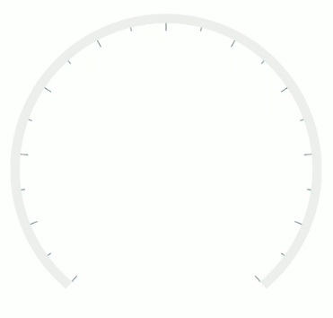
Label placement
The radial axis allows you to position the labels either inside or outside of the axis line using the LabelPosition property. By default, labels are positioned inside the axis line.
<gauge:SfRadialGauge>
    <gauge:SfRadialGauge.Axes>
        <gauge:RadialAxis LabelPosition = "Outside" />
    </gauge:SfRadialGauge.Axes>
</gauge:SfRadialGauge>
SfRadialGauge sfRadialGauge = new SfRadialGauge();
RadialAxis radialAxis = new RadialAxis();
radialAxis.LabelPosition = GaugeLabelsPosition.Outside;
sfRadialGauge.Axes.Add(radialAxis);
this.Content = sfRadialGauge;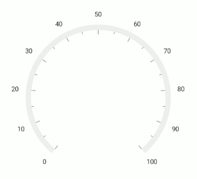
Label position customization
The LabelOffset property allows to adjust the distance between the axis line and the labels. The OffsetUnit property of axis allows to specify the label offset either in factor or pixels. By default, the value of the label offset is double.NaN.
Label offset in pixel
If the OffsetUnit is set as a pixel, the axis labels will be moved based on the pixel values given in LabelOffset.
<gauge:SfRadialGauge>
    <gauge:SfRadialGauge.Axes>
        <gauge:RadialAxis LabelOffset = "70"
                          OffsetUnit = "Pixel" />
    </gauge:SfRadialGauge.Axes>
</gauge:SfRadialGauge>
SfRadialGauge sfRadialGauge = new SfRadialGauge();
RadialAxis radialAxis = new RadialAxis();
radialAxis.OffsetUnit = SizeUnit.Pixel;
radialAxis.LabelOffset = 70;
sfRadialGauge.Axes.Add(radialAxis);
this.Content = sfRadialGauge;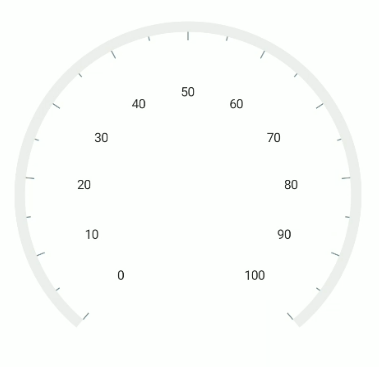
Label offset in factor
If the OffsetUnit is set as a factor, then the provided factor value in the LabelOffset is multiplied by the axis radius. The factor value ranges from 0 to 1.
<gauge:SfRadialGauge>
    <gauge:SfRadialGauge.Axes>
        <gauge:RadialAxis LabelOffset = "0.3"
                          OffsetUnit = "Factor" />
    </gauge:SfRadialGauge.Axes>
</gauge:SfRadialGauge>
SfRadialGauge sfRadialGauge = new SfRadialGauge();
RadialAxis radialAxis = new RadialAxis();
radialAxis.OffsetUnit = SizeUnit.Factor;
radialAxis.LabelOffset = 0.3;
sfRadialGauge.Axes.Add(radialAxis);
this.Content = sfRadialGauge;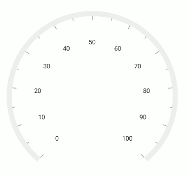
The
OffsetUnitproperty of axis is common for both theTickOffsetandLabelOffset.
Tick customization
The major and minor tick lines of an axis can be customized using the MajorTickStyle and MinorTickStyle of the RadialAxis. The following properties are available in the RadialTickStyle class:
-
Length, of typedouble, specifies the length of the ticks. -
LengthUnit, of theSizeUnitenum, specifies whether the tick length is interpreted in pixels or as a factor of the axis radius. -
Stroke, of typeBrush, specifies the color for the tick line. -
StrokeThickness, of typedouble, specifies the width of the tick line. -
StrokeDashArray, of typeDoubleCollection, specifies the dash array for the tick line.
Tick length in pixel
If the LengthUnit is set as a pixel, the tick lines will be rendered based on the pixel values given in Length.
<gauge:SfRadialGauge>
    <gauge:SfRadialGauge.Axes>
        <gauge:RadialAxis>
            <gauge:RadialAxis.MajorTickStyle>
                <gauge:RadialTickStyle LengthUnit = "Pixel" Length = "15"/>
            </gauge:RadialAxis.MajorTickStyle>
            <gauge:RadialAxis.MinorTickStyle>
                <gauge:RadialTickStyle LengthUnit = "Pixel" Length = "10"/>
            </gauge:RadialAxis.MinorTickStyle>
        </gauge:RadialAxis>
    </gauge:SfRadialGauge.Axes>
</gauge:SfRadialGauge>
SfRadialGauge sfRadialGauge = new SfRadialGauge();
RadialAxis radialAxis = new RadialAxis();
radialAxis.MajorTickStyle.Length = 15;
radialAxis.MajorTickStyle.LengthUnit = SizeUnit.Pixel;
radialAxis.MinorTickStyle.Length = 10;
radialAxis.MinorTickStyle.LengthUnit = SizeUnit.Pixel;
sfRadialGauge.Axes.Add(radialAxis);
this.Content = sfRadialGauge;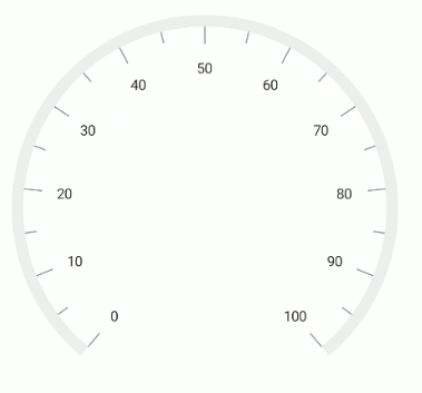
Tick length in factor
If the LengthUnit is set as a factor, the provided factor value in the Length is multiplied by the axis radius, respectively. The factor value ranges from 0 to 1.
<gauge:SfRadialGauge>
    <gauge:SfRadialGauge.Axes>
        <gauge:RadialAxis>
            <gauge:RadialAxis.MajorTickStyle>
                <gauge:RadialTickStyle LengthUnit = "Factor" Length = "0.1"/>
            </gauge:RadialAxis.MajorTickStyle>
            <gauge:RadialAxis.MinorTickStyle>
                <gauge:RadialTickStyle LengthUnit = "Factor" Length = "0.05"/>
            </gauge:RadialAxis.MinorTickStyle>
        </gauge:RadialAxis>
    </gauge:SfRadialGauge.Axes>
</gauge:SfRadialGauge>
SfRadialGauge sfRadialGauge = new SfRadialGauge();
RadialAxis radialAxis = new RadialAxis();
radialAxis.MajorTickStyle.Length = 0.1;
radialAxis.MajorTickStyle.LengthUnit = SizeUnit.Factor;
radialAxis.MinorTickStyle.Length = 0.05;
radialAxis.MinorTickStyle.LengthUnit = SizeUnit.Factor;
sfRadialGauge.Axes.Add(radialAxis);
this.Content = sfRadialGauge;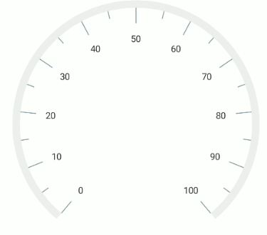
Tick style customization
The Stroke, StrokeThickness, and StrokeDashArray properties allows you to customize the axis tick as shown in the following code example.
<gauge:SfRadialGauge>
    <gauge:SfRadialGauge.Axes>
        <gauge:RadialAxis>
            <gauge:RadialAxis.MajorTickStyle>
                <gauge:RadialTickStyle Stroke = "Black"
                                       Length = "15"
                                       StrokeThickness = "1.5"
                                       StrokeDashArray = "5,2"/>
            </gauge:RadialAxis.MajorTickStyle>
            <gauge:RadialAxis.MinorTickStyle>
                <gauge:RadialTickStyle Stroke = "Black"
                                       Length = "10"
                                       StrokeThickness = "1.5"
                                       StrokeDashArray = "3,2"/>
            </gauge:RadialAxis.MinorTickStyle>
        </gauge:RadialAxis>
    </gauge:SfRadialGauge.Axes>
</gauge:SfRadialGauge>
SfRadialGauge sfRadialGauge = new SfRadialGauge();
RadialAxis radialAxis = new RadialAxis();
radialAxis.MajorTickStyle.Length = 15;
radialAxis.MajorTickStyle.Stroke = new SolidColorBrush(Colors.Black);
radialAxis.MajorTickStyle.StrokeThickness = 1.5;
DoubleCollection collection = new DoubleCollection();
collection.Add(5);
collection.Add(2);
radialAxis.MajorTickStyle.StrokeDashArray = collection;
radialAxis.MinorTickStyle.Length = 10;
radialAxis.MinorTickStyle.Stroke = new SolidColorBrush(Colors.Black);
radialAxis.MinorTickStyle.StrokeThickness = 1.5;
collection = new DoubleCollection();
collection.Add(3);
collection.Add(2);
radialAxis.MinorTickStyle.StrokeDashArray = collection;
sfRadialGauge.Axes.Add(radialAxis);
this.Content = sfRadialGauge;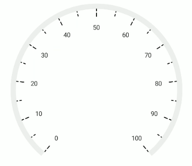
Setting minor ticks count
The major ticks are generated based on the Interval property. Like major ticks, the minor ticks are generated using the MinorTicksPerInterval property of axis. By default, the count value of this property is 1.
<gauge:SfRadialGauge>
    <gauge:SfRadialGauge.Axes>
        <gauge:RadialAxis MinorTicksPerInterval = "4" />
    </gauge:SfRadialGauge.Axes>
</gauge:SfRadialGauge>
SfRadialGauge sfRadialGauge = new SfRadialGauge();
RadialAxis radialAxis = new RadialAxis();
radialAxis.MinorTicksPerInterval = 4;
sfRadialGauge.Axes.Add(radialAxis);
this.Content = sfRadialGauge;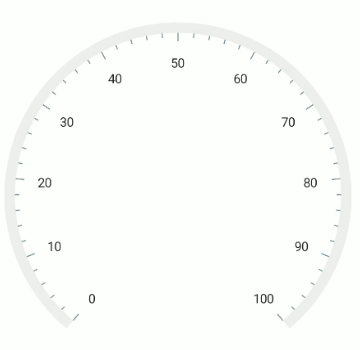
Tick line visibility
The ShowTicks property of the axis is used to enable or disable the visibility of both the major and the minor ticks of axis. The default value of this property is true.
<gauge:SfRadialGauge>
    <gauge:SfRadialGauge.Axes>
        <gauge:RadialAxis ShowTicks = "False" />
    </gauge:SfRadialGauge.Axes>
</gauge:SfRadialGauge>
SfRadialGauge sfRadialGauge = new SfRadialGauge();
RadialAxis radialAxis = new RadialAxis();
radialAxis.ShowTicks = false;
sfRadialGauge.Axes.Add(radialAxis);
this.Content = sfRadialGauge;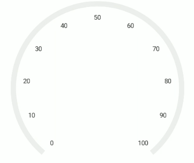
Tick placement
The radial axis allows you to position the ticks either inside or outside or center of the axis line using the TickPosition property. By default, ticks are positioned inside the axis line.
<gauge:SfRadialGauge>
    <gauge:SfRadialGauge.Axes>
        <gauge:RadialAxis TickPosition = "Outside" />
    </gauge:SfRadialGauge.Axes>
</gauge:SfRadialGauge>
SfRadialGauge sfRadialGauge = new SfRadialGauge();
RadialAxis radialAxis = new RadialAxis();
radialAxis.TickPosition = GaugeElementPosition.Outside;
sfRadialGauge.Axes.Add(radialAxis);
this.Content = sfRadialGauge;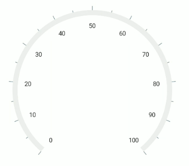
Tick position customization
The OffsetUnit property of axis allows you to specify the TickOffset either in factor or pixels and the default value of OffsetUnit and TickOffset is pixel and double.NaN.
Tick offset in pixel
If the OffsetUnit is set as a pixel, the axis ticks will be moved based on the pixel values given in TickOffset.
<gauge:SfRadialGauge>
    <gauge:SfRadialGauge.Axes>
        <gauge:RadialAxis TickOffset = "50" />
    </gauge:SfRadialGauge.Axes>
</gauge:SfRadialGauge>
SfRadialGauge sfRadialGauge = new SfRadialGauge();
RadialAxis radialAxis = new RadialAxis();
radialAxis.TickOffset = 50;
sfRadialGauge.Axes.Add(radialAxis);
this.Content = sfRadialGauge;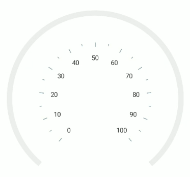
Tick offset in factor
If the OffsetUnit is set as a factor, the provided factor value in the TickOffset is multiplied by the axis radius. The factor value ranges from 0 to 1.
<gauge:SfRadialGauge>
    <gauge:SfRadialGauge.Axes>
        <gauge:RadialAxis TickOffset = "0.1"
                          OffsetUnit = "Factor" />
    </gauge:SfRadialGauge.Axes>
</gauge:SfRadialGauge>
SfRadialGauge sfRadialGauge = new SfRadialGauge();
RadialAxis radialAxis = new RadialAxis();
radialAxis.TickOffset = 0.1;
radialAxis.OffsetUnit = SizeUnit.Factor;
sfRadialGauge.Axes.Add(radialAxis);
this.Content = sfRadialGauge;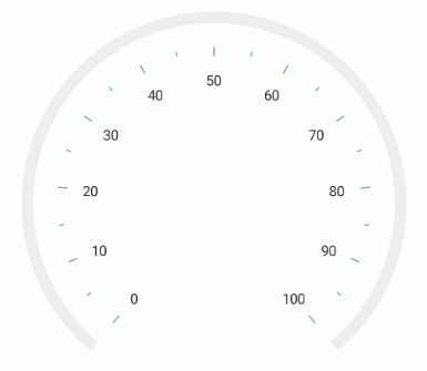
The
OffsetUnitproperty of axis is common for both theTickOffsetandLabelOffset.
Multiple axis
The radial gauge allows you to add any number of radial axes to its Axes collection. You can also customize each axis added to the collection independently.
<gauge:SfRadialGauge>
    <gauge:SfRadialGauge.Axes>
        <gauge:RadialAxis Maximum = "60"
                          Interval = "10"
                          MinorTicksPerInterval = "5"
                          RadiusFactor = "0.63">
            <gauge:RadialAxis.AxisLineStyle>
                <gauge:RadialLineStyle Fill = "Black" Thickness = "3"/>
            </gauge:RadialAxis.AxisLineStyle>
            <gauge:RadialAxis.AxisLabelStyle>
                <gauge:GaugeLabelStyle TextColor = "Black"/>
            </gauge:RadialAxis.AxisLabelStyle>
            <gauge:RadialAxis.MajorTickStyle>
                <gauge:RadialTickStyle Length = "0.10" LengthUnit = "Factor" Stroke = "Black" StrokeThickness = "1.5"/>
            </gauge:RadialAxis.MajorTickStyle>
            <gauge:RadialAxis.MinorTickStyle>
                <gauge:RadialTickStyle Length = "0.05" LengthUnit = "Factor" Stroke = "Black" StrokeThickness = "1.5"/>
            </gauge:RadialAxis.MinorTickStyle>
        </gauge:RadialAxis>
        <gauge:RadialAxis LabelPosition = "Outside"
                          TickPosition = "Outside"
                          Minimum = "0"
                          Maximum = "100"
                          Interval = "10"
                          MinorTicksPerInterval = "5"
                          RadiusFactor = "0.63">
            <gauge:RadialAxis.AxisLineStyle>
                <gauge:RadialLineStyle Fill = "#8f1502" Thickness = "3"/>
            </gauge:RadialAxis.AxisLineStyle>
            <gauge:RadialAxis.AxisLabelStyle>
                <gauge:GaugeLabelStyle TextColor = "#8f1502"/>
            </gauge:RadialAxis.AxisLabelStyle>
            <gauge:RadialAxis.MajorTickStyle>
                <gauge:RadialTickStyle Length = "0.15" LengthUnit = "Factor" Stroke = "#8f1502" StrokeThickness = "1.5"/>
            </gauge:RadialAxis.MajorTickStyle>
            <gauge:RadialAxis.MinorTickStyle>
                <gauge:RadialTickStyle Length = "0.07" LengthUnit = "Factor" Stroke = "#8f1502" StrokeThickness = "1.5"/>
            </gauge:RadialAxis.MinorTickStyle>
        </gauge:RadialAxis>
    </gauge:SfRadialGauge.Axes>
</gauge:SfRadialGauge>
SfRadialGauge sfRadialGauge = new SfRadialGauge();
RadialAxis innerRadialAxis = new RadialAxis();
innerRadialAxis.Maximum = 60;
innerRadialAxis.Interval = 10;
innerRadialAxis.MinorTicksPerInterval = 5;
innerRadialAxis.RadiusFactor = 0.63;
innerRadialAxis.MajorTickStyle.LengthUnit = SizeUnit.Factor;
innerRadialAxis.MinorTickStyle.LengthUnit = SizeUnit.Factor;
innerRadialAxis.MinorTickStyle.Length = 0.05;
innerRadialAxis.MinorTickStyle.Stroke = new SolidColorBrush(Colors.Black);
innerRadialAxis.MinorTickStyle.StrokeThickness = 1.5;
innerRadialAxis.MajorTickStyle.Length = 0.10;
innerRadialAxis.MajorTickStyle.Stroke = new SolidColorBrush(Colors.Black);
innerRadialAxis.MajorTickStyle.StrokeThickness = 1.5;
innerRadialAxis.AxisLineStyle.Thickness = 3;
innerRadialAxis.AxisLineStyle.Fill = new SolidColorBrush(Colors.Black);
innerRadialAxis.AxisLabelStyle.TextColor = Colors.Black;
sfRadialGauge.Axes.Add(innerRadialAxis);
RadialAxis outerRadialAxis = new RadialAxis();
outerRadialAxis.LabelPosition = GaugeLabelsPosition.Outside;
outerRadialAxis.TickPosition = GaugeElementPosition.Outside;
outerRadialAxis.Minimum = 0;
outerRadialAxis.Maximum = 100;
outerRadialAxis.Interval = 10;
outerRadialAxis.MinorTicksPerInterval = 5;
outerRadialAxis.RadiusFactor = 0.63;
outerRadialAxis.MajorTickStyle.LengthUnit = SizeUnit.Factor;
outerRadialAxis.MinorTickStyle.LengthUnit = SizeUnit.Factor;
outerRadialAxis.MinorTickStyle.Length = 0.07;
outerRadialAxis.MinorTickStyle.Stroke = new SolidColorBrush(Color.FromRgb(143, 21, 2));
outerRadialAxis.MinorTickStyle.StrokeThickness = 1.5;
outerRadialAxis.MajorTickStyle.Length = 0.15;
outerRadialAxis.MajorTickStyle.Stroke = new SolidColorBrush(Color.FromRgb(143, 21, 2));
outerRadialAxis.MajorTickStyle.StrokeThickness = 1.5;
outerRadialAxis.AxisLineStyle.Thickness = 3;
outerRadialAxis.AxisLineStyle.Fill = new SolidColorBrush(Color.FromRgb(143, 21, 2));
outerRadialAxis.AxisLabelStyle.TextColor = Color.FromRgb(143, 21, 2);
sfRadialGauge.Axes.Add(outerRadialAxis);
this.Content = sfRadialGauge;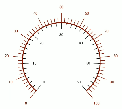
Custom scale range
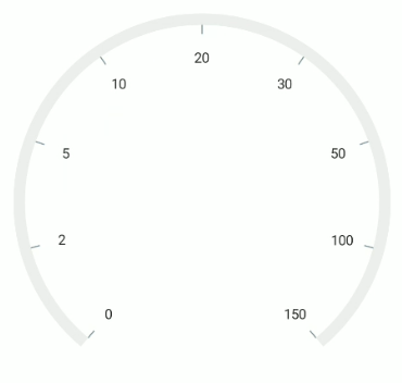
The radial gauge allows you to define a custom scale range by extending the axis based on your business logic.
<gauge:SfRadialGauge>
    <gauge:SfRadialGauge.Axes>
        <local:RadialAxisExt Maximum = "150" />
    </gauge:SfRadialGauge.Axes>
</gauge:SfRadialGauge>
public class RadialAxisExt : RadialAxis
{
protected override List<GaugeLabelInfo> GenerateVisibleLabels()
{
List<GaugeLabelInfo> customLabels = new List<GaugeLabelInfo>();
for (int i = 0; i < 9; i++)
{
double value = CalculateLabelValue(i);
GaugeLabelInfo label = new GaugeLabelInfo
{
Value = value,
Text = value.ToString()
};
customLabels.Add(label);
}
return customLabels;
}
public override double ValueToFactor(double value)
{
if (value >= 0 && value <= 2)
{
return (value * 0.125) / 2;
}
else if (value > 2 && value <= 5)
{
return (((value - 2) * 0.125) / (5 - 2)) + (1 * 0.125);
}
else if (value > 5 && value <= 10)
{
return (((value - 5) * 0.125) / (10 - 5)) + (2 * 0.125);
}
else if (value > 10 && value <= 20)
{
return (((value - 10) * 0.125) / (20 - 10)) + (3 * 0.125);
}
else if (value > 20 && value <= 30)
{
return (((value - 20) * 0.125) / (30 - 20)) + (4 * 0.125);
}
else if (value > 30 && value <= 50)
{
return (((value - 30) * 0.125) / (50 - 30)) + (5 * 0.125);
}
else if (value > 50 && value <= 100)
{
return (((value - 50) * 0.125) / (100 - 50)) + (6 * 0.125);
}
else if (value > 100 && value <= 150)
{
return (((value - 100) * 0.125) / (150 - 100)) + (7 * 0.125);
}
else
{
return 1;
}
}
double CalculateLabelValue(double value)
{
if (value == 0)
{
return 0;
}
else if (value == 1)
{
return 2;
}
else if (value == 2)
{
return 5;
}
else if (value == 3)
{
return 10;
}
else if (value == 4)
{
return 20;
}
else if (value == 5)
{
return 30;
}
else if (value == 6)
{
return 50;
}
else if (value == 7)
{
return 100;
}
else
{
return 150;
}
}
}
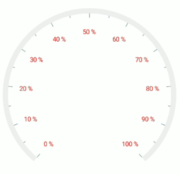
Events
LabelCreated
The LabelCreated event is triggered each time a label is created for use. The following properties are available in the LabelCreatedEventArgs:
-
Text, of typestring, customizes the text of the label. -
Style, of typeGaugeLabelStyle, customizes the text style of the label.
<gauge:SfRadialGauge>
    <gauge:SfRadialGauge.Axes>
        <gauge:RadialAxis LabelCreated = "RadialAxis_LabelCreated" />
    </gauge:SfRadialGauge.Axes>
</gauge:SfRadialGauge>
private void RadialAxis_LabelCreated(object sender, LabelCreatedEventArgs e)
{
e.Text += " %";
e.Style = new GaugeLabelStyle()
{
TextColor = Colors.Red
};
}