Thumb and Overlay in .NET MAUI DateTime Slider (SfDateTimeSlider)
17 Jan 202517 minutes to read
This section helps to learn about how to customize the thumb and thumb overlay in the DateTime Slider.
- Thumb - It is one of the elements of slider which can be used to drag and change the selected value of the slider.
- Thumb overlay - It is rendered around the thumb while interacting with them.
Thumb size
Change the size of the thumb in the DateTime Slider using the Radius property of the ThumbStyle class. The default value of the Radius property is 10.0.
<sliders:SfDateTimeSlider Minimum="2010-01-01"
                          Maximum="2018-01-01"
                          Value="2014-01-01">
    <sliders:SfDateTimeSlider.ThumbStyle>
        <sliders:SliderThumbStyle Radius="15" />
     </sliders:SfDateTimeSlider.ThumbStyle>
</sliders:SfDateTimeSlider>
SfDateTimeSlider slider = new SfDateTimeSlider();
slider.Minimum = new DateTime(2010, 01, 01);
slider.Maximum = new DateTime(2018, 01, 01);
slider.Value = new DateTime(2014, 01, 01);
slider.ThumbStyle.Radius = 15;
Thumb color
Change the color of the thumb using the Fill property of the ThumbStyle class.
<sliders:SfDateTimeSlider Minimum="2010-01-01"
                          Maximum="2018-01-01"
                          Value="2014-01-01">
   <sliders:SfDateTimeSlider.ThumbStyle>
       <sliders:SliderThumbStyle Fill="#EE3F3F" />
   </sliders:SfDateTimeSlider.ThumbStyle>
</sliders:SfDateTimeSlider>
SfDateTimeSlider slider = new SfDateTimeSlider();
slider.Minimum = new DateTime(2010, 01, 01);
slider.Maximum = new DateTime(2018, 01, 01);
slider.Value = new DateTime(2014, 01, 01);
slider.ThumbStyle.Fill = new SolidColorBrush(Color.FromArgb("#EE3F3F"));
Thumb stroke thickness and stroke
Change the thumb stroke width using the StrokeThickness property and thumb stroke color using the Stroke property of the ThumbStyle class.
<sliders:SfDateTimeSlider Minimum="2010-01-01"
                          Maximum="2018-01-01"
                          Value="2014-01-01">
    <sliders:SfDateTimeSlider.ThumbStyle>
        <sliders:SliderThumbStyle Stroke="#EE3F3F"
                                  StrokeThickness="2"/>
    </sliders:SfDateTimeSlider.ThumbStyle>
</sliders:SfDateTimeSlider>
SfDateTimeSlider slider = new SfDateTimeSlider();
slider.Minimum = new DateTime(2010, 01, 01);
slider.Maximum = new DateTime(2018, 01, 01);
slider.Value = new DateTime(2014, 01, 01);
slider.ThumbStyle.Stroke = new SolidColorBrush(Color.FromArgb("#EE3F3F"));
slider.ThumbStyle.StrokeThickness = 2;
Thumb overlay size
Change the size of the thumb overlay using the Radius property of the ThumbOverlayStyle class. The default value of the Radius property is 24.0.
<sliders:SfDateTimeSlider Minimum="2010-01-01"
                          Maximum="2018-01-01"
                          Value="2014-01-01">
   <sliders:SfDateTimeSlider.ThumbOverlayStyle>
      <sliders:SliderThumbOverlayStyle Radius="18"/>
   </sliders:SfDateTimeSlider.ThumbOverlayStyle>
</sliders:SfDateTimeSlider>
SfDateTimeSlider slider = new SfDateTimeSlider();
slider.Minimum = new DateTime(2010, 01, 01);
slider.Maximum = new DateTime(2018, 01, 01);
slider.Value = new DateTime(2014, 01, 01);
slider.ThumbOverlayStyle.Radius = 18;
Thumb overlay color
Change the color of the thumb overlay using the Fill property of the ThumbOverlayStyle class.
<sliders:SfDateTimeSlider Minimum="2010-01-01"
                          Maximum="2018-01-01"
                          Value="2014-01-01">
   <sliders:SfDateTimeSlider.ThumbOverlayStyle>
       <sliders:SliderThumbOverlayStyle Fill="#66FFD700"/>
   </sliders:SfDateTimeSlider.ThumbOverlayStyle>
</sliders:SfDateTimeSlider>
SfDateTimeSlider slider = new SfDateTimeSlider();
slider.Minimum = new DateTime(2010, 01, 01);
slider.Maximum = new DateTime(2018, 01, 01);
slider.Value = new DateTime(2014, 01, 01);
slider.ThumbOverlayStyle.Fill = new SolidColorBrush(Color.FromArgb("#66FFD700"));
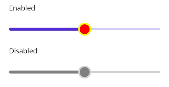
Disabled thumb
Change the state of the slider to disabled by setting false to the IsEnabled property. Using the Visual State Manager (VSM), customize the slider thumb properties based on the visual states. The applicable visual states are enabled(default) and disabled.
<ContentPage.Resources>
    <Style TargetType="sliders:SfDateTimeSlider">
        <Setter Property="Minimum"
                Value="2010-01-01" />
        <Setter Property="Maximum"
                Value="2018-01-01" />
        <Setter Property="Value"
                Value="2014-01-01" />
        <Setter Property="Interval"
                Value="2" />
        <Setter Property="VisualStateManager.VisualStateGroups">
            <VisualStateGroupList>
                <VisualStateGroup>
                    <VisualState x:Name="Default">
                        <VisualState.Setters>
                            <Setter Property="ThumbStyle">
                                <Setter.Value>
                                    <sliders:SliderThumbStyle Radius="13"
                                                              Fill="Red"
                                                              Stroke="Yellow"
                                                              StrokeThickness="3" />
                                </Setter.Value>
                            </Setter>
                        </VisualState.Setters>
                    </VisualState>
                    <VisualState x:Name="Disabled">
                        <VisualState.Setters>
                            <Setter Property="ThumbStyle">
                                <Setter.Value>
                                    <sliders:SliderThumbStyle Radius="13"
                                                              Fill="Gray"
                                                              Stroke="LightGray"
                                                              StrokeThickness="3" />
                                </Setter.Value>
                            </Setter>
                            <Setter Property="TrackStyle">
                                <Setter.Value>
                                    <sliders:SliderTrackStyle ActiveFill="Gray"
                                                              InactiveFill="LightGray" />
                                </Setter.Value>
                            </Setter>
                        </VisualState.Setters>
                    </VisualState>
                </VisualStateGroup>
            </VisualStateGroupList>
        </Setter>
    </Style>
</ContentPage.Resources>

<ContentPage.Content>
    <VerticalStackLayout>
        <Label Text="Enabled"
               Padding="24,10" />
        <sliders:SfDateTimeSlider />
        <Label Text="Disabled"
               Padding="24,10" />
        <sliders:SfDateTimeSlider IsEnabled="False" />
    </VerticalStackLayout>
</ContentPage.Content>
VerticalStackLayout stackLayout = new();
SfDateTimeSlider defaultSlider = new()
{
Minimum = new DateTime(2010, 01, 01),
Maximum = new DateTime(2018, 01, 01),
Value = new DateTime(2014, 01, 01),
Interval = 2
};
SfDateTimeSlider disabledSlider = new()
{
Minimum = new DateTime(2010, 01, 01),
Maximum = new DateTime(2018, 01, 01),
Value = new DateTime(2014, 01, 01),
IsEnabled = false,
Interval = 2
};
VisualStateGroupList visualStateGroupList = new();
VisualStateGroup commonStateGroup = new();
// Default State.
VisualState defaultState = new() { Name = "Default" };
defaultState.Setters.Add(new Setter
{
Property = SfDateTimeSlider.ThumbStyleProperty,
Value = new SliderThumbStyle
{
Radius = 13,
Fill = Colors.Red,
Stroke = Colors.Yellow,
StrokeThickness = 3,
}
});
// Disabled State.
VisualState disabledState = new VisualState { Name = "Disabled" };
disabledState.Setters.Add(new Setter
{
Property = SfDateTimeSlider.ThumbStyleProperty,
Value = new SliderThumbStyle
{
Radius = 13,
Fill = Colors.Gray,
Stroke = Colors.LightGray,
StrokeThickness = 3,
}
});
disabledState.Setters.Add(new Setter
{
Property = SfDateTimeSlider.TrackStyleProperty,
Value = new SliderTrackStyle
{
ActiveFill = Colors.Gray,
InactiveFill = Colors.LightGray,
}
});
commonStateGroup.States.Add(defaultState);
commonStateGroup.States.Add(disabledState);
visualStateGroupList.Add(commonStateGroup);
VisualStateManager.SetVisualStateGroups(defaultSlider, visualStateGroupList);
VisualStateManager.SetVisualStateGroups(disabledSlider, visualStateGroupList);
stackLayout.Children.Add(new Label() { Text = "Enabled", Padding = new Thickness(24, 10) });
stackLayout.Children.Add(defaultSlider);
stackLayout.Children.Add(new Label() { Text = "Disabled", Padding = new Thickness(24, 10) });
stackLayout.Children.Add(disabledSlider);
this.Content = stackLayout;