Dividers in .NET MAUI DateTime Slider (SfDateTimeSlider)
17 Jan 202521 minutes to read
This section explains how to add dividers to the DateTime Slider.
Show dividers
The ShowDividers property is used to render the dividers on the track. The default value of the ShowDividers property is False. It is a shape used to represent the major interval points of the track.
For example, if the Minimum is DateTime(2010, 01, 01), the Maximum is DateTime(2018, 01, 01), and Interval is 2.0, the DateTime Slider will render the dividers at 2010, 2012, 2014, and so on.
<sliders:SfDateTimeSlider Minimum="2010-01-01"
                          Maximum="2018-01-01"
                          Value="2014-01-01"
                          Interval="2"
                          ShowDividers="True" />
SfDateTimeSlider slider = new SfDateTimeSlider()
{
Minimum = new DateTime(2010, 01, 01),
Maximum = new DateTime(2018, 01, 01),
Value = new DateTime(2014, 01, 01),
Interval = 2,
ShowDividers = true,
};
Divider radius
Change the active and inactive divider radius of the slider using the ActiveRadius and the InactiveRadius properties of the DividerStyle class.
<sliders:SfDateTimeSlider Minimum="2010-01-01"
                          Maximum="2020-01-01"
                          Value="2015-01-01"
                          Interval="2"
                          ShowDividers="True">

    <sliders:SfDateTimeSlider.DividerStyle>
        <sliders:SliderDividerStyle ActiveRadius="3"
                                    InactiveRadius="7" />
    </sliders:SfDateTimeSlider.DividerStyle>

</sliders:SfDateTimeSlider>
SfDateTimeSlider slider = new SfDateTimeSlider()
{
Minimum = new DateTime(2010, 01, 01),
Maximum = new DateTime(2020, 01, 01),
Value = new DateTime(2015, 01, 01),
Interval = 2,
ShowDividers = true,
};
slider.DividerStyle.ActiveRadius = 3;
slider.DividerStyle.InactiveRadius = 7;
Divider color
Change the active and inactive divider color of the slider using the ActiveFill and InactiveFill properties of the DividerStyle class.
<sliders:SfDateTimeSlider Minimum="2010-01-01"
                          Maximum="2018-01-01"
                          Value="2014-01-01"
                          Interval="2"
                          ShowDividers="True">

    <sliders:SfDateTimeSlider.DividerStyle>
       <sliders:SliderDividerStyle ActiveRadius="7"
                                   InactiveRadius="7"
				                   ActiveFill="#EE3F3F"
				                   InactiveFill="#F7B1AE"/>
      </sliders:SfDateTimeSlider.DividerStyle>

</sliders:SfDateTimeSlider>
SfDateTimeSlider slider = new SfDateTimeSlider()
{
Minimum = new DateTime(2010, 01, 01),
Maximum = new DateTime(2018, 01, 01),
Value = new DateTime(2014, 01, 01),
Interval = 2,
ShowDividers = true,
};
slider.DividerStyle.ActiveRadius = 7;
slider.DividerStyle.InactiveRadius = 7;
slider.DividerStyle.ActiveFill = new SolidColorBrush(Color.FromArgb("#EE3F3F"));
slider.DividerStyle.InactiveFill = new SolidColorBrush(Color.FromArgb("#F7B1AE"));
Divider stroke width and stroke color
Change the active and inactive divider stroke width of the slider using the ActiveStrokeThickness and the InactiveStrokeThickness properties of the DividerStyle class.
Also, change the active and inactive divider stroke color of the slider using the ActiveStroke and the InactiveStroke properties of the DividerStyle class.
<sliders:SfDateTimeSlider Minimum="2010-01-01"
                          Maximum="2018-01-01"
                          Value="2014-01-01"
                          Interval="2"
                          ShowDividers="True">

    <sliders:SfDateTimeSlider.DividerStyle>
        <sliders:SliderDividerStyle ActiveRadius="7"
                                    InactiveRadius="7"
                                    ActiveFill="#EE3F3F"
                                    InactiveFill="#F7B1AE"
                                    ActiveStrokeThickness="2"
                                    InactiveStrokeThickness="2"
                                    ActiveStroke="#FFD700"
                                    InactiveStroke="#FFD700" />
    </sliders:SfDateTimeSlider.DividerStyle>

</sliders:SfDateTimeSlider>
SfDateTimeSlider slider = new SfDateTimeSlider()
{
Minimum = new DateTime(2010, 01, 01),
Maximum = new DateTime(2018, 01, 01),
Value = new DateTime(2014, 01, 01),
Interval = 2,
ShowDividers = true,
};
slider.DividerStyle.ActiveRadius = 7;
slider.DividerStyle.InactiveRadius = 7;
slider.DividerStyle.ActiveFill = new SolidColorBrush(Color.FromArgb("#EE3F3F"));
slider.DividerStyle.InactiveFill = new SolidColorBrush(Color.FromArgb("#F7B1AE"));
slider.DividerStyle.ActiveStroke = new SolidColorBrush(Color.FromArgb("#FFD700"));
slider.DividerStyle.InactiveStroke = new SolidColorBrush(Color.FromArgb("#FFD700"));
slider.DividerStyle.ActiveStrokeThickness = 2;
slider.DividerStyle.InactiveStrokeThickness = 2;
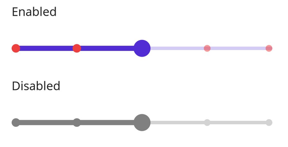
Disabled divider
Change the state of the slider to disabled by setting false to the IsEnabled property. Using the Visual State Manager (VSM), customize the slider divider properties based on the visual states. The applicable visual states are enabled(default) and disabled.
<ContentPage.Resources>
    <Style TargetType="sliders:SfDateTimeSlider">
        <Setter Property="Minimum"
                Value="2010-01-01" />
        <Setter Property="Maximum"
                Value="2018-01-01" />
        <Setter Property="Value"
                Value="2014-01-01" />
        <Setter Property="Interval"
                Value="2" />
        <Setter Property="ShowDividers"
                Value="True" />
        <Setter Property="VisualStateManager.VisualStateGroups">
            <VisualStateGroupList>
                <VisualStateGroup>
                    <VisualState x:Name="Default">
                        <VisualState.Setters>
                            <Setter Property="DividerStyle">
                                <Setter.Value>
                                    <sliders:SliderDividerStyle ActiveFill="#EE3F3F"
                                                                InactiveFill="#88EE3F3F"
                                                                ActiveRadius="5"
                                                                InactiveRadius="4" />
                                </Setter.Value>
                            </Setter>
                        </VisualState.Setters>
                    </VisualState>
                    <VisualState x:Name="Disabled">
                        <VisualState.Setters>
                            <Setter Property="DividerStyle">
                                <Setter.Value>
                                    <sliders:SliderDividerStyle ActiveFill="Gray"
                                                                InactiveFill="LightGray"
                                                                ActiveRadius="5"
                                                                InactiveRadius="4" />
                                </Setter.Value>
                            </Setter>
                            <Setter Property="TrackStyle">
                                <Setter.Value>
                                    <sliders:SliderTrackStyle ActiveFill="Gray"
                                                              InactiveFill="LightGray" />
                                </Setter.Value>
                            </Setter>
                            <Setter Property="ThumbStyle">
                                <Setter.Value>
                                    <sliders:SliderThumbStyle Fill="Gray" />
                                </Setter.Value>
                            </Setter>
                        </VisualState.Setters>
                    </VisualState>
                </VisualStateGroup>
            </VisualStateGroupList>
        </Setter>
    </Style>
</ContentPage.Resources>

<ContentPage.Content>
    <VerticalStackLayout>
        <Label Text="Enabled"
               Padding="24,10" />
        <sliders:SfDateTimeSlider />
        <Label Text="Disabled"
               Padding="24,10" />
        <sliders:SfDateTimeSlider IsEnabled="False" />
    </VerticalStackLayout>
</ContentPage.Content>
VerticalStackLayout stackLayout = new();
SfDateTimeSlider defaultSlider = new()
{
Minimum = new DateTime(2010, 01, 01),
Maximum = new DateTime(2018, 01, 01),
Value = new DateTime(2014, 01, 01),
Interval = 2,
ShowDividers = true
};
SfDateTimeSlider disabledSlider = new()
{
Minimum = new DateTime(2010, 01, 01),
Maximum = new DateTime(2018, 01, 01),
Value = new DateTime(2014, 01, 01),
IsEnabled = false,
Interval = 2,
ShowDividers = true
};
VisualStateGroupList visualStateGroupList = new();
VisualStateGroup commonStateGroup = new();
// Default State.
VisualState defaultState = new() { Name = "Default" };
defaultState.Setters.Add(new Setter
{
Property = SfDateTimeSlider.DividerStyleProperty,
Value = new SliderDividerStyle
{
ActiveFill = Color.FromArgb("#EE3F3F"),
InactiveFill = Color.FromArgb("#88EE3F3F"),
ActiveRadius = 5,
InactiveRadius = 4,
}
});
// Disabled State.
VisualState disabledState = new VisualState { Name = "Disabled" };
disabledState.Setters.Add(new Setter
{
Property = SfDateTimeSlider.DividerStyleProperty,
Value = new SliderDividerStyle
{
ActiveFill = Colors.Gray,
InactiveFill = Colors.LightGray,
ActiveRadius = 5,
InactiveRadius = 4,
}
});
disabledState.Setters.Add(new Setter
{
Property = SfDateTimeSlider.TrackStyleProperty,
Value = new SliderTrackStyle
{
ActiveFill = Colors.Gray,
InactiveFill = Colors.LightGray,
}
});
disabledState.Setters.Add(new Setter
{
Property = SfDateTimeSlider.ThumbStyleProperty,
Value = new SliderThumbStyle
{
Fill = Colors.Gray,
}
});
commonStateGroup.States.Add(defaultState);
commonStateGroup.States.Add(disabledState);
visualStateGroupList.Add(commonStateGroup);
VisualStateManager.SetVisualStateGroups(defaultSlider, visualStateGroupList);
VisualStateManager.SetVisualStateGroups(disabledSlider, visualStateGroupList);
stackLayout.Children.Add(new Label() { Text = "Enabled", Padding = new Thickness(24, 10) });
stackLayout.Children.Add(defaultSlider);
stackLayout.Children.Add(new Label() { Text = "Disabled", Padding = new Thickness(24, 10) });
stackLayout.Children.Add(disabledSlider);
this.Content = stackLayout;