How can I help you?
Footer in .NET MAUI Calendar (SfCalendar)
7 Jan 20255 minutes to read
You can customize all the properties of the Footer view using FooterView. By using this property, you can customize the Background, Height, DividerColor, TextStyle, ShowActionButtons and ShowTodayButton of the Calendar.
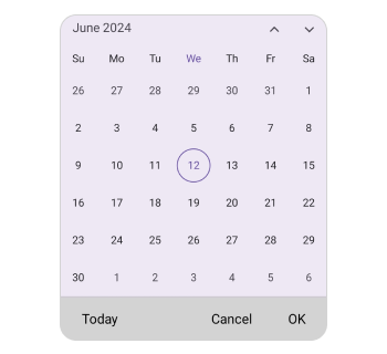
Customize the header height
You can customize the footer height Calendar by using the Height property.
<calendar:SfCalendar  x:Name="calendar"
                      View="Month">
            <calendar:SfCalendar.FooterView>
                <calendar:CalendarFooterView Height="70" ShowActionButtons="True" ShowTodayButton="True" />
            </calendar:SfCalendar.FooterView>
</calendar:SfCalendar>this.calendar.FooterView.Height = 70;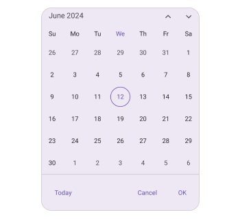
Action buttons
You can display action buttons at the footer of the calendar by using the ShowActionButtons property of the SfCalendar. It allows you to confirm or cancel the selected date, dates, and range of dates in calendar views of the SfCalendar.
<calendar:SfCalendar  x:Name="calendar"
                      View="Month">
            <calendar:SfCalendar.FooterView>
                <calendar:CalendarFooterView ShowActionButtons="true" />
            </calendar:SfCalendar.FooterView>
</calendar:SfCalendar>this.calendar.FooterView.ShowActionButtons = true;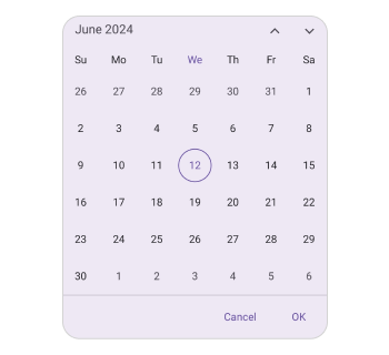
Today button
The today button can be displayed at the footer of the calendar using the ShowTodayButton property of the SfCalendar, allowing you to quickly navigate from current view to the today view.
<calendar:SfCalendar  x:Name="calendar"
                      View="Month">
            <calendar:SfCalendar.FooterView>
                <calendar:CalendarFooterView ShowTodayButton="True" />
            </calendar:SfCalendar.FooterView>
</calendar:SfCalendar>this.calendar.FooterView.ShowTodayButton = true;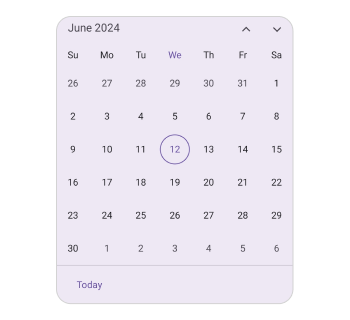
Set the Divider color
You can customize the footer divider color by setting the DividerColor property of the CalendarFooterView.
<calendar:SfCalendar  x:Name="calendar"
                      View="Month">
            <calendar:SfCalendar.FooterView>
                <calendar:CalendarFooterView DividerColor="Red" ShowActionButtons="True" ShowTodayButton="True" />
            </calendar:SfCalendar.FooterView>
</calendar:SfCalendar>this.calendar.FooterView.Height = 70;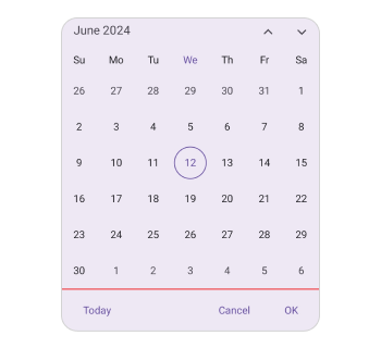
Customization of the footer
You can customize the footer text style and background color of the Calendar footer view using the TextStyle and Background properties of the CalendarFooterView.
<calendar:SfCalendar x:Name="calendar" >
    <calendar:SfCalendar.FooterView >
        <calendar:CalendarFooterView Background="#D3D3D3" ShowActionButtons="True" ShowTodayButton="True" >
            <calendar:CalendarFooterView.TextStyle >
                <calendar:CalendarTextStyle FontSize="15" TextColor="Black" />
            </calendar:CalendarFooterView.TextStyle>
        </calendar:CalendarFooterView>
    </calendar:SfCalendar.FooterView>
</calendar:SfCalendar>
SfCalendar calendar = new SfCalendar();
calendar.FooterView = new CalendarFooterView()
{
Background = Color.FromArgb("#D3D3D3"),
TextStyle = new CalendarTextStyle()
{
TextColor = Colors.Black,
FontSize = 15,
}
};
this.Content = calendar;