Selection in .NET MAUI Autocomplete
18 Nov 201824 minutes to read
Prerequisites
Before using the SfAutocomplete, ensure the following NuGet package is installed in your .NET MAUI project:
Syncfusion.Maui.Inputs
For step-by-step setup, refer to the Getting Started documentation.
Overview
The SfAutocomplete allows users to select a single item or multiple items from the drop-down. The selection mode is set by using the SelectionMode property. The supported values are Single and Multiple.
Properties
| Property | Type | Default | Description |
|---|---|---|---|
SelectionMode |
AutocompleteSelectionMode |
Single |
Specifies single or multiple selection. |
SelectedItem |
object |
null |
Gets or sets the currently selected item (single mode). |
SelectedItems |
IList |
null |
Gets or sets the collection of selected items (multiple mode). |
SelectedValue |
object |
null |
Gets or sets the value(s) of the selected item(s) based on SelectedValuePath. |
SelectedValuePath |
string |
null |
The property path used to populate SelectedValue. |
MultiSelectionDisplayMode |
AutocompleteMultiSelectionDisplayMode |
Token |
Specifies how selected items are displayed in multiple mode. Values: Token, Delimiter. |
TokensWrapMode |
AutocompleteTokensWrapMode |
None |
Specifies how tokens are arranged when MultiSelectionDisplayMode is Token. Values: Wrap, None. |
DelimiterText |
string |
, |
The character used to separate selected items in Delimiter mode. |
IsClearButtonVisible |
bool |
true |
Gets or sets a value that indicates whether the clear button is shown. |
IsDropDownOpen |
bool |
false |
Gets or sets a value that indicates whether the drop-down is open. |
Events
| Event | Description |
|---|---|
SelectionChanging |
Raised when the selection is about to change. Use the Cancel property of the event args to prevent the change. |
SelectionChanged |
Raised after the selection has changed. Exposes the AddedItems and RemovedItems collections. |
Single selection
The SfAutocomplete allows the user to type a value and then select an item from the drop-down. The selected item is exposed by the SelectedItem property.
<editors:SfAutocomplete x:Name="autocomplete"
                        ItemsSource="{Binding SocialMedias}"
                        DisplayMemberPath="Name"
                        TextMemberPath="Name" />
var viewModel = new SocialMediaViewModel();
SfAutocomplete autocomplete = new SfAutocomplete
{
DisplayMemberPath = "Name",
TextMemberPath = "Name",
ItemsSource = viewModel.SocialMedias
};// ViewModel
public class SocialMediaViewModel
{
public ObservableCollection<SocialMedia> SocialMedias { get; set; }
public SocialMediaViewModel()
{
this.SocialMedias = new ObservableCollection<SocialMedia>
{
new SocialMedia { Name = "Facebook", ID = 0 },
new SocialMedia { Name = "Google Plus", ID = 1 },
new SocialMedia { Name = "Instagram", ID = 2 },
new SocialMedia { Name = "LinkedIn", ID = 3 },
new SocialMedia { Name = "Skype", ID = 4 },
new SocialMedia { Name = "Telegram", ID = 5 },
new SocialMedia { Name = "Twitter", ID = 6 },
new SocialMedia { Name = "WhatsApp", ID = 7 },
new SocialMedia { Name = "YouTube", ID = 8 }
};
}
}
public class SocialMedia
{
public string Name { get; set; }
public int ID { get; set; }
}The following image illustrates single selection in the SfAutocomplete:

Multiple selection
The SfAutocomplete allows users to select multiple values from the drop-down by setting the SelectionMode property to Multiple.
The selected items can be retrieved or set programmatically by using the SelectedItems property.
You can choose how the selected items are displayed using the MultiSelectionDisplayMode property. The default value is Token. The supported values are:
<editors:SfAutocomplete x:Name="autocomplete"
                        SelectionMode="Multiple"
                        ItemsSource="{Binding SocialMedias}"
                        SelectedItems="{Binding SelectedItemsList}"
                        DisplayMemberPath="Name"
                        TextMemberPath="Name" />
var viewModel = new SocialMediaViewModel();
SfAutocomplete autocomplete = new SfAutocomplete
{
SelectionMode = AutocompleteSelectionMode.Multiple,
ItemsSource = viewModel.SocialMedias,
SelectedItems = viewModel.SelectedItemsList,
DisplayMemberPath = "Name",
TextMemberPath = "Name"
};// ViewModel
public class SocialMediaViewModel
{
public ObservableCollection<SocialMedia> SocialMedias { get; set; }
public ObservableCollection<SocialMedia> SelectedItemsList { get; set; }
public SocialMediaViewModel()
{
this.SocialMedias = new ObservableCollection<SocialMedia>
{
new SocialMedia { Name = "Facebook", ID = 0 },
new SocialMedia { Name = "Google Plus", ID = 1 },
new SocialMedia { Name = "Instagram", ID = 2 },
new SocialMedia { Name = "LinkedIn", ID = 3 },
new SocialMedia { Name = "Skype", ID = 4 },
new SocialMedia { Name = "Telegram", ID = 5 },
new SocialMedia { Name = "Twitter", ID = 6 },
new SocialMedia { Name = "WhatsApp", ID = 7 },
new SocialMedia { Name = "YouTube", ID = 8 }
};
SelectedItemsList = new ObservableCollection<SocialMedia>
{
SocialMedias[0],
SocialMedias[2],
};
}
}
public class SocialMedia
{
public string Name { get; set; }
public int ID { get; set; }
}Delimiter mode
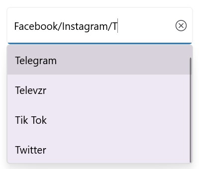
When MultiSelectionDisplayMode is set to Delimiter, the selected items are separated by the character defined by the DelimiterText property. The default value of DelimiterText is ,.
<editors:SfAutocomplete x:Name="autocomplete"
                        ItemsSource="{Binding SocialMedias}"
                        SelectionMode="Multiple"
                        MultiSelectionDisplayMode="Delimiter"
                        DelimiterText="/"
                        MaxDropDownHeight="250"
                        DisplayMemberPath="Name"
                        TextMemberPath="Name"
                        Placeholder="Enter Media" />
SfAutocomplete autocomplete = new SfAutocomplete
{
ItemsSource = new SocialMediaViewModel().SocialMedias,
SelectionMode = AutocompleteSelectionMode.Multiple,
MultiSelectionDisplayMode = AutocompleteMultiSelectionDisplayMode.Delimiter,
DelimiterText = "/",
MaxDropDownHeight = 250,
DisplayMemberPath = "Name",
TextMemberPath = "Name",
Placeholder = "Enter Media"
};// ViewModel
public class SocialMediaViewModel
{
public ObservableCollection<SocialMedia> SocialMedias { get; set; }
public SocialMediaViewModel()
{
this.SocialMedias = new ObservableCollection<SocialMedia>
{
new SocialMedia { Name = "Facebook", ID = 0 },
new SocialMedia { Name = "Google Plus", ID = 1 },
new SocialMedia { Name = "Instagram", ID = 2 },
new SocialMedia { Name = "LinkedIn", ID = 3 },
new SocialMedia { Name = "Skype", ID = 4 },
new SocialMedia { Name = "Telegram", ID = 5 },
new SocialMedia { Name = "Twitter", ID = 6 },
new SocialMedia { Name = "WhatsApp", ID = 7 },
new SocialMedia { Name = "YouTube", ID = 8 }
};
}
}
public class SocialMedia
{
public string Name { get; set; }
public int ID { get; set; }
}
Token mode
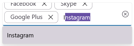
When MultiSelectionDisplayMode is set to Token, the selected items are displayed as tokens. The arrangement of the tokens is controlled by the TokensWrapMode property. The supported values are:
Wrap mode
When TokensWrapMode is set to Wrap, the selected tokens wrap to the next line of the SfAutocomplete.
<editors:SfAutocomplete x:Name="autocomplete"
                        ItemsSource="{Binding SocialMedias}"
                        SelectionMode="Multiple"
                        MaxDropDownHeight="250"
                        DisplayMemberPath="Name"
                        Placeholder="Enter Media"
                        TextMemberPath="Name"
                        TokensWrapMode="Wrap" />
SfAutocomplete autocomplete = new SfAutocomplete
{
ItemsSource = new SocialMediaViewModel().SocialMedias,
DisplayMemberPath = "Name",
TextMemberPath = "Name",
Placeholder = "Enter Media",
SelectionMode = AutocompleteSelectionMode.Multiple,
MaxDropDownHeight = 250,
TokensWrapMode = AutocompleteTokensWrapMode.Wrap
};// ViewModel
public class SocialMediaViewModel
{
public ObservableCollection<SocialMedia> SocialMedias { get; set; }
public SocialMediaViewModel()
{
this.SocialMedias = new ObservableCollection<SocialMedia>
{
new SocialMedia { Name = "Facebook", ID = 0 },
new SocialMedia { Name = "Google Plus", ID = 1 },
new SocialMedia { Name = "Instagram", ID = 2 },
new SocialMedia { Name = "LinkedIn", ID = 3 },
new SocialMedia { Name = "Skype", ID = 4 },
new SocialMedia { Name = "Telegram", ID = 5 },
new SocialMedia { Name = "Twitter", ID = 6 },
new SocialMedia { Name = "WhatsApp", ID = 7 },
new SocialMedia { Name = "YouTube", ID = 8 }
};
}
}
public class SocialMedia
{
public string Name { get; set; }
public int ID { get; set; }
}
None mode
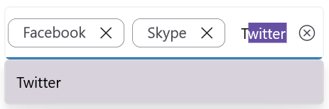
When TokensWrapMode is set to None, the selected tokens are displayed on a single horizontal line.
<editors:SfAutocomplete x:Name="autocomplete"
                        ItemsSource="{Binding SocialMedias}"
                        DisplayMemberPath="Name"
                        TextMemberPath="Name"
                        Placeholder="Enter Media"
                        SelectionMode="Multiple"
                        MaxDropDownHeight="250"
                        TokensWrapMode="None" />
SfAutocomplete autoComplete = new SfAutocomplete
{
ItemsSource = new SocialMediaViewModel().SocialMedias,
SelectionMode = AutocompleteSelectionMode.Multiple,
MaxDropDownHeight = 250,
DisplayMemberPath = "Name",
Placeholder = "Enter Media",
TextMemberPath = "Name",
TokensWrapMode = AutocompleteTokensWrapMode.None
};// ViewModel
public class SocialMediaViewModel
{
public ObservableCollection<SocialMedia> SocialMedias { get; set; }
public SocialMediaViewModel()
{
this.SocialMedias = new ObservableCollection<SocialMedia>
{
new SocialMedia { Name = "Facebook", ID = 0 },
new SocialMedia { Name = "Google Plus", ID = 1 },
new SocialMedia { Name = "Instagram", ID = 2 },
new SocialMedia { Name = "LinkedIn", ID = 3 },
new SocialMedia { Name = "Skype", ID = 4 },
new SocialMedia { Name = "Telegram", ID = 5 },
new SocialMedia { Name = "Twitter", ID = 6 },
new SocialMedia { Name = "WhatsApp", ID = 7 },
new SocialMedia { Name = "YouTube", ID = 8 }
};
}
}
public class SocialMedia
{
public string Name { get; set; }
public int ID { get; set; }
}
Selection changing notification
When the user attempts to select an item, the SelectionChanging event is raised. The event lets you intercept the selection and optionally cancel it. The SelectionChangingEventArgs provides the following data:
- CurrentSelection - the items that are about to be selected.
- PreviousSelection - the items that were previously selected.
-
Cancel- set totrueto prevent the selection change.
<editors:SfAutocomplete x:Name="autocomplete"
                        ItemsSource="{Binding SocialMedias}"
                        TextMemberPath="Name"
                        DisplayMemberPath="Name"
                        SelectionChanging="OnSelectionChanging" />
SfAutocomplete autocomplete = new SfAutocomplete
{
ItemsSource = new SocialMediaViewModel().SocialMedias,
TextMemberPath = "Name",
DisplayMemberPath = "Name"
};
autocomplete.SelectionChanging += OnSelectionChanging;// ViewModel
public class SocialMediaViewModel
{
public ObservableCollection<SocialMedia> SocialMedias { get; set; }
public SocialMediaViewModel()
{
this.SocialMedias = new ObservableCollection<SocialMedia>
{
new SocialMedia { Name = "Facebook", ID = 0 },
new SocialMedia { Name = "Google Plus", ID = 1 },
new SocialMedia { Name = "Instagram", ID = 2 },
new SocialMedia { Name = "LinkedIn", ID = 3 },
new SocialMedia { Name = "Skype", ID = 4 },
new SocialMedia { Name = "Telegram", ID = 5 },
new SocialMedia { Name = "Twitter", ID = 6 },
new SocialMedia { Name = "WhatsApp", ID = 7 },
new SocialMedia { Name = "YouTube", ID = 8 }
};
}
}
public class SocialMedia
{
public string Name { get; set; }
public int ID { get; set; }
}The event handler is implemented in the page’s code-behind:
private async void OnSelectionChanging(object sender, SelectionChangingEventArgs e)
{
    await DisplayAlert("Alert", "Selecting item is changing", "Ok");
}
The following image illustrates the result of the above code:

Selection changed notification
When the selection changes, the SelectionChanged event is raised. The SelectionChangedEventArgs provides the newly selected and removed items in the following collections:
-
AddedItems- the items that were selected. -
RemovedItems- the items that were unselected.
<editors:SfAutocomplete x:Name="autocomplete"
                        ItemsSource="{Binding SocialMedias}"
                        TextMemberPath="Name"
                        DisplayMemberPath="Name"
                        SelectionChanged="OnSelectionChanged" />
SfAutocomplete autocomplete = new SfAutocomplete
{
ItemsSource = new SocialMediaViewModel().SocialMedias,
TextMemberPath = "Name",
DisplayMemberPath = "Name"
};
autocomplete.SelectionChanged += OnSelectionChanged;// ViewModel
public class SocialMediaViewModel
{
public ObservableCollection<SocialMedia> SocialMedias { get; set; }
public SocialMediaViewModel()
{
this.SocialMedias = new ObservableCollection<SocialMedia>
{
new SocialMedia { Name = "Facebook", ID = 0 },
new SocialMedia { Name = "Google Plus", ID = 1 },
new SocialMedia { Name = "Instagram", ID = 2 },
new SocialMedia { Name = "LinkedIn", ID = 3 },
new SocialMedia { Name = "Skype", ID = 4 },
new SocialMedia { Name = "Telegram", ID = 5 },
new SocialMedia { Name = "Twitter", ID = 6 },
new SocialMedia { Name = "WhatsApp", ID = 7 },
new SocialMedia { Name = "YouTube", ID = 8 }
};
}
}
public class SocialMedia
{
public string Name { get; set; }
public int ID { get; set; }
}The event handler is implemented in the page’s code-behind:
private async void OnSelectionChanged(object sender, SelectionChangedEventArgs e)
{
    await DisplayAlert("Alert", "Selected item has changed", "Ok");
}
The following image illustrates the result of the above code:

The
CurrentSelectionandPreviousSelectionmembers of the legacySelectionChangedEventArgsare obsolete. Use theAddedItemsandRemovedItemscollections instead.
Selected value
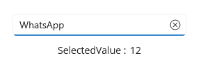
The SelectedValue property gets or sets the value of the selected item based on the SelectedValuePath property. Use it instead of SelectedItem or SelectedItems when you only need the underlying value (for example, an ID).
Single selection
In single selection mode, SelectedValue holds the value defined by SelectedValuePath (for example, ID).
<StackLayout>
    <editors:SfAutocomplete x:Name="autocomplete"
                            MaxDropDownHeight="250"
                            TextMemberPath="Name"
                            DisplayMemberPath="Name"
                            ItemsSource="{Binding SocialMedias}"
                            SelectedValuePath="ID"
                            SelectionChanged="OnSelectionChanged" />
    <HorizontalStackLayout>
        <Label x:Name="labelTitle" Text="SelectedValue :" />
        <Label x:Name="selectedValue" />
    </HorizontalStackLayout>
</StackLayout>
SfAutocomplete autocomplete = new SfAutocomplete
{
MaxDropDownHeight = 250,
TextMemberPath = "Name",
DisplayMemberPath = "Name",
ItemsSource = new SocialMediaViewModel().SocialMedias,
SelectedValuePath = "ID"
};
autocomplete.SelectionChanged += OnSelectionChanged;
Label labelTitle = new Label { Text = "SelectedValue :" };
Label selectedValue = new Label();
HorizontalStackLayout horizontalLayout = new HorizontalStackLayout
{
Children = { labelTitle, selectedValue }
};
StackLayout mainLayout = new StackLayout
{
Children = { autocomplete, horizontalLayout }
};// ViewModel
public class SocialMediaViewModel
{
public ObservableCollection<SocialMedia> SocialMedias { get; set; }
public SocialMediaViewModel()
{
this.SocialMedias = new ObservableCollection<SocialMedia>
{
new SocialMedia { Name = "Facebook", ID = 0 },
new SocialMedia { Name = "Google Plus", ID = 1 },
new SocialMedia { Name = "Instagram", ID = 2 },
new SocialMedia { Name = "LinkedIn", ID = 3 },
new SocialMedia { Name = "Skype", ID = 4 },
new SocialMedia { Name = "Telegram", ID = 5 },
new SocialMedia { Name = "Twitter", ID = 6 },
new SocialMedia { Name = "WhatsApp", ID = 7 },
new SocialMedia { Name = "YouTube", ID = 8 }
};
}
}
public class SocialMedia
{
public string Name { get; set; }
public int ID { get; set; }
}private void OnSelectionChanged(object sender, SelectionChangedEventArgs e)
{
selectedValue.Text = autocomplete.SelectedValue?.ToString();
}The following image illustrates the result of the above code:
Multiple selection
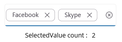
In multiple selection mode, SelectedValue is a collection (IList<object>) of the values derived from SelectedItems using SelectedValuePath.
<StackLayout>
    <editors:SfAutocomplete x:Name="autocomplete"
                            MaxDropDownHeight="250"
                            TextMemberPath="Name"
                            DisplayMemberPath="Name"
                            ItemsSource="{Binding SocialMedias}"
                            SelectionMode="Multiple"
                            SelectedValuePath="ID"
                            SelectedValue="{Binding SelectedValueList}"
                            SelectionChanged="OnSelectionChanged"/>
    <HorizontalStackLayout>
        <Label x:Name="labelTitle" Text="SelectedValue count :"/>
        <Label x:Name="selectedValue"/>
    </HorizontalStackLayout>
</StackLayout>
SfAutocomplete autocomplete = new SfAutocomplete
{
MaxDropDownHeight = 250,
TextMemberPath = "Name",
DisplayMemberPath = "Name",
ItemsSource = new SocialMediaViewModel().SocialMedias,
SelectionMode = AutocompleteSelectionMode.Multiple,
SelectedValuePath = "ID",
SelectedValue = new SocialMediaViewModel().SelectedValueList
};
autocomplete.SelectionChanged += OnSelectionChanged;// ViewModel
public class SocialMediaViewModel
{
public ObservableCollection<SocialMedia> SocialMedias { get; set; }
public SocialMediaViewModel()
{
this.SocialMedias = new ObservableCollection<SocialMedia>
{
new SocialMedia { Name = "Facebook", ID = 0 },
new SocialMedia { Name = "Google Plus", ID = 1 },
new SocialMedia { Name = "Instagram", ID = 2 },
new SocialMedia { Name = "LinkedIn", ID = 3 },
new SocialMedia { Name = "Skype", ID = 4 },
new SocialMedia { Name = "Telegram", ID = 5 },
new SocialMedia { Name = "Twitter", ID = 6 },
new SocialMedia { Name = "WhatsApp", ID = 7 },
new SocialMedia { Name = "YouTube", ID = 8 }
};
}
}
public class SocialMedia
{
public string Name { get; set; }
public int ID { get; set; }
}private void OnSelectionChanged(object sender, SelectionChangedEventArgs e)
{
if (autocomplete.SelectedValue is IList<object> value)
{
selectedValue.Text = value.Count.ToString();
}
}The following image illustrates the result of the above code:
If
SelectedValuePathis not specified,SelectedValueis the same asSelectedItem(single mode) orSelectedItems(multiple mode).
Hide the clear button
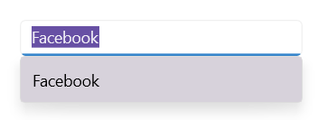
By default, the clear button (X) is displayed in the input area of the SfAutocomplete. Hide it by setting the IsClearButtonVisible property to false. The default value is true.
<editors:SfAutocomplete x:Name="autocomplete"
                        IsClearButtonVisible="false"
                        ItemsSource="{Binding SocialMedias}"
                        DisplayMemberPath="Name"
                        TextMemberPath="Name" />
SfAutocomplete autocomplete = new SfAutocomplete
{
IsClearButtonVisible = false,
ItemsSource = new SocialMediaViewModel().SocialMedias,
DisplayMemberPath = "Name",
TextMemberPath = "Name"
};// ViewModel
public class SocialMediaViewModel
{
public ObservableCollection<SocialMedia> SocialMedias { get; set; }
public SocialMediaViewModel()
{
this.SocialMedias = new ObservableCollection<SocialMedia>
{
new SocialMedia { Name = "Facebook", ID = 0 },
new SocialMedia { Name = "Google Plus", ID = 1 },
new SocialMedia { Name = "Instagram", ID = 2 },
new SocialMedia { Name = "LinkedIn", ID = 3 },
new SocialMedia { Name = "Skype", ID = 4 },
new SocialMedia { Name = "Telegram", ID = 5 },
new SocialMedia { Name = "Twitter", ID = 6 },
new SocialMedia { Name = "WhatsApp", ID = 7 },
new SocialMedia { Name = "YouTube", ID = 8 }
};
}
}
public class SocialMedia
{
public string Name { get; set; }
public int ID { get; set; }
}The following image illustrates the result of the above code:
Programmatically open or close the drop-down
You can open or close the drop-down programmatically by using the IsDropDownOpen property. The default value is false.
<editors:SfAutocomplete x:Name="autocomplete"
                        ItemsSource="{Binding SocialMedias}"
                        IsDropDownOpen="True"
                        DisplayMemberPath="Name"
                        TextMemberPath="Name" />
SfAutocomplete autocomplete = new SfAutocomplete
{
ItemsSource = new SocialMediaViewModel().SocialMedias,
IsDropDownOpen = true,
DisplayMemberPath = "Name",
TextMemberPath = "Name"
};// ViewModel
public class SocialMediaViewModel
{
public ObservableCollection<SocialMedia> SocialMedias { get; set; }
public SocialMediaViewModel()
{
this.SocialMedias = new ObservableCollection<SocialMedia>
{
new SocialMedia { Name = "Facebook", ID = 0 },
new SocialMedia { Name = "Google Plus", ID = 1 },
new SocialMedia { Name = "Instagram", ID = 2 },
new SocialMedia { Name = "LinkedIn", ID = 3 },
new SocialMedia { Name = "Skype", ID = 4 },
new SocialMedia { Name = "Telegram", ID = 5 },
new SocialMedia { Name = "Twitter", ID = 6 },
new SocialMedia { Name = "WhatsApp", ID = 7 },
new SocialMedia { Name = "YouTube", ID = 8 }
};
}
}
public class SocialMedia
{
public string Name { get; set; }
public int ID { get; set; }
}Clear selected items
You can remove the selected items and the input text programmatically by calling the Clear method on the SfAutocomplete.
autocomplete.Clear();