Searching and Filtering in .NET MAUI Autocomplete (SfAutocomplete)
24 Apr 202523 minutes to read
The Autocomplete control allows for rich text searching and filtering functionality.
Searching based on member path
The DisplayMemberPath and TextMemberPath properties of Autocomplete control specify the property path by which the searching must be done when a custom data is bound to the ItemsSource property.
-
DisplayMemberPath- Specifies the property path whose value is displayed as text in the drop-down menu. The default value isstring.Empty. -
TextMemberPath- Specifies the property path whose value is used to perform searching based on user input received in the selection box portion of the Autocomplete control. The default value isstring.Empty. WhenTextMemberPathisnullorstring.Empty, searching will be performed based onDisplayMemberPath.
NOTE
DisplayMemberPathandTextMemberPathwill be effective for the collection item that holds two or more properties in it.
NOTE
When both the
DisplayMemberPathandTextMemberPathproperties have anullorstring.Emptyvalue, searching will be performed based on the class name with the namespace of the item.
Searching based on DisplayMemberPath
Searching will be performed based on the DisplayMemberPath property while entering the text into the selection box when TextMemberPath is null or string.Empty.
//Model.cs
public class SocialMedia
{
    public string Name { get; set; }
    public int ID { get; set; }
}

//ViewModel.cs
public class SocialMediaViewModel
{
    public ObservableCollection<SocialMedia> SocialMedias { get; set; }
    public SocialMediaViewModel()
    {
        this.SocialMedias = new ObservableCollection<SocialMedia>();
        this.SocialMedias.Add(new SocialMedia() { Name = "Facebook", ID = 0 });
        this.SocialMedias.Add(new SocialMedia() { Name = "Google Plus", ID = 1 });
        this.SocialMedias.Add(new SocialMedia() { Name = "Instagram", ID = 2 });
        this.SocialMedias.Add(new SocialMedia() { Name = "LinkedIn", ID = 3 });
        this.SocialMedias.Add(new SocialMedia() { Name = "Skype", ID = 4 });
        this.SocialMedias.Add(new SocialMedia() { Name = "Telegram", ID = 5 });
        this.SocialMedias.Add(new SocialMedia() { Name = "Televzr", ID = 6 });
        this.SocialMedias.Add(new SocialMedia() { Name = "Tik Tok", ID = 7 });
        this.SocialMedias.Add(new SocialMedia() { Name = "Tout", ID = 8 });
        this.SocialMedias.Add(new SocialMedia() { Name = "Tumblr", ID = 9 });
        this.SocialMedias.Add(new SocialMedia() { Name = "Twitter", ID = 10 });
        this.SocialMedias.Add(new SocialMedia() { Name = "Vimeo", ID = 11 });
        this.SocialMedias.Add(new SocialMedia() { Name = "WhatsApp", ID = 12 });
        this.SocialMedias.Add(new SocialMedia() { Name = "YouTube", ID = 13 });
    }
}<editors:SfAutocomplete x:Name="autocomplete"
ItemsSource="{Binding SocialMedias}"
DisplayMemberPath="Name" />SfAutocomplete autocomplete = new SfAutocomplete()
{
DisplayMemberPath = "Name",
ItemsSource = socialMediaViewModel.SocialMedias
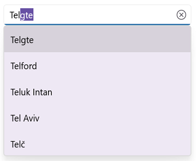
};For e.g. After typing T in selection box, social media which have starting letter T will be listed in drop-down.
The following image illustrates the result of the above code:
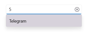
Searching based on TextMemberPath
Searching will be performed based on the TextMemberPath property while entering the text into the selection box. If TextMemberPath is null or string.Empty, searching will be performed based on DisplayMemberPath.
<editors:SfAutocomplete x:Name="autocomplete"
                        ItemsSource="{Binding SocialMedias}"
                        TextMemberPath="ID"
                        DisplayMemberPath="Name" />
SfAutocomplete autocomplete = new SfAutocomplete()
{
DisplayMemberPath = "Name",
TextMemberPath = "ID",
ItemsSource = socialMediaViewModel.SocialMedias
};The following image illustrates the result of the above code:
Filtering mode
The TextSearchMode property of the Autocomplete can be used to regulate how the control behaves when it receives user input. The default text filtering type is StartWith, which ignores accent and is case insensitive. The text filter modes that are available are as follows:
- StartsWith
- Contains
Filter with beginning text
Set the TextSearchMode property value to StartWith to filter matching items based on the starting text. The first item in the drop-down list that matches the user input will be highlighted.
<editors:SfAutocomplete x:Name="autocomplete"
                        TextSearchMode="StartsWith"
                        ItemsSource="{Binding SocialMedias}"
                        DisplayMemberPath="Name"
                        TextMemberPath="Name" />
SfAutocomplete autocomplete = new SfAutocomplete()
{
DisplayMemberPath = "Name",
TextMemberPath = "Name",
TextSearchMode = AutocompleteTextSearchMode.StartsWith,
ItemsSource = socialMediaViewModel.SocialMedias
};The following image illustrates the result of the above code:
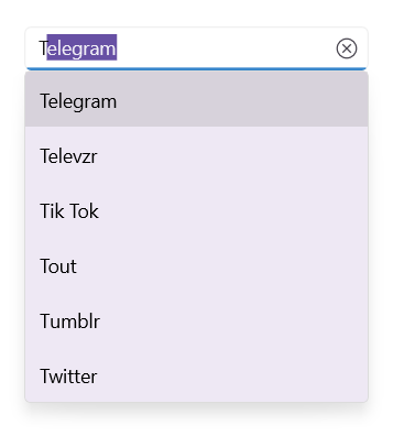
Filter with contains text
Set the TextSearchMode property value to Contains to filter the matching items based on the containing specific text. The first item in the drop-down list that matches the user input will be highlighted.
<editors:SfAutocomplete x:Name="autocomplete"
                        TextSearchMode="Contains"
                        ItemsSource="{Binding SocialMedias}"
                        DisplayMemberPath="Name"
                        TextMemberPath="Name" />
SfAutocomplete autocomplete = new SfAutocomplete()
{
DisplayMemberPath = "Name",
TextMemberPath = "Name",
TextSearchMode = AutocompleteTextSearchMode.Contains,
ItemsSource = socialMediaViewModel.SocialMedias
};The following image illustrates the result of the above code.
Prefix characters constraint
Instead of displaying suggestion list on every character entry, matches can be filtered and displayed after a few character entries. This can be done by MinimumPrefixCharacters property and its default value is 1.
<editors:SfAutocomplete x:Name="autocomplete"
                        TextSearchMode="StartsWith"
                        ItemsSource="{Binding SocialMedias}"
                        MinimumPrefixCharacters="3"
                        DisplayMemberPath="Name"
                        TextMemberPath="Name" />
SfAutocomplete autocomplete = new SfAutocomplete()
{
DisplayMemberPath = "Name",
TextMemberPath = "Name",
MinimumPrefixCharacters = 3,
TextSearchMode = AutocompleteTextSearchMode.StartsWith,
ItemsSource = socialMediaViewModel.SocialMedias
};The following image illustrates the result of the above code.
Custom filtering
The Autocomplete control supports applying your custom filter logic to suggest items based on your filter criteria by using the FilterBehavior and SearchBehavior properties. The default value of FilterBehavior and SearchBehavior is null.
//Model.cs

public class CityInfo
{
    private bool _isCapital;
    public bool IsCapital
    {
        get { return _isCapital; }
        set { _isCapital = value; }
    }
    private string _cityname;
    public string CityName
    {
        get { return _cityname; }
        set { _cityname = value; }
    }
    private string _country;
    public string CountryName
    {
        get { return _country; }
        set { _country = value; }
    }
}

//ViewModel.cs

public class CityViewModel
{
    private ObservableCollection<CityInfo> _cityCollection;
    public ObservableCollection<CityInfo> Cities
    {
        get { return _cityCollection; }
        set { _cityCollection = value; }
    }
    public CityViewModel()
    {
        _cityCollection = new ObservableCollection<CityInfo>();

        Cities.Add(new CityInfo() { CityName = "Delhi", CountryName = "India", IsCapital = true });
        Cities.Add(new CityInfo() { CityName = "Mumbai", CountryName = "India", IsCapital = false });
        Cities.Add(new CityInfo() { CityName = "Chennai", CountryName = "India", IsCapital = false });
        Cities.Add(new CityInfo() { CityName = "Kolkata", CountryName = "India", IsCapital = false });
        Cities.Add(new CityInfo() { CityName = "Chicago", CountryName = "USA", IsCapital = false });
        Cities.Add(new CityInfo() { CityName = "Los Angels", CountryName = "USA", IsCapital = false });
        Cities.Add(new CityInfo() { CityName = "Houston", CountryName = "USA", IsCapital = false });
        Cities.Add(new CityInfo() { CityName = "New York", CountryName = "USA", IsCapital = true });
        Cities.Add(new CityInfo() { CityName = "Wasington", CountryName = "USA", IsCapital = false });

    }
}
Now, create a custom filtering class to apply your filter logic to the Autocomplete control by following these steps.
Step 1: Create a class that derives from the IAutocompleteFilterBehavior interface.
/// <summary>
/// Represents a custom filtering behavior for the    `Autocomplete` control.
/// </summary>
public class CityFilteringBehavior : IAutocompleteFilterBehavior
{

}
Step 2: Then, implement the GetMatchingIndexes method of the IAutocompleteFilterBehavior interface to create your suggestion list (containing the indices of the filtered items) based on the text entered in the Autocomplete control that needs to be shown in the drop-down. The GetMatchingIndexes method contains following arguments.
-
source- The owner of the filter behavior, which holds information about theItemsSourceproperty and so on. -
filterInfo- Contains details about the text entered inAutocompletecontrol. Using this text, you can prepare suggestion list, which gets displayed in the drop-down list.
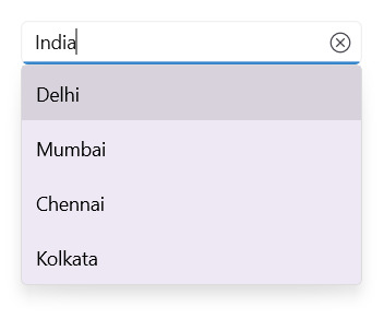
The following image shows how to display cities in a drop-down based on the country name entered in the Autocomplete control.
public class CityFilteringBehavior : IAutocompleteFilterBehavior
{
    public async Task<object> GetMatchingItemsAsync(SfAutocomplete source, AutocompleteFilterInfo filterInfo)
    {
         IEnumerable itemssource = source.ItemsSource as IEnumerable;
        var filteredItems = (from CityInfo item in itemssource
                             where item.CountryName.StartsWith(filterInfo.Text, StringComparison.CurrentCultureIgnoreCase) ||
                                   item.CityName.StartsWith(filterInfo.Text, StringComparison.CurrentCultureIgnoreCase)
                             select item);

        return await Task.FromResult(filteredItems);
    }
}
Step 3: Applying custom filtering to the Autocomplete control by using the FilterBehavior property.
<ContentPage.BindingContext>
    <local:CityViewModel/>
</ContentPage.BindingContext>
  <editors:SfAutocomplete
    DisplayMemberPath="CityName"
    ItemsSource="{Binding Cities}">
            <editors:SfAutocomplete.FilterBehavior>
                <local:CityFilteringBehavior/>
            </editors:SfAutocomplete.FilterBehavior>
  </editors:SfAutocomplete>
The following image demonstrates how to display cities in the drop-down based on the country name entered in the Autocomplete control.
Choose default item to select
When searching, the first item in the drop-down will be highlighted by default. Using the SearchBehavior property, you can customize the default highlighting behavior by using your custom selection logic to select the items based on your search criteria. The default value of SearchBehavior is null.
Step 1: Create a class that derives from the IAutocompleteSearchBehavior interface.
/// <summary>
/// Represents a custom searching behavior for `Autocomplete` control.
/// </summary>

public class CapitalCitySearchingBehavior : Syncfusion.Maui.Inputs.IAutocompleteSearchBehavior

{

}
Step 2: Then, implement the GetHighlightIndex method of the IAutocompleteSearchBehavior interface to initially select any item from the filtered list in the Autocomplete control drop-down. The GetHighlightIndex method contains the following arguments.
-
source- The owner of the search behavior, which holds information about theItemsSourceand so on. -
searchInfo- Contains information about the filtered items based on the text entered in theAutocompletecontrol. Select an item from the drop-down list using this list.
The following code initially demonstrates how to select an item from the filtered list of the drop-down in the Autocomplete control. When entering the country’s name, the capital cities will be selected.
public class CapitalCitySearchingBehavior : Syncfusion.Maui.Inputs.IAutocompleteSearchBehavior
{
    public int GetHighlightIndex(SfAutocomplete source, AutocompleteSearchInfo searchInfo)
    {

        var filteredCapitals = from CityInfo cityInfo in searchInfo.FilteredItems
                               where cityInfo.IsCapital
                               select searchInfo.FilteredItems.IndexOf(cityInfo);
        if (filteredCapitals.Count() > 0)
            return filteredCapitals.FirstOrDefault();

        return 0;
    }
}
Step 3: Apply the custom searching to the Autocomplete control by using the SearchBehavior property.
<ContentPage.BindingContext>
        <local:CityViewModel></local:CityViewModel>
    </ContentPage.BindingContext>
<editors:SfAutocomplete
    DisplayMemberPath="CityName"
    ItemsSource="{Binding Cities}">
            <editors:SfAutocomplete.FilterBehavior>
                <local:CityFilteringBehavior/>
            </editors:SfAutocomplete.FilterBehavior>
<editors:SfAutocomplete.SearchBehavior>
                <local:CapitalCitySearchingBehavior></local:CapitalCitySearchingBehavior>
            </editors:SfAutocomplete.SearchBehavior>
</editors:SfAutocomplete>
The following image demonstrates how to select the capital city from the drop-down based on the country name entered in the Autocomplete control.
Load asynchronous items
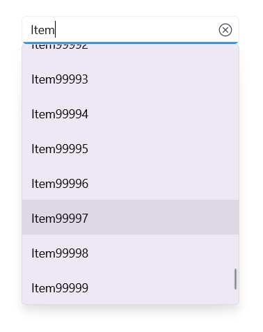
Load the data dynamically at runtime based on typed input. This dynamic loading can be done while performing custom filtering using the CustomFilter property.
The GetMatchingItemsAsync method of the IAutocompleteFilterBehavior helps you perform filtering operations on different threads without blocking the current thread by using await Task.Run().
Step 1: Create a class from the IAutocompleteFilterBehavior interface and add your custom filter logic to the GetMatchingItemsAsync method to load the runtime items based on typed input.
public class CustomAsyncFilter : IAutocompleteFilterBehavior
{
    /// <summary>
    /// Gets the cancellation token source.
    /// </summary>
    CancellationTokenSource cancellationTokenSource;

    public async Task<object> GetMatchingItemsAsync(SfAutocomplete source, AutocompleteFilterInfo filterInfo)
    {
        if (this.cancellationTokenSource != null)
        {
            this.cancellationTokenSource.Cancel();
            this.cancellationTokenSource.Dispose();
        }

        this.cancellationTokenSource = new CancellationTokenSource();
        CancellationToken token = this.cancellationTokenSource.Token;

        return await Task.Run(() =>
        {
            List<string> list = new List<string>();
            for (int i = 0; i < 100000; i++)
            {
                list.Add(filterInfo.Text + i);
            }

            return list;
        }, token);
    }
}
Step 2: Apply the CustomAsyncFilter to the Autocomplete control by using the FilterBehavior property.
<editors:SfAutocomplete
       >
            <editors:SfAutocomplete.FilterBehavior>
                <local:CustomAsyncFilter/>
            </editors:SfAutocomplete.FilterBehavior>
        </editors:SfAutocomplete>
The following image shows 1 lakh of data being loaded asynchronously in a drop-down at runtime based on typed input.