Header and Footer in .NET MAUI Autocomplete (SfAutocomplete)
21 Jul 202612 minutes to read
Prerequisites
Before using the SfAutocomplete, ensure the following NuGet package is installed in your .NET MAUI project:
Syncfusion.Maui.Inputs
For step-by-step setup, refer to the Getting Started documentation.
Overview
You can add a header and footer view to the drop-down of the SfAutocomplete by enabling the ShowDropdownHeaderView and ShowDropdownFooterView properties.
Header Content
You can add a header at the top of the SfAutocomplete drop-down. The DropdownHeaderView property is used to set the content of the header. The height of the header in the SfAutocomplete can be adjusted by the DropdownHeaderViewHeight property. The default value of DropdownHeaderViewHeight is 30.
Properties
| Property | Type | Default | Description |
|---|---|---|---|
ShowDropdownHeaderView |
bool |
false |
Gets or sets a value that indicates whether the drop-down header is displayed. |
DropdownHeaderView |
View |
null |
Gets or sets the content of the drop-down header. |
DropdownHeaderViewHeight |
double |
30 |
Gets or sets the height of the drop-down header. |
The following code example shows how to set a header view in the SfAutocomplete:
<autocomplete:SfAutocomplete x:Name="autocomplete"
                             ShowDropdownHeaderView="true"
                             ItemsSource="{Binding SocialMedias}"
                             DisplayMemberPath="Name"
                             DropdownHeaderViewHeight="50">
    <autocomplete:SfAutocomplete.DropdownHeaderView>
        <StackLayout BackgroundColor="#f0f0f0">
            <Label x:Name="SearchLabel"
                   Text="Search a social media"
                   FontSize="20"
                   VerticalTextAlignment="Center"
                   HorizontalOptions="Center"
                   VerticalOptions="Center"
                   TextColor="#006bcd" />
        </StackLayout>
    </autocomplete:SfAutocomplete.DropdownHeaderView>
</autocomplete:SfAutocomplete>
StackLayout stackLayout = new StackLayout
{
VerticalOptions = LayoutOptions.Start,
HorizontalOptions = LayoutOptions.Start,
Padding = new Thickness(30)
};
SfAutocomplete autoComplete = new SfAutocomplete
{
ShowDropdownHeaderView = true,
ItemsSource = new SocialMediaViewModel().SocialMedias,
DisplayMemberPath = "Name",
DropdownHeaderViewHeight = 50
};
StackLayout dropDownHeaderView = new StackLayout
{
BackgroundColor = Color.FromHex("#f0f0f0")
};
Label searchLabel = new Label
{
Text = "Search a social media",
FontSize = 20,
VerticalTextAlignment = TextAlignment.Center,
HorizontalOptions = LayoutOptions.Center,
VerticalOptions = LayoutOptions.Center,
TextColor = Color.FromHex("#006bcd")
};
dropDownHeaderView.Children.Add(searchLabel);
autoComplete.DropdownHeaderView = dropDownHeaderView;
stackLayout.Children.Add(autoComplete);
this.Content = stackLayout;// ViewModel
public class SocialMediaViewModel
{
public ObservableCollection<SocialMedia> SocialMedias { get; set; }
public SocialMediaViewModel()
{
this.SocialMedias = new ObservableCollection<SocialMedia>
{
new SocialMedia { Name = "Facebook", ID = 0 },
new SocialMedia { Name = "Google Plus", ID = 1 },
new SocialMedia { Name = "Instagram", ID = 2 },
new SocialMedia { Name = "LinkedIn", ID = 3 },
new SocialMedia { Name = "Skype", ID = 4 },
new SocialMedia { Name = "Telegram", ID = 5 },
new SocialMedia { Name = "Twitter", ID = 6 },
new SocialMedia { Name = "WhatsApp", ID = 7 },
new SocialMedia { Name = "YouTube", ID = 8 }
};
}
}
public class SocialMedia
{
public string Name { get; set; }
public int ID { get; set; }
}The following image illustrates a header view in the SfAutocomplete drop-down:

Footer Content
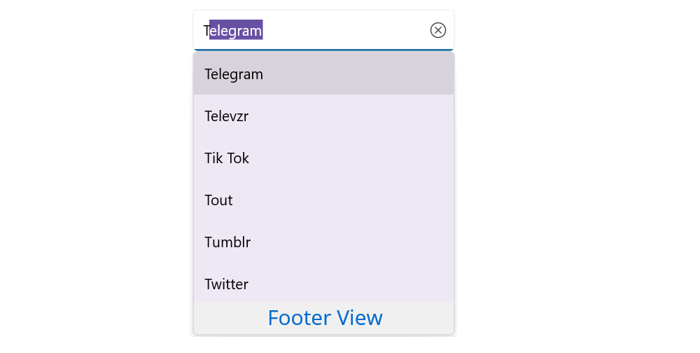
You can add a footer at the bottom of the SfAutocomplete drop-down. The DropDownFooterView property is used to set the content of the footer. The height of the footer in the SfAutocomplete can be adjusted by the DropdownFooterViewHeight property. The default value of DropdownFooterViewHeight is 30.
Properties
| Property | Type | Default | Description |
|---|---|---|---|
ShowDropdownFooterView |
bool |
false |
Gets or sets a value that indicates whether the drop-down footer is displayed. |
DropdownFooterView |
View |
null |
Gets or sets the content of the drop-down footer. |
DropdownFooterViewHeight |
double |
30 |
Gets or sets the height of the drop-down footer. |
The following code example shows how to set a footer view in the SfAutocomplete:
<autocomplete:SfAutocomplete x:Name="autocomplete"
                             ShowDropdownFooterView="true"
                             ItemsSource="{Binding SocialMedias}"
                             DisplayMemberPath="Name"
                             DropdownFooterViewHeight="50">
    <autocomplete:SfAutocomplete.DropdownFooterView>
        <StackLayout BackgroundColor="#f0f0f0">
            <Label Text="Add New"
                   FontSize="20"
                   VerticalTextAlignment="Center"
                   HorizontalOptions="Center"
                   VerticalOptions="Center"
                   TextColor="#006bcd" />
        </StackLayout>
    </autocomplete:SfAutocomplete.DropdownFooterView>
</autocomplete:SfAutocomplete>
StackLayout stackLayout = new StackLayout
{
VerticalOptions = LayoutOptions.Start,
HorizontalOptions = LayoutOptions.Start,
Padding = new Thickness(30)
};
SfAutocomplete autoComplete = new SfAutocomplete
{
ShowDropdownFooterView = true,
ItemsSource = new SocialMediaViewModel().SocialMedias,
DisplayMemberPath = "Name",
DropdownFooterViewHeight = 50
};
StackLayout footerLayout = new StackLayout
{
BackgroundColor = Color.FromHex("#f0f0f0")
};
Label footerLabel = new Label
{
Text = "Add New",
FontSize = 20,
VerticalTextAlignment = TextAlignment.Center,
HorizontalOptions = LayoutOptions.Center,
VerticalOptions = LayoutOptions.Center,
TextColor = Color.FromHex("#006bcd")
};
footerLayout.Children.Add(footerLabel);
autoComplete.DropdownFooterView = footerLayout;
stackLayout.Children.Add(autoComplete);
this.Content = stackLayout;// ViewModel
public class SocialMediaViewModel
{
public ObservableCollection<SocialMedia> SocialMedias { get; set; }
public SocialMediaViewModel()
{
this.SocialMedias = new ObservableCollection<SocialMedia>
{
new SocialMedia { Name = "Facebook", ID = 0 },
new SocialMedia { Name = "Google Plus", ID = 1 },
new SocialMedia { Name = "Instagram", ID = 2 },
new SocialMedia { Name = "LinkedIn", ID = 3 },
new SocialMedia { Name = "Skype", ID = 4 },
new SocialMedia { Name = "Telegram", ID = 5 },
new SocialMedia { Name = "Twitter", ID = 6 },
new SocialMedia { Name = "WhatsApp", ID = 7 },
new SocialMedia { Name = "YouTube", ID = 8 }
};
}
}
public class SocialMedia
{
public string Name { get; set; }
public int ID { get; set; }
}The following image illustrates a footer view in the SfAutocomplete drop-down: