How can I help you?
Scale
Adding scale
Scales can be added within the pivot gauge control.
<ej-pivot-gauge id="PivotGauge1">
    <e-scales>
        <e-circular-scales show-ranges="true" radius="150" show-scale-bar="true"></e-circular-scales>
    </e-scales>
</ej-pivot-gauge>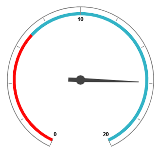
Scale customization
Pointer cap
The pointer cap is a circular shape element which is located at the center of the pivot gauge. It can be customized with the pointer-cap property in the scales option. Following are the properties that are used to customize its appearance:
- radius: Sets the radius of the pointer cap.
- border-color: Sets the color of the pointer cap border.
- border-width: Sets the width of the pointer cap border.
- background-color: Sets the background color of the pointer cap.
<ej-pivot-gauge id="PivotGauge1">
    <e-scales>
        <e-circular-scales radius="150" show-scale-bar="true">
            <e-pointer-cap background-color="yellow" border-color="green" radius="5" border-width="2"></e-pointer-cap>
        </e-circular-scales>
    </e-scales>
</ej-pivot-gauge>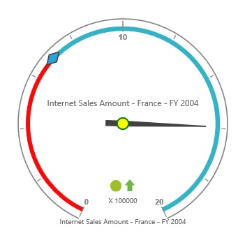
Appearance
The appearance of the scale can be customized through the following properties:
- radius: Sets the radius of the scale.
- background-color: Sets the background color of the scale.
- border: Sets the border of the scale with color and width properties.
- size: Sets the size of the scale.
- minimum: Sets the least value of the scale.
- maximum: Sets the highest value of the scale.
- major-interval-value: Sets the interval between minor ticks in the scale.
- minor-interval-value: Sets the interval between major ticks in the scale.
- direction: Sets the direction of the scale. By default, it takes “Clockwise” direction.
The ShowIndicators, ShowTicks, ShowRanges, ShowPointers, and ShowScaleBar properties are used to enable/disable the indicators, ticks, ranges, pointers, and scale bar respectively. By default, ShowTicks and ShowPointers are set to true, other properties are set as false.
<ej-pivot-gauge id="PivotGauge1">
<e-scales>
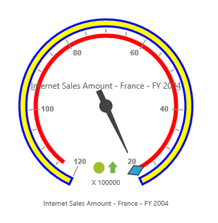
<e-circular-scales radius="120" show-scale-bar="true" size="10" background-color="yellow" minimum="20" maximum="120" major-interval-value="20" minor-interval-value="5" direction="CounterClockwise">
<e-border width="0.5"></e-border>
</e-circular-scales>
</e-scales>
</ej-pivot-gauge>