How can I help you?
User Interactions
Tooltip
Enable tooltip for data point
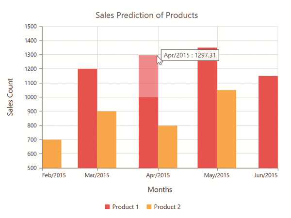
Tooltip for the data points can be enabled by using the visible option of the tooltip in the series.
<ej-chart id="chart">
        <e-seriescollection>
            <e-series tooltip.visible="true">
            </e-series>
        </e-seriescollection>
</ej-chart>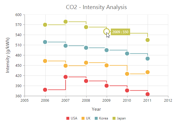
Format the tooltip
Tooltip displays data specified by the format option of the tooltip. The default value of the format option is * #point.x# : #point.y# *. Here, * #point.x# * is the placeholder for x value of the point and * #point.y# * is the placeholder for y value of the point.
You can also use * **#series.
<ej-chart id="chart">
        <e-seriescollection>
            <e-series tooltip.visible="true" tooltip.format="#series.name# <br/>
                                             #point.x# : #point.y#  (g/kWh)">
            </e-series>
        </e-seriescollection>
</ej-chart>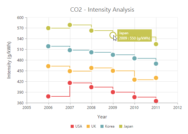
Tooltip Template
HTML elements can be displayed in the tooltip by using the template option of the tooltip. The template option takes the value of the id attribute of the HTML element. You can use the * #point.x# * and * #point.y# * as place holders in the HTML element to display the x and y values of the corresponding data point.
You can also use * **#series.
<body>
<!-- Create Tooltip template here -->
<div id="Tooltip" style="display: none;">
<div id="icon">
<div id="eficon"> </div>
</div>
<div id="value">
<div>
<label id="efpercentage"> #point.y#% </label>
<label id="ef">Efficiency </label>
</div>
</div>
</div>
<ej-chart id="chart">
<e-seriescollection>
<e-series tooltip.visible="true" tooltip.template="Tooltip">
</e-series>
</e-seriescollection>
</ej-chart>
</body>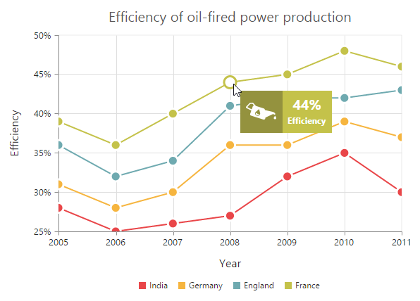
Tooltip template animation
You can enable animation by setting the enableAnimation to true. Tooltip animates when the mouse moves from one data point to another point. The duration property in tooltip specifies the time taken to animate the tooltip. the duration is set to “500ms”, by default.
NOTE
Tooltip is animated only if the template is specified for tooltip.
<ej-chart id="chart">
        <e-seriescollection>
            <e-series name="India" tooltip.visible="true" tooltip.template="Tooltip"
                          tooltip.enableAnimation="true" tooltip.duration="1000ms">
            </e-series>
        </e-seriescollection>
</ej-chart>
Customize the appearance of tooltip
The fill and border options are used to customize the background color and border of the tooltip respectively. The font option in the tooltip is used to customize the font of the tooltip text.
<ej-chart id="chartcontainer" style="display:block;">
    <e-seriescollection>
        <e-series [tooltip.visible]="true" tooltip.fill="#FF9933"
         [tooltip.border.width]=1 tooltip.border.color="#993300">
		</e-series>
    </e-seriescollection>
</ej-chart>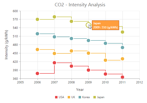
Tooltip with rounded corners
The options rx and ry are used to customize the corner radius of the tooltip rectangle.
<ej-chart id="chart">
        <e-seriescollection>
            <e-series name="India" tooltip.visible="true" tooltip.rx="50" tooltip.ry="50">
            </e-series>
        </e-seriescollection>
</ej-chart>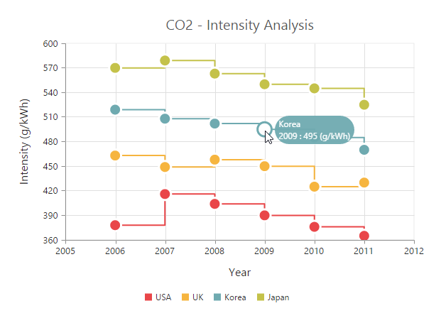
Zooming and Panning
Enable Zooming
There are two ways you can zoom the chart,
-
When the zooming.enable option is set to true, you can zoom the chart by using the rubber band selection.
-
When the zooming.enableMouseWheel option is set to true, you can zoom the chart on mouse wheel scrolling.
-
When zooming.enablePinching option is set to true, you can zoom the chart through pinch gesture.
NOTE
Pinch zooming is supported only in browsers that support multi-touch gestures. Currently IE10, IE11, Chrome and Opera browsers support multi-touch in desktop devices.
<ej-chart id="zooming" [zooming.enable]="true" >
</ej-chart>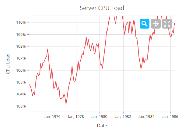
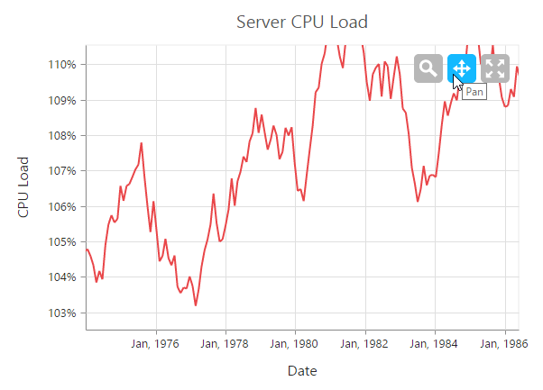
After zooming the chart, a zooming toolbar will appear with options to zoom, pan and reset. Selecting the Pan option will allow to pan the chart and selecting the Reset option will reset the zoomed chart.
Types of zooming
The type option in zooming specifies whether the chart is allowed to scale along the horizontal axis or vertical axis or along both axis. The default value of the type is “xy” (both axis).
<ej-chart id="zooming" [zooming.enable]="true" zooming.type="x, y" >
</ej-chart>
Customizing zooming toolbar
You can choose the items displayed in the zooming toolbar by specifying the property toolBarItems.
<ej-chart id="zooming" [zooming.toolbarItems]="['reset', 'zoomIn', 'zoomOut']" [zooming.enable]="true">
</ej-chart>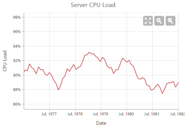
Enable ScrollBar
EjChart provides scrollbar support to view the other portions of chart area which is not shown in the view port when zoomed, by setting true to enableScrollbar option in zooming.
<ej-chart id="zooming" [zooming.enableScrollbar]="true" >
</ej-chart>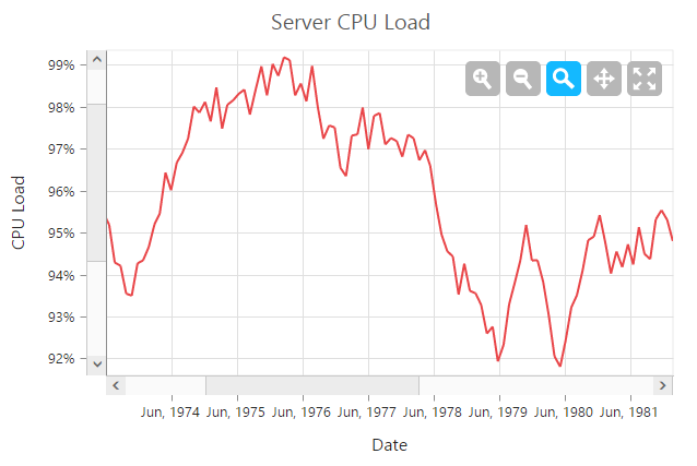
Crosshair
Crosshair is used to view the value of an axis at mouse position or touch contact point.
Enable crosshair and crosshair label
Crosshair can be enabled by using the visible option in the crosshair. Crosshair label for an axis can be enabled by using the visible option of crosshairLabel in the corresponding axis.
<ej-chart id="zooming" [crosshair.visible]="true"
             [primaryXAxis.crosshairLabel.visible]="true"
              [primaryYAxis.crosshairLabel.visible]="true" >
</ej-chart>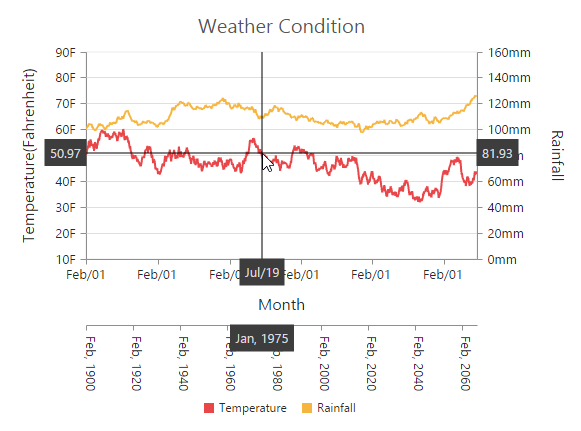
Customize the crosshair line and crosshair label
The fill and border options of the crosshairLabel is used to customize the background color and border of the crosshair label respectively. Color and width of the crosshair line can be customized by using the line** option in the crosshair.
<ej-chart id="zooming"
        [crosshair.visible]="true"
        [crosshair.line.color]="green"
        [crosshair.line.width]="2"

        [primaryXAxis.crosshairLabel.visible]="true"
        [primaryXAxis.crosshairLabel.fill]="red"
        [primaryXAxis.crosshairLabel.border.color]="green"
        [primaryXAxis.crosshairLabel.border.width]="2" >

</ej-chart>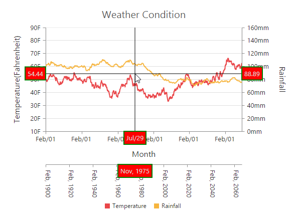
Trackball
Trackball is used to track a data point close to the mouse position or touch contact point. Trackball marker indicates the closest point and trackball tooltip displays the information about the point.
Enable Trackball
Trackball can be enabled by setting the visible option of the crosshair to true and then set the type as “trackball”. The default value of type is “crosshair”.
<ej-chart id="zooming"
        [crosshair.visible]="true"
        crosshair.type="trackball" >

</ej-chart>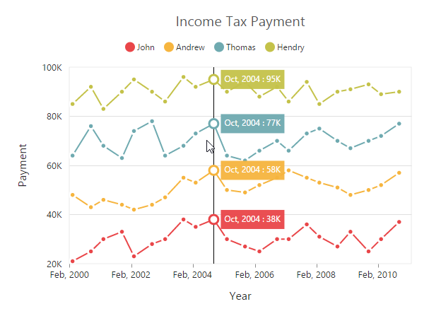
Customize trackball marker and trackball line
Shape and size of the trackball marker can be customized by using the shape and size options of the crosshair marker. Color and width of the trackball line can be customized by using the line option in the crosshair.
<ej-chart id="zooming"
        [crosshair.visible]="true"
        crosshair.type="trackball"
        [crosshair.marker]="{shape : 'pentagon', size: { width: 9, height: 9 }}" >

</ej-chart>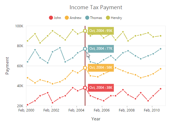
Format Trackball tooltip
X and Y values displayed in the trackball tooltip are formatted based on its axis labelFormat.
<ej-chart id="zooming"
        [crosshair.visible]="true"
        crosshair.type="trackball"

        primaryXAxis.labelFormat="MMM, yyyy"
        primaryYAxis.labelFormat="{value}K" >

</ej-chart>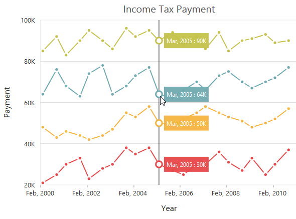
You can able to show the trackball tooltip in two modes, using trackballTooltipSettings.
            1.	Grouping.
            2.	Float.
<ej-chart id="zooming"
        [crosshair.visible]="true"
        crosshair.type="trackball"
        [crosshair.trackballTooltipSettings]="{mode: 'grouping', fill: 'green'}" >
</ej-chart>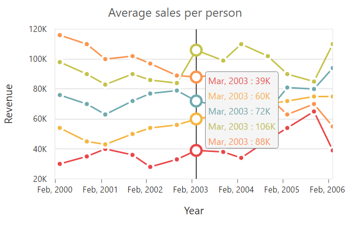
Trackball tooltip template:
Trackball tooltip template is used to display the tooltip in customized template format. You can define the desired template in css style. You can enable the toolTipTemplate by using the following code snippet.
<ej-chart id="zooming"
        [crosshair.visible]="true"
        crosshair.type="trackball"
        [crosshair.trackballTooltipSettings]="{mode: 'grouping', toolTipTemplate: 'tooltip'}" >
</ej-chart>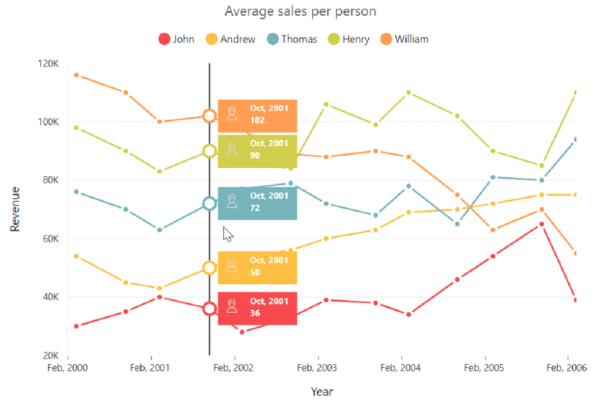
Highlight
EjChart provides highlighting support for the series and data points on mouse hover. To enable the highlighting option, set the enable property to true in the highlightSettings of the series.
NOTE
When hovering mouse on the data points, the corresponding series legend also will be highlighted.
<ej-chart id="container" [commonSeriesOptions.highlightSettings.enable]="true" >
</ej-chart>
Highlight Mode
You can set three different highlight mode for the highlighting data point and series by using the mode property of the highlightSettings.
- Series
- Points
- Cluster
Series mode
To highlight all the data points of the specified series, you can set the “series” value to the mode option in the highlightSettings.
<ej-chart id="container"
        [commonSeriesOptions.highlightSettings.enable]="true"
        [commonSeriesOptions.highlightSettings.mode] = "series"
    >
</ej-chart>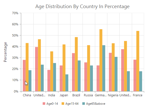
Point mode
To highlight a single point, you can set the “point” value to the mode option.
<ej-chart id="container" [commonSeriesOptions.highlightSettings]="{enable:'true', mode: 'point'}" >
</ej-chart>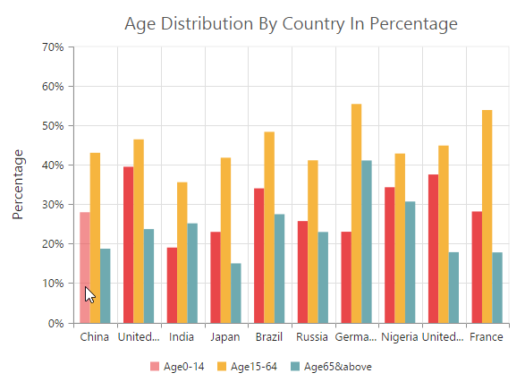
Cluster mode
To highlight the points that corresponds to the same index in all the series, set the “cluster” value to the mode option.
<ej-chart id="container" [commonSeriesOptions.highlightSettings]="{enable:'true',
                                                              mode: 'cluster'}" >
</ej-chart>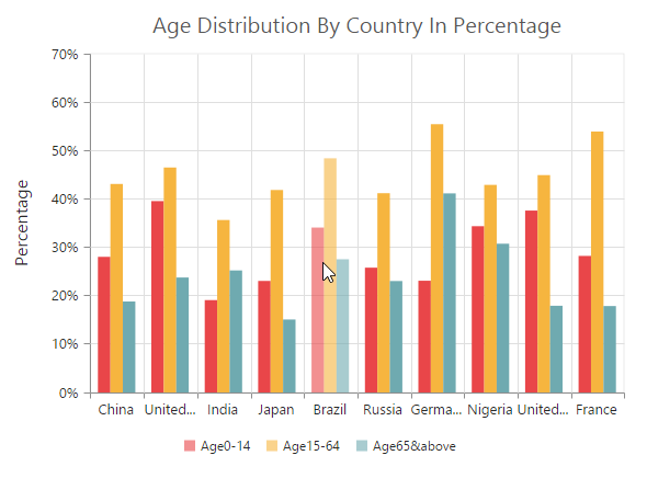
Customize the highlight styles
To customize the highlighted series, use the color, border and opacity options in the highlightSettings.
<ej-chart id="container" [commonSeriesOptions.highlightSettings]="{
        enable:'true',
        border: { width: '1.5', color: 'red' },
        opacity: 0.5,
        color: 'green'
        }" >
</ej-chart>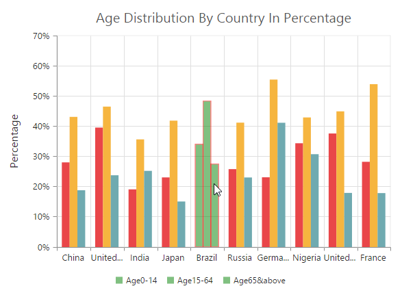
Patterns to highlight
EjChart provides pattern support for highlighting the data by setting the value to the pattern property of the highlightSettings. The different types of highlight patterns are as follows.
- chessboard
- crosshatch
- dots
- pacman
- grid
- turquoise
- star
- triangle
- circle
- tile
- horizontalDash
- verticalDash
- rectangle
- box
- verticalStripe
- horizontalStripe
- bubble
- diagonalBackward
- diagonalForward
<ej-chart id="container" [commonSeriesOptions.highlightSettings]="{enable:'true', pattern:'chessboard' }" >
</ej-chart>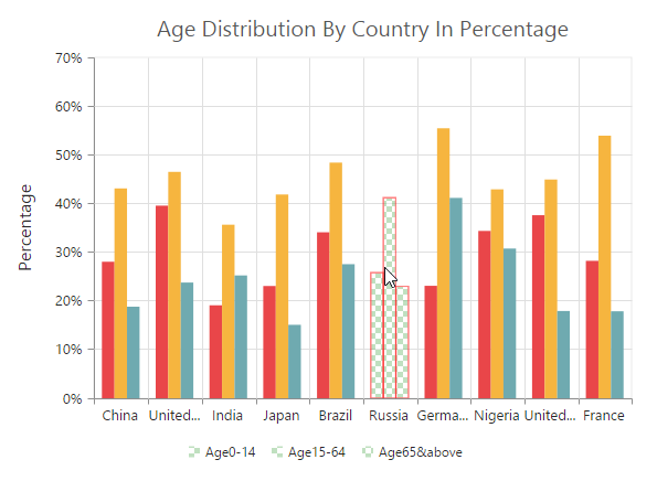
Custom pattern
To create a custom pattern for the highlighting data points, set the pattern type as “custom” and add the custom pattern id in the customPattern option of the highlightSettings.
<body>
    <svg>
     <pattern id="dots_a" patternUnits="userSpaceOnUse" width="6" height="6">
        <rect x="0" y="0" width="6" height="6" transform="translate(0,0)" fill="black" opacity="1">
        </rect>
        <path d='M 3 -3 L -3 3 M 0 6 L 6 0 M 9 3 L 3 9'stroke-width="1" stroke="white">
        </path>
     </pattern>
    </svg>

<ej-chart id="container" >
        <e-seriescollection>
            <e-series [highlightSettings]="{enable:'true', pattern: "custom",
                                                 customPattern: 'dots_a' }" >
            </e-series>
        </e-seriescollection>
</ej-chart>
</body>
Selection
EjChart provides selection support for the series and data points on mouse click. To enable the selection option, set the enable property to true in the selectionSettings of the series.
NOTE
When mouse is clicked on the data points, the corresponding series legend also will be selected.
<ej-chart id="container" >
        <e-seriescollection>
            <e-series [selectionSettings]="{ enable:'true' }" >
            </e-series>
        </e-seriescollection>
</ej-chart>
Selection Mode
You can set four different selection mode for highlighting the data point and series by using the mode property of the selectionSettings.
- Series
- Points
- Cluster
- Range
Series mode
To select all the data points of the specified series, you can set the “series” value to the mode option in the selectionSettings.
<ej-chart id="container" >
        <e-seriescollection>
            <e-series [selectionSettings]="{ enable:'true', mode: 'series',
                                                  pattern:'chessboard' }" >
            </e-series>
        </e-seriescollection>
</ej-chart>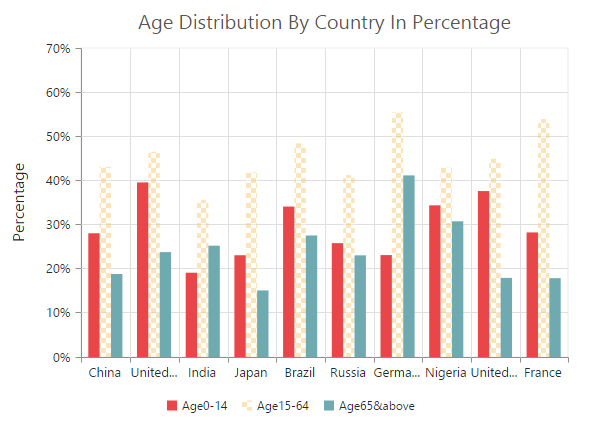
Point mode
To highlight a single point, you can set the “point” value to the mode option.
<ej-chart id="container" >
        <e-seriescollection>
            <e-series [selectionSettings]="{ enable:'true', mode: 'point'}" >
            </e-series>
        </e-seriescollection>
</ej-chart>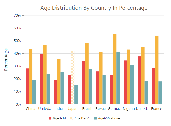
Cluster mode
To select the points that corresponds to the same index in all the series, set the “cluster” value to the mode option.
<ej-chart id="container" >
        <e-seriescollection>
            <e-series [selectionSettings]="{ enable:'true', mode: 'cluster' }" >
            </e-series>
        </e-seriescollection>
</ej-chart>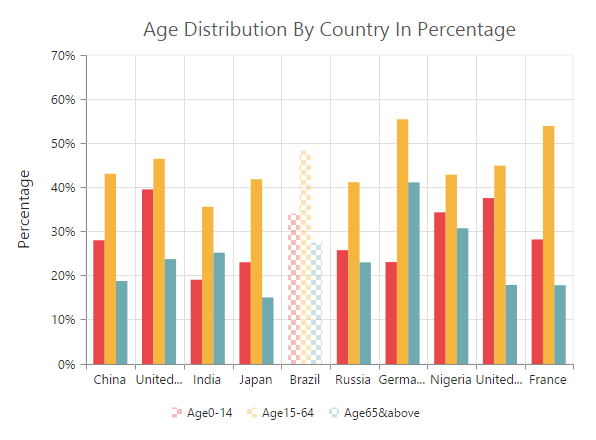
Range mode
To fetch the selected area data points value, you can set the selectionSettings mode as range in the chart series. The selection rectangle can be drawn as horizontally, vertically or in both direction by using rangeType property and the selected data are returned as an array collection in the rangeSelected event.
<ej-chart id="container" (rangeSlected) = "rangeSelection($event)" >
        <e-seriescollection>
            <e-series [selectionSettings]="{ enable:'true', mode: 'range',
                                                   rangeType: 'xy' }" >
            </e-series>
        </e-seriescollection>
</ej-chart>

   <script>

         //event to fetch the selected data point values
         rangeSelection:function (sender){
            var selectedData = sender.data.selectedDataCollection;
            //...
         }
</script>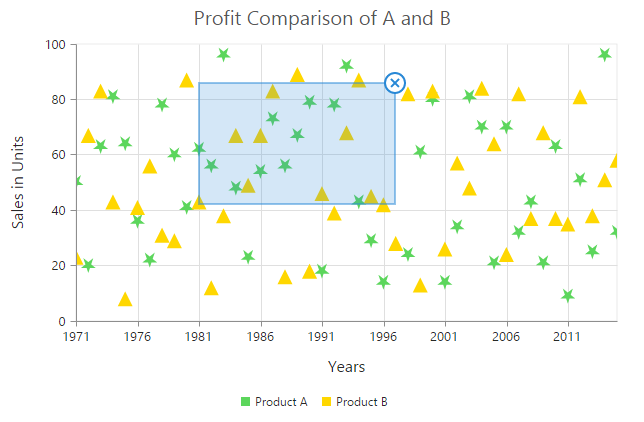
Selection Type
You can set two different selection type for selecting the data point and series on mouse click by using the type property of the selectionSettings.
- Single
- Multiple
Single Type
To select a data point or a series on mouse click based on the selectionSettings.mode, set selectionSettings.type as “single” in the series.
<ej-chart id="container" >
        <e-seriescollection>
            <e-series [selectionSettings]="{ enable:'true', mode: 'series',
                                                        type: 'single' }" >
            </e-series>
        </e-seriescollection>
</ej-chart>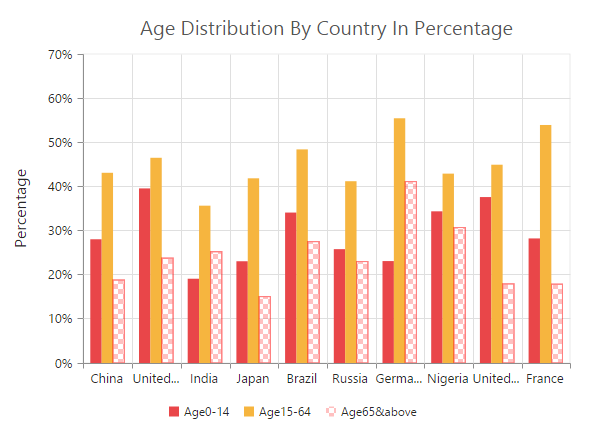
Multiple Type
For selecting multiple data points or series on mouse click, set selectionSettings.type as “multiple” in the series.
<ej-chart id="container" >
        <e-seriescollection>
            <e-series [selectionSettings]="{ enable:'true', mode: 'series',
                                                   type: 'multiple' }" >
            </e-series>
        </e-seriescollection>
</ej-chart>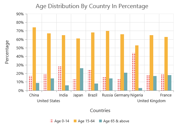
Customizing selection styles
To customize the selection styles, use the color, border and opacity options in the selectionSettings.
<ej-chart id="container" >
        <e-seriescollection>
            <e-series [selectionSettings]="{ enable:'true',
             border: { width: '1.5', color: "red" }, opacity: 0.5, color: "red" }" >
            </e-series>
        </e-seriescollection>
</ej-chart>
Patterns for selection
EjChart provides pattern support for the data selection by setting the value to the pattern property of the selectionSettings. The different types of selection patterns are as follows.
- chessboard
- crosshatch
- dots
- pacman
- grid
- turquoise
- star
- triangle
- circle
- tile
- horizontalDash
- verticalDash
- rectangle
- box
- verticalStripe
- horizontalStripe
- bubble
- diagonalBackward
- diagonalForward
<ej-chart id="container" >
        <e-seriescollection>
            <e-series [selectionSettings]="{ enable:'true', pattern:'diagonalForward' }" >
            </e-series>
        </e-seriescollection>
</ej-chart>
Custom pattern
To create a custom pattern for selecting the data points, set the pattern type as “custom” and add the custom pattern id in the customPattern option of the selectionSettings.
<body>
  <svg>
   <pattern id="dots_a" patternUnits="userSpaceOnUse" width="6" height="6">
        <rect x="0" y="0" width="6" height="6" transform="translate(0,0)" fill="black" opacity="1">
        </rect>
        <path d='M 3 -3 L -3 3 M 0 6 L 6 0 M 9 3 L 3 9'stroke-width="1" stroke="white"></path>
    </pattern>
 </svg>

<ej-chart id="container" >
        <e-seriescollection>
            <e-series [selectionSettings]="{ enable:'true', pattern:'custom',
                                                 customPattern:'dots_a' }" >
            </e-series>
        </e-seriescollection>
</ej-chart>

</body>
Handling Series Selection
To get the series information when selecting the specific series, subscribe to the seriesRegionClick event and set the selectionSettings.mode as “series”.
<ej-chart id="chartcontainer" (seriesRegionClick)="seriesSelection($event)" >
    <e-seriescollection>
        <e-series [selectionSettings]="{ enable: true, mode: 'series'}">
        <!-- Add points here-->
		</e-series>
    </e-seriescollection>
</ej-chart>

   <script>

        function seriesSelection(sender) {
            //Get Series information on series selection
            var seriesData = sender.series;
        }
</script>
Selection on Load
We can able to select the point/series programmatically on chart load, by setting series and point index in the selectedDataPointIndexes property.
<ej-chart id="chartcontainer" [selectedDataPointIndexes]="[
                                                     { seriesIndex:0 , pointIndex:2 },
                                                     { seriesIndex:1 , pointIndex:4 }]" >
    <e-seriescollection>
        <e-series>
        <!-- Add points here-->
		</e-series>
        <e-series>
        <!-- Add points here-->
		</e-series>
    </e-seriescollection>
</ej-chart>
Data Editing
EjChart provides support to change the location of the rendered points. This can be done by dragging the point and dropping it on another location in chart. To enable the data editing, set the enable property to true in the dragSettings of the series.
<ej-chart id="container" >
        <e-seriescollection>
            <e-series [dragSettings.enable]="true" >
            </e-series>
        </e-seriescollection>
</ej-chart>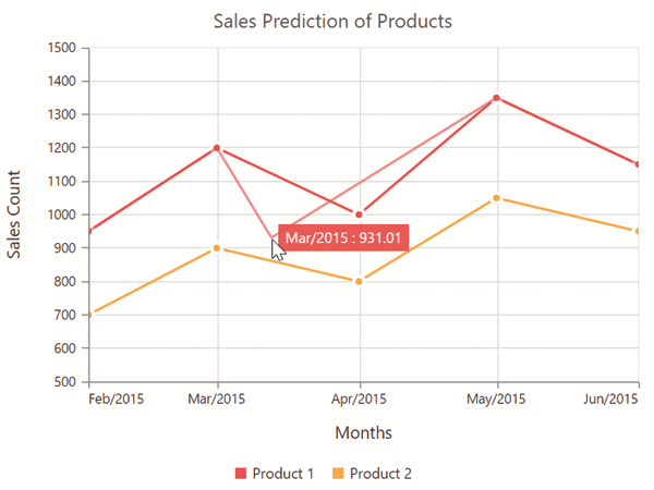
Click here to view the data editing online demo sample.
Customize Dragging direction
To drag the point along x and y axes, you can specify type as xy in dragSettings. And to drag along x axis alone, specify the type as x and to drag along y axis, specify type as y.
<ej-chart id="container" >
        <e-seriescollection>
            <e-series [dragSettings.type]="y" >
            </e-series>
        </e-seriescollection>
</ej-chart>