How can I help you?
Cards in Xamarin Kanban Board (SfKanban)
8 Jan 20258 minutes to read
The default elements of a card can be customized using the below properties of KanbanModel.
-
Title- Used to set the title of a card. -
ImageURL- Used to set the image URL of a card. The image will be displayed at right side in default card template. -
Category- Used to set the category of a card. Based on the category the cards will be added to the respective columns. -
Description- Used to set the description text of a card. -
ColorKey- Used to specify the indicator color key. TheColorvalue of the correspondingKeyshould be added inColorModelcollection ofSfKanban. -
Tags- Used to specify the tags of a card. The tags will be displayed at bottom in default card template. -
ID- Used to set the ID of a card.
new KanbanModel()
{
    ID = 1,
    Title = "iOS - 1002",
    ImageURL = "Image1.png",
    Category = "Open",
    Description = "Analyze customer requirements",
    ColorKey = "Red",
    Tags = new string[] { "Incident", "Customer" }
});
Following code snippet is used to define the colors for each key.
List<KanbanColorMapping> colorModels = new List<KanbanColorMapping>();
colorModels.Add(new KanbanColorMapping("Green", Color.Green));
colorModels.Add(new KanbanColorMapping("Red", Color.Red));
colorModels.Add(new KanbanColorMapping("Aqua", Color.Aqua));
colorModels.Add(new KanbanColorMapping("Blue", Color.Blue));
kanban.ColorModel = colorModels;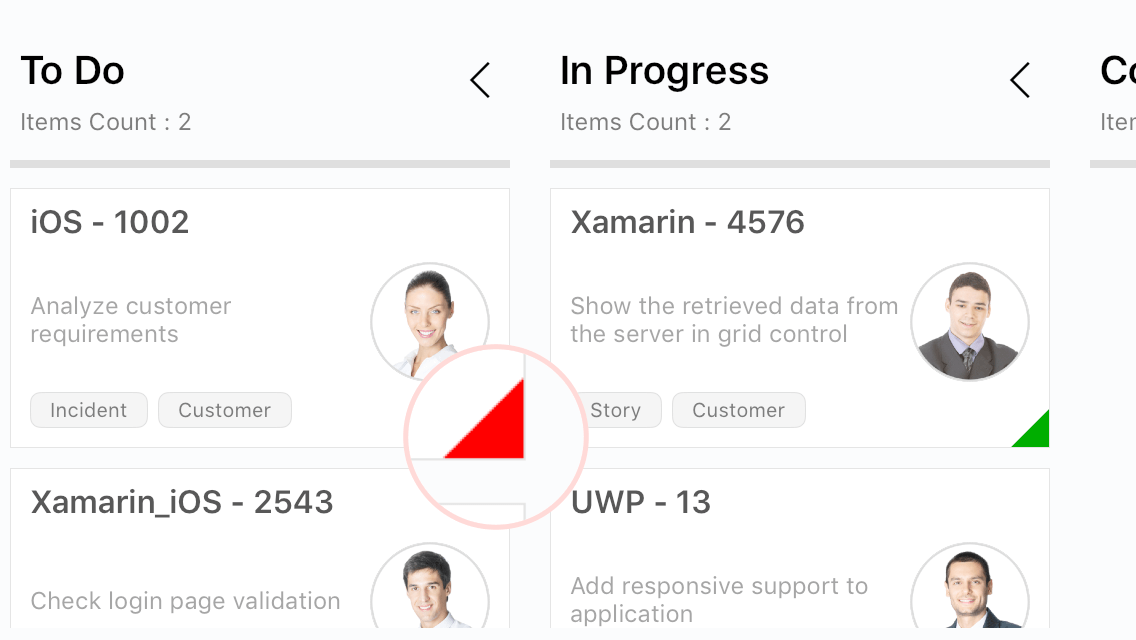
Template
You can replace the entire card template with your own design using SfKanban.CardTemplate property. The following code snippet and screenshot illustrates this.
<kanban:SfKanban.CardTemplate >

<DataTemplate>
    <StackLayout WidthRequest="250" Orientation="Vertical" BackgroundColor="Gray" Padding="10,10,10,10">

        <StackLayout  Orientation="Horizontal">

            <Label Text="{Binding Path=Title}" TextColor="Silver" HorizontalOptions="StartAndExpand" >
            </Label>

        </StackLayout>

        <StackLayout  Orientation="Horizontal">

            <Label Text="{Binding Description}" WidthRequest="150" FontSize="14" TextColor="Silver" LineBreakMode="WordWrap" ></Label>
            <Image Source="{Binding ImageURL}" HeightRequest="50" WidthRequest="50"  ></Image>

        </StackLayout>

    </StackLayout>
</DataTemplate>

</kanban:SfKanban.CardTemplate>
var cardTemplate = new DataTemplate(() =>
{
StackLayout root = new StackLayout()
{
WidthRequest = 250,
Orientation = StackOrientation.Vertical,
Padding = new Thickness(10),
BackgroundColor = Color.Gray
};
StackLayout titleLayout = new StackLayout();
Label title = new Label()
{
TextColor = Color.Silver,
HorizontalOptions = LayoutOptions.StartAndExpand
};
title.SetBinding(Label.TextProperty, new Binding("Title"));
titleLayout.Children.Add(title);
StackLayout contentLayout = new StackLayout()
{
Orientation = StackOrientation.Horizontal
};
Label desc = new Label()
{
WidthRequest = 150,
FontSize = 14,
TextColor = Color.Silver,
LineBreakMode = LineBreakMode.WordWrap
};
desc.SetBinding(Label.TextProperty, new Binding("Description"));
Image image = new Image()
{
HeightRequest = 50,
WidthRequest = 50
};
image.SetBinding(Image.SourceProperty, new Binding("ImageURL"));
contentLayout.Children.Add(desc);
contentLayout.Children.Add(image);
root.Children.Add(titleLayout);
root.Children.Add(contentLayout);
return root;
});
kanban.CardTemplate = cardTemplate;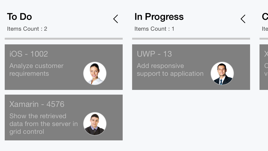
Data template selector
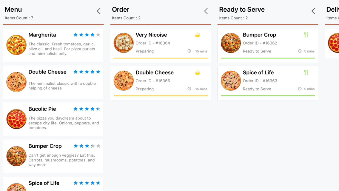
You can customize the appearance of each card with different templates based on specific constraints using DataTemplateSelector.
Create a data template selector
Create a custom class by inheriting DataTemplateSelector, and override the OnSelectTemplate method to return the DataTemplate for that item. At runtime, the SfKanban invokes the OnSelectTemplate method for each item and passes the data object as parameter.
public class KanbanTemplateSelector : DataTemplateSelector
{
	private readonly DataTemplate menuTemplate;
	private readonly DataTemplate orderTemplate;
	private readonly DataTemplate readyToServeTemplate;
	private readonly DataTemplate deliveryTemplate;

	public KanbanTemplateSelector()
	{
		menuTemplate = new DataTemplate(typeof(MenuTemplate));
		orderTemplate = new DataTemplate(typeof(OrderTemplate));
		readyToServeTemplate = new DataTemplate(typeof(ReadyToServeTemplate));
		deliveryTemplate = new DataTemplate(typeof(DeliveryTemplate));
	}

	protected override DataTemplate OnSelectTemplate(object item, BindableObject container)
	{
		var data = item as CustomKanbanModel;
		if (data == null)
			return null;

		string category = data.Category?.ToString();

		return category.Equals("Menu") ? menuTemplate :
		category.Equals("Dining") || category.Equals("Delivery") ? orderTemplate :
		category.Equals("Ready to Serve") ? readyToServeTemplate : deliveryTemplate;
	}
}
Applying the data template selector
Assign custom DataTemplateSelector to the CardTemplate of the SfKanban in either XAML or C#.
<ContentPage xmlns="http://xamarin.com/schemas/2014/forms"
             xmlns:x="http://schemas.microsoft.com/winfx/2009/xaml"
             x:Class="SimpleSample.MainPage"
             xmlns:kanban="clr-namespace:Syncfusion.SfKanban.XForms;assembly=Syncfusion.SfKanban.XForms""
             xmlns:local="clr-namespace:SimpleSample;assembly=SimpleSample">

  <ContentPage.Resources>
    <ResourceDictionary>
      <local:KanbanTemplateSelector x:Key="kanbanTemplateSelector" />
    </ResourceDictionary>
  </ContentPage.Resources>

  <ContentPage.BindingContext>
	  <local:KanbanCustomViewModel />
  </ContentPage.BindingContext>

  <kanban:SfKanban x:Name="kanban" HorizontalOptions="FillAndExpand"
				VerticalOptions="FillAndExpand" ItemsSource="{Binding Cards}"
				CardTemplate="{StaticResource kanbanTemplateSelector}" >

   ...

  </kanban:SfKanban>

</ContentPage>
SfKanban kanban = new SfKanban();
kanban.ItemsSource = viewModel.Cards;
kanban.CardTemplate = new KanbanTemplateSelector();