Visual Customization in Xamarin CheckBox (SfCheckBox)
17 Oct 20237 minutes to read
Customizing a shape
The check box shape can be customized using the CornerRadius property. This property specifies the uniform radius value to the every corner of the check box.
<syncfusion:SfCheckBox x:Name="checkBox" Text="CheckBox" IsChecked="True" CornerRadius="5.0"/>SfCheckBox checkBox = new SfCheckBox();
checkBox.Text = "CheckBox";
checkBox.IsChecked = true;
checkBox.CornerRadius = 5.0f;
Customizing a state color
The default state colors can be customized using the CheckedColor and UncheckedColor properties. The checked or indeterminate state color is updated to the CheckedColor property value when the state is changed to the checked or indeterminate.The unchecked state color is updated to UncheckedColor property value when the state is changed to unchecked.
<syncfusion:SfCheckBox x:Name="check" Text="CheckBox" IsChecked="True" CheckedColor="Green"/>
<syncfusion:SfCheckBox x:Name="uncheck" Text="CheckBox" UncheckedColor="Violet"/>
<syncfusion:SfCheckBox x:Name="indeterminate " Text="CheckBox" IsThreeState="True" IsChecked="{x:Null}" CheckedColor="Purple"/>
SfCheckBox check= new SfCheckBox();
check.Text = "CheckBox";
check.IsChecked = true;
check.CheckedColor = Color.Green;
SfCheckBox uncheck = new SfCheckBox();
uncheck.Text = "CheckBox";
uncheck.UncheckedColor = Color.Violet;
SfCheckBox indeterminate = new SfCheckBox();
indeterminate.IsChecked = null;
indeterminate.IsThreeState = true;
indeterminate.Text = "CheckBox";
indeterminate.CheckedColor = Color.Purple;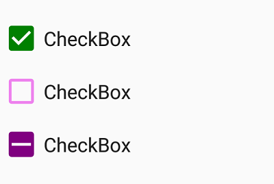
BorderWidth
The tick box border thickness of the checkbox control can be customized using the BorderWidth property.
<syncfusion:SfCheckBox Text="Hello" BorderWidth="2" UncheckedColor="Blue" FontSize="20"/>
<syncfusion:SfCheckBox Text="Hello" BorderWidth="4" UncheckedColor="Blue" FontSize="25"/>
<syncfusion:SfCheckBox Text="Hello" BorderWidth="6" UncheckedColor="Blue" FontSize="30"/>
SfCheckBox check1= new SfCheckBox();
check1.Text = "Hello";
check1.BorderWidth = 2;
check1.FontSize = 20;
check1.UncheckedColor = Color.Blue;
SfCheckBox check2 = new SfCheckBox();
check2.Text = "Hello";
check2.BorderWidth = 4;
check2.FontSize = 25;
check2.UncheckedColor = Color.Blue;
SfCheckBox check3 = new SfCheckBox();
check3.Text = "Hello";
check3.BorderWidth = 6;
check3.FontSize = 30;
check3.UncheckedColor = Color.Blue;
Setting a caption text appearance
You can customize the display text appearance of the SfCheckBox control using the following properties:
-
TextColor: Changes the color of the text. -
HorizontalTextAlignment: Changes the horizontal alignment of the caption text. -
FontFamily: Changes the font family of the caption text. -
FontAttributes: Sets font attributes(bold/italic/none) of the caption text. -
FontSize: Sets font size of the caption text.
<syncfusion:SfCheckBox x:Name="caption" Text="CheckBox" IsChecked="True" TextColor="Violet" HorizontalTextAlignment="Center" FontFamily="Arial" FontAttributes="Bold" FontSize="20"/>SfCheckBox caption = new SfCheckBox();
caption.IsChecked = true;
caption.Text = "CheckBox";
caption.TextColor = Color.Violet;
caption.HorizontalTextAlignment = TextAlignment.Center;
caption.FontFamily = "Arial";
caption.FontAttributes = FontAttributes.Bold;
caption.FontSize = 20;
LineBreakMode
The LineBreakMode allows you to wrap or truncate the text. The default value of this property is NoWrap. The following other options are available in LineBreakMode:
-
NoWrap- Avoids the text wrap. -
WordWrap- Wraps the text by words. -
CharacterWrap- Wraps the text by character. -
HeadTruncation- Truncates the text at the start. -
MiddleTruncation- Truncates the text at the center. -
TailTruncation- Truncates the text at the end.
TickColor Customization
The TickColor property customizes the color of the tick in SfCheckBox control using the following properties:
.
<ContentPage xmlns="http://xamarin.com/schemas/2014/forms"
             xmlns:x="http://schemas.microsoft.com/winfx/2009/xaml"
             xmlns:syncfusion="clr-namespace:Syncfusion.XForms.Buttons;assembly=Syncfusion.Buttons.XForms"  x:Class="CheckBoxCustomization.checkbox">
     <ContentPage.Content>
            <StackLayout>
                <syncfusion:SfCheckBox x:Name="checkBox" IsChecked="True" CheckedColor="Aqua" TickColor="Fuchsia" Text="CheckBox" />
            </StackLayout>
        </ContentPage.Content>
</ContentPage>
using System;
using Syncfusion.XForms.Buttons;
using Xamarin.Forms;
namespace CheckBoxCustomization
{
public partial class MainPage : ContentPage
{
public MainPage()
{
InitializeComponent();
StackLayout stackLayout = new StackLayout();
SfCheckBox checkBox = new SfCheckBox();
checkBox.IsChecked = true;
checkBox.Text = "CheckBox";
checkBox.CheckedColor = Color.Aqua;
checkBox.TickColor = Color.Fuchsia;
stackLayout.Children.Add(checkBox);
this.Content = stackLayout;
Size Customization
The ControlSize property is used to customize the CheckBox control size.
<StackLayout>
    <syncfusion:SfCheckBox Text="CheckBox" ControlSize="60"/>
</StackLayout>
StackLayout stackLayout = new StackLayout();
SfCheckBox sfCheckBox = new SfCheckBox();
sfCheckBox.Text = "Radio Button";
sfCheckBox.ControlSize = 60;
stackLayout.Children.Add(sfCheckBox);See also
How to get the values of selected checkboxes in a group using Xamarin.Forms