How can I help you?
Display Modes in Xamarin Calendar (SfCalendar)
8 Jan 202518 minutes to read
Xamarin.Forms calendar control provides 4 different types of views such month, year, decade and century. It allows users to easily select and navigate between all built-in views. This can be achieved by using ViewMode property of SfCalendar.
NOTE
By default calendar control is assigned with month view.
Month view
This displays entire dates of a particular month, by default current month will be displayed on loading. The current date is provided with separate color different from the rest of the dates color in a month. The events availability will be denoted within the cell based on its duration.
The dates in month view can be selected by four ways such as single, multiple, range and multi range selections which can be achieved using SelectionMode. Refer here.
<syncfusion:SfCalendar x:Name="calendar" ViewMode="MonthView"/>calendar.ViewMode = ViewMode.MonthView;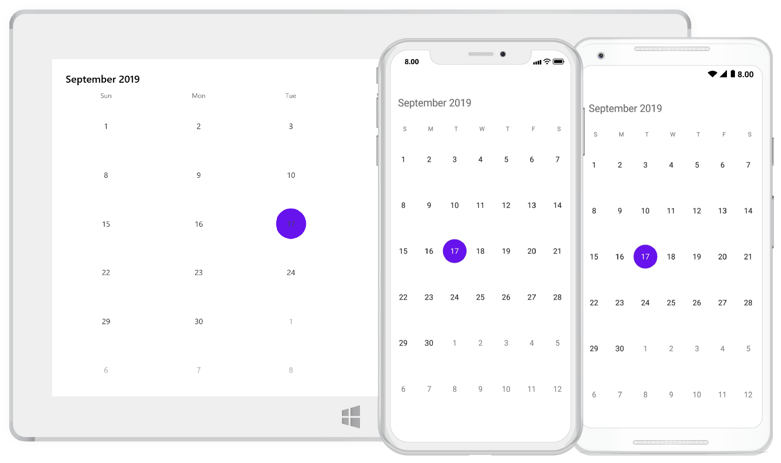
Trailing and leading days
The SfCalendar allows you show/hide the days of the next month and previous month in calendar to enhance the appearance. This can be achieved by enabling the ShowLeadingAndTrailingDays property. The following code demonstrates how to hide the leading and trailing dates in calendar.
<syncfusion:SfCalendar  x:Name="calendar" ViewMode="MonthView"
ShowLeadingAndTrailingDays="False"/>calendar.ViewMode = ViewMode.MonthView;
calendar.ShowLeadingAndTrailingDays = False;
NOTE
- The OnMonthCellLoaded event is triggered for the current month dates.
- The VisibleDates in the MonthChanged event will return the current month dates.
Enable and disable past dates
The SfCalendar allows you to enable/disable the past dates in MonthView. This can be achieved by changing the EnableDatesInPast property. By default, value of this property is set to true.
<syncfusion:SfCalendar  x:Name="calendar" ViewMode="MonthView"
EnableDatesInPast="False"/>calendar.ViewMode = ViewMode.MonthView;
calendar.EnableDatesInPast = False;
NOTE
The
EnableDatesInPastis not applicable for UWP.
Month view customization
You can customize the calendar month view by using MonthViewSettings of SfCalendar.
- Current day text color can be modified using TodayTextColor.
- The day header format, day font size, day header font size, day header font family, header font family, day cell font family can be modified using DayHeaderFormat, DayFontSize, DayHeaderFontSize, DayHeaderFontFamily
HeaderFontFamily, DayCellFontFamily,DayHeight,DayLabelTextAlignment,DisabledTextColor Properties. - The background color of the inline view can be modified using InlineBackgroundColor property.
- The text color of the inline view can be modified using InlineTexColor property.
- In AgendaView the selected date color can be modified using AgendaSelectedDateColor
- The Calendar Header text color, Background color and font can be modified using the HeaderTextColor, HeaderBackgroundColor,HeaderFont Properties.
- The date text can be Aligned using the DateTextAlignment.
- The Radius of the Selection shape can be modified by SelectionRadius.
- The header font can be modified using the HeaderFontAttributes.
- The background color of the day header can be modified using the DayHeaderBackgroundColor.
- The text color of the day header can be changed by using the DayHeaderTextColor.
- The size of the header font can be modified using the HeaderFontSize.
- The text color of the selected date can be changed by using the SelectedDayTextColor.
- The selection color of the date can be modified using the DateSelectionColor.
- Background color of the previous month can be changed by using the PreviousMonthBackgroundColor.
- The text color of the previous month can be modified by using the PreviousMonthTextColor.
- Selection background color of the current day can be modified by using the TodaySelectionBackgroundColor.
- Selection text color of the current day can be modified by using the TodaySelectionTextColor.
- The background color and text color of the current month can be modified by using the CurrentMonthBackgroundColor and CurrentMonthTextColor.
- The text color and background color of the weekend can be modified by using the WeekEndTextColor and WeekEndBackgroundColor.
<syncfusion:SfCalendar x:Name="calendar">
	<syncfusion:SfCalendar.MonthViewSettings>
<syncfusion:MonthViewSettings
		CurrentMonthBackgroundColor="#800080"
		CurrentMonthTextColor="#ffffff"
		PreviousMonthBackgroundColor="#9895F0"
		PreviousMonthTextColor="#000000"
		DateSelectionColor="#ffffff"
		SelectedDayTextColor="#000000"
		DayHeaderFormat="EEEEE"
		DayFontSize="12"
		DayHeaderFontSize="14"
		DayHeaderBackgroundColor="#fed766"
		SelectionRadius="15"
		TodaySelectionTextColor="Black"
		TodaySelectionBackgroundColor="Green"
		DayHeaderTextColor="Black"
		HeaderBackgroundColor="Pink"
		HeaderFontAttributes="Italic"
		HeaderFontSize="16"
		WeekEndTextColor="#fe4a49"
		WeekEndBackgroundColor="#2ab7ca">
			<syncfusion:MonthViewSettings.HeaderFontFamily>
				<OnPlatform x:TypeArguments="x:String" iOS="Lobster-Regular" Android="Lobster-Regular.ttf" WinPhone="Assets/Lobster-Regular.ttf#Lobster" />
			</syncfusion:MonthViewSettings.HeaderFontFamily>
			<syncfusion:MonthViewSettings.DayHeaderFontFamily>
				<OnPlatform x:TypeArguments="x:String" iOS="Lobster-Regular" Android="Lobster-Regular.ttf" WinPhone="Assets/Lobster-Regular.ttf#Lobster" />
			</syncfusion:MonthViewSettings.DayHeaderFontFamily>
			<syncfusion:MonthViewSettings.DayCellFontFamily>
				<OnPlatform x:TypeArguments="x:String" iOS="Lobster-Regular" Android="Lobster-Regular.ttf" WinPhone="Assets/Lobster-Regular.ttf#Lobster" />
			</syncfusion:MonthViewSettings.DayCellFontFamily>
		</syncfusion:MonthViewSettings>
   </syncfusion:SfCalendar.MonthViewSettings>
</syncfusion:SfCalendar>
SfCalendar calendar = new SfCalendar();
MonthViewSettings monthViewSettings = new MonthViewSettings();
monthViewSettings.CurrentMonthBackgroundColor = Color.FromHex("#800080");
monthViewSettings.CurrentMonthTextColor = Color.FromHex("#ffffff");
monthViewSettings.PreviousMonthBackgroundColor = Color.FromHex("#9895F0");
monthViewSettings.PreviousMonthTextColor = Color.FromHex("#000000");
monthViewSettings.DateSelectionColor = Color.FromHex("#ffffff");
monthViewSettings.SelectedDayTextColor = Color.FromHex("#000000");
monthViewSettings.DayHeaderFormat = "EEEEE";
monthViewSettings.DayFontSize = 12;
monthViewSettings.DayHeaderFontSize = 14;
monthViewSettings.DayHeaderBackgroundColor = Color.FromHex("#fed766");
monthViewSettings.SelectionRadius = 15;
monthViewSettings.TodaySelectionTextColor = Color.Black;
monthViewSettings.TodaySelectionBackgroundColor = Color.Green;
monthViewSettings.DayHeaderTextColor = Color.Black;
monthViewSettings.DayHeaderFontFamily = Device.OnPlatform("Lobster-Regular", "Lobster-Regular.ttf", "Assets/Lobster-Regular.ttf#Lobster");
monthViewSettings.HeaderBackgroundColor = Color.Pink;
monthViewSettings.HeaderFontAttributes = FontAttributes.Italic;
monthViewSettings.HeaderFontFamily = Device.OnPlatform("Lobster-Regular", "Lobster-Regular.ttf", "Assets/Lobster-Regular.ttf#Lobster");
monthViewSettings.HeaderFontSize = 16;
monthViewSettings.DayCellFontFamily = Device.OnPlatform("Lobster-Regular", "Lobster-Regular.ttf", "Assets/Lobster-Regular.ttf#Lobster");
monthViewSettings.WeekEndTextColor = Color.FromHex("#fe4a49");
monthViewSettings.WeekEndBackgroundColor = Color.FromHex("#2ab7ca");
monthViewSettings.AgendaSelectedDateColor = Color.Blue;
calendar.MonthViewSettings = monthViewSettings;
this.Content = calendar;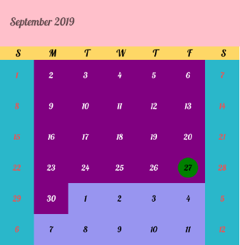
NOTE
- To disable the current day selection, use
TodaySelectionBackgroundColorcolor as Transparent.- DisabledBackgroundColor added while calendar using MinDate, MaxDate and EnableDatesInPast properties.
Month view border color customization
You can customize the border color of calendar month view using MonthViewSettings. The border color of month view can be customized using the BorderColor property and the lines of month cells can be enabled using the CellGridOptions property.
<syncfusion:SfCalendar x:Name="calendar">
	<syncfusion:SfCalendar.MonthViewSettings>
		  <syncfusion:MonthViewSettings BorderColor ="#ff0000" CellGridOptions="Both"/>
   </syncfusion:SfCalendar.MonthViewSettings>
</syncfusion:SfCalendar>
SfCalendar calendar = new SfCalendar();
MonthViewSettings monthViewSettings = new MonthViewSettings();
monthViewSettings.BorderColor = Color.FromHex("#ff0000");
monthViewSettings.CellGridOptions = CellGridOptions.Both;
calendar.MonthViewSettings = monthViewSettings;
this.Content = calendar;
Today border color customization
You can customize the today border color of calendar month cell using MonthViewSettings. The border color of current day can be customized using the TodayBorderColor property and it is applicable for both Fill and Circle SelectionShape.
<syncfusion:SfCalendar x:Name="calendar">
	<syncfusion:SfCalendar.MonthViewSettings>
		  <syncfusion:MonthViewSettings TodayBorderColor="#ff0000"/>
   </syncfusion:SfCalendar.MonthViewSettings>
</syncfusion:SfCalendar>
SfCalendar calendar = new SfCalendar();
MonthViewSettings monthViewSettings = new MonthViewSettings();
monthViewSettings.TodayBorderColor = Color.FromHex("#ff0000");
calendar.MonthViewSettings = monthViewSettings;
this.Content = calendar;
Customize day header text
You can customize the day header text by adding the custom day labels in the CustomDayLabels collection by using the CustomDayLabels collection of SfCalendar.
List<string> customDayLabels = new List<string>()
{
    "Off",
    "Mon(D1)",
    "Tue(D2)",
    "Wed(D3)",
    "Thu(D3)",
    "Fri(D4)",
    "Off",
};

calendar.CustomDayLabels = customDayLabels;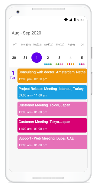
Week view
The number of weeks in the month view can be changed by setting the NumberOfWeeksInView property in SfCalendar. By default, NumberOfWeeksInView starts from current week, and this can be modified using the MoveToDate property of calendar. It also supports all existing features such as FirstDayOfWeek, MinDate, MaxDate, and SelectionMode.
NOTE
- Week number ranges from 1 to 6. If lesser or greater than these range is considered,
NumberOfWeeksInViewwill be displayed as 6.- Inline view considers
NumberOfWeeksInViewas only 6. For other count, only agenda view will be displayed in calendar.- Dynamically changing
NumberOfWeeksInViewshows the first row of month view dates. It can be handled using theMoveToDateproperty of calendar- ShowLeadingAndTrailingDays is not applicable if the
NumberOfWeeksInViewis lesser than 6.
<syncfusion:SfCalendar x:Name="calendar" NumberOfWeeksInView="2"/>SfCalendar calendar = new SfCalendar();
calendar.NumberOfWeeksInView = 2;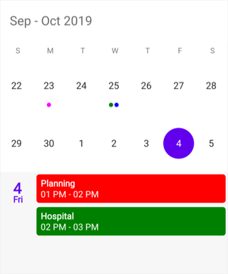
Year view
This displays entire dates/month of a particular year, by default current year will be displayed on loading. The Years can be changed by swiping back and forth or Forward and Backward methods. The Months can be navigated quickly by selecting on the particular month in year view.
<syncfusion:SfCalendar x:Name="calendar" ViewMode="YearView"/>SfCalendar calendar = new SfCalendar();
calendar.ViewMode=ViewMode.YearView;
this.Content = calendar;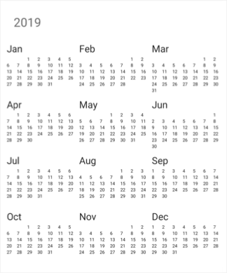
Year view mode
You can set the year view as either date or month using YearViewMode. By default, current year and months will be displayed.
- If the
YearViewModeis date, it will be displays all the months with dates in a particular year view. - If the
YearViewModeis month, it will be displays all the months in a particular year view.
<syncfusion:SfCalendar x:Name="calendar" ViewMode="YearView" YearViewMode="Date" NavigationDirection="Vertical"/>SfCalendar calendar = new SfCalendar();
calendar.ViewMode=ViewMode.YearView;
calendar.YearViewMode = YearViewMode.Date;
this.Content = calendar;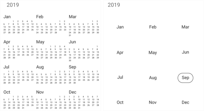
NOTE
- The
YearViewModeproperty is only applicable for calendar in Android and iOS platforms.
Year view customization
We can customize the calendar view in yearView mode by using YearViewSettings property of SfCalendar. Date text color can be modified using DateTextColor. You can also customize the header, month layout in year view’s text color and background color and LabelAlignment by using the HeaderBackground, LayoutBackground, YearHeaderTextColor,MonthHeaderBackground and LabelAlignment properties.
<syncfusion:SfCalendar x:Name="calendar">
	<syncfusion:SfCalendar.YearViewSettings>
		<syncfusion:YearViewSettings
			LayoutBackground="#ffe4b5"
			DateTextColor="#E6E6FA"
			HeaderBackground="#8B4513"
			YearHeaderTextColor="#FFFFFF"
			MonthHeaderBackground="#bfff00"
			LabelAlignment="Centre"
			/>
	</syncfusion:SfCalendar.YearViewSettings>
</syncfusion:SfCalendar>
SfCalendar calendar = new SfCalendar();
YearViewSettings yearViewSettings = new YearViewSettings();
yearViewSettings.LayoutBackground = Color.FromHex("#ffe4b5");
yearViewSettings.DateTextColor = Color.FromHex("#008000");
yearViewSettings.YearHeaderTextColor = Color.FromHex("#ff0000");
yearViewSettings.MonthHeaderBackground = Color.FromHex("#bfff00");
yearViewSettings.LabelAlignment = LabelAlignment.Centre;
calendar.YearViewSettings = yearViewSettings;
this.Content = calendar;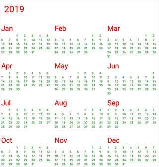
Decade view
This view displays the period of 10 years. By default, current year range of 10 years will be displayed on loading. You can easily navigate between month/year view to decade view by tapping the calendar header. The year can be navigated quickly by selecting a particular year from decade view.
<syncfusion:SfCalendar  x:Name="calendar" ViewMode="Decade" ShowNavigationButtons="True" NavigationDirection="Vertical">
</syncfusion:SfCalendar>
SfCalendar calendar = new SfCalendar();
calendar.ViewMode=ViewMode.Decade;
calendar.ShowNavigationButtons=true;
calendar.NavigationDirection = NavigationDirection.Vertical;
this.Content = calendar;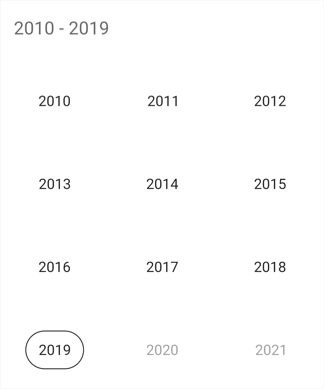
Decade view customization
You can customize the decade view of calendar by using YearViewSettings.
- Year text color can be modified using MonthHeaderTextColor.
- You can customize the decade view header text and background color by using the YearHeaderTextColor and HeaderBackground property.
- You can customize the background of decade view by using LayoutBackground and MonthLayoutBackground.
<syncfusion:SfCalendar x:Name="calendar" ShowNavigationButtons="True" NavigationDirection="Vertical">
<syncfusion:SfCalendar.YearViewSettings>
	<syncfusion:YearViewSettings
		LayoutBackground ="#D3D3D3"
		HeaderBackground = "#F2F2F2"
		MonthHeaderTextColor ="#0000FF"
		YearHeaderTextColor="#ff0000"
		MonthLayoutBackground  ="#F2F2F2"/>
</syncfusion:SfCalendar.YearViewSettings>
</syncfusion:SfCalendar>
SfCalendar calendar = new SfCalendar();
calendar.ShowNavigationButtons=true;
calendar.NavigationDirection = NavigationDirection.Vertical;
YearViewSettings yearViewSettings = new YearViewSettings();
yearViewSettings.LayoutBackground = Color.FromHex("#D3D3D3");
yearViewSettings.MonthHeaderTextColor = Color.FromHex("#0000FF");
yearViewSettings.MonthLayoutBackground = Color.FromHex("#F2F2F2");
yearViewSettings.YearHeaderTextColor = Color.FromHex("#ff0000");
yearViewSettings.HeaderBackground = Color.FromHex("#F2F2F2");
calendar.YearViewSettings = yearViewSettings;
this.Content = calendar;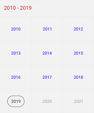
Century view
This view displays the period of 100 years. By default, current year range of 100 years will be displayed on loading. You can easily navigate between month/year/decade view to century view by tapping the calendar header. You can easily navigate to decade view by selecting decade years in century view.
<syncfusion:SfCalendar  x:Name="calendar" ViewMode="Century" ShowNavigationButtons="True" NavigationDirection="Vertical">
</syncfusion:SfCalendar>
SfCalendar calendar = new SfCalendar();
calendar.ViewMode=ViewMode.Century;
calendar.ShowNavigationButtons=true;
calendar.NavigationDirection = NavigationDirection.Vertical;
this.Content = calendar;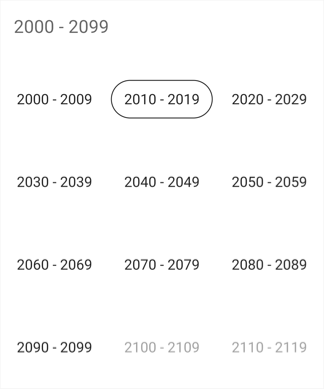
Century view customization
You can customize the century view of calendar using YearViewSettings.
- Year text color can be modified using MonthHeaderTextColor.
- You can customize the century view header text and background color by using the YearHeaderTextColor and HeaderBackground property.
- You can customize the background of century view by using LayoutBackground and MonthLayoutBackground.
<syncfusion:SfCalendar x:Name="calendar" ShowNavigationButtons="True" NavigationDirection="Vertical">
	<syncfusion:SfCalendar.YearViewSettings>
		<syncfusion:YearViewSettings
			LayoutBackground ="#D3D3D3"
			HeaderBackground = "#F2F2F2"
			MonthHeaderTextColor ="#0000FF"
			YearHeaderTextColor="#ff0000"
			MonthLayoutBackground  ="#F2F2F2"/>
	</syncfusion:SfCalendar.YearViewSettings>
</syncfusion:SfCalendar>
SfCalendar calendar = new SfCalendar();
calendar.ShowNavigationButtons = true;
calendar.NavigationDirection = NavigationDirection.Vertical;
YearViewSettings yearViewSettings = new YearViewSettings();
yearViewSettings.LayoutBackground = Color.FromHex("#D3D3D3");
yearViewSettings.MonthHeaderTextColor = Color.FromHex("#0000FF");
yearViewSettings.MonthLayoutBackground = Color.FromHex("#F2F2F2");
yearViewSettings.YearHeaderTextColor = Color.FromHex("#ff0000");
yearViewSettings.HeaderBackground = Color.FromHex("#F2F2F2");
calendar.YearViewSettings = yearViewSettings;
this.Content = calendar;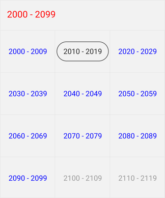
Programmatically expand the InlineView
You can Programmatically Expand the InlineView using ExpandInlineView method which Expands the Appointment details of the corresponding date.
calendar.ExpandInlineView(DateTime.Now.Date);Programmatically collapse the InlineView
You can Programmatically Collapsed the InlineView Using CollapseInlineView method which collapsed the Appointment details of the corresponding date.
calendar.CollapseInlineView(DateTime.Now.Date);See also
How to Identify the current month day cell in SfCalendar?
How to customize the month cell of SfCalendar?
How to customize the month cell of SfCalendar with custom object?
How to customize the month cell border lines of SfCalendar?
How to restrict the year view move while tapping calendar’s month header?
How to change the selection shape of calendar’s date cell selection?
How to customize the selected month cell in Xamarin.Forms Calendar (SfCalendar)